Executive Snapshot
West Pack Lifestyle grew from one store in 2008 to 47 warehouse and Express locations by 2017. The network later reached 50 South African stores and three in Namibia.
Rapid expansion created a management challenge. West Pack had a recognized logo, but no formal system controlling its use across stores, franchises, suppliers, agencies and customer channels.
The System Challenge
Logo variations appeared across signage, print and daily retail communication. Changes to scale, spacing, color and proportions weakened consistency as more people produced branded material.
West Pack Lifestyle served as the larger superstore offer, while West Pack Express supported smaller and franchised locations. Both needed to feel related without becoming interchangeable.
My Role
As Fractional Creative Director and Brand Strategist, I audited the identity and creative operation. I led brand rationalization, architecture, manual development, application standards and rollout.
My role also included staff training, guidance for the internal brand manager and handover tools for agencies, printers, franchise teams and suppliers.
The Governance Response
I began with an identity audit and mapped areas exposed to brand drift. These included logo reproduction, store formats, third-party production and high-volume promotions.
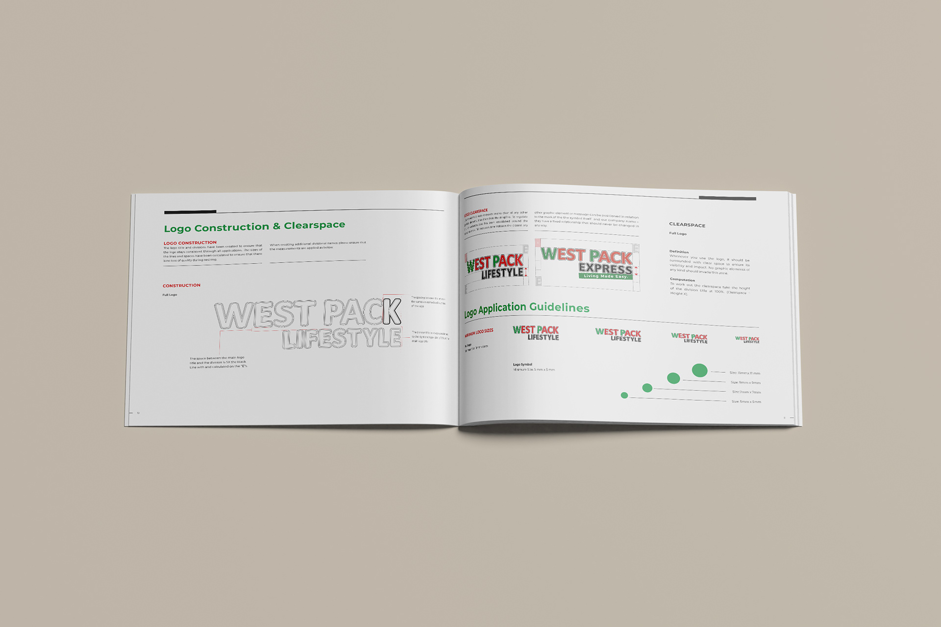
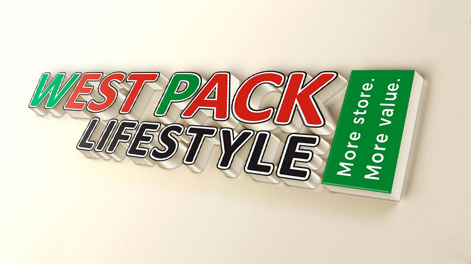
I reconstructed the logo using defined proportions, line widths, clearspace and scale rules. This protected its integrity from small printed applications to large store and vehicle signage.
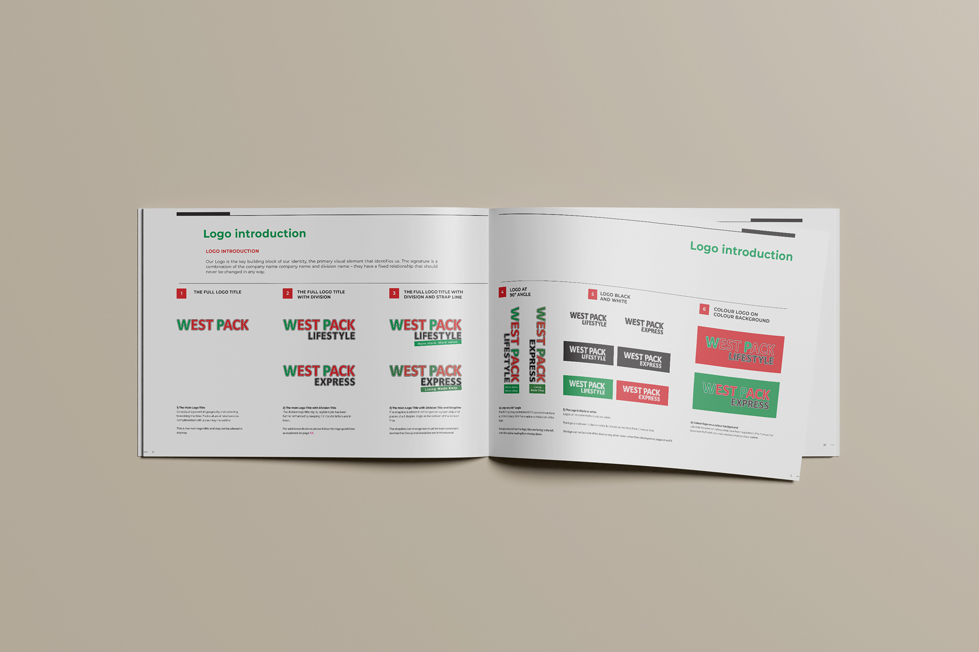
The manual established the relationship between West Pack Lifestyle and West Pack Express. It defined naming, lockups and shared standards while preserving each format’s purpose.
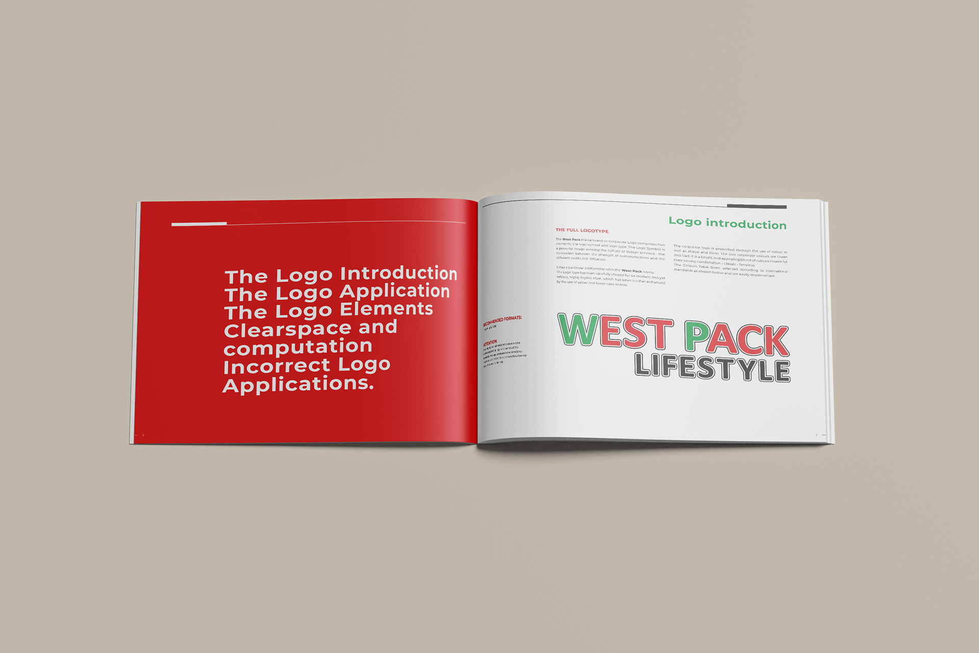
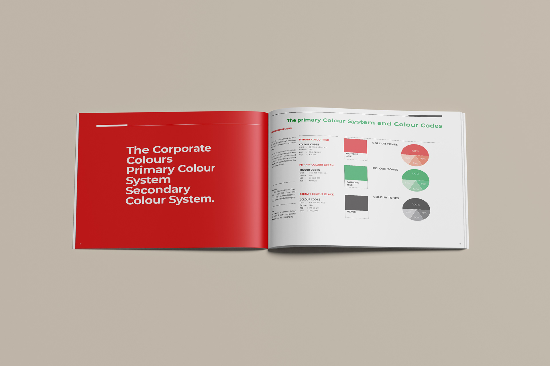
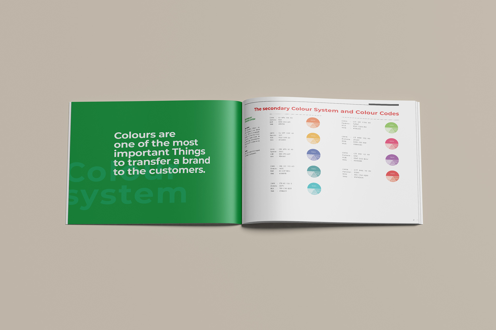
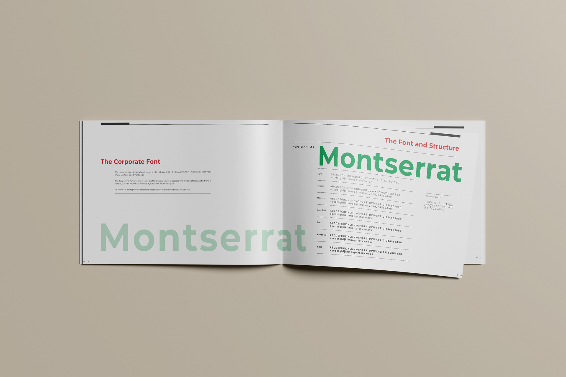
I formalised the Portuguese-inspired colour palette, selected accessible typefaces and created a hierarchy for internal and agency use. A new strapline added a consistent verbal anchor.
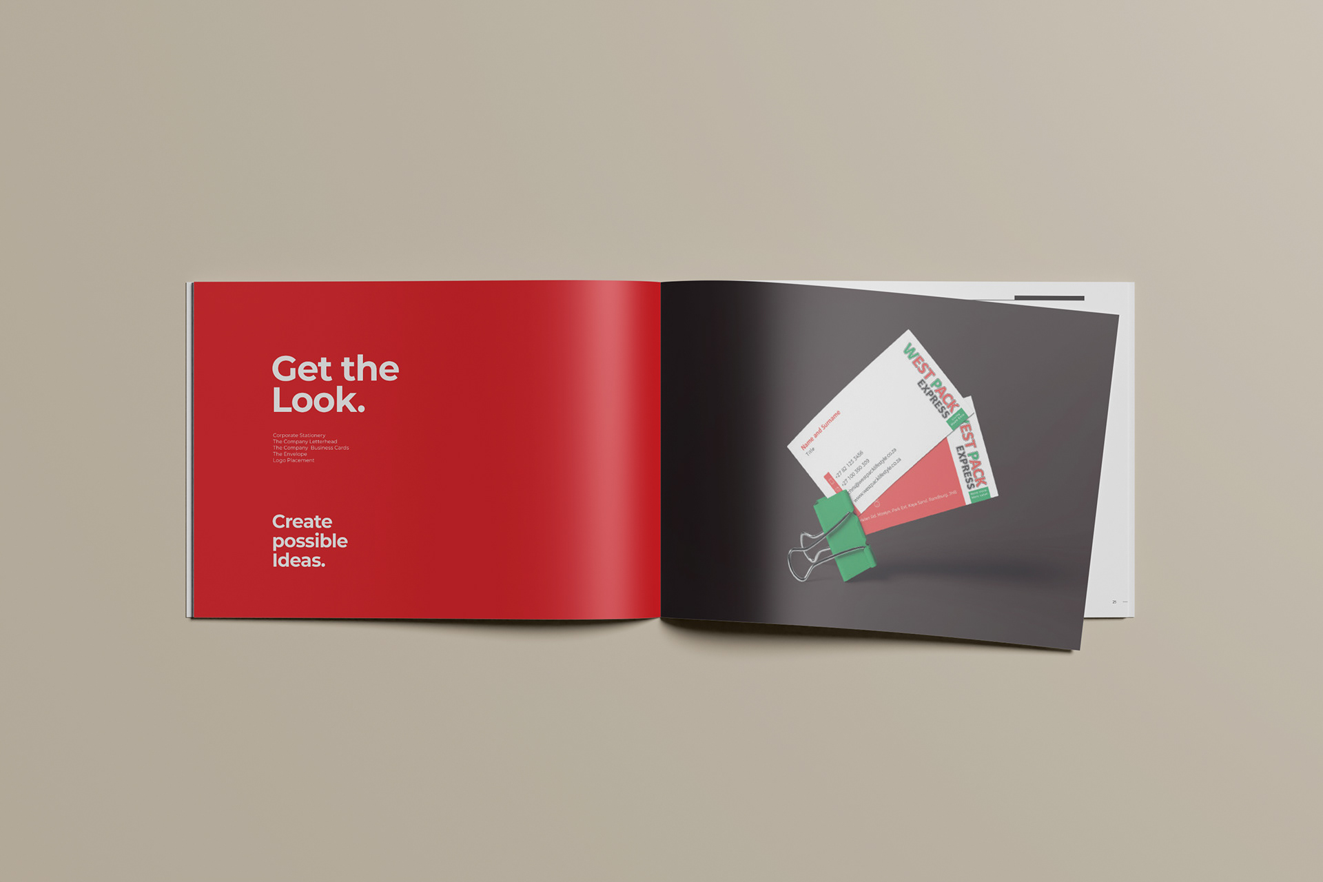
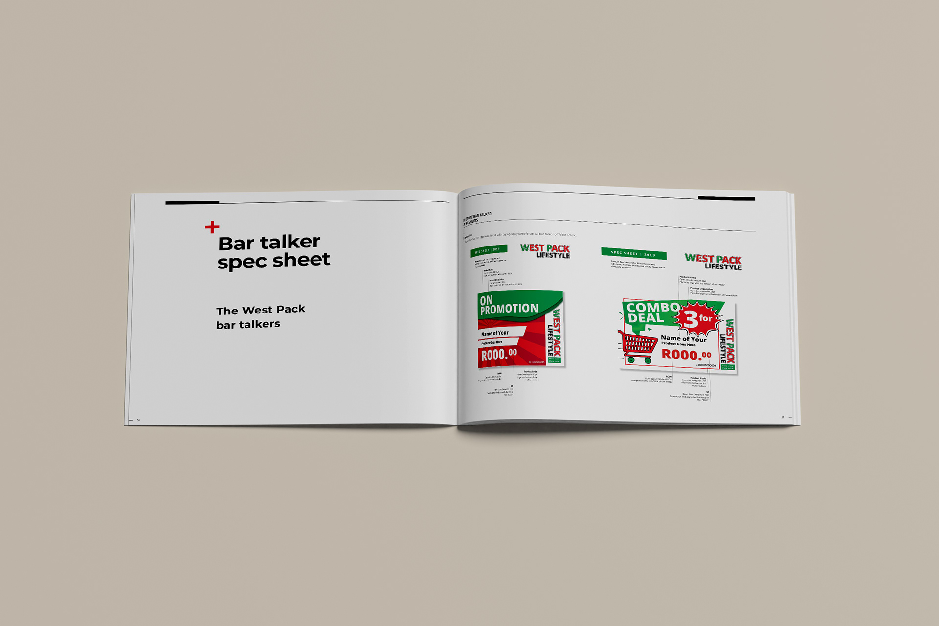
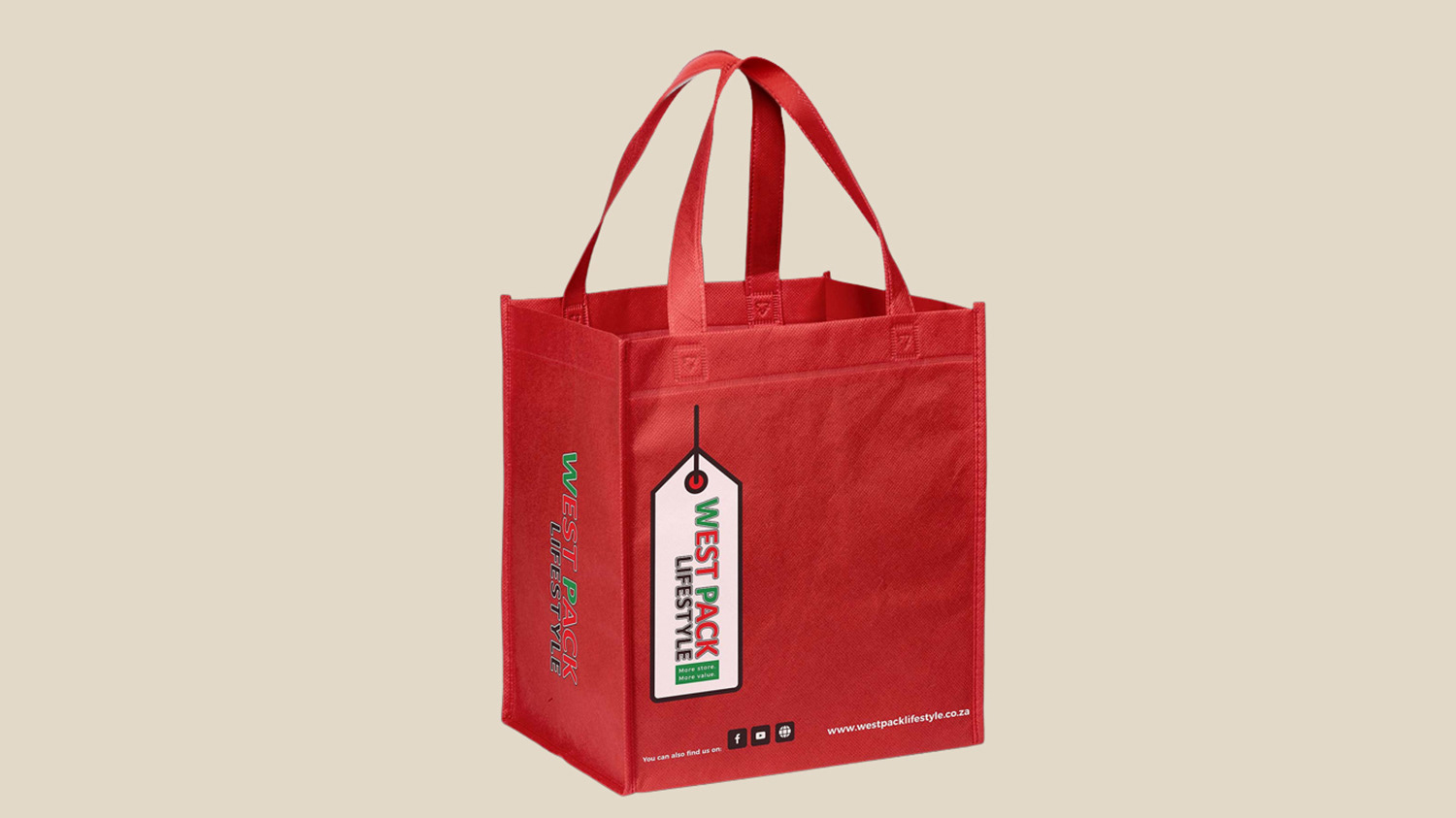
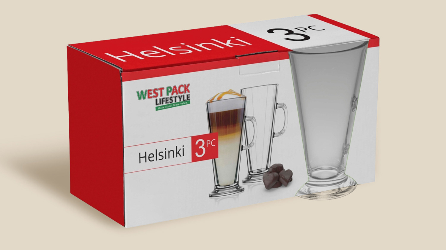
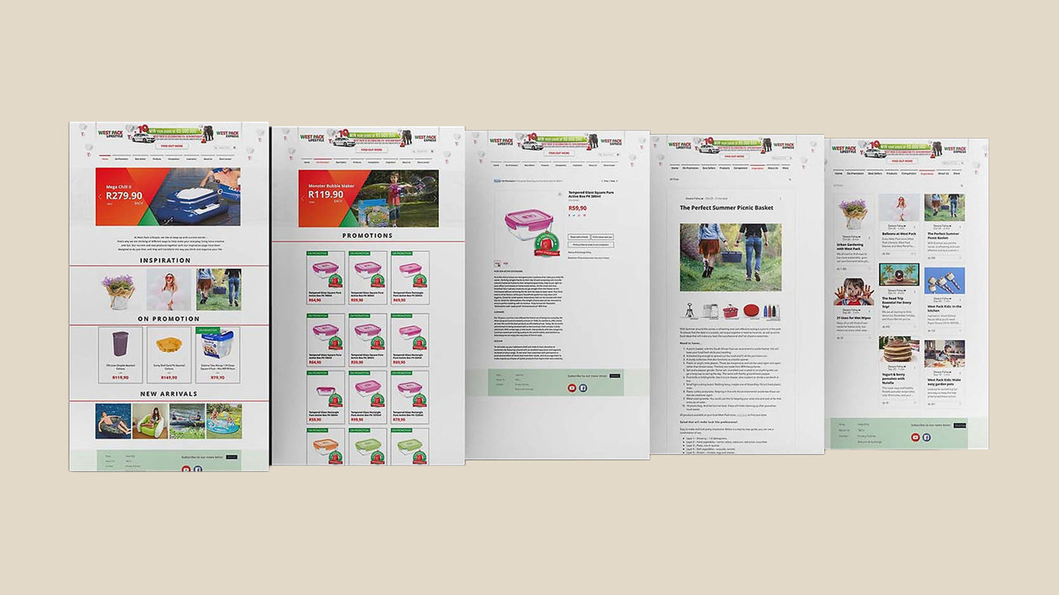
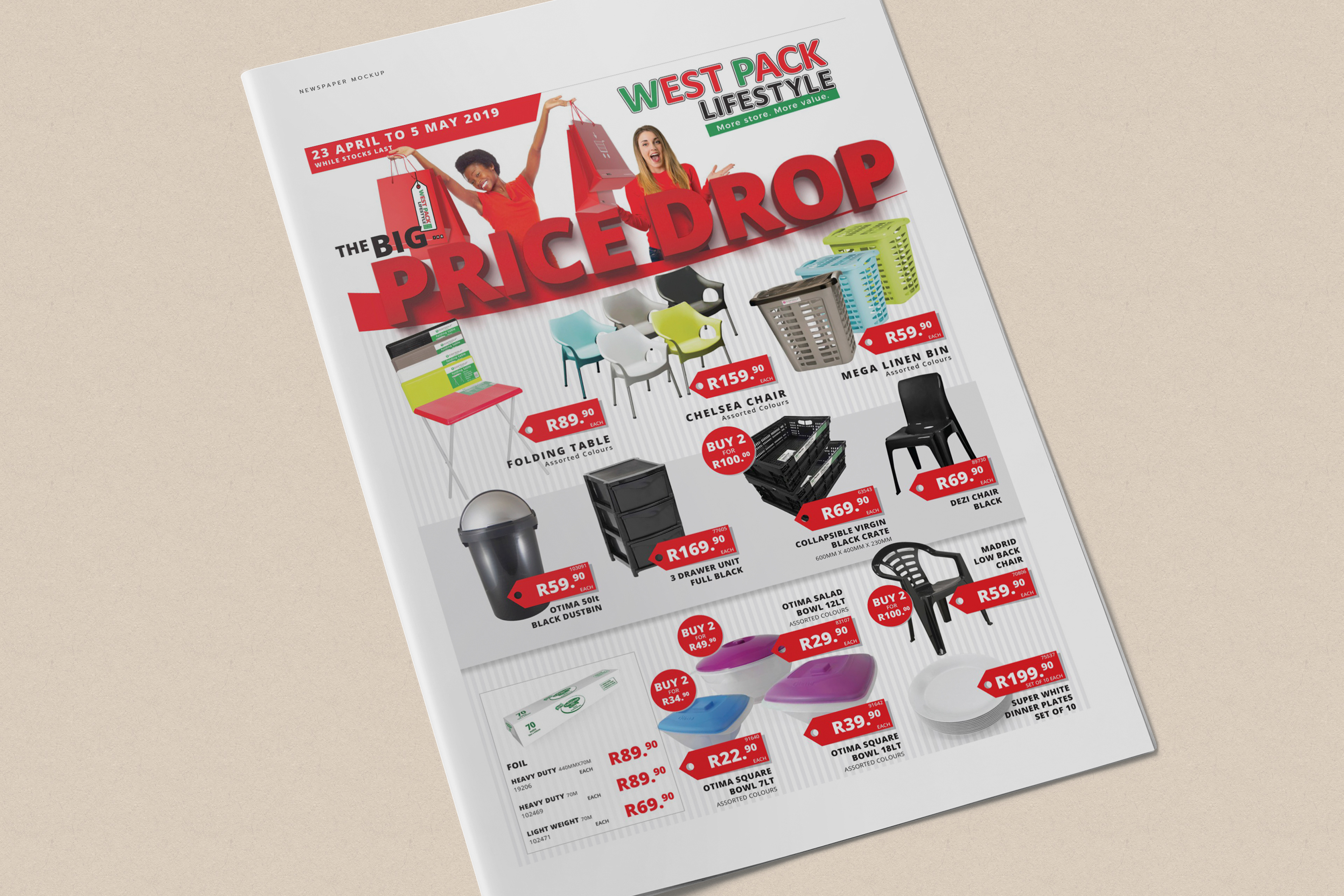
Application rules covered stationery, packaging, campaigns, in-store material, truck signage, print, social media and website use. Training helped teams apply the standards in daily work.
Business and Brand Value
The manual became a single source of truth for a growing retail and franchise network. It reduced visual drift and gave internal teams and external partners practical production rules.
The system supported continued expansion, the launch of Petzone and later communication across packaging, campaigns and digital channels.
What This Project Demonstrates
Retail brand governance, identity rationalization, brand architecture, franchise systems, technical logo standards, rollout planning, team training and operational brand management.
View the Brand Manual
Explore the identity standards, architecture and application rules.
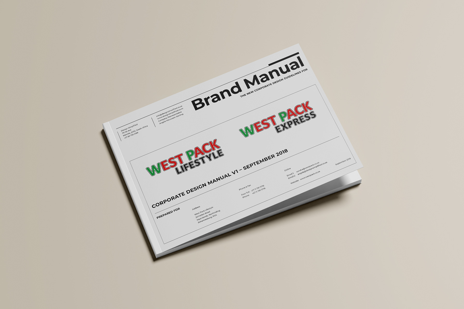
View the West Pack Lifestyle Brand Manual
Download Brand Manual