Petzone
Building a Community-Led Pet Brand

Project Overview
Petzone was created as a specialist pet retail brand with a broad-market mindset. The opportunity was to build a brand that felt more welcoming, more emotionally connected, and more accessible than traditional pet retail, while still delivering enough structure and consistency to work across signage, stationery, campaign rollout, branded packaging, and in-store communication.

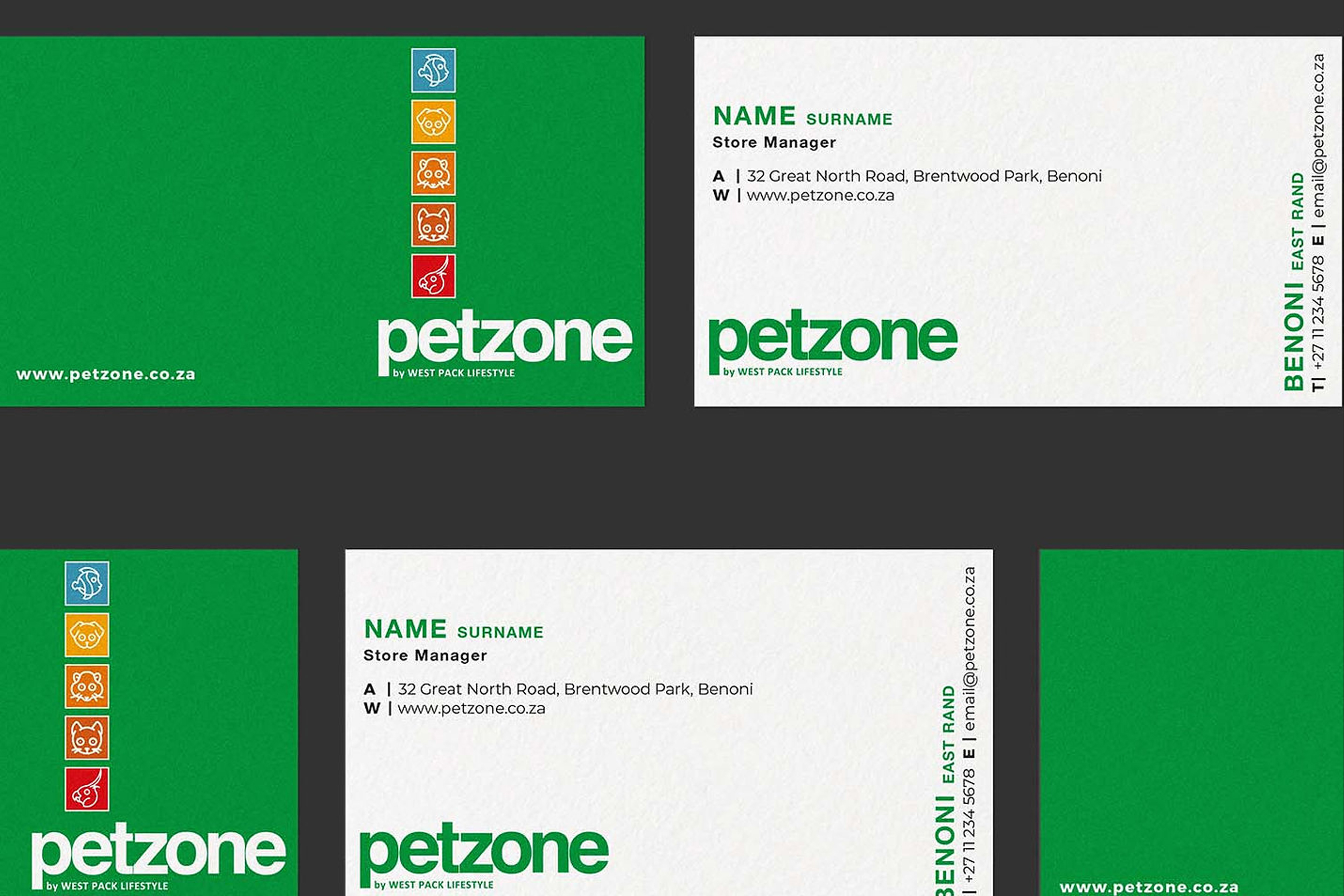
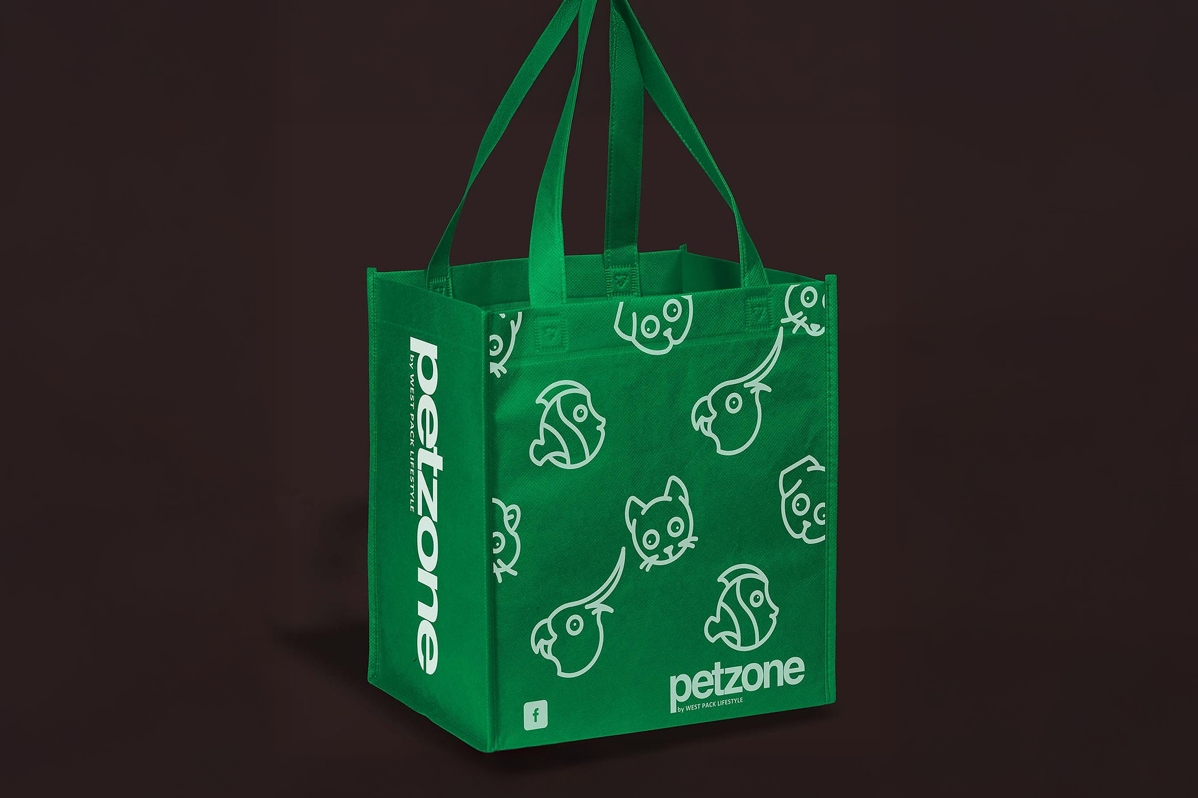
The project began with the development of a clear brand system and then extended into a wider retail rollout that translated the identity into a live consumer-facing environment. This included branded bags, retail communications, promotional boards, and supporting collateral designed to create a recognisable and commercially usable brand presence.
From a strategy perspective, the challenge was not simply to make the brand look appealing. The larger task was to position Petzone in a way that felt relevant to lower- to middle-income pet owners, family-led households, and diverse communities across the South African market, while still giving the brand enough clarity and character to stand apart in a competitive retail environment.

My role
As Creative Director and strategic lead on the rollout, I worked across both the brand identity development and the retail application phase. My contribution included:
• brand positioning
• creative strategy
• brand architecture thinking
• visual identity rollout
• copy direction
• messaging simplification
• image selection guidance
• retail communication system development
• brand consistency across touchpoints

This was a project where creative direction, brand strategy, consumer insight, and retail execution had to work together. The result needed to feel not only designed, but usable, scalable, and commercially grounded.

The strategic opportunity
The South African pet retail environment creates an interesting tension. On one side, pet ownership is emotional, intimate, and rooted in companionship. On the other, retail decisions are practical, price-sensitive, and often driven by convenience. That gap created the opportunity for Petzone.

Rather than positioning the brand as premium, clinical, or overly specialist, the strategy leaned toward an accessible-specialist model. Petzone needed to feel like a place where everyday pet owners could shop confidently, find what they needed, and enjoy a friendlier, more inclusive experience.

That positioning shaped everything that followed: the tone of voice, the visual system, the use of colour, the iconography, the campaign style, and the deliberate focus on warmth, simplicity, and recognisability.

Target audience
Petzone was built for a broad but clearly defined consumer base:

Core audience
Lower- to middle-income pet lovers and family households looking for affordable, approachable, and reliable pet retail.

Primary shopper profile
Practical household shoppers who care deeply about their pets but make purchase decisions with value, convenience, and accessibility in mind.

Secondary audience
Pet owners shopping for dogs, cats, birds, fish, and smaller animals, including first-time pet owners and families introducing pet care into everyday household routines.

Behavioral insight
This audience does not separate functionality from emotion. They want useful products, understandable choice, and a brand that feels human. They are looking for a retail experience that balances affordability with care, rather than forcing them to choose between the two.

Brand challenge
One of the most important challenges in this project was cross-racial marketing within a highly diverse South African consumer landscape.

Petzone needed to speak across different cultural and social groups without becoming generic, flat, or visually diluted. The communication had to feel inclusive, but not bland. Friendly, but not childish. Distinctive, but not too premium for the intended market.

There was also a second challenge: translating a newly established brand identity into a live retail system. It was not enough for the brand manual to look good. The system had to work across retail branding, campaign assets, shopping bags, promotional signage, and store-facing communication, while maintaining a strong and recognisable brand language.

Strategic response
The solution was to build the rollout around a few clear principles:

1. Accessibility as a positioning tool
The brand was designed to feel open, visible, and easy to engage with. This showed up in the bold typography, the uncomplicated layouts, the bright colour system, and the friendly icon language.

2. Emotional relevance without exclusivity
The visual and verbal identity focused on the everyday relationship between pets and owners. This kept the brand relatable and community-oriented, rather than aspirational in a way that would distance the target audience.

3. A system that could scale
The identity needed enough discipline to hold together across all touchpoints. Typography, iconography, colour segmentation, and copy direction were all developed as part of a broader brand system rather than as isolated design decisions.

4. Simplicity in retail communication
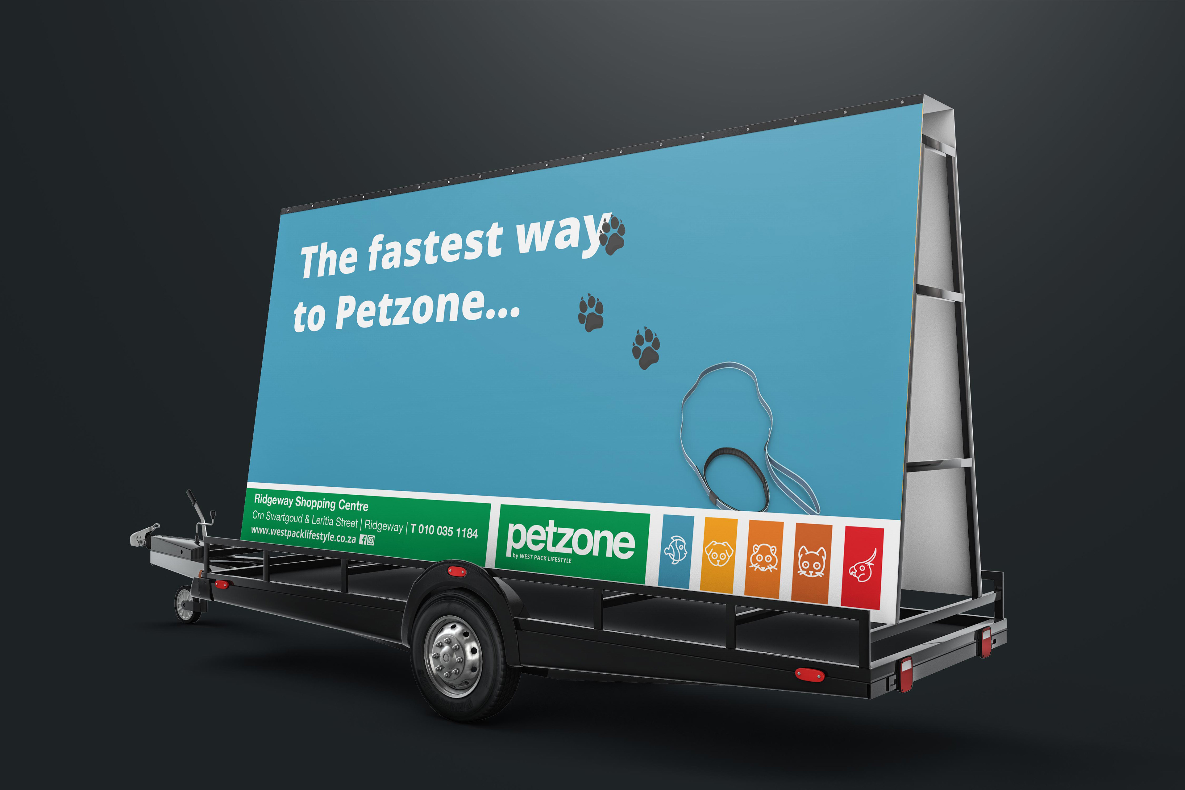
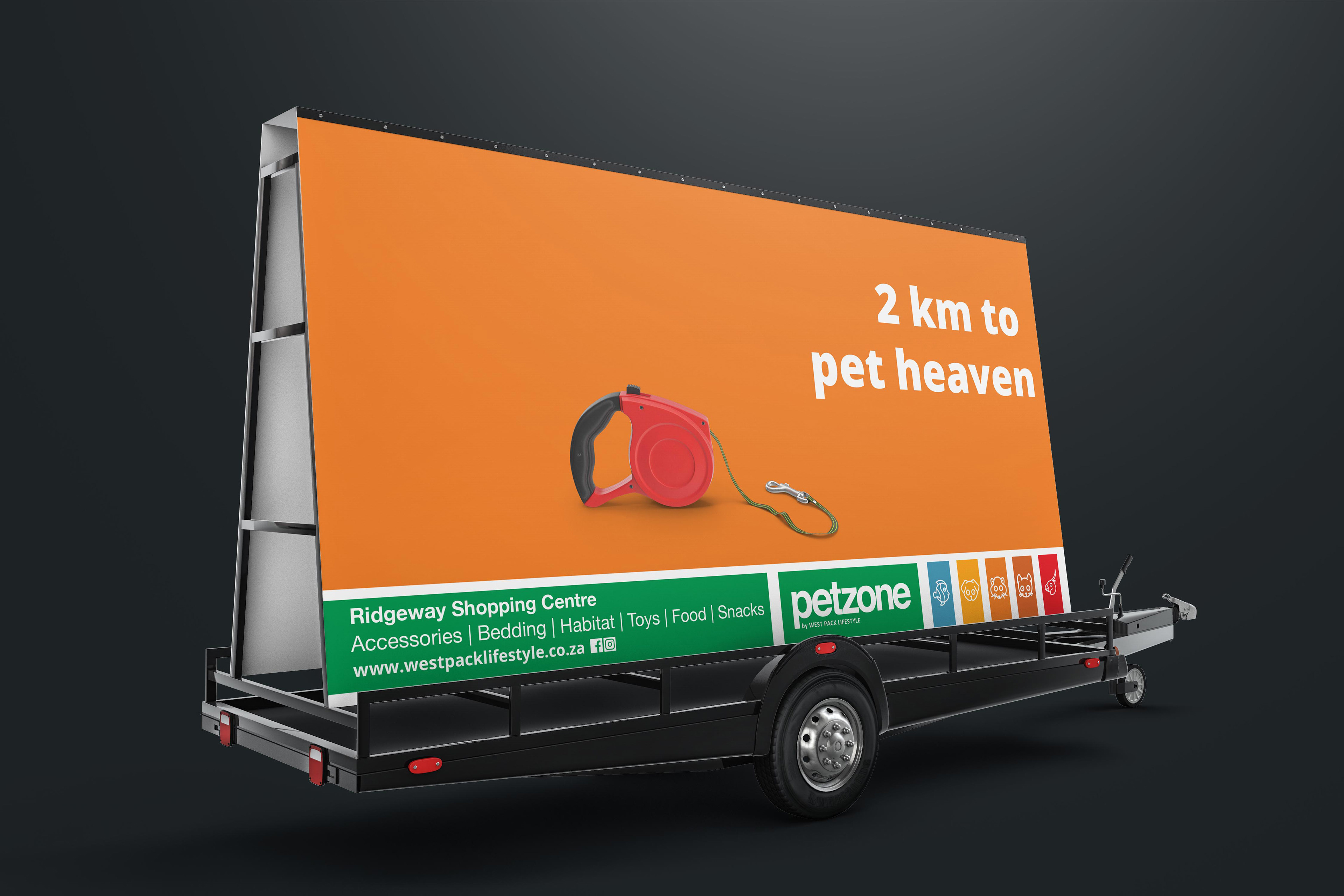
Retail messages had to work instantly. The campaign direction therefore relied on short, clear, personality-led copy and strong visual contrast to help the brand communicate quickly in busy commercial environments.

Visual strategy
The visual language was intentionally clean, bold, and modular.

The identity uses bright category colour coding, simple animal iconography, and strong typographic hierarchy to create immediate recognition. This helped the brand feel playful and energetic without becoming chaotic.

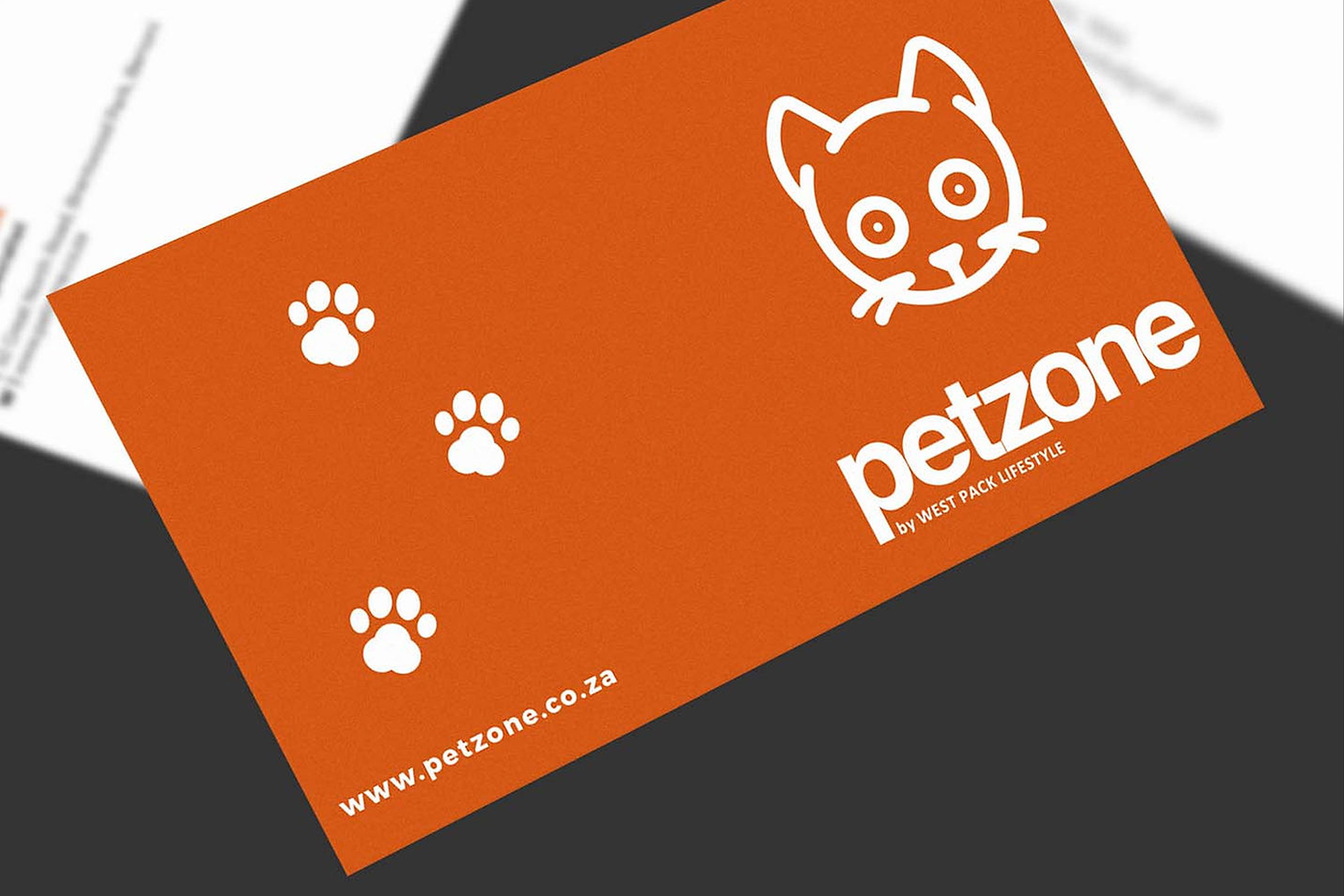
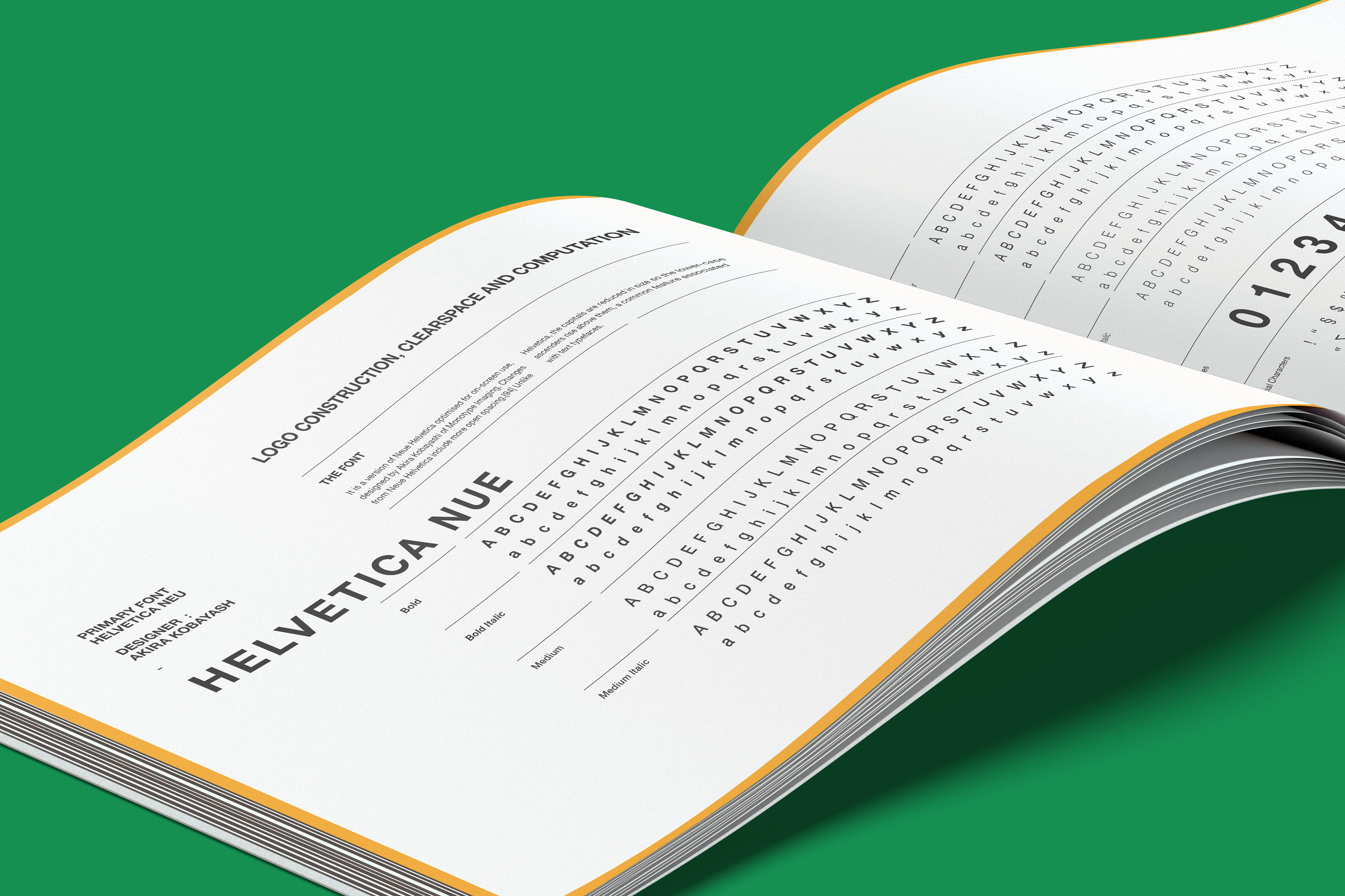
The icon system gave Petzone a distinctive asset base that could flex across stationery, bags, signage, and promotions. The typography reinforced clarity and usability, while the overall design system supported consistent application across both static and promotional formats.

From a brand identity and visual strategy point of view, this was less about decoration and more about designing a recognizable retail language.

Copywriting and messaging
A key part of the rollout was the role of copywriting.

Because the brand targeted a broad mass-market audience, the messaging needed to be easy to understand, quick to process, and warm in tone. The copy was developed to feel approachable, human, and lightly playful, giving Petzone more personality without undermining trust.

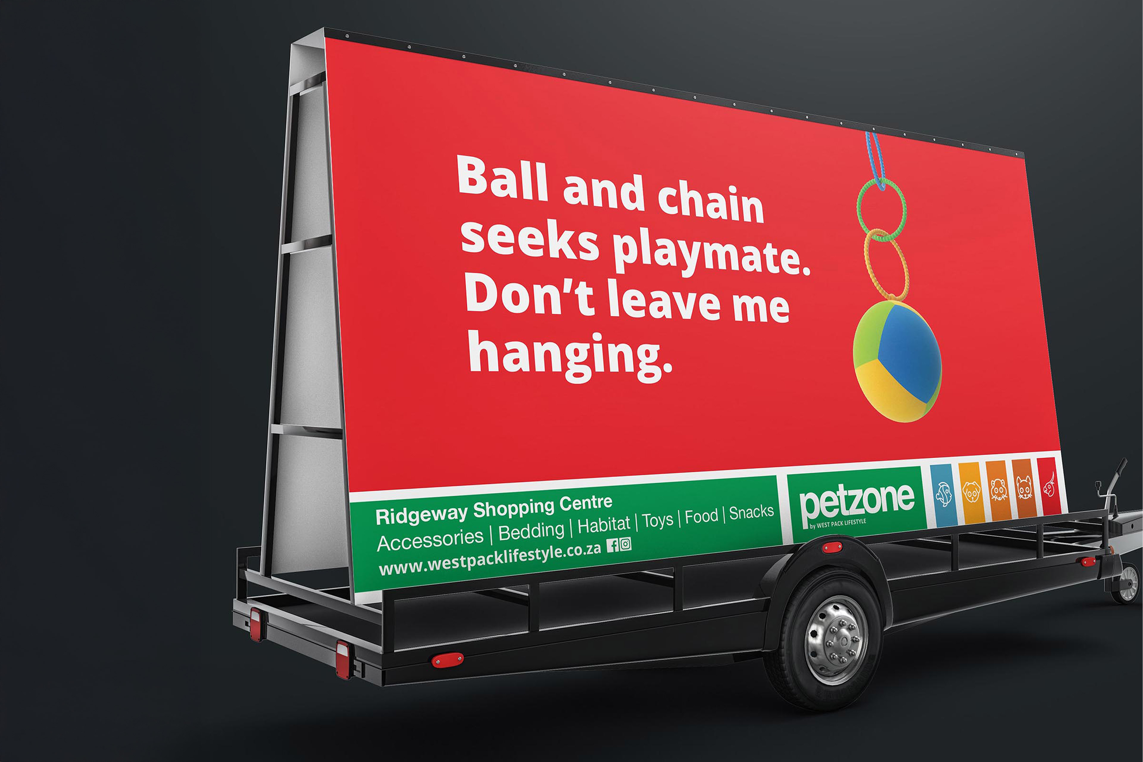
This was especially important in outdoor and promotional applications, where the communication had to do three things at once:
• attract attention
• express brand character
• remain instantly legible

That balance between friendliness and function helped turn the rollout into something more memorable than standard retail advertising.

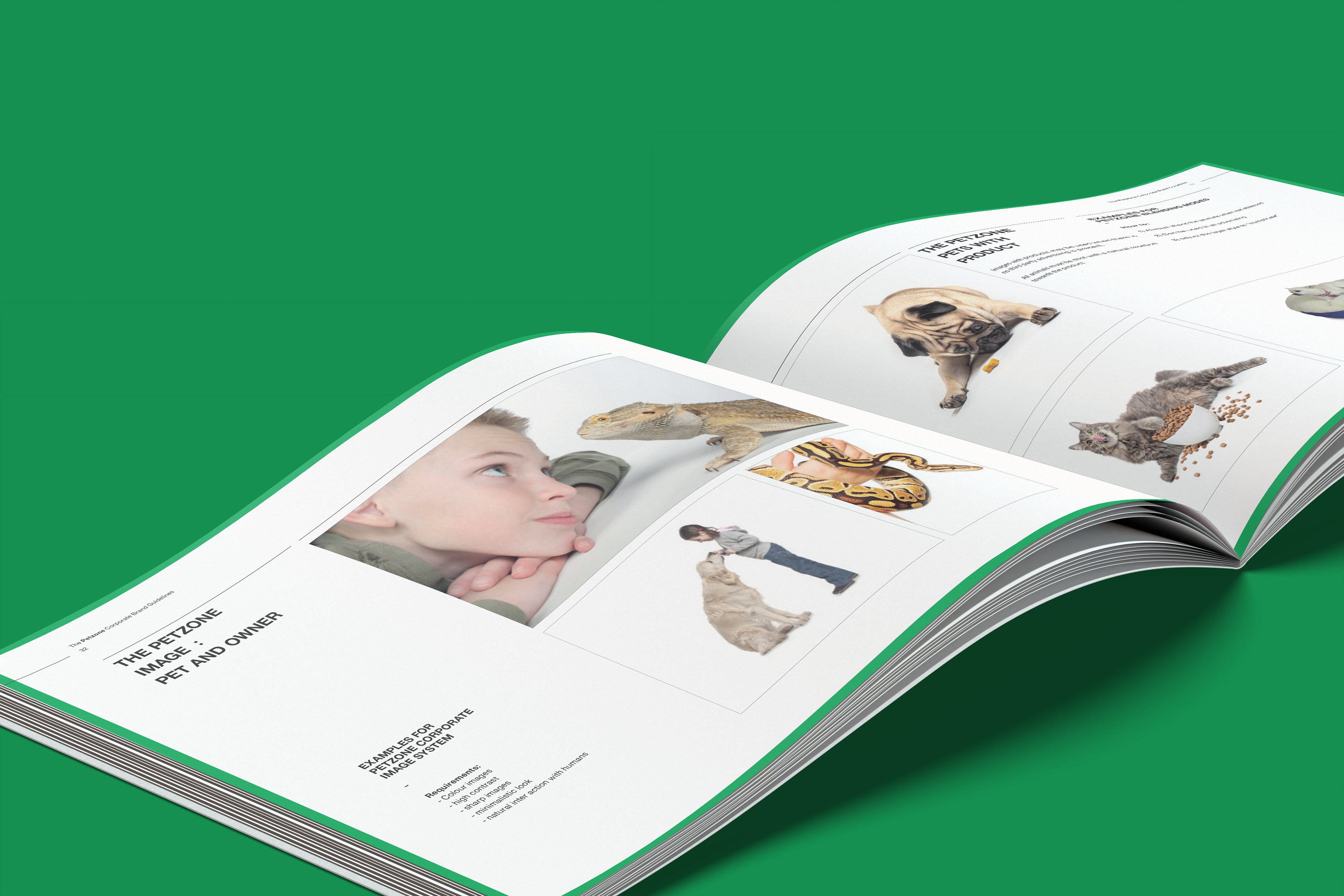
Image selection and brand tone
Image direction was treated strategically, not just aesthetically.

The challenge was to select imagery that reinforced the relationship between people and pets while remaining relevant to a broad South African audience. The brand needed to avoid looking either too elite or too generic. That meant choosing visuals that felt grounded, relatable, and emotionally honest.

The result was a tone that positioned Petzone as:
• friendly
• community-led
• practical
• engaging
• trustworthy
• full of everyday pet energy

This combination helped the brand sit comfortably between emotional connection and retail clarity.

Retail rollout
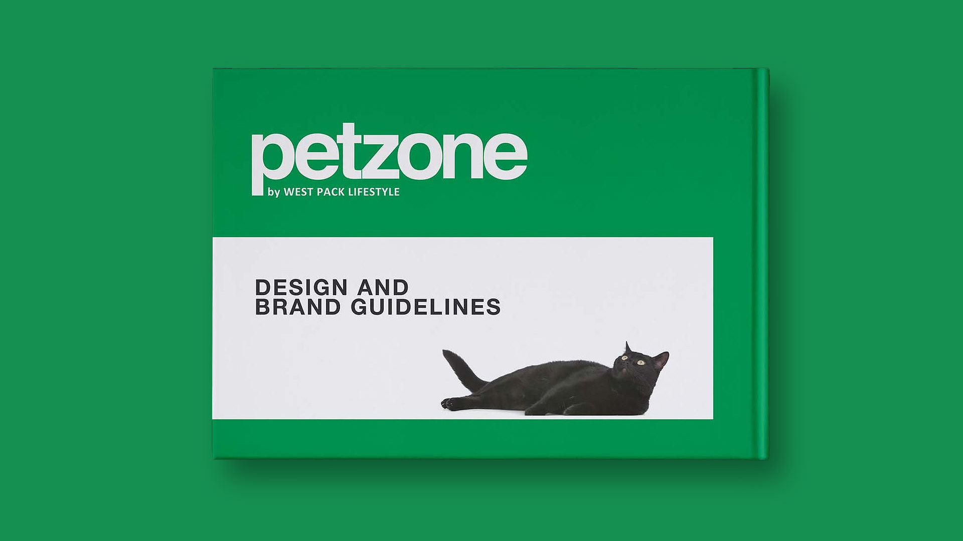
Once the guidelines were established, the brand moved into rollout across key retail touch points.

Applications included:
• branded shopping bags
• stationery
• outdoor campaign boards
• promotional retail communication
• store-facing visual assets

The rollout demonstrated how the core brand strategy could translate into brand activation and retail brandingwithout losing coherence. Each application reinforced the same visual language while adapting to its specific context.

This is where the project became especially strong from a creative consultant perspective. It showed not just the creation of a brand identity, but the extension of that identity into a functioning consumer environment.

Outcome
Petzone emerged as a retail brand that felt both structured and approachable. The system created consistency across multiple applications while maintaining enough flexibility to support promotional energy and in-market relevance.

The final outcome was a brand that:
• felt accessible to a broad audience
• translated well into physical retail
• used copy and visual design strategically
• created stronger emotional connection in a practical category
• supported a scalable and recognizable brand presence

For me, this project is a strong example of how brand strategy, creative direction, consumer insight, copywriting, and retail rollout can work together to build a brand that is commercially grounded and visually distinctive.

Petzone demonstrates my approach to brand positioning, creative strategy, retail communication, and identity rollout. It sits at the intersection of brand development, consumer-facing design, campaign thinking, and visual systems, showing how strategic thinking can shape not just how a brand looks, but how it behaves in the real world.
Back to Top