ENVIRONMENTAL GRAPHICS | SIGNAGE GOVERNANCE | WAYFINDING SYSTEMS
Executive Snapshot
York Timbers, South Africa’s largest timber supplier, operated across multiple offices and sites in Southern Africa.
Its identity was changing, but external signage lacked a controlled system. York needed a technical manual that could guide contractors and fabricators across locations.
The System Challenge
Signage had to support visitor navigation and operational work environments. Sign families included site identification, directional, access, regulatory and safety communication.
Without shared rules, logos, arrows, icons and text could shift between suppliers. Poor spacing, inconsistent sizing and weak contrast could reduce distance legibility and weaken the brand.
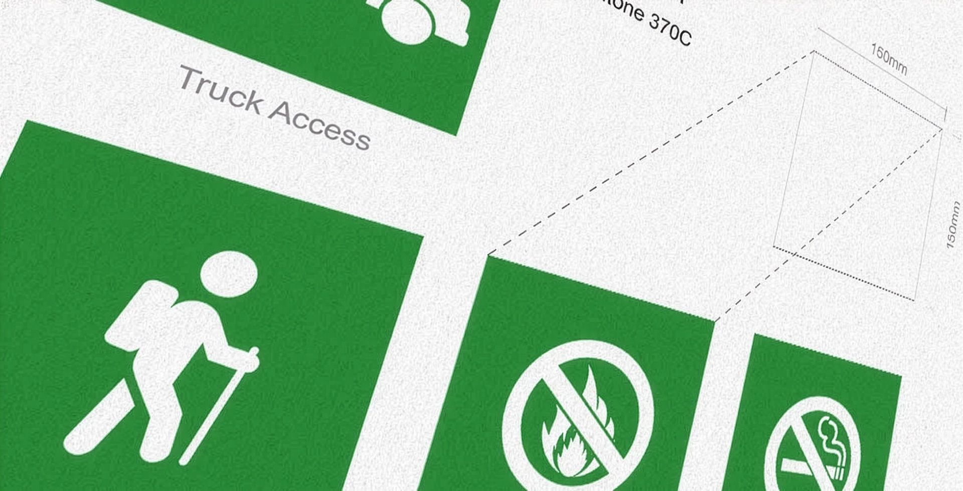
The iconography also needed to represent tourism and workplace functions. New signs had to join the system without requiring a fresh design process each time.
My Role
As Creative Director and Brand Strategist, I visited York Timbers locations and audited how signage worked within each environment. I assessed navigation needs, brand risks and production requirements.
I then led the signage architecture, iconography, technical design and manual development. The work translated updated corporate identity guidelines into an external operating standard.
The Governance Response
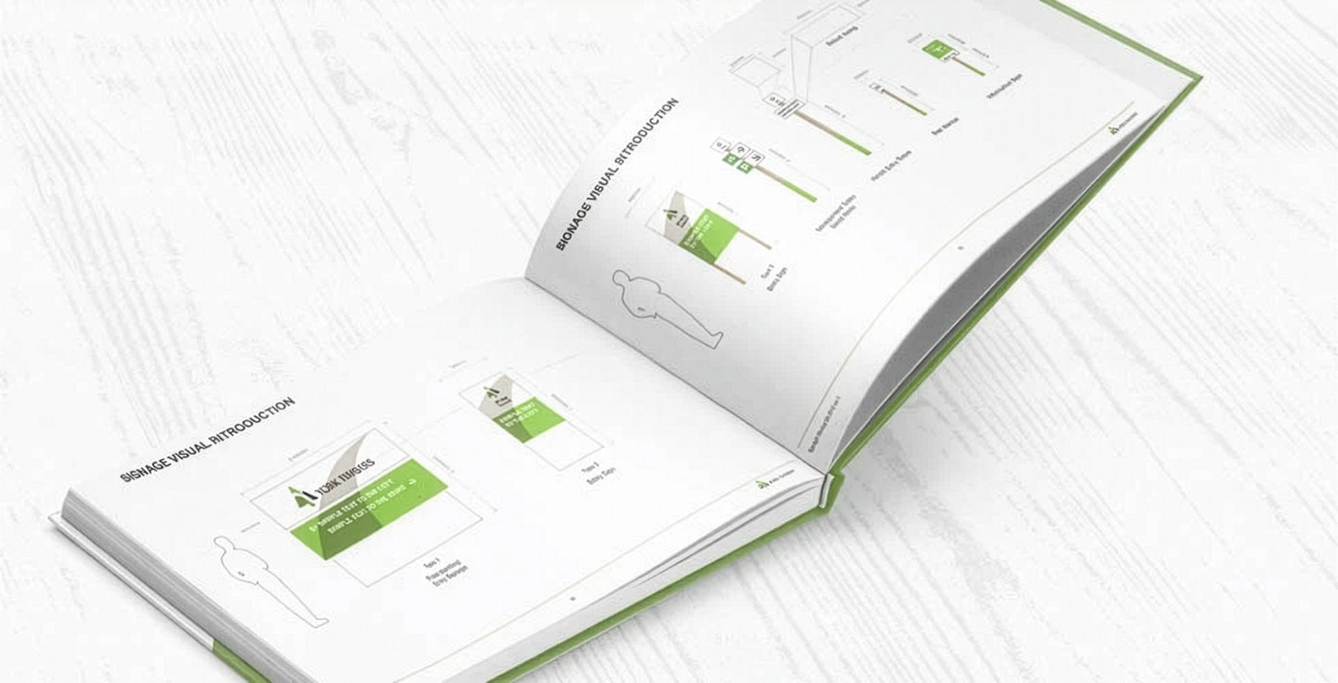
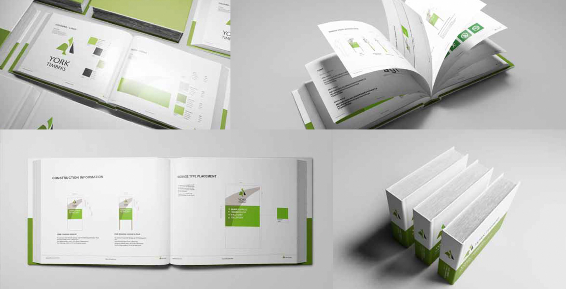
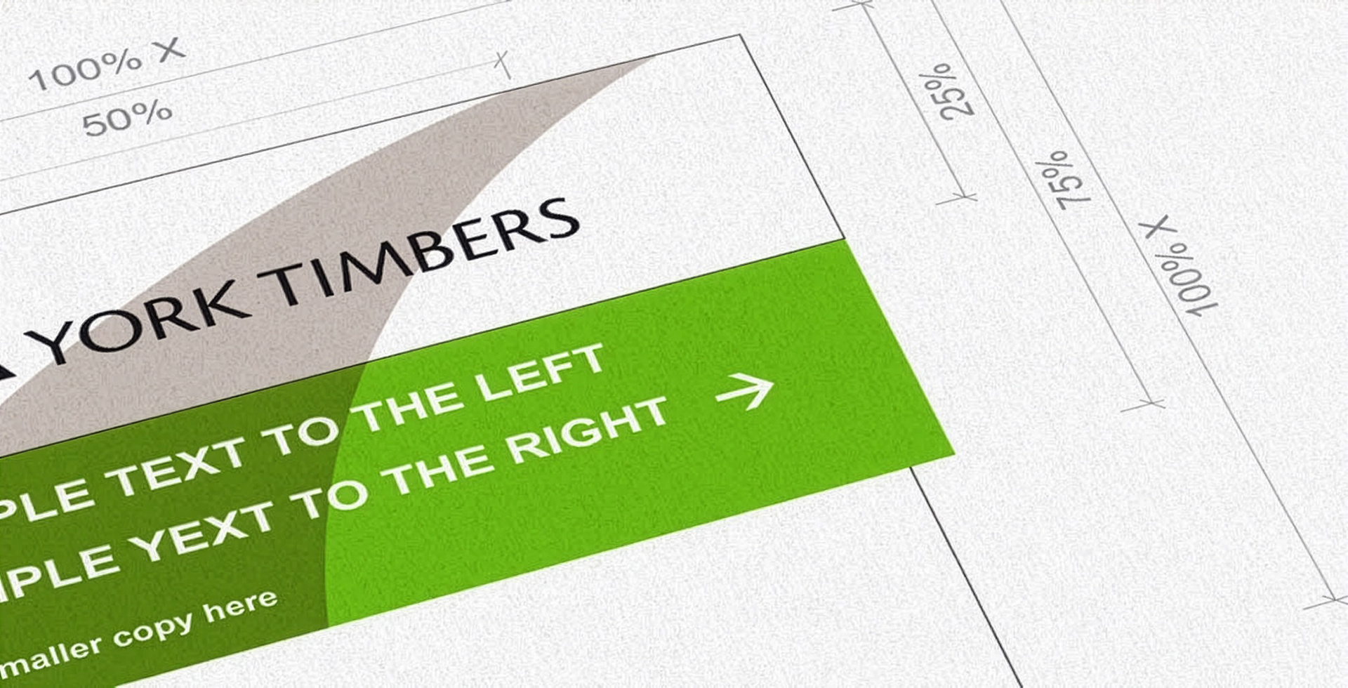
I built a modular grid supporting multiple sign formats within one visual hierarchy. Rules controlled logo placement, titles, supporting text, icons and directional cues.
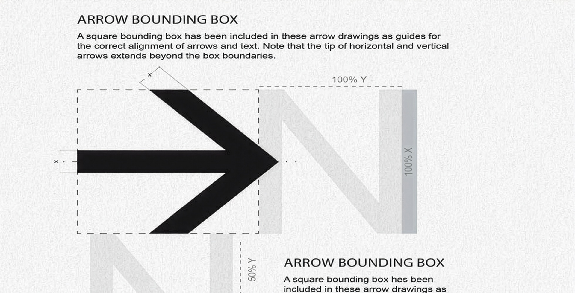
Technical standards defined sizing ratios, clearspace, margins, alignment and spacing. An arrow bounding box prevented arrows from being stretched, cropped or positioned differently by each supplier.
Icon rules controlled weight, scale, padding and placement. Typography standards addressed reading distance, contrast, line spacing and hierarchy. York Timbers green became a functional navigation cue rather than decoration.
The manual included quick-reference examples, production notes and correct-use guidance. Colour specifications came from the updated identity guidelines and supported consistent reproduction.
Business and Brand Value
The manual created a single source of truth across sites, sign types and suppliers. It gave installers and fabricators enough detail to produce consistent work with less interpretation.
The system connected brand recognition with practical navigation. It supported future replacement, expansion and maintenance without redesigning each sign.
What This Project Demonstrates
Signage governance, environmental graphics, wayfinding strategy, site auditing, technical design, icon systems, production standards, multi-site rollout and operational brand management.
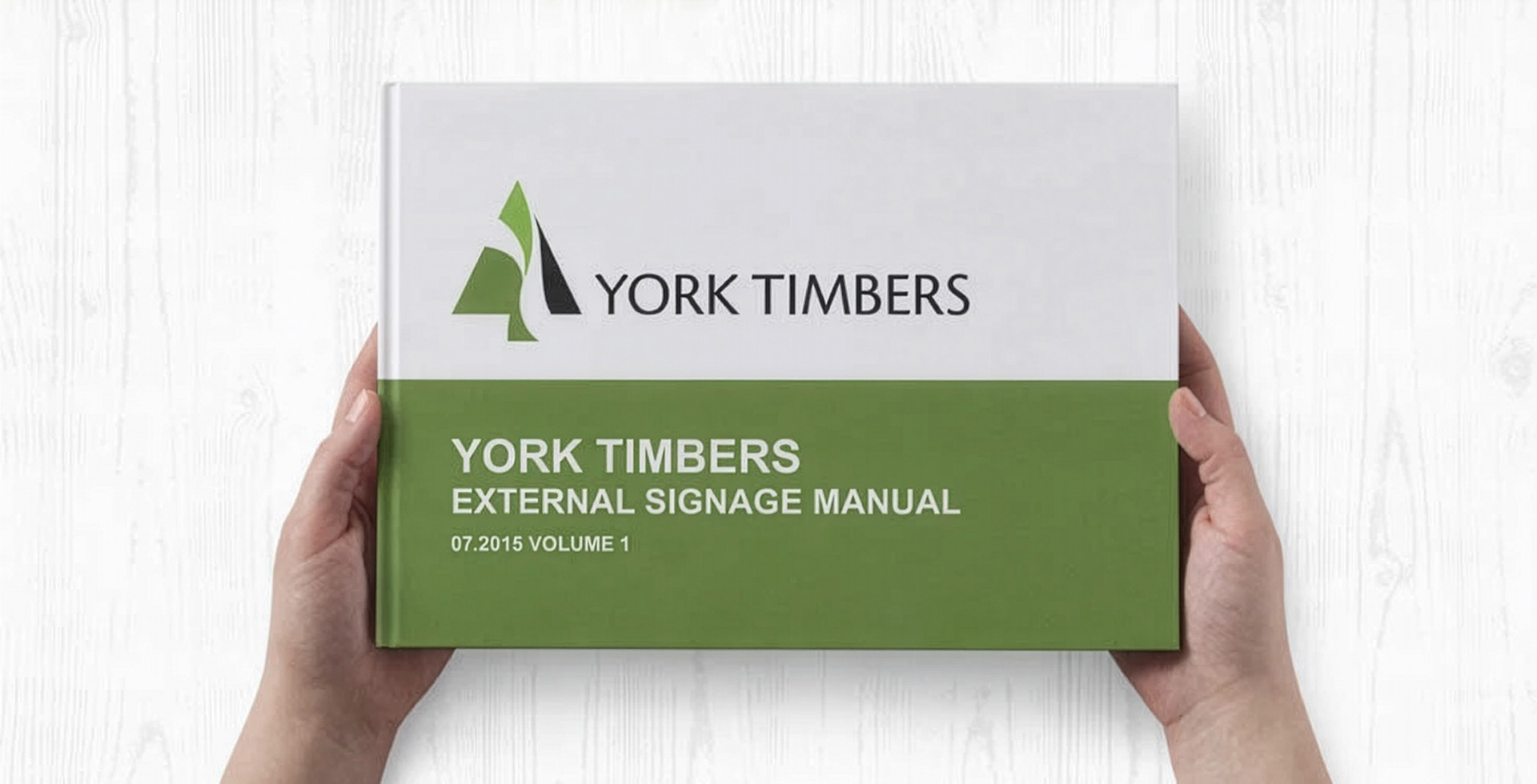
View the Signage Manual
Explore the signage architecture, technical rules and implementation guidance.
View the York Timbers Signage System Manual