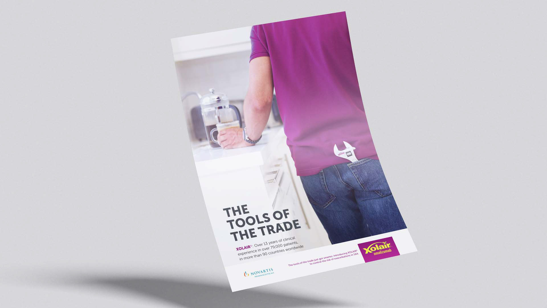
XOLAIR sits in a category where treatment communication is dense, highly regulated, and often visually indistinguishable from competing pharmaceutical brands. In that kind of market, the challenge is not just to communicate efficacy. It is to build a brand position that feels clinically authoritative, practically useful, and distinct enough to remain top of mind.
The strategic question behind this campaign was simple:
• How do you move a treatment brand beyond product messaging and into a stronger, more ownable role within the clinical decision-making environment?
• The answer was not louder design. It was sharper positioning.
XOLAIR needed to show up not just as a treatment option, but as a trusted clinical tool. That required a communication system that could support brand differentiation, simplify medical complexity, and reinforce the brand’s relevance within the broader asthma management landscape.
Strategic Positioning
The campaign positioned XOLAIR around the idea of clinical confidence through clarity.
This was not a lifestyle brand trying to manufacture emotion where it did not belong. It was a specialist pharmaceutical brand needing to strengthen its place in the market by making itself easier to understand, easier to use, and easier to trust. The strategic positioning therefore focused on three core brand roles:
1. XOLAIR as a precision brand
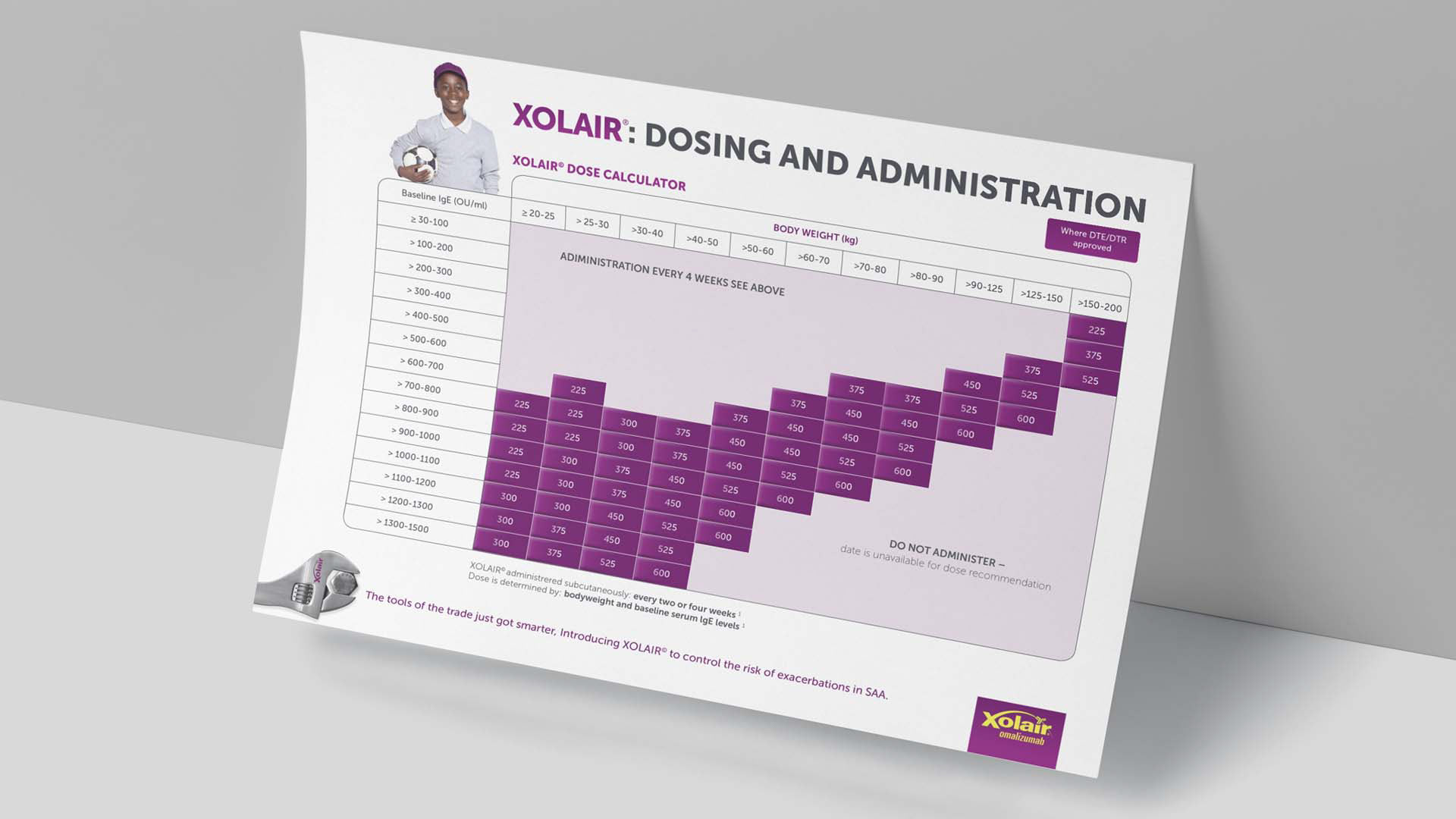
The dosing tools, treatment pathways, and administration guidance all reinforced the idea that XOLAIR is a carefully considered treatment requiring structured clinical application. This built a positioning around precision, control, and professional credibility.
2. XOLAIR as a practical partner
The communication system was designed to support healthcare professionals in real use cases, not just in theory. That shifted the brand from being a product being promoted to a brand actively enabling better understanding and faster interpretation.
3. XOLAIR as a human healthcare brand
The inclusion of patient-oriented messaging and more relatable visual cues helped balance the scientific rigour with a more human treatment outcome. In brand terms, this created a bridge between clinical efficacy and quality of life, which is where much of healthcare brand equity is built.
This positioning gave the campaign a stronger role within the market. It moved XOLAIR away from simply presenting information and toward owning a more distinctive space in clinical visual communication.
Project Strategy
From a brand strategy perspective, the project was built around one key principle:
make complexity feel manageable without weakening authority.
That principle shaped the full communication system.
The strategy worked on multiple levels:
Brand Architecture
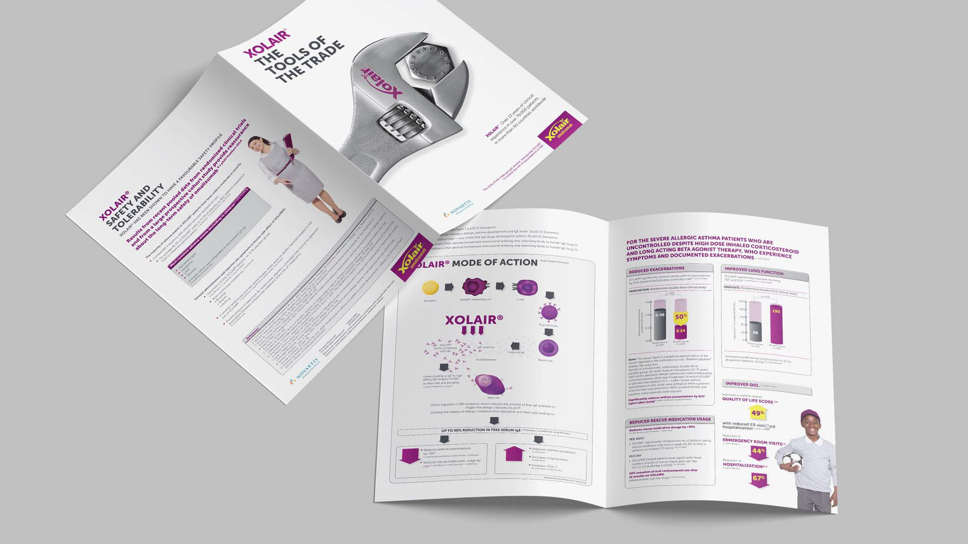
The campaign created consistency across multiple touchpoints, from folders and brochures to dosing charts and educational posters. Every asset was designed to behave like part of the same brand ecosystem, reinforcing visual consistency and message cohesion.
Audience Strategy
The primary audience was healthcare professionals, which meant the materials had to respect limited time, high cognitive load, and the need for quick reference. The communication therefore prioritized clarity, hierarchy, and fast access to the most important information. Secondary value came from reinforcing the patient benefit story, which broadened emotional relevance without losing clinical focus.
Content Strategy
The content was structured to support different layers of engagement. High-level claims and headlines created entry points, while charts, tables, and clinical diagrams supported deeper reading. This helped the materials function as both sales enablement tools and medical education assets.
Visual Strategy
The visual system was deliberately disciplined. White space, strong typography, clear modular structure, and strategic use of XOLAIR’s brand color created a design language that felt both premium and practical. The purple brand color did more than brand the pages. It acted as a navigational device, helping organize information and create visual memory across the campaign.
Market Positioning Strategy
In a market crowded with visually similar pharmaceutical materials, the aim was to create an ownable brand presence built around usability. The campaign did not try to compete on visual noise. It competed on clarity, credibility, and utility, which are stronger long-term positioning assets in healthcare communications.
Creative Director’s Analogy
I approached this campaign like designing the dashboard of a high-performance vehicle.
The engine, in this case, was the science. Powerful, sophisticated, and full of detail. But no matter how advanced the engine is, it fails the user if the dashboard is confusing. The role of creative direction was to build that dashboard, to make the information legible, intuitive, and actionable, so the audience could move with confidence.
That became the heart of the creative thinking.
Not decoration. Not simplification for its own sake.
But intelligent translation.
The “tools of the trade” visual language supported this perfectly. It positioned XOLAIR as part of the physician’s working toolkit, a treatment brand associated with precision, control, and practical value. That metaphor gave the campaign a strategic creative hook that linked product utility with broader brand meaning.
How the Campaign Worked Within the Larger Brand Framework
What made this campaign effective was that it did not sit outside the brand. It strengthened the brand.
Within a larger pharmaceutical brand framework, the campaign contributed to several important objectives:
Reinforcing brand consistency
The system established a repeatable visual and editorial structure that could extend across future physician-facing materials. That is critical in brand management and integrated marketing communications, especially in regulated categories where trust is built through consistency over time.
Strengthening brand recognition
The repeated use of core visual devices, typography, color, and message hierarchy helped build a more recognizable XOLAIR presence across multiple formats. In practical terms, that supports stronger recall in busy clinical environments.
Supporting brand equity
The campaign linked technical proof with practical application. That is a key move in brand development because it helps shift perception from product awareness to product confidence.
Aligning message with market role
The materials consistently reinforced XOLAIR’s role within asthma treatment management. Rather than speaking in fragmented pieces, the campaign worked as a connected story about where the brand fits, why it matters, and how it helps.
In other words, this was not a brochure exercise. It was a strategic brand communications exercise.
Creative Direction
The creative direction was rooted in information design, editorial design, and healthcare marketing strategy. Each piece needed to do two jobs at once: communicate clearly in the moment and contribute to the larger positioning of the brand over time.
The design system leaned into restraint. Clean space, structured layouts, strong typographic hierarchy, and selective emphasis allowed the information to lead. The human imagery softened the clinical tone without undermining credibility, helping the brand feel more relevant to treatment outcomes rather than only treatment mechanics.
This balance is where senior creative work becomes most valuable. The goal is not just to make the brand look good. It is to make the brand behave coherently across every touchpoint.
Key Deliverables
The campaign included a range of integrated medical marketing and brand communication assets:
• Dosing and administration chart
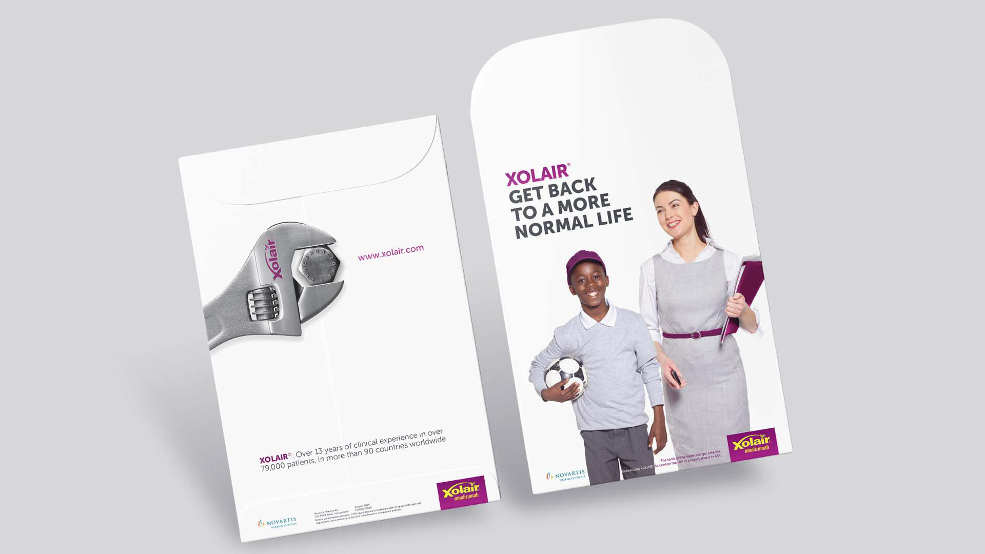
• Branded folder system
• Clinical evidence brochure
• Mode of action infographic
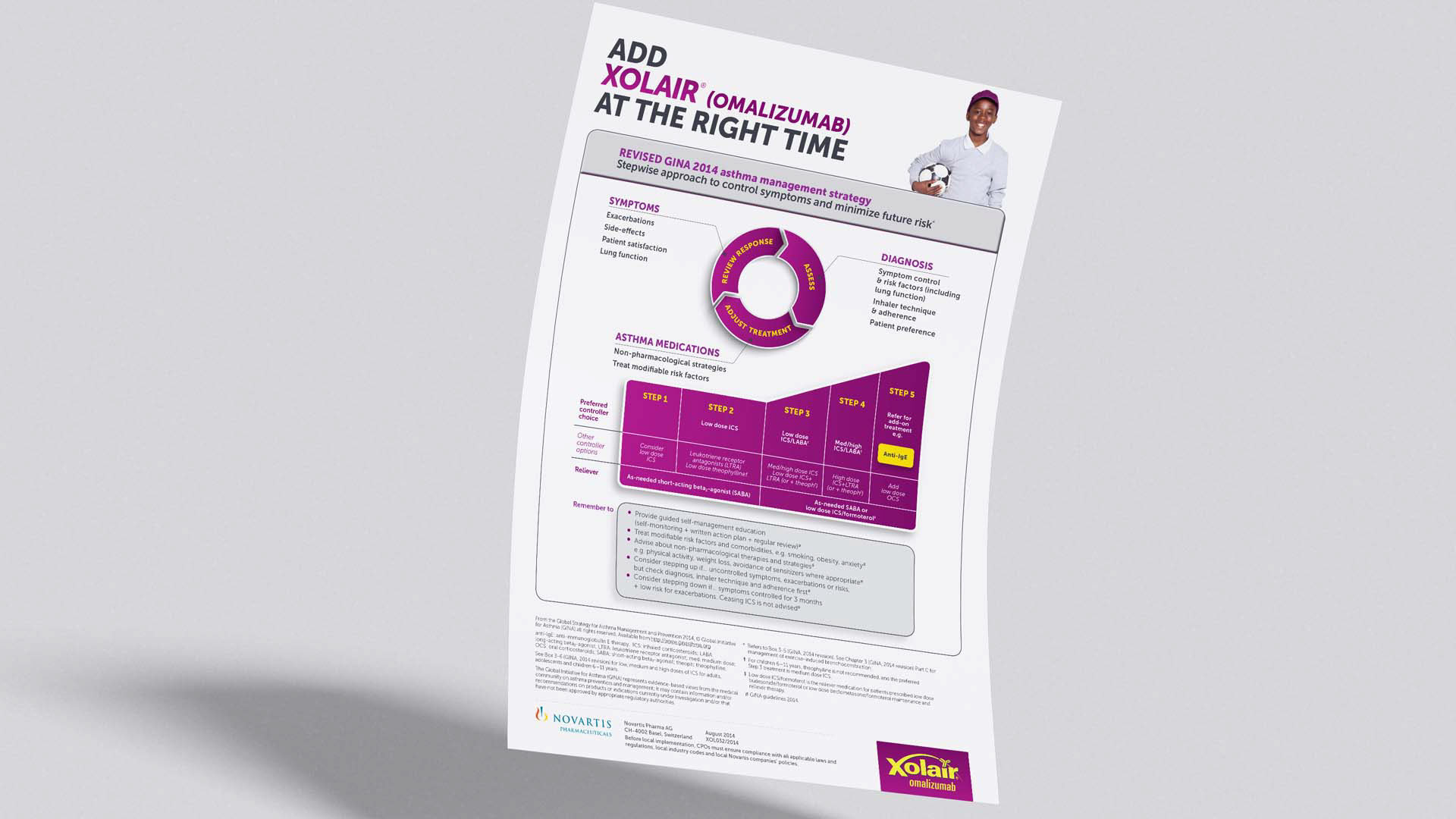
• Asthma management poster
• Healthcare professional educational materials
• Physician-facing leave-behinds
Together, these formed a connected communication suite designed to strengthen both usability and brand positioning.
Outcome
The result was a more strategically aligned brand communication system that helped XOLAIR show up with greater clarity, consistency, and confidence in the market.
From a creative leadership perspective, the value of the project was not only in the final design execution, but in the way the campaign translated business need, market context, audience behaviour, and clinical information into a stronger brand experience.
This is the kind of work that sits at the intersection of brand strategy, creative direction, healthcare branding, pharmaceutical marketing, information design, and integrated campaign development. It demonstrates how design can do more than package a message. It can sharpen positioning, support adoption, and strengthen the role a brand plays in its category.