LUXURY HOSPITALITY | BRAND IDENTITY | EXPERIENCE GOVERNANCE
Executive Snapshot
The Black Door was conceived as an upmarket South African club and hospitality brand owned by music producers.
The owners wanted more than a venue. Their ambition included live performance, artist launches and premium social experiences. The identity needed to connect music, status and African cultural confidence within one brand world.
The Identity Challenge
The brief called for opulence and class, with strong appeal among affluent African professionals, music tastemakers and visible nightlife audiences.
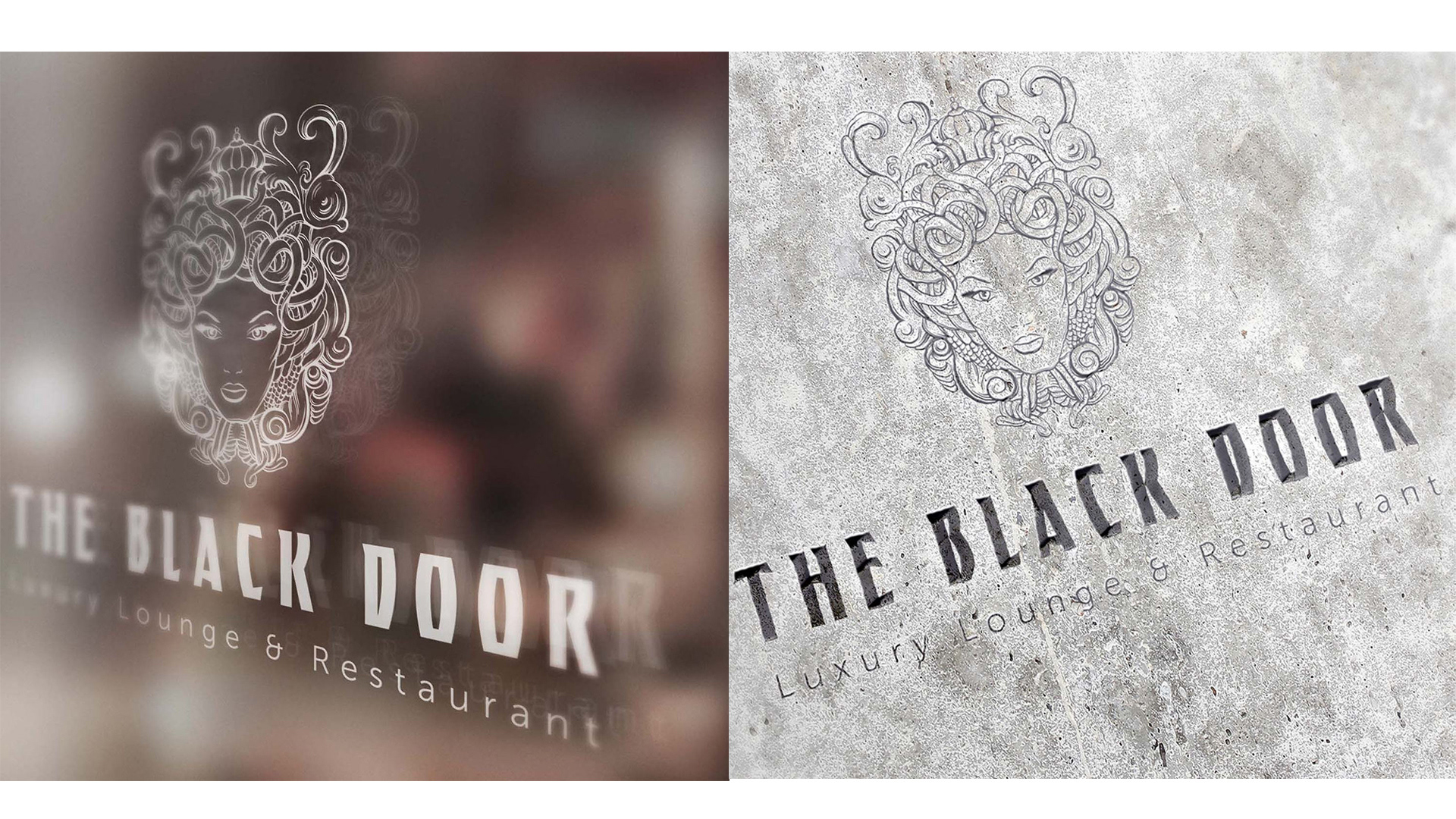
An early Medusa concept brought drama and visual power. Yet its snake symbolism risked appearing threatening, gothic or culturally disconnected. The mark needed to retain mystery and authority while feeling desirable and appropriate for luxury hospitality.
The brand supported a high-end venue, an artist platform, event promotion and social communication. Each expression needed its own energy without fragmenting the identity.
My Role
As Brand Strategist and Creative Director, I led the positioning, creative direction and visual identity development.
I translated the business ambition into a system covering the logo, colour, typography, decorative elements and applications. My work connected audience expectations with the commercial needs of hospitality and entertainment.
The Governance Response
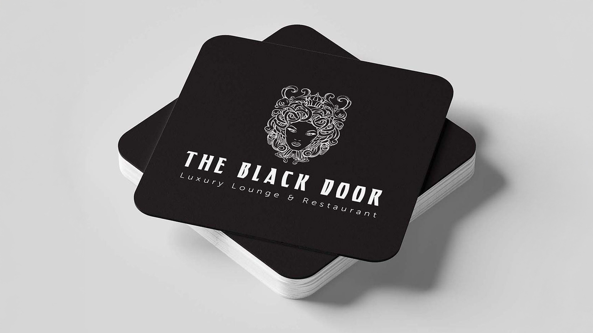
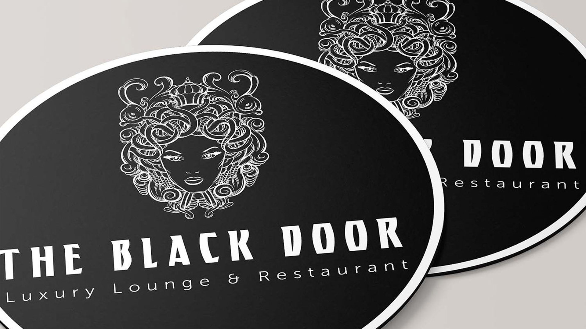
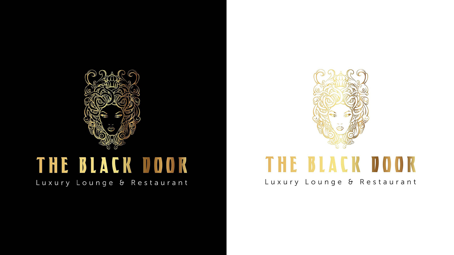
I reframed the Medusa-inspired idea around regal femininity, ornament, mystique and control. This retained the symbol’s presence while moving it away from aggression.
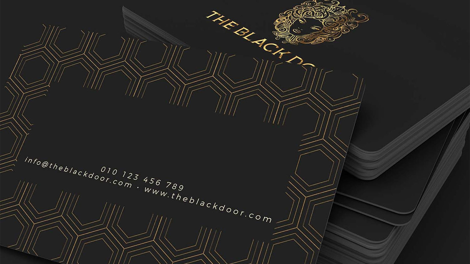
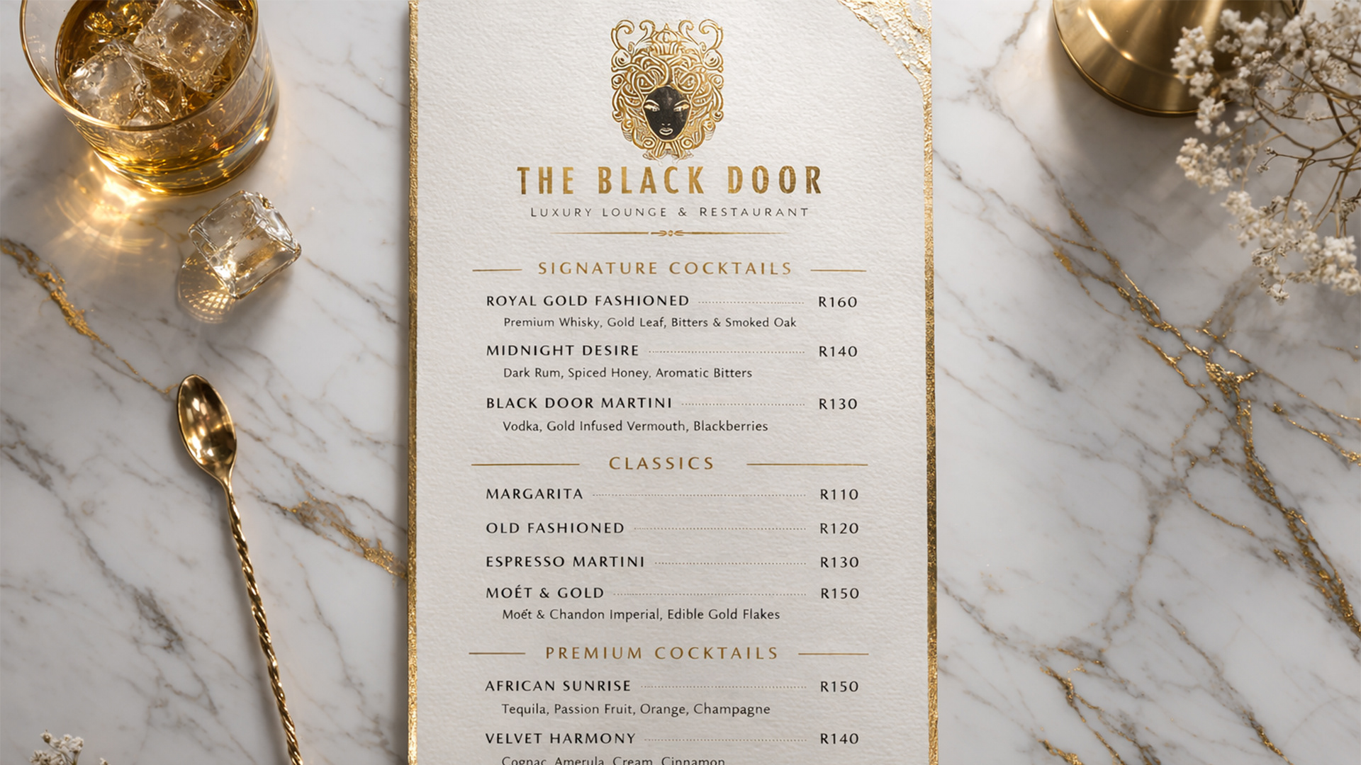
Black and gold established an after-dark luxury code. Decorative linework added richness without overpowering information. Assertive typography connected refined hospitality with contemporary music culture.
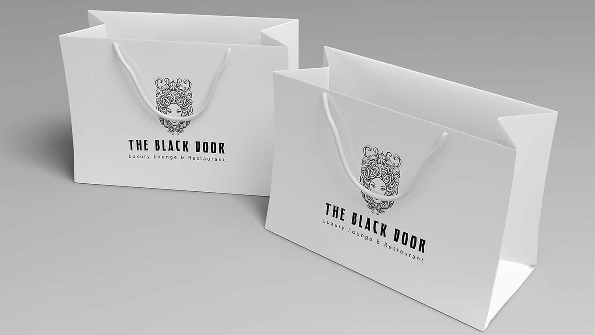
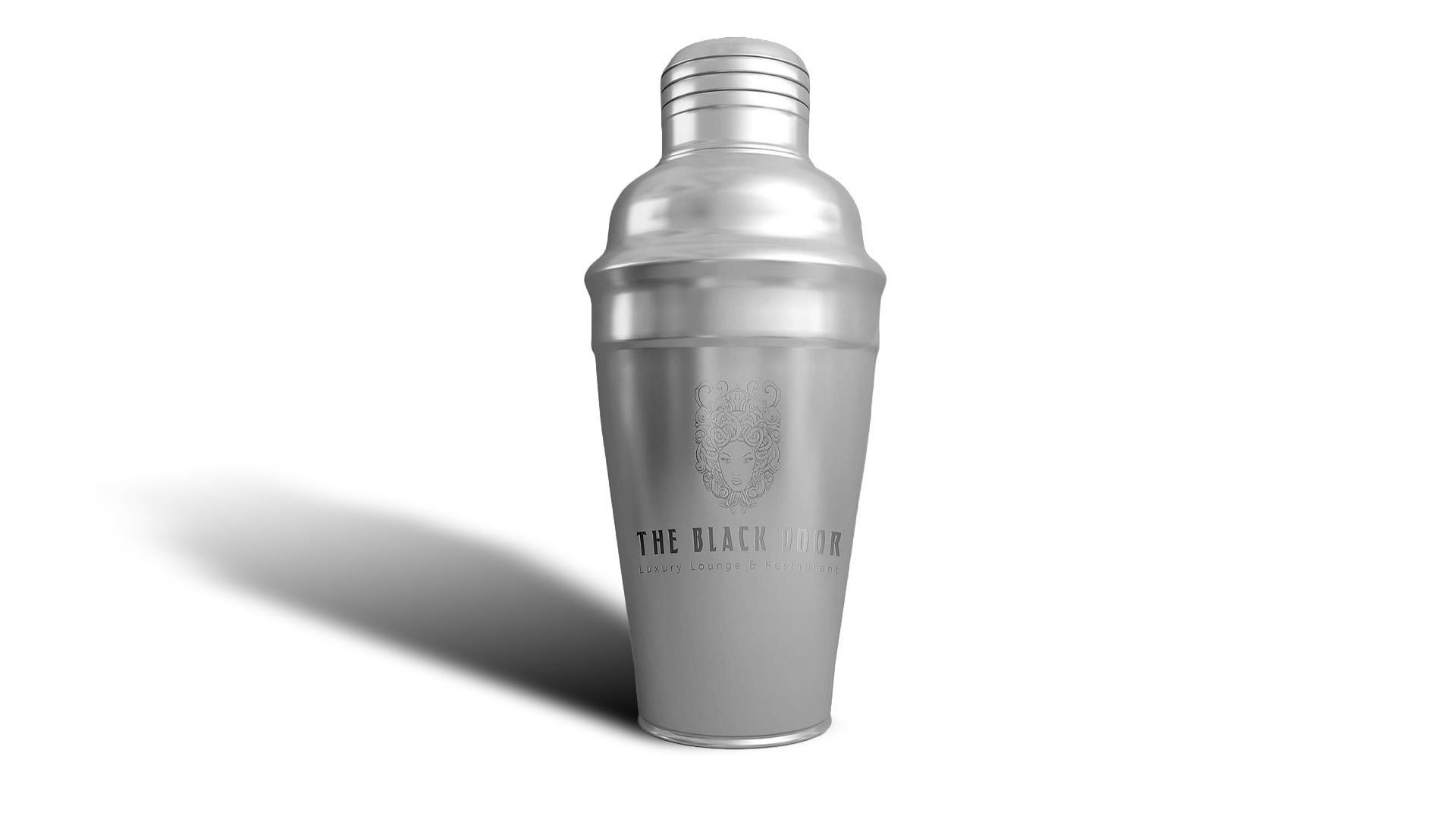
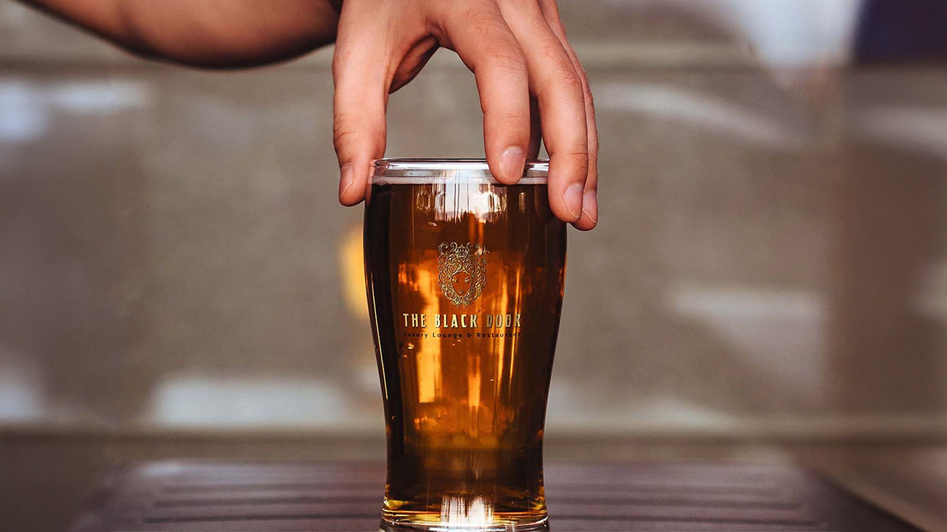
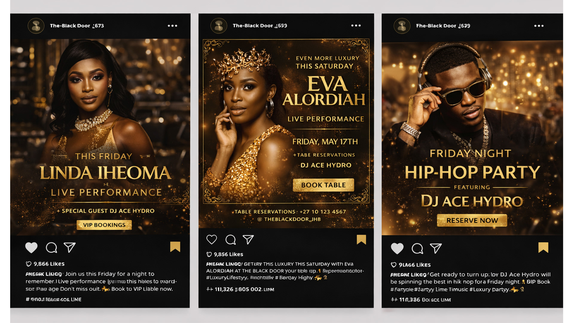
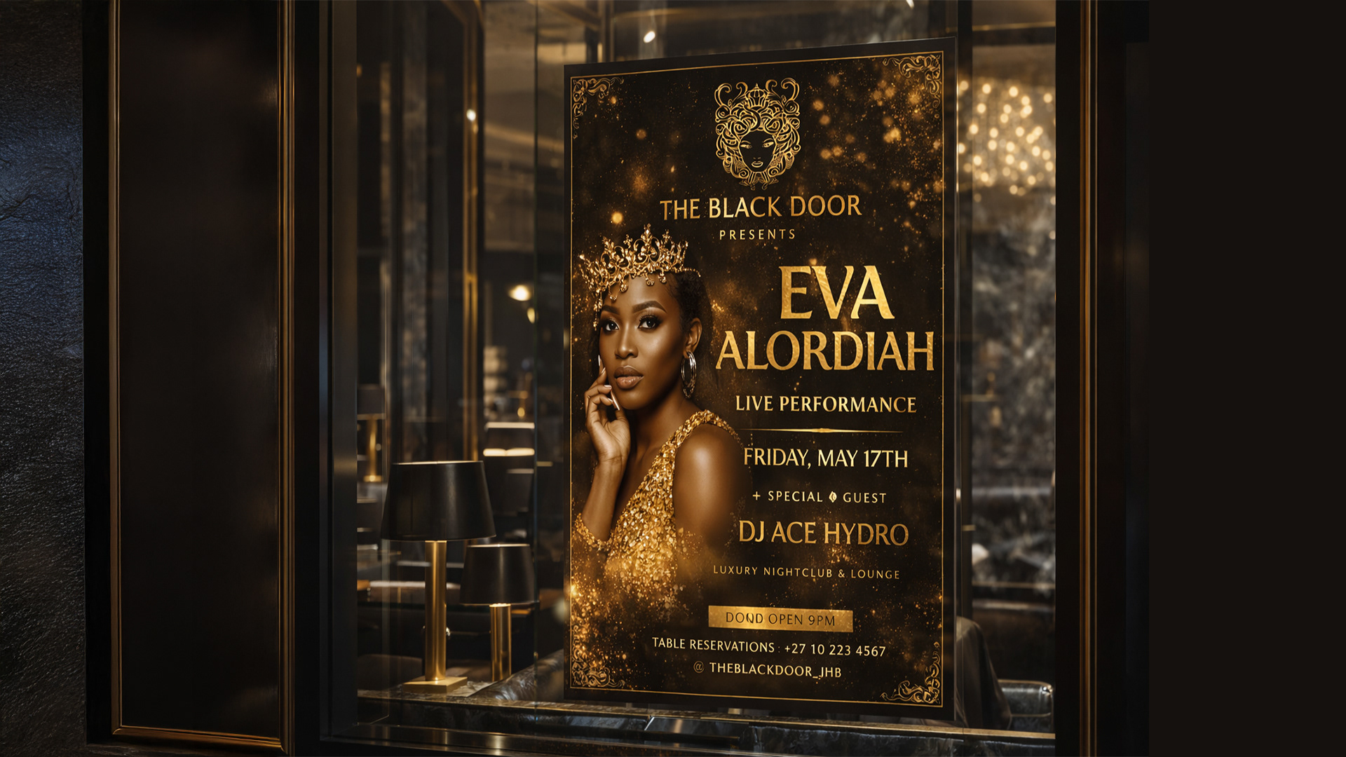
The system extended across venue collateral, cocktail menus, event posters and social media content. Clear visual principles allowed promotions to become expressive while maintaining recognition.
The identity balanced four requirements: exclusivity without emotional distance, luxury with cultural relevance, artist energy with commercial credibility, and visual drama with practical consistency.
Business and Brand Value
The Black Door gained a coherent identity for physical and digital touch points. The system gave owners, promoters and creative partners a shared visual direction.
It positioned the venue as more than a nightlife destination. The brand became a framework for arrival, association, performance and social visibility.
What This Project Demonstrates
Luxury hospitality branding, audience positioning, cultural strategy, symbolic refinement, brand identity, creative direction, experience design, event communication, social media application and design governance.
View the Identity System
View The Black Door Luxury Club Identity