PACKAGING STRATEGY | RETAIL COMMUNICATION | RANGE ARCHITECTURE
Executive Snapshot
Smoothies Africa needed to launch a ready-to-drink smoothie range within South Africa’s forecourt market.
The challenger brand had a limited budget and needed to attract on-the-go consumers. Inside crowded refrigerated displays, shoppers would choose within seconds.
The project united packaging, point-of-sale material and social content in one visual system.
The Communication Challenge
The range had to compete against established beverage brands with greater media and retail support.
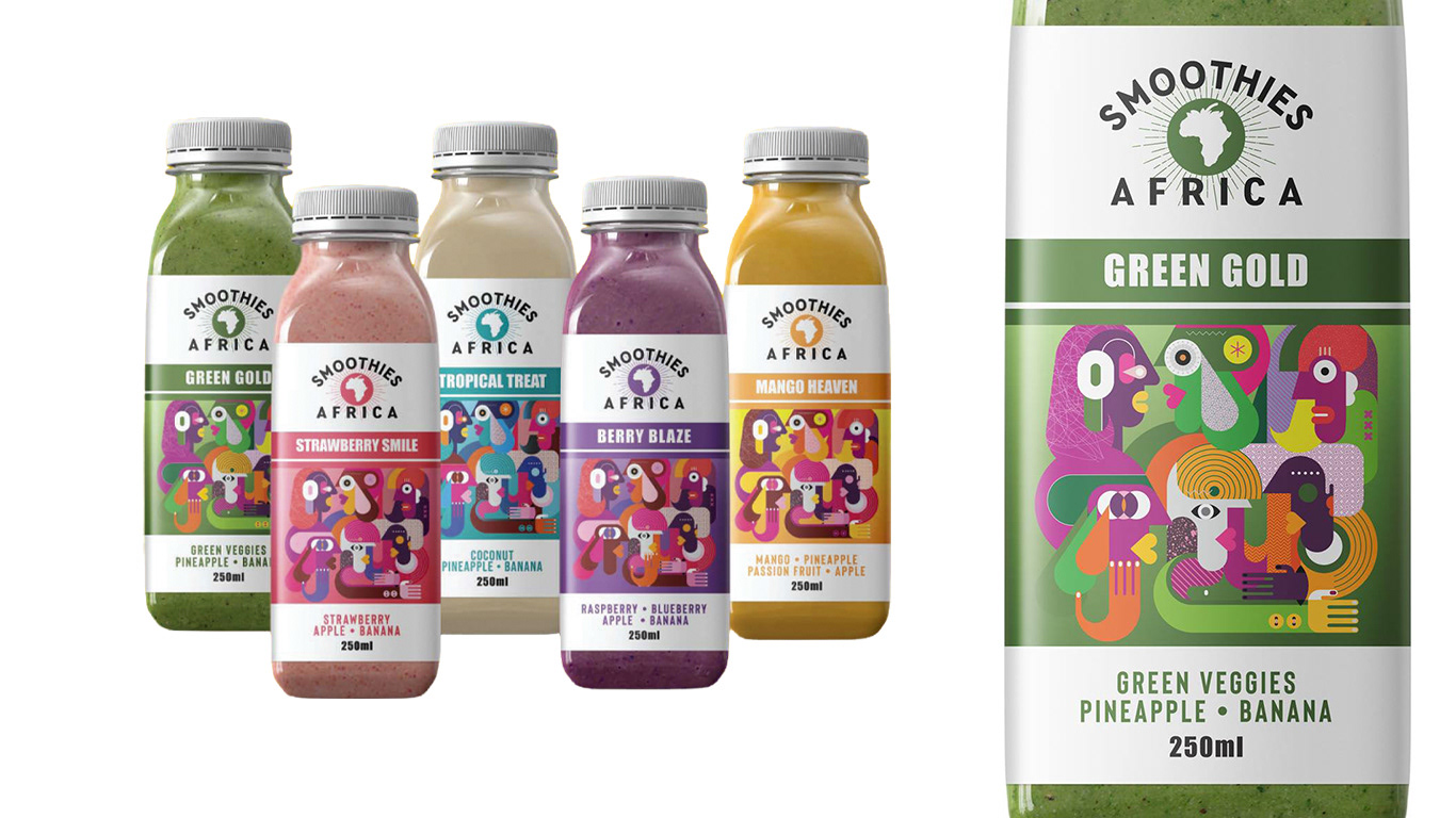
Each bottle needed to communicate the brand, flavour, ingredients and benefits at speed. Natural and dairy-free cues required clear presentation so the health message remained credible.
Several flavours needed individual recognition without making the range appear disconnected. Marketing also had to extend beyond the bottle without costly photography for each promotion.
My Role
As Creative Strategist and Creative Director, I led the positioning concept, packaging strategy, visual language and campaign direction.
I developed the range architecture, information hierarchy and central creative device, then directed its use across labels, posters, displays and social content.
The Creative Response
The strategic idea was simple: make the label the billboard.
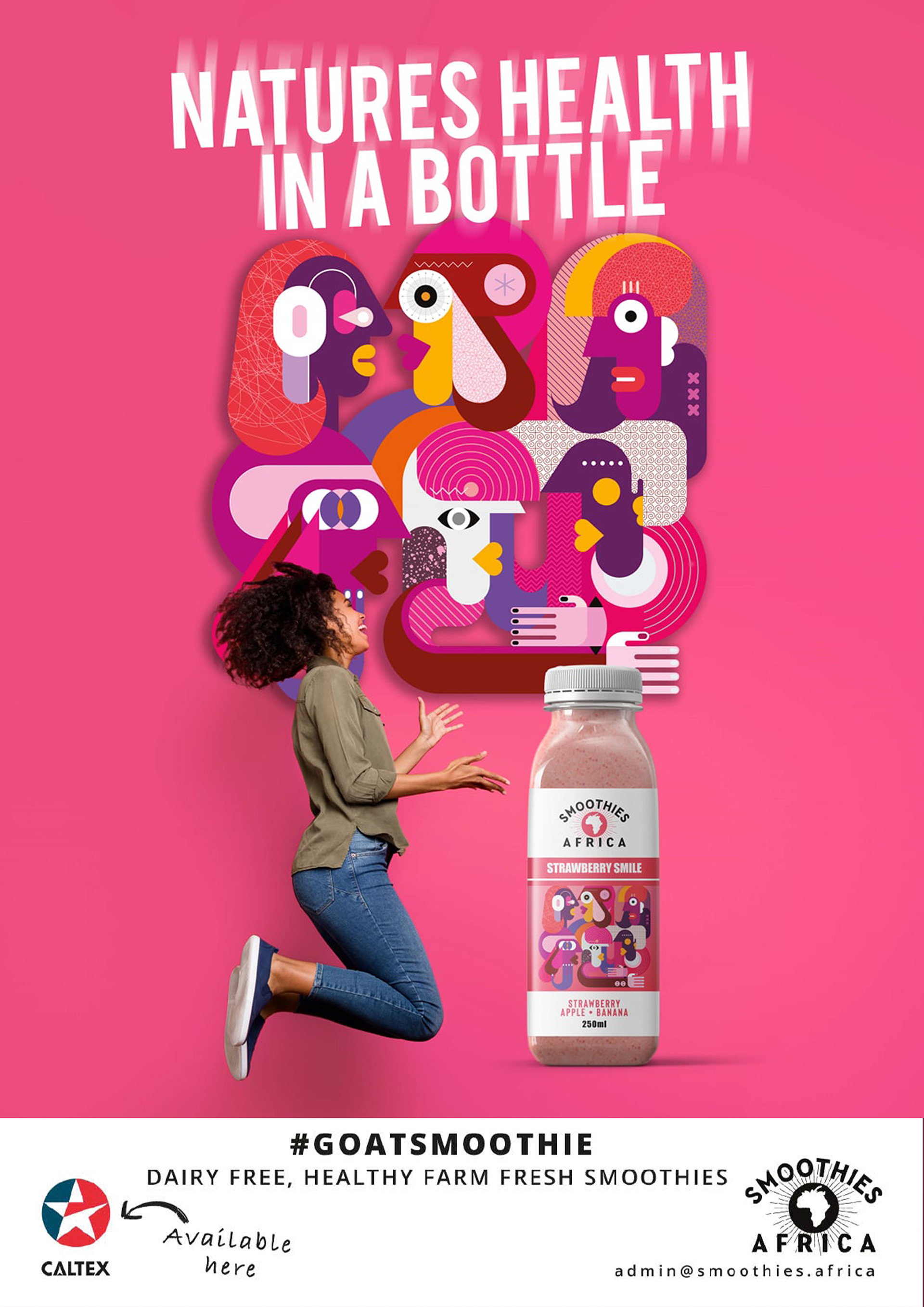
A bold geometric character collage gave Smoothies Africa a distinctive signature rooted in African energy. The illustration created cooler impact and became reusable artwork across other channels.
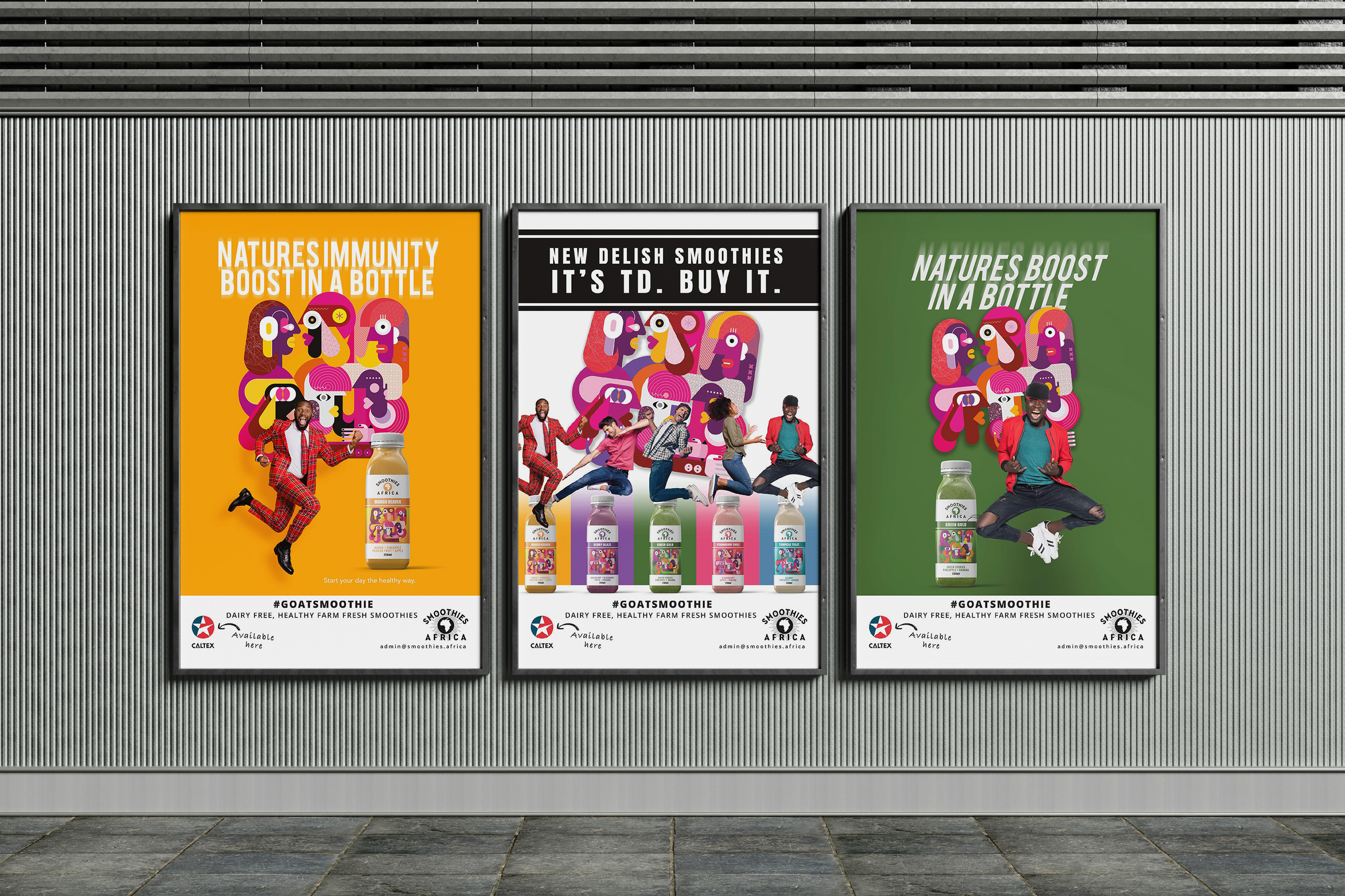
Each flavour used a defined colour band within a consistent label structure. The hierarchy moved from brand to flavour, ingredients and pack size, helping consumers compare products quickly. Cues such as “100% natural” and “dairy free” remained prominent without overcrowding the label.
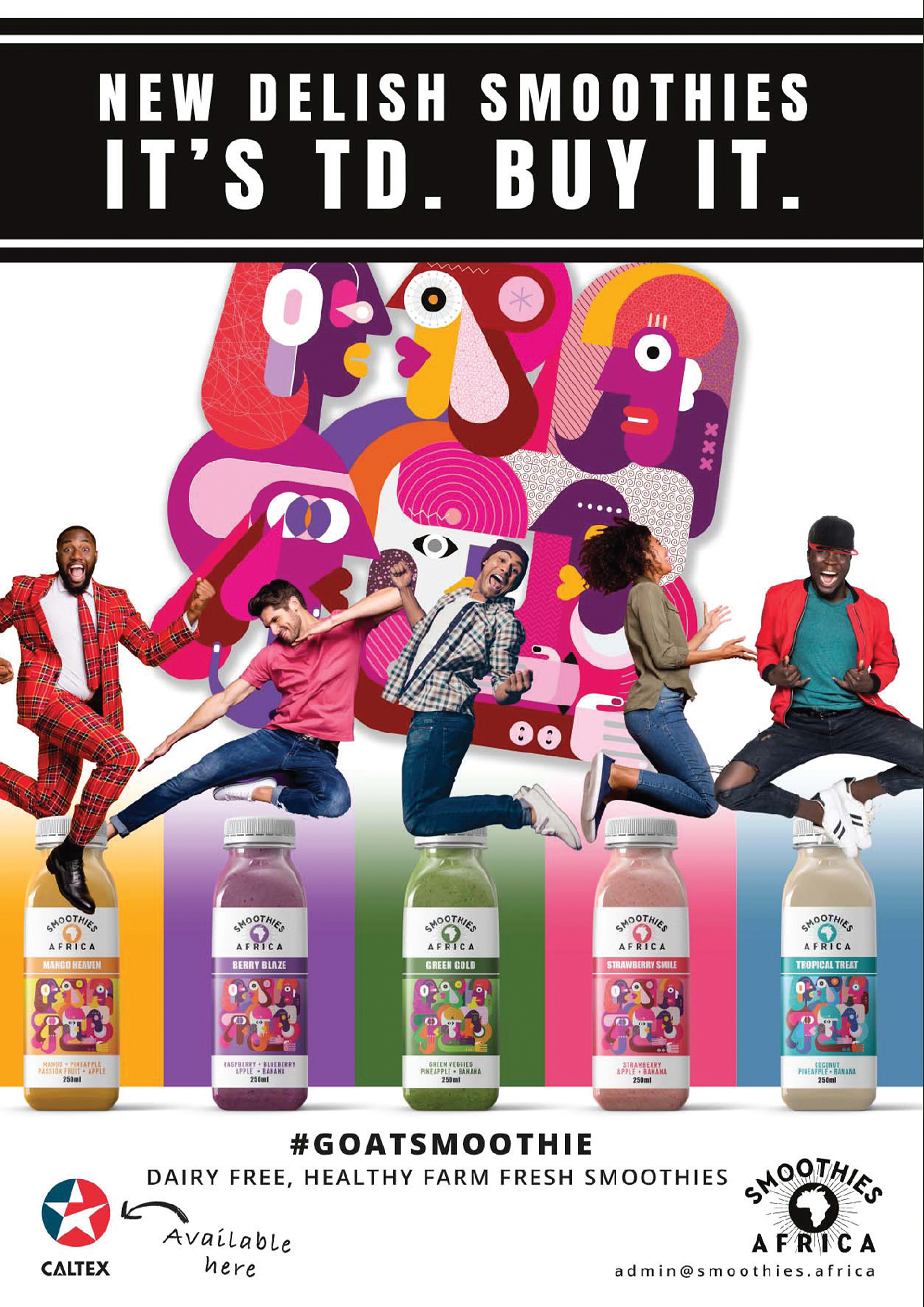
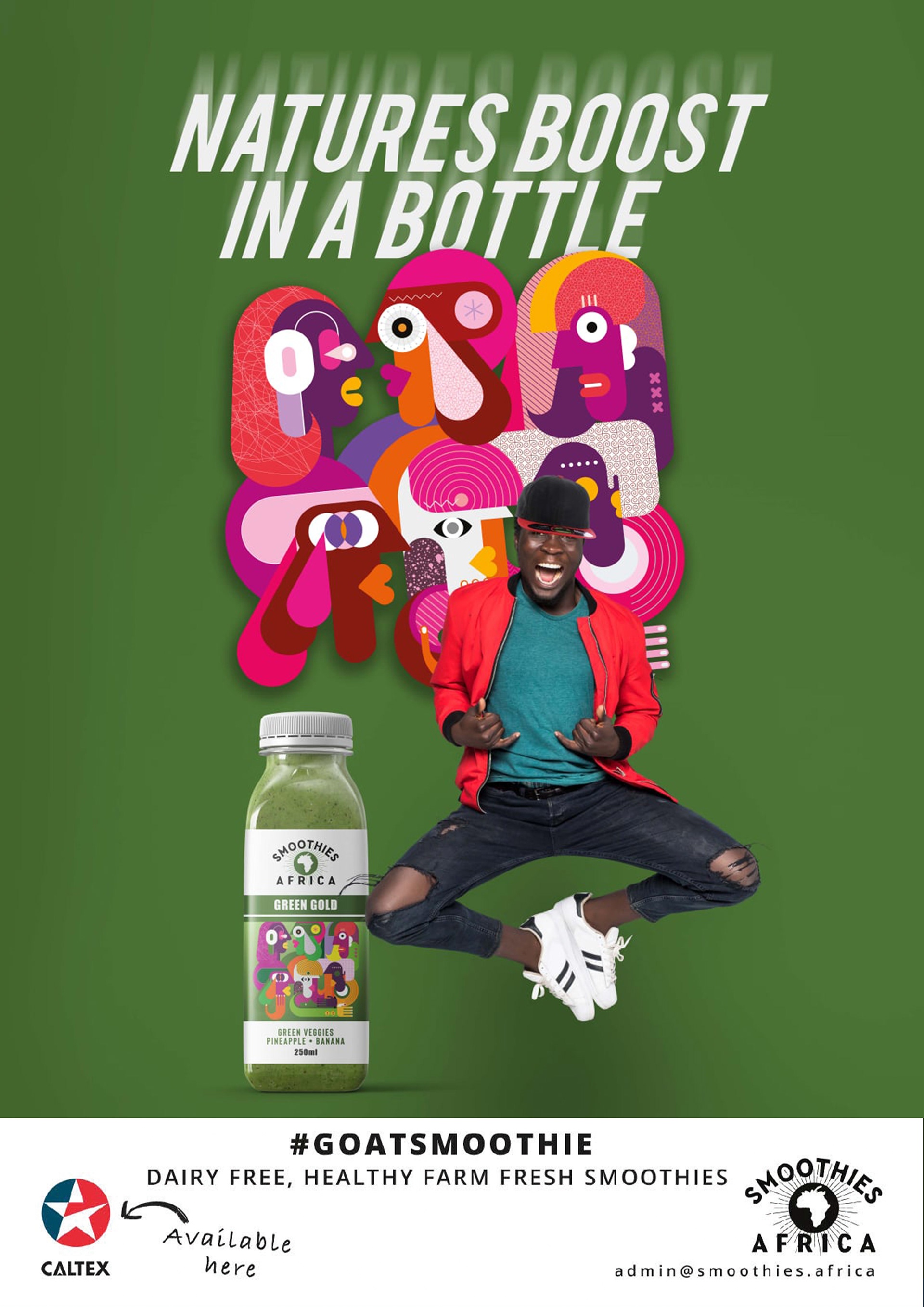
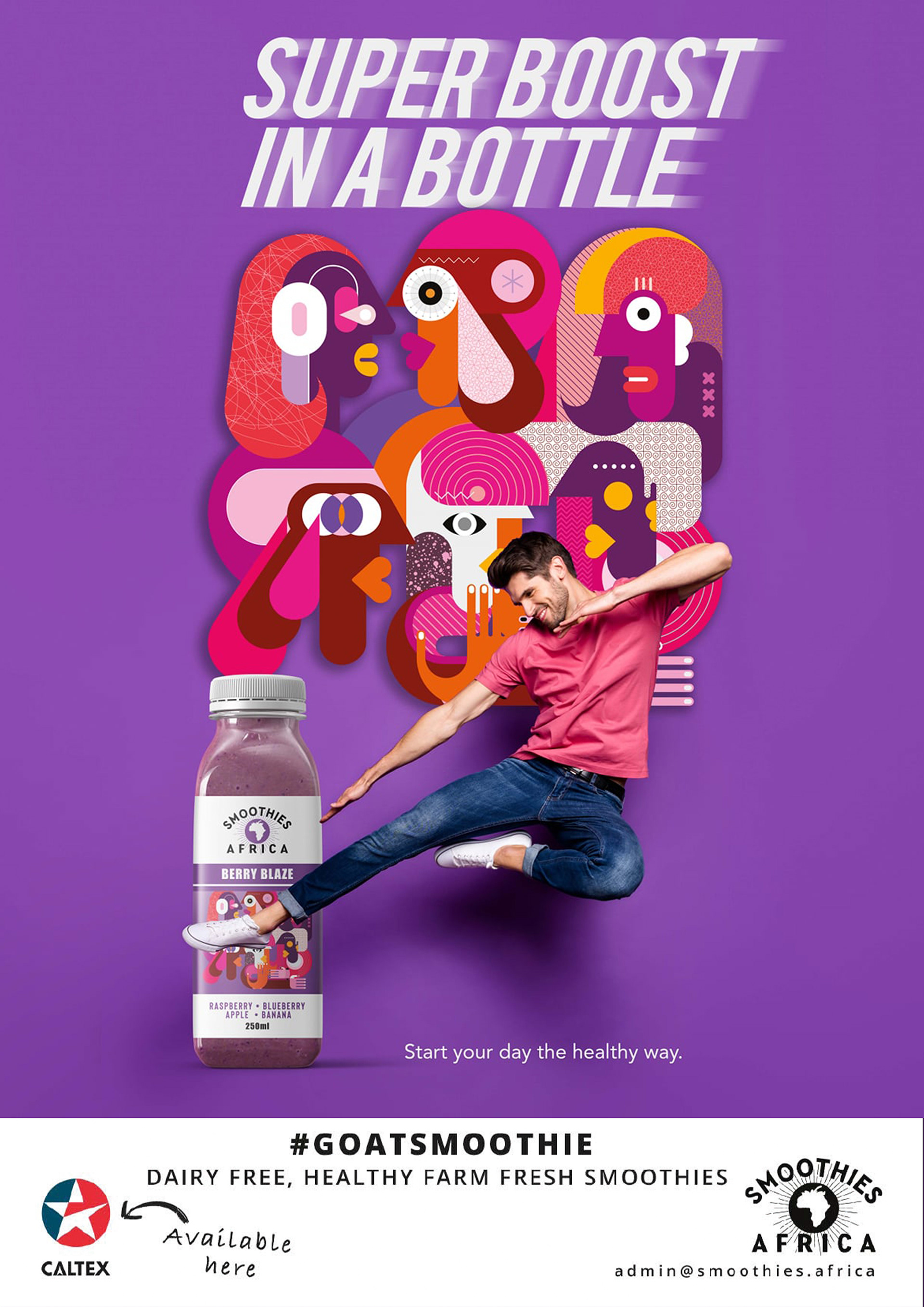
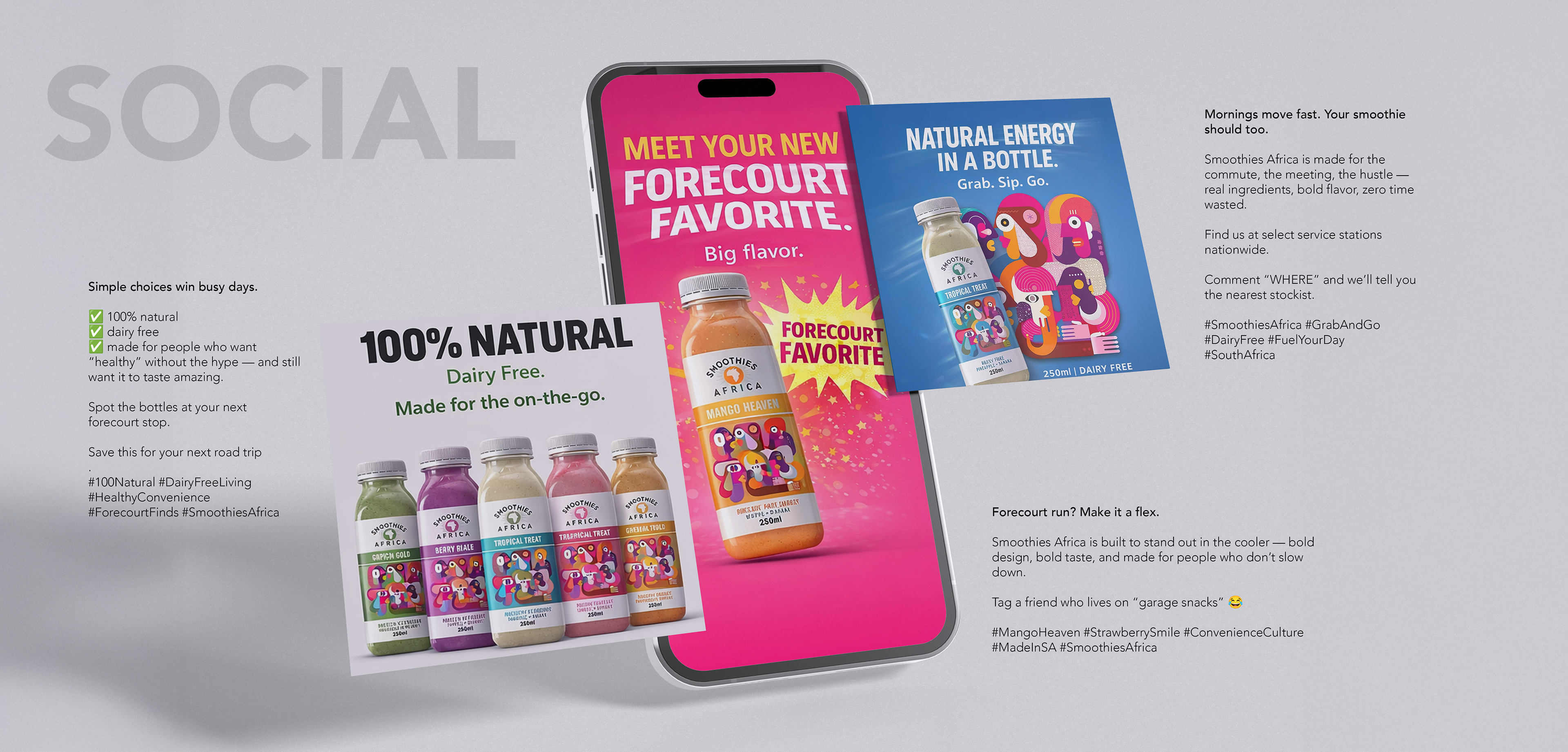
The packaging system became the foundation for posters, social posts and in-store promotion. This reduced the need for separate concepts across every format.
A Cape Town weekend giveaway added a launch activation. Social content and forecourt displays used the same bottles, colours and illustration, connecting awareness with trial at the point of purchase.
Business and Brand Value
The system gave Smoothies Africa a recognizable shelf presence and a clear structure for expanding the range.
One central brand asset worked across packaging and marketing, supporting consistency within a limited budget. The result was a challenger-brand system built for recognition, rapid choice and future flavour launches.
What This Project Demonstrates
Packaging strategy, retail communication, beverage branding, SKU architecture, creative direction, illustration systems, point-of-sale design, social campaign development and forecourt marketing.