AGRICULTURE | EVIDENCE-LED BRANDING | MARKET ADOPTION
Executive Snapshot
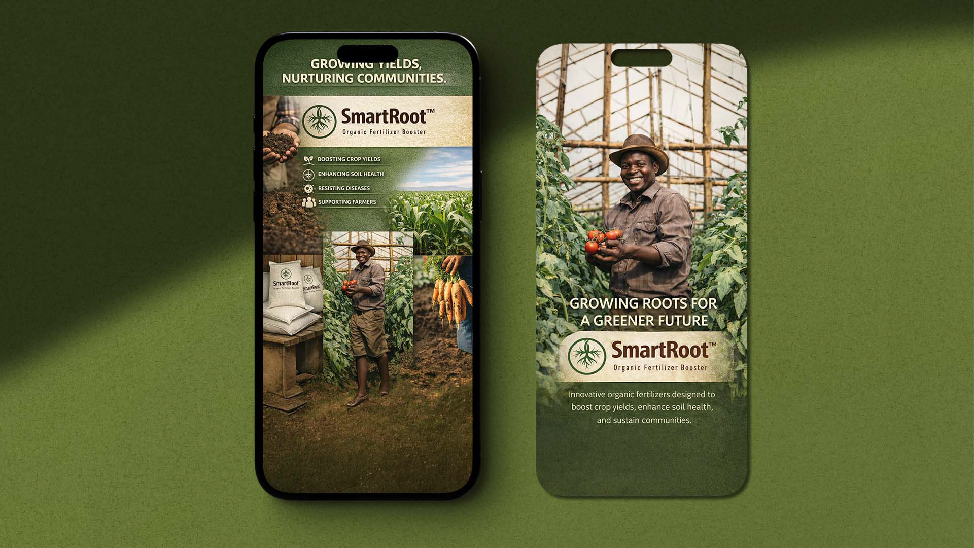
SmartRoot is a South African agricultural startup founded in the Eastern Cape, producing organic biofertilizer products for smallholder farmers, field crops and indoor farming. Its 2023–2026 strategy addressed how a science-led business could build trust through farmer networks and input channels.
The Strategic Challenge
The challenge was not awareness. It was credibility. Farmers and channel partners needed local evidence, clear application guidance and technical support before changing established input practices. Rising costs, climate stress and uncertainty around biological products made unsupported sustainability claims weak.
How could SmartRoot turn technical product potential into credible, repeatable farmer adoption?
My Role
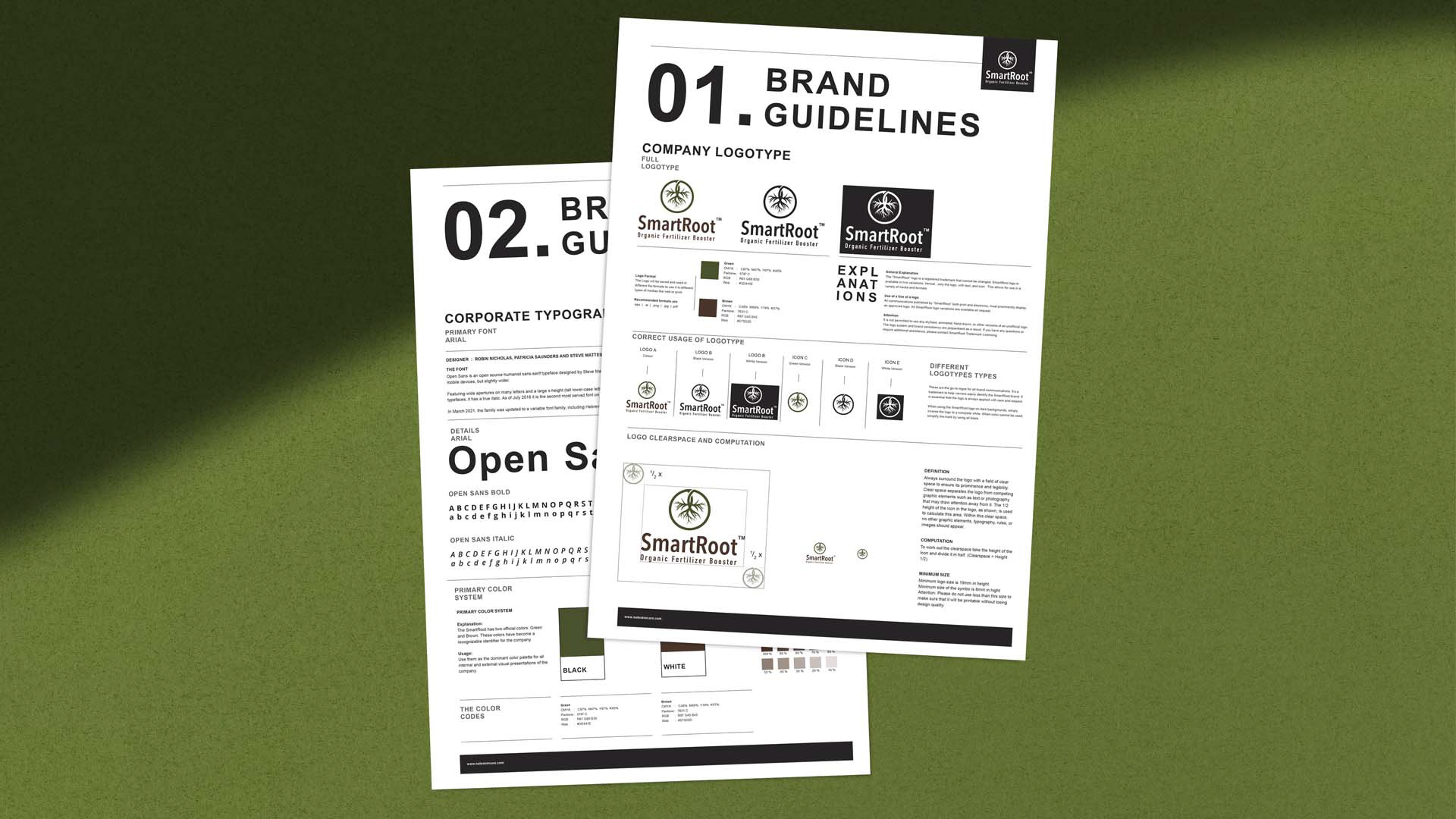
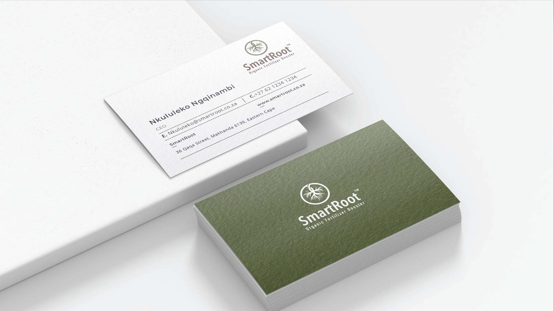
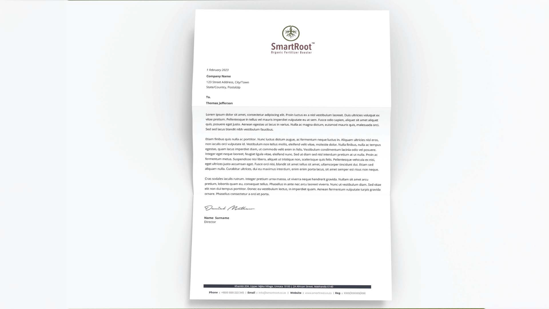
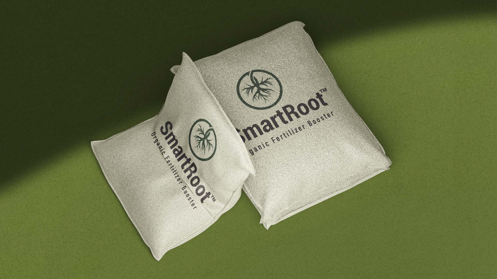
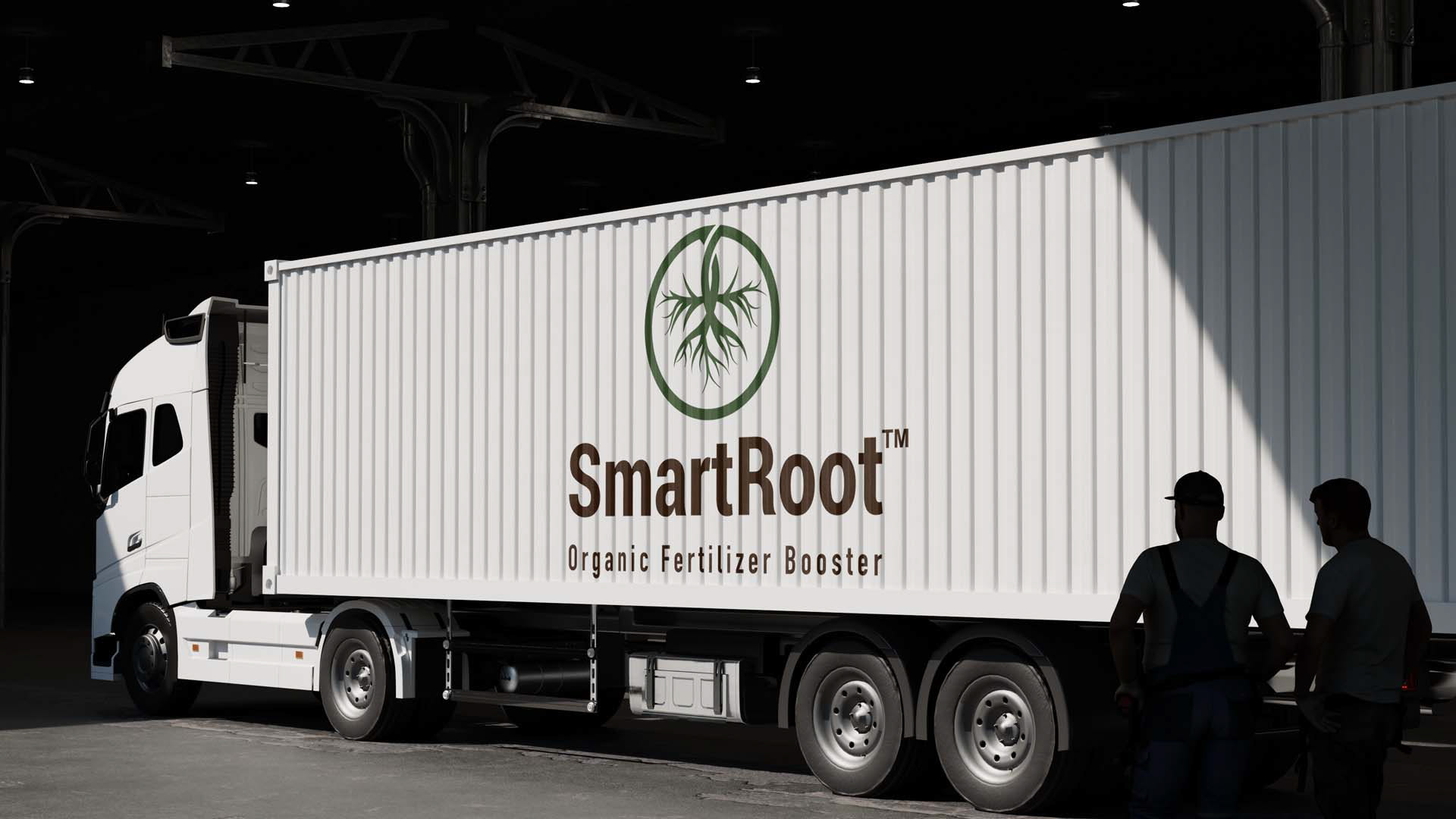
As Brand Strategist and Creative Director, I led the positioning, audience strategy, messaging and brand system. The work covered identity, guidelines, packaging, sales tools, signage, vehicle branding and the B2B go-to-market framework.
The Strategic Response
I positioned SmartRoot around “proof-led biofertilizer efficiency for farmer networks.” This moved the brand beyond selling a product and toward helping farmers improve input efficiency through evidence, education and practical support.
The audience strategy prioritized co-operatives, farmer groups, agro-dealers, distributors, development programs, aggregators and emerging commercial farms before individual smallholders. This B2B and B2B2C model used trusted networks to reduce adoption risk.
The proof system connected pilot farms, demonstration plots, crop-specific protocols, harvest reports and case studies. Dealer training, field days, WhatsApp support and digital resources carried that evidence into customer conversations.
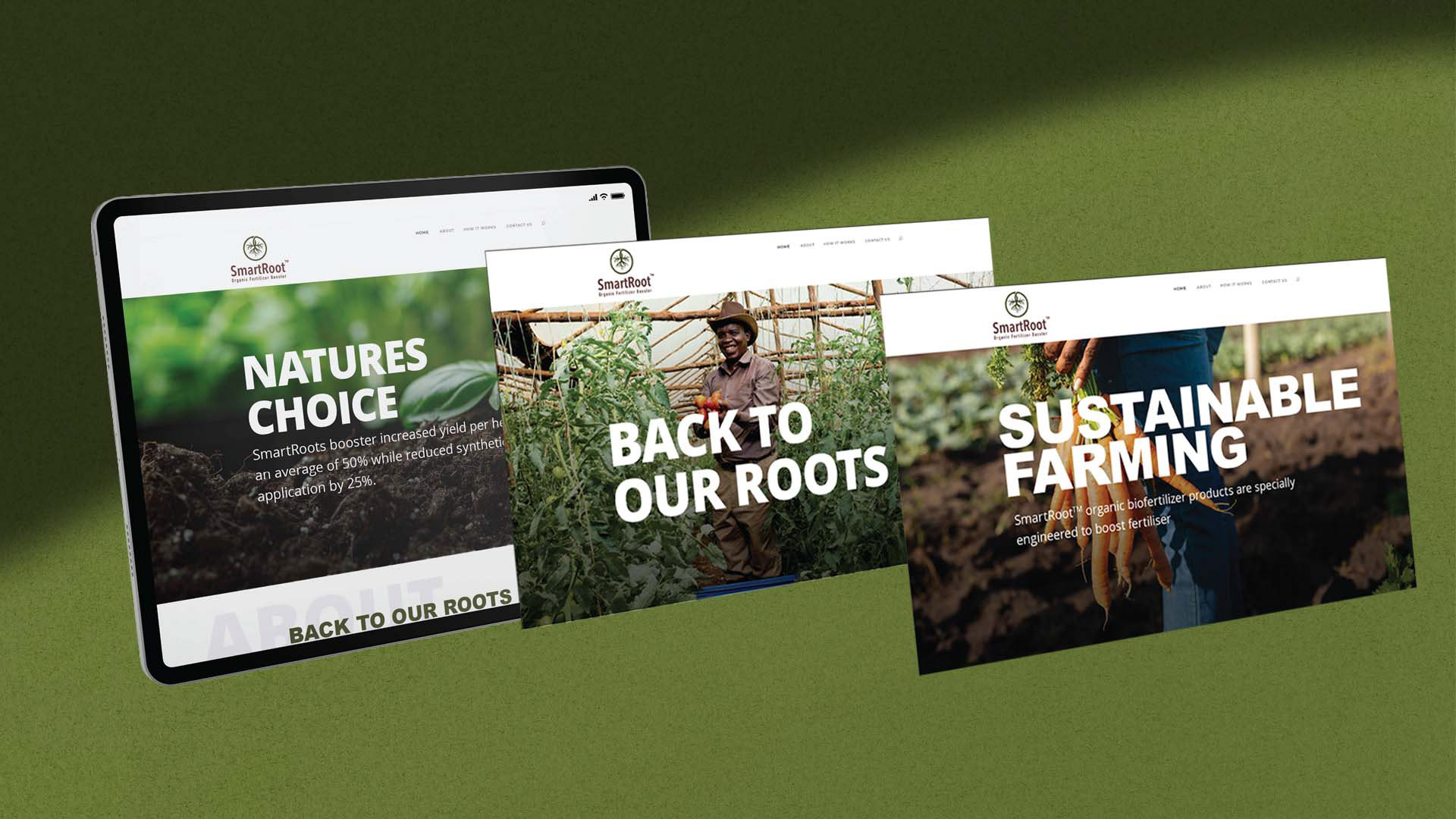
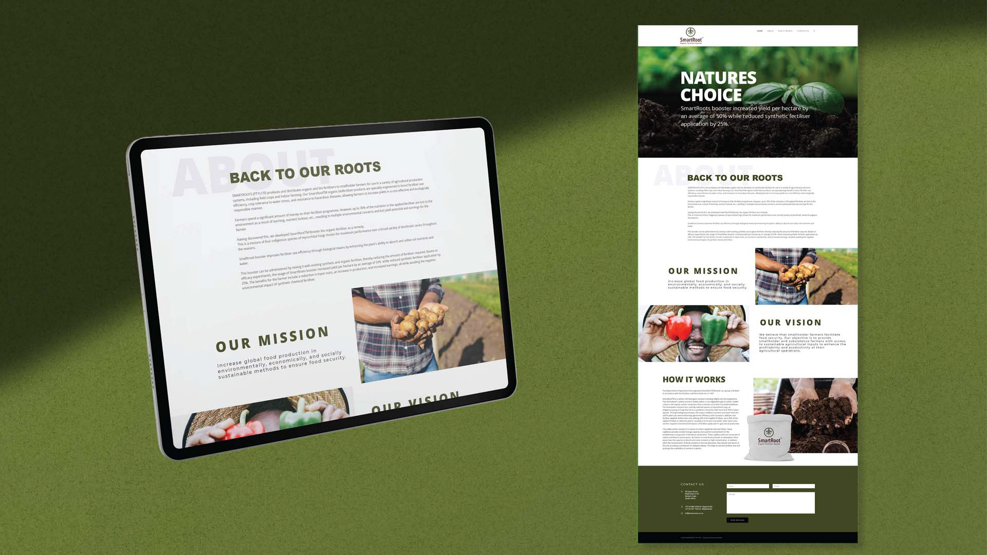
The same logic shaped packaging, sales materials, website, signage, vehicles and field applications. The voice remained clear, practical and farmer-relevant, avoiding hype and vague sustainability promises.
The plan set targets of 20 pilots, 10 harvest reports, five publishable case studies, 12 channel agreements and repeat orders. These were strategic milestones, not claimed results.
Business and Brand Value
The strategy connected communication with field proof, channel capability and commercial measurement. It gave SmartRoot a disciplined route from technical credibility to adoption and a stronger basis for trust among farmers, distributors and commercial partners.
What This Project Demonstrates
Agricultural brand strategy, B2B and B2B2C positioning, audience segmentation, evidence-led communication, channel strategy, go-to-market planning, identity, packaging and creative direction.
View the Strategy Document
The downloadable report provides the positioning, audience framework, proof strategy, channel plan, implementation roadmap and measurement system.
Download the SmartRoot Brand and Marketing Strategy