B2B BRAND SYSTEMS | INDUSTRIAL IDENTITY | TRUST POSITIONING
Executive Snapshot
Siswa supplies heavy machinery, trucks, operators and maintenance services for roadworks and large construction sites. Many opportunities involved government-linked projects.
The company had a credible offer, but worked in a crowded, relationship-driven market. Its brand needed to communicate capability before a sales or tender conversation began.
The System Challenge
Construction competitors often used similar industrial imagery and claims. Siswa needed to appear established, dependable and ready for complex work without relying on generic toughness.
The system had to address procurement and project stakeholders. Fleet branding needed distance visibility, while the corporate brochure had to support sales discussions.
My Role
As Brand Strategist and Creative Director, I led the positioning, identity strategy, visual system and rollout. I translated Siswa’s machinery, people, maintenance capability and network into one market presentation.
The Governance Response
I positioned Siswa as a trusted construction partner rather than only a machinery supplier. Reliability, scale, service and operational confidence guided every design decision.
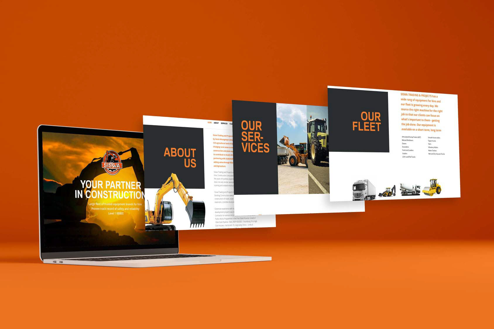
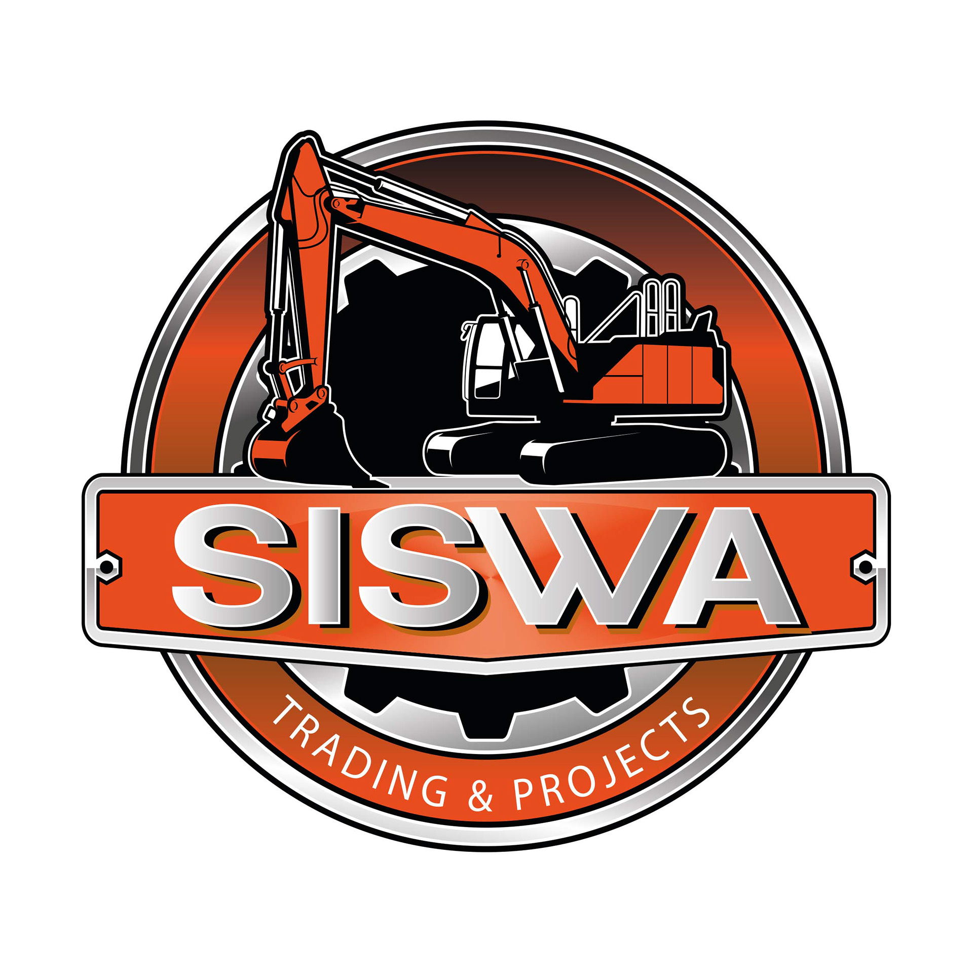
The identity used industrial forms influenced by machinery, structural shapes and heavy linework. The emblem carried presence on construction sites while remaining controlled in corporate documents.
Orange created visibility, black communicated authority, and white provided clarity. Metallic tones connected the brand with machinery and infrastructure. The limited palette supported reproduction across vehicles, apparel and print.
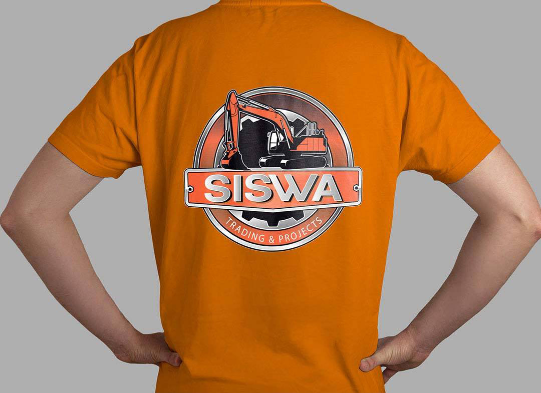
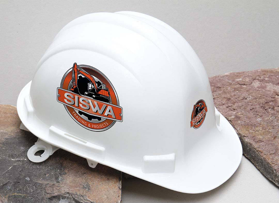
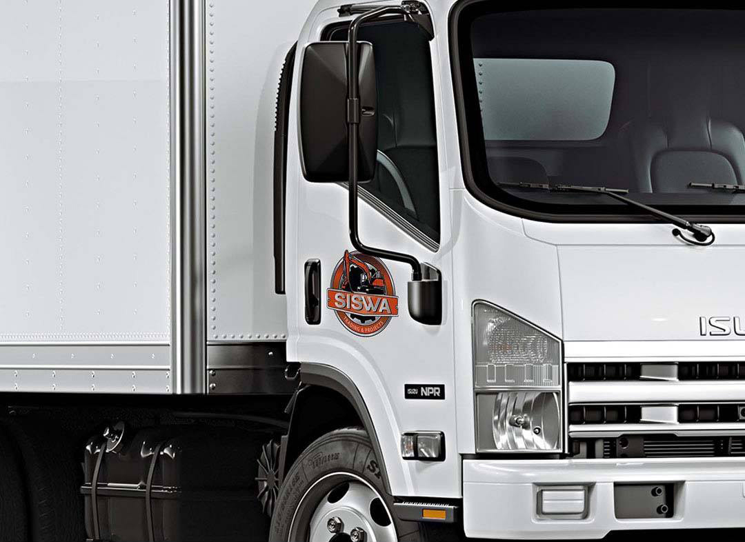
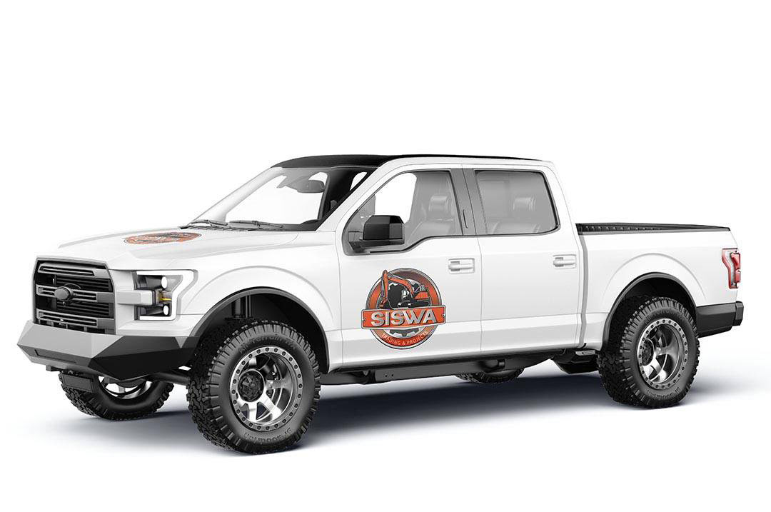
Fleet graphics turned trucks and equipment into visible brand assets on roads and project sites. Branded hard hats and apparel gave operational teams a consistent presence.
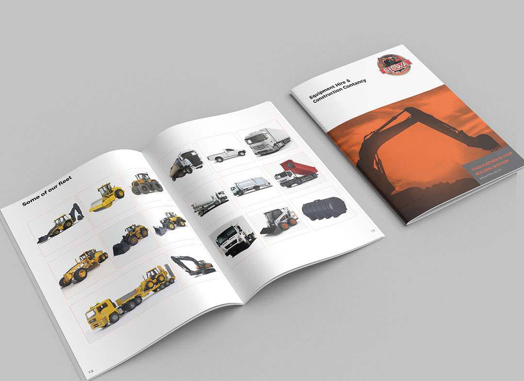
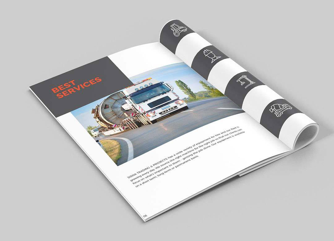
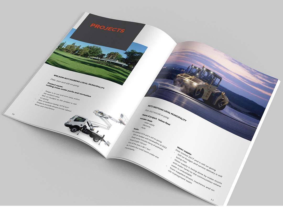
The corporate brochure provided the formal layer needed by decision-makers. Strong headings, clear sections and disciplined imagery organised services, fleet and project capability around buyer questions.
Application rules controlled logo scale, colour, spacing and hierarchy. The identity could move between site use and procurement settings without changing character.
Business and Brand Value
The system brought Siswa’s capability to the surface and created one expression across fleet, site teams and sales material.
It gave procurement and project stakeholders a clearer view of the company’s scale, services and readiness without claiming more than the business could deliver.
What This Project Demonstrates
B2B positioning, construction branding, industrial identity, trust communication, fleet branding, corporate publications, site applications and brand governance.
Explore the positioning, identity, fleet applications and corporate brochure.