CORPORATE REPORTING | DATA STORYTELLING | COMMUNITY COMMUNICATION
Executive Snapshot
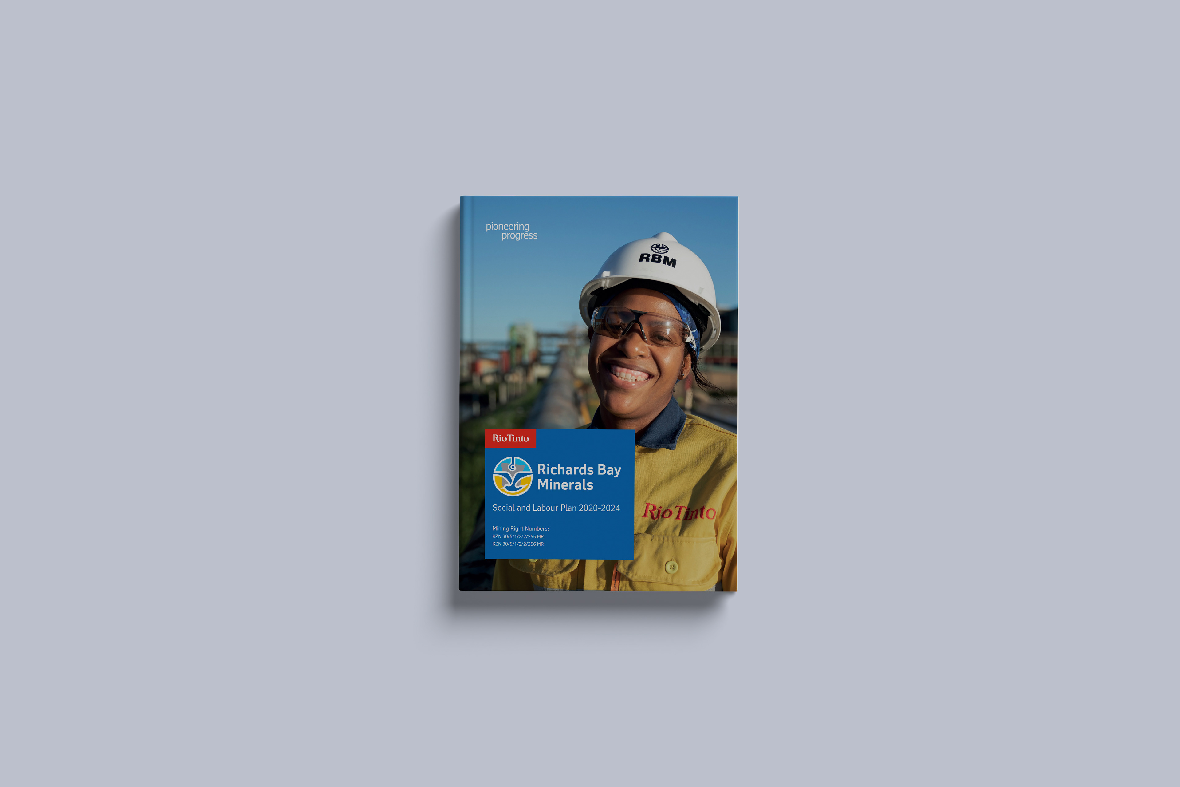
Richards Bay Minerals, a Rio Tinto mining business in KwaZulu-Natal, needed to communicate its Social and Labour Plan 2020–2024 to corporate, government and community audiences.
The material covered operations, employment, skills development and local economic commitments. The task was to turn dense information into structured communication for readers with different literacy levels and subject knowledge.
The Communication Challenge
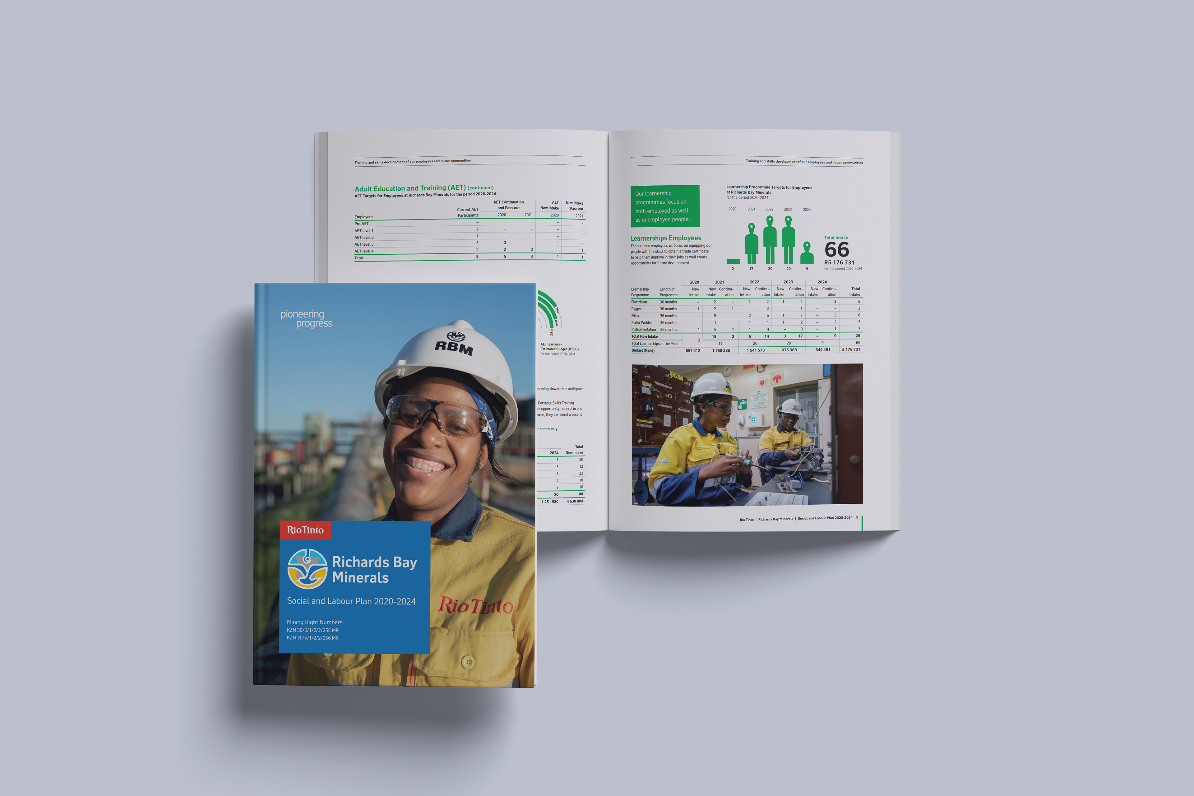
The report had to meet Rio Tinto’s global brand standards while remaining relevant to communities in the uMfolozi and uMhlathuze municipal areas.
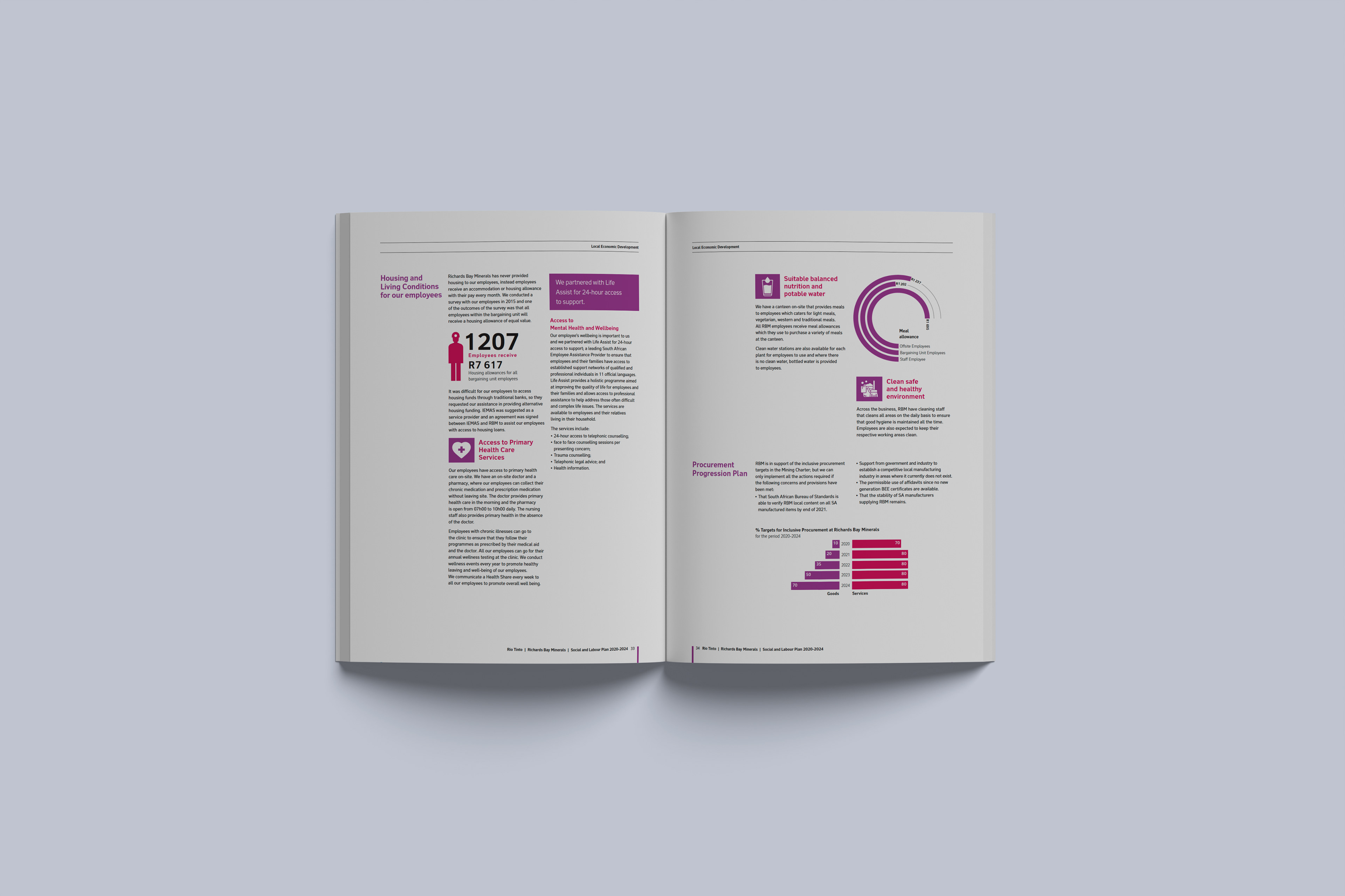
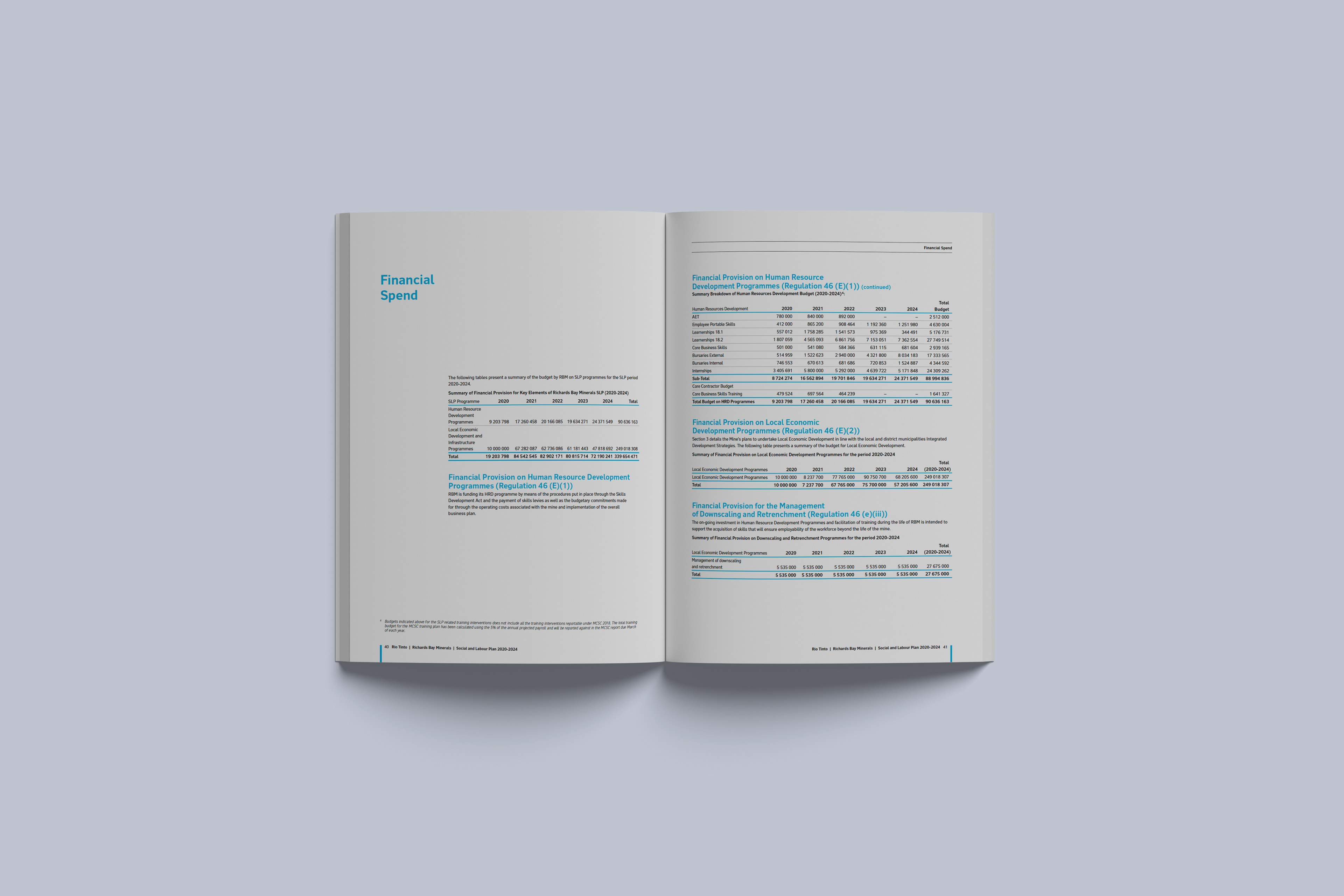
Content covered four host communities, housing, healthcare, employee wellbeing, local procurement, nutrition, potable water and environmental conditions. Without clear hierarchy, important commitments could become difficult to find and understand.
How could a formal corporate document remain compliant while becoming useful to the people affected by its content?
My Role
Working with MTS, a data analytics company, I led the creative direction, content analysis and visual communication strategy. I reviewed the copy, identified priority messages, simplified information and translated technical data into visual narratives.
The Communication Response
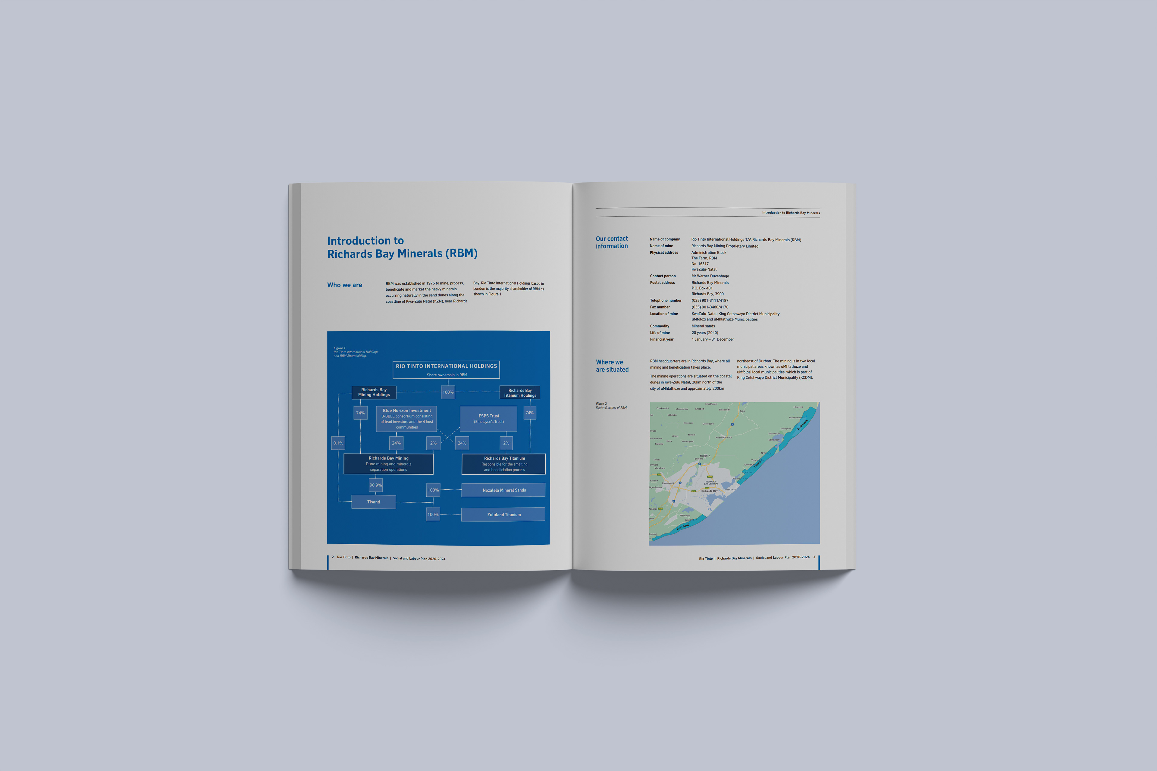
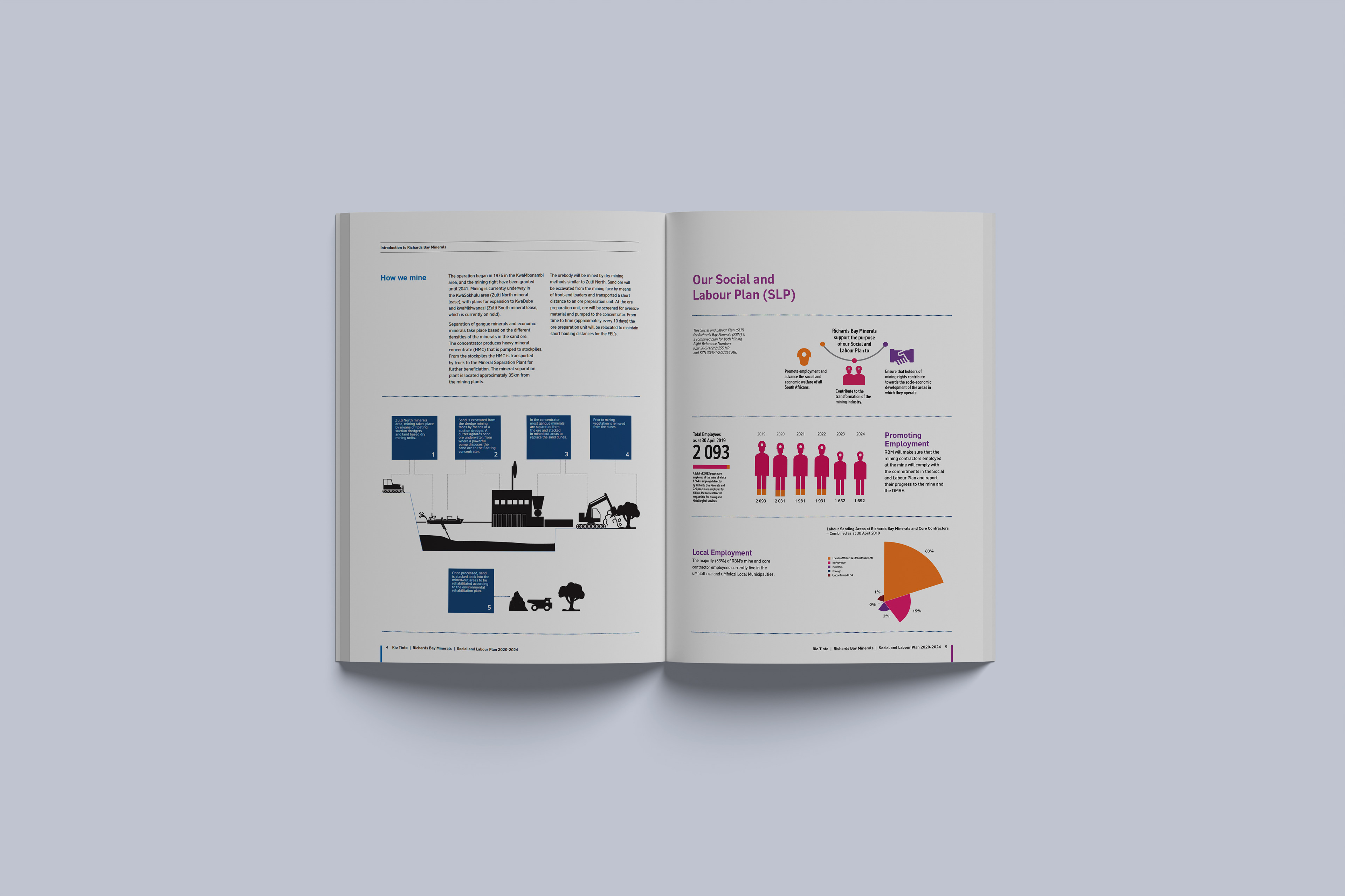
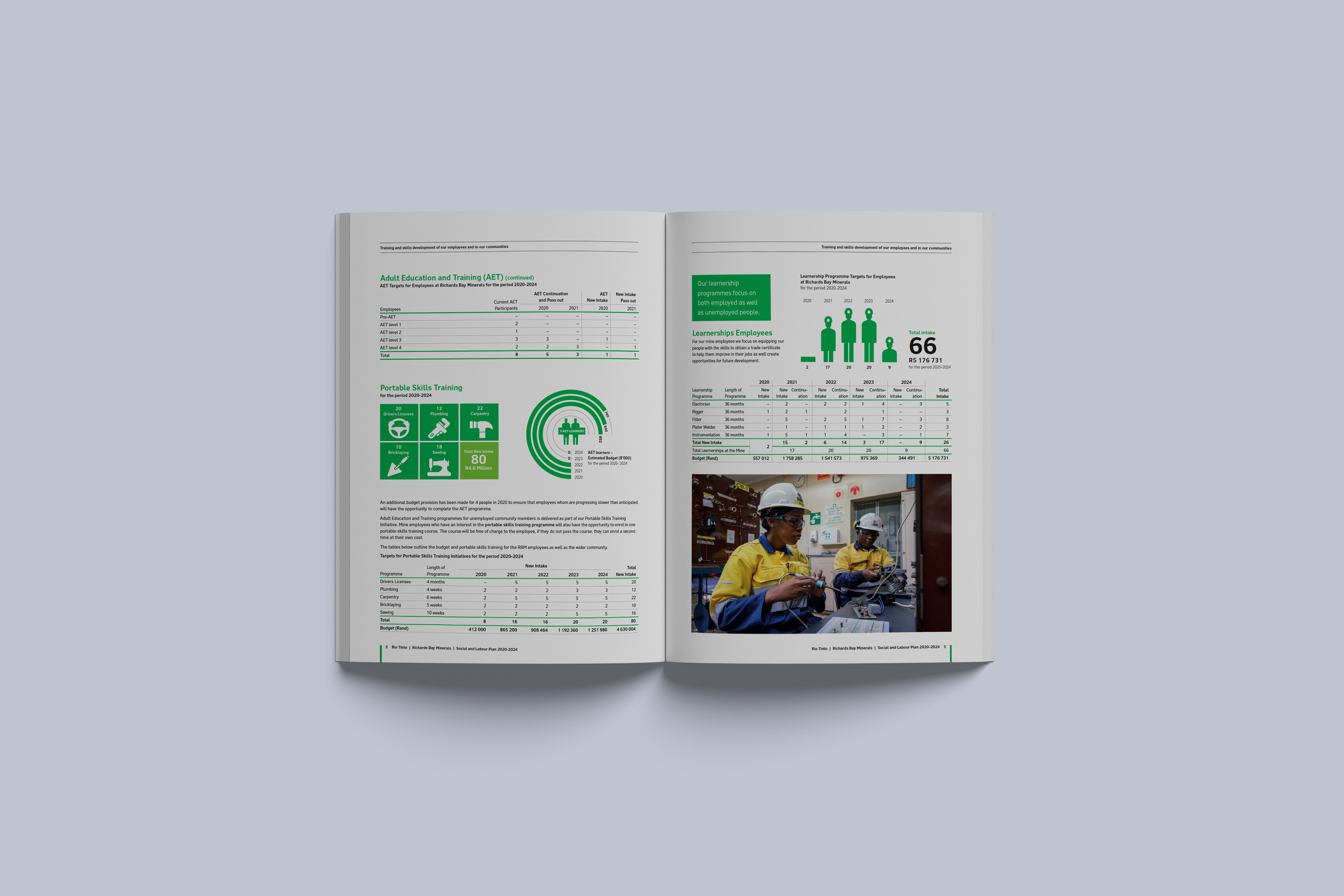
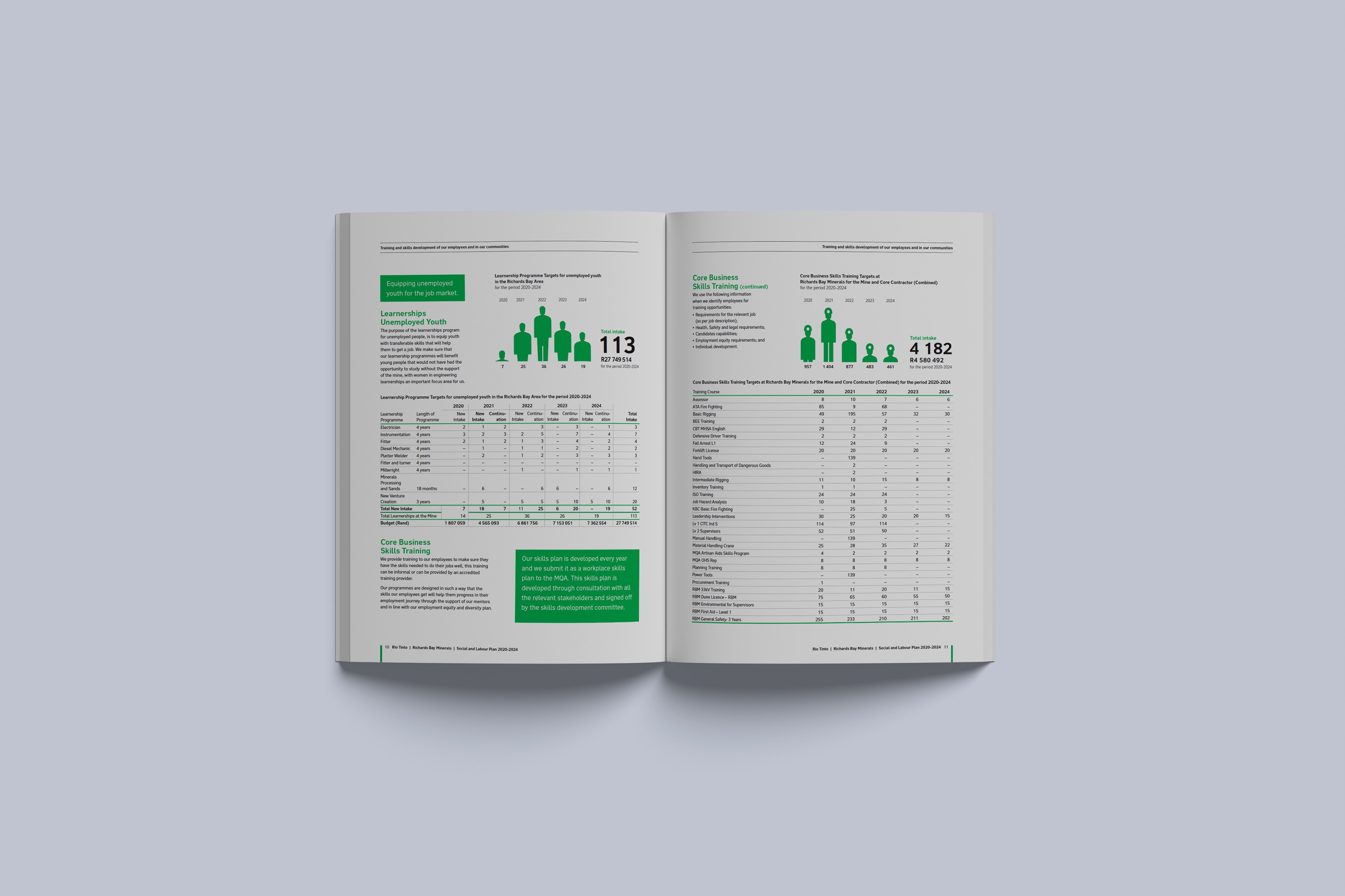
I developed an information system that guided readers from context to commitment, action and data. Copy was reduced where possible, related information was grouped, and key figures received greater visual priority.
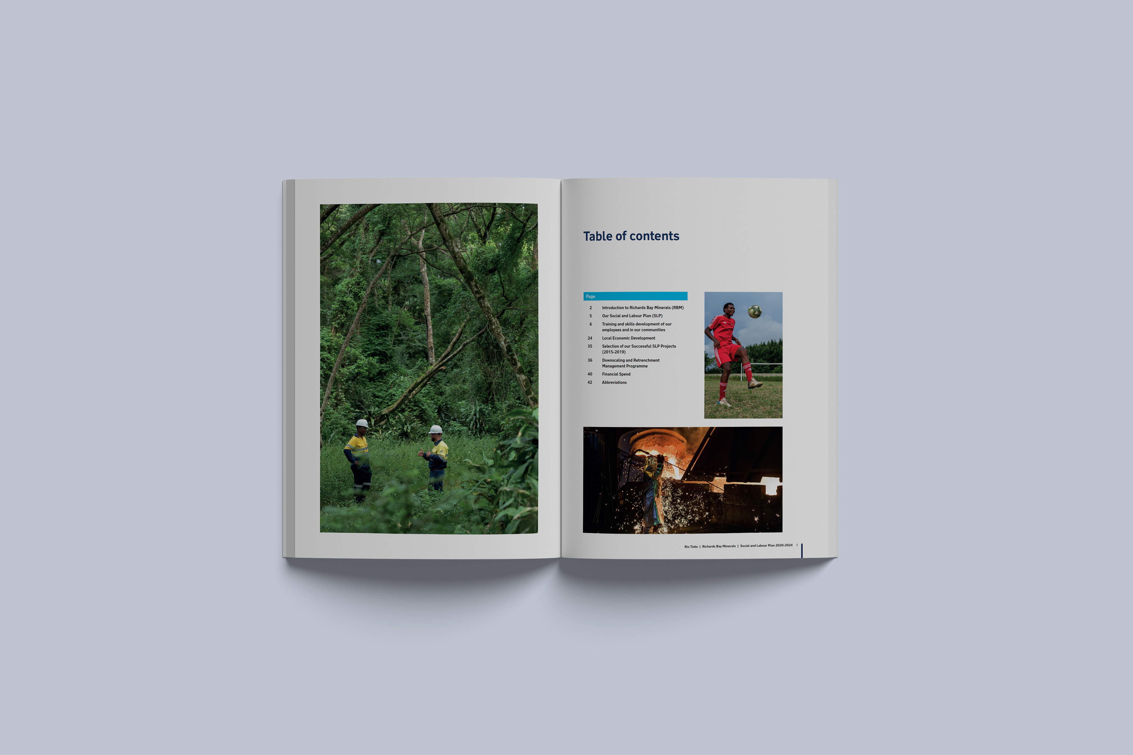
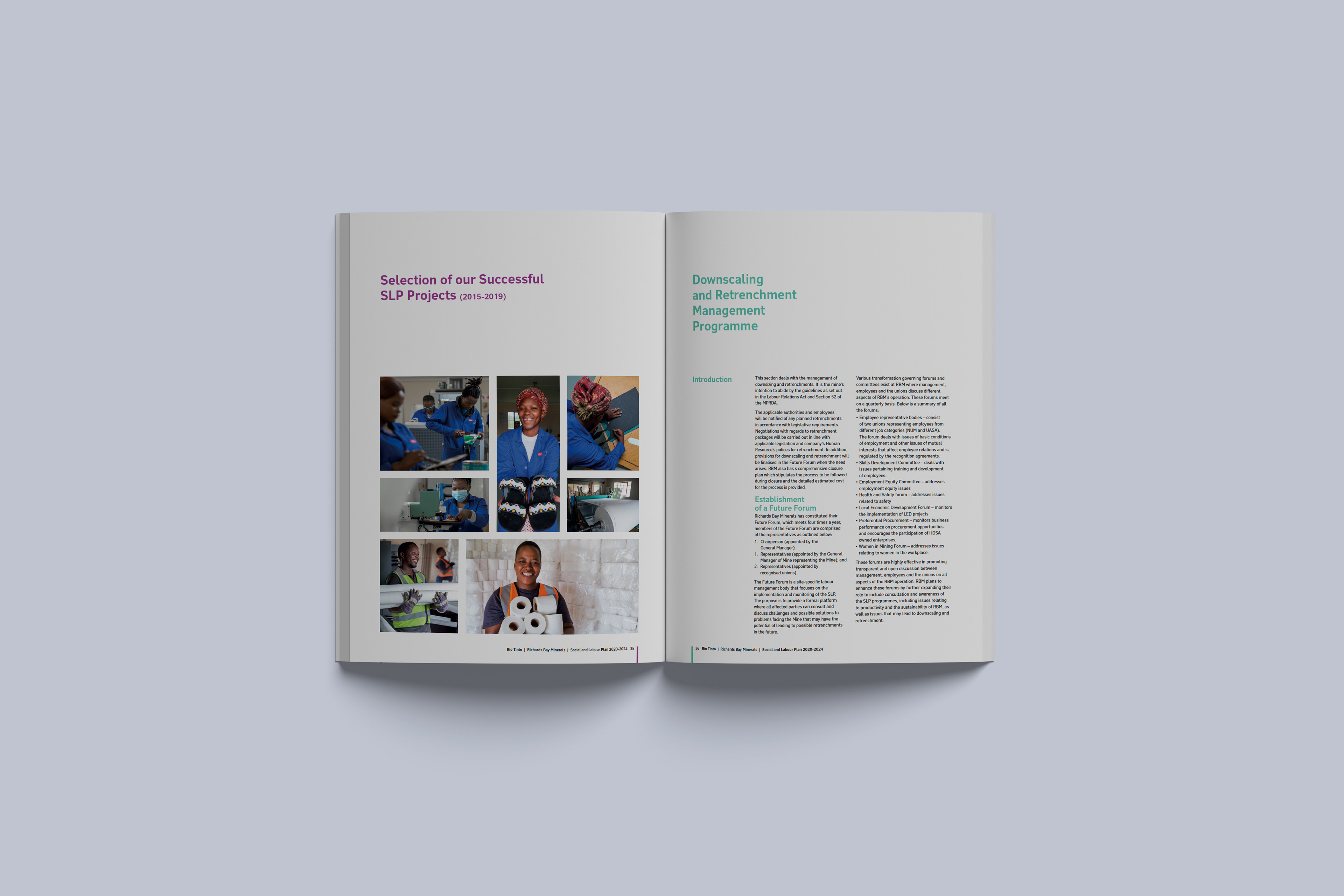
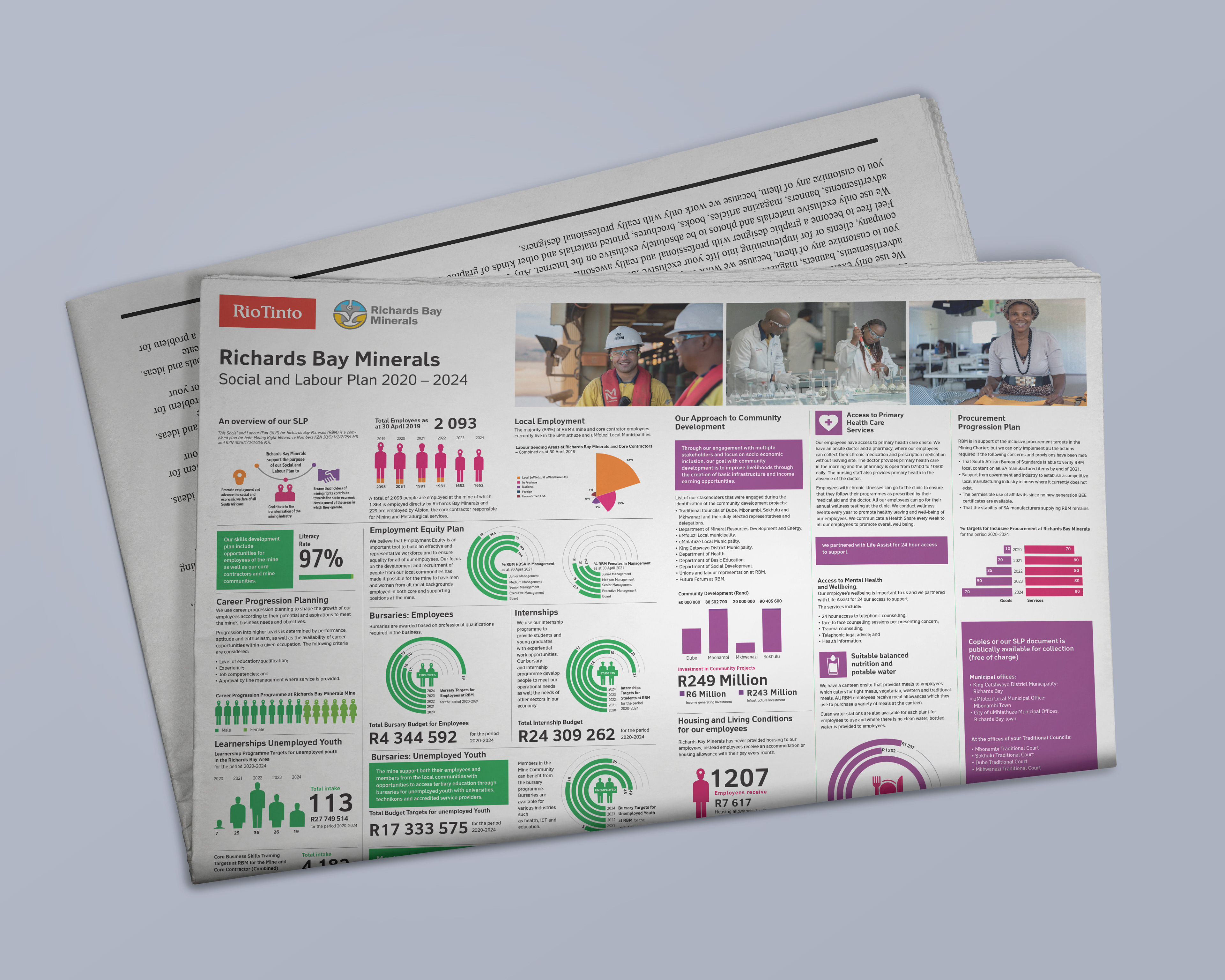
Infographics, charts, icons and disciplined hierarchy divided complex content into manageable sections. Approved photography, colors and typography maintained Rio Tinto’s global identity.
The design balanced corporate precision with local accessibility. It avoided decoration that could compete with the evidence and helped readers locate programs, responsibilities and reported figures.
The work extended into a newspaper advertisement for local and regional press. A Zulu version made the core message available in a locally relevant language and format.
Business and Communication Value
The system created a clearer route through technical information. It allowed the same content to work across a formal report and concise public advertisement while protecting brand consistency.
What This Project Demonstrates
Corporate communications, stakeholder reporting, community engagement, content simplification, data storytelling, infographic design, multilingual communication, brand governance, editorial direction and cross-channel adaptation.
View the Published Report
The Social and Labour Plan provides the context, program detail and reported data behind the communication system.