NAFE
Building a Premium Brand Through Strategy, Not Decoration

There is always a moment in a brand project where the work has to move beyond making something look beautiful. That moment is usually where the real thinking begins.

NAFE was approached as a premium product brand with one clear objective: to create an identity that could speak to a high-end consumer with confidence, clarity, and trust. The project was not simply about developing a logo or choosing a sophisticated colour palette. It was about understanding how a product earns its place in a market where people are not just buying what is in front of them. They are buying reassurance, credibility, and a feeling that the brand understands the world they live in.

For me, brand strategy always begins with the same question: why should anyone care?

It sounds simple, but it is often the question that gets lost when brands rush straight into visuals. A logo can create recognition, but it cannot carry the entire weight of trust on its own. A premium brand needs more than polish. It needs a reason to exist, a clear audience, a defined market position, and a visual language that supports the promise being made.

NAFE became an opportunity to explore exactly that.

Understanding the Market Before Designing the Brand
Before developing the identity, the first step was to understand the type of consumer NAFE would need to speak to. In a premium market, the audience is more selective. They notice details. They respond to quality, but they also respond to restraint. They are not necessarily drawn to the loudest brand in the room. Often, they are drawn to the one that feels the most considered.

This audience does not want to be oversold. They do not need exaggerated claims or overdesigned luxury signals. They are looking for a brand that feels calm, intelligent, and trustworthy. The design needs to feel refined, but the strategy behind it needs to feel even stronger.

The high-end consumer is not simply asking, “Do I like how this looks?” They are also asking, “Can I trust this? Does this feel credible? Does this feel like it belongs in my world?”

That thinking shaped the foundation of the NAFE brand.

The opportunity was to position NAFE as a premium product with quiet confidence. Not cold. Not overly clinical. Not decorative for the sake of looking expensive. The brand needed to feel refined, grounded, and intentional.

Defining the Audience
The NAFE audience was defined as a quality-conscious, design-aware consumer who values simplicity, credibility, and a more elevated brand experience.

This is someone who pays attention to how a brand presents itself. They notice whether the typography feels considered, whether the packaging feels balanced, whether the messaging is clear, and whether the brand feels consistent across different touchpoints.
They are willing to invest in products that feel thoughtfully made. But they are also quick to sense when a brand is relying too heavily on surface-level luxury.

That became an important insight for the strategy. NAFE could not simply look premium. It had to behave like a premium brand.

That meant every part of the identity had to work harder. The logo, the colour palette, the typography, the spacing, the tone of voice, and the overall brand world all needed to communicate the same message: this is a brand built with care, clarity, and confidence.

Looking at the Competitive Space
To understand where NAFE could sit in the market, I created a simulated competitor landscape. This helped map out the types of brands that often appear in premium categories and identify where NAFE could create a more distinctive position.

Some competitors leaned heavily into lifestyle. These brands looked beautiful, soft, and aspirational, often using polished imagery and warm neutral palettes. They created emotional appeal, but sometimes lacked the substance needed to build deeper trust.
Other competitors took a more clinical or science-led approach. These brands felt credible and structured, but often lacked warmth. They communicated function well, but not always desire.

A third group leaned into boutique luxury. These brands had elegant packaging and strong shelf appeal, but their messaging could feel vague. The product looked premium, but the value was not always clear.

Then there were the modern digital-first competitors: clean, stylish, accessible, and easy to understand, but often difficult to distinguish from one another. Beautiful, yes. Memorable, not always. And there we find the familiar tragedy of modern branding: everything looks tasteful, and somehow nothing says anything.

This competitor review revealed a clear opportunity. NAFE could sit between credibility and desirability. It could feel premium without becoming distant. It could feel trustworthy without becoming clinical. It could feel elegant without disappearing into the sea of beige luxury sameness.

That became the strategic gap.

The Strategic Gap
The strongest opportunity for NAFE was to create a brand that combined trust, refinement, and clarity.

Many premium brands tend to fall into one of two directions. They either focus so much on beauty that the substance feels thin, or they focus so much on credibility that the emotional connection disappears. NAFE needed to hold both.

The brand needed to feel intelligent, but still warm. Elevated, but still accessible. Premium, but not pretentious. Refined, but not forgettable.

The strategic direction became clear:
NAFE should be a premium brand built on quiet confidence.

That phrase became the emotional centre of the project. Quiet confidence does not need to shout. It does not need excessive decoration or dramatic claims. It earns attention through discipline, consistency, and a strong sense of self.

For a high-end audience, that kind of restraint can be far more powerful than noise.

Brand Positioning
NAFE was positioned as a refined, high-trust premium brand for consumers who value quality, clarity, and understated sophistication.

The brand needed to communicate that it was thoughtfully crafted and commercially mature. It needed to feel ready for a premium market, not like a beautiful concept waiting for a reason to exist.

The positioning was built around four key pillars:
Trust – The brand had to feel credible at every touchpoint. From the logo to the messaging, every element needed to reassure the consumer that NAFE was a considered and reliable choice.

Clarity – Premium should never mean confusing. The brand language needed to be clean, direct, and easy to understand. A high-end consumer does not want to decode a product as if they are solving a corporate treasure hunt.

Refinement – The visual identity needed to feel elevated through restraint. Space, proportion, and balance became more important than decorative design.

Distinction – NAFE needed enough character to stand apart, while still feeling timeless. The goal was not to chase a trend, but to create a brand identity with longevity.
Together, these pillars gave the brand a clear strategic foundation before the visual work began.

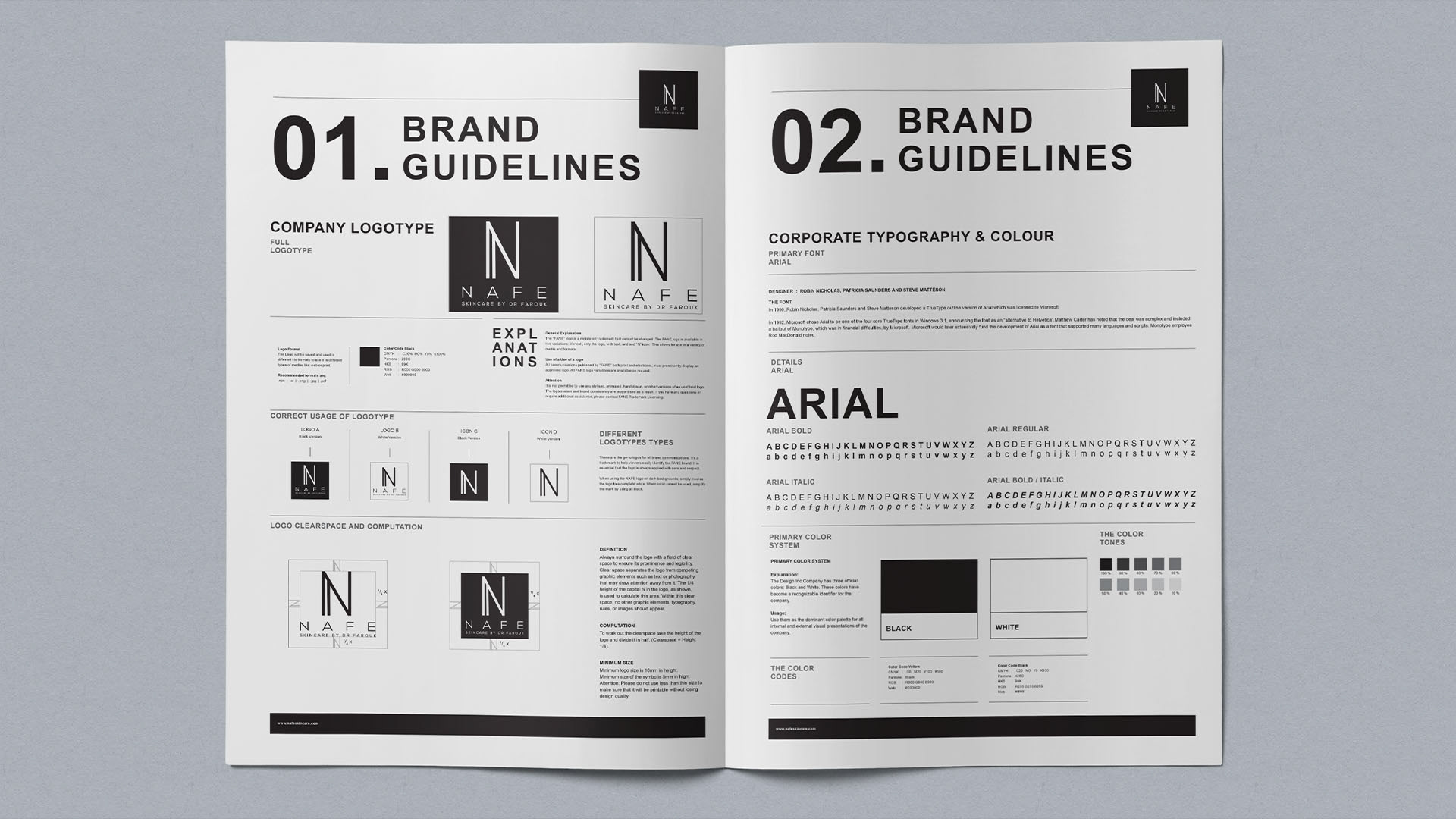
Logo Development
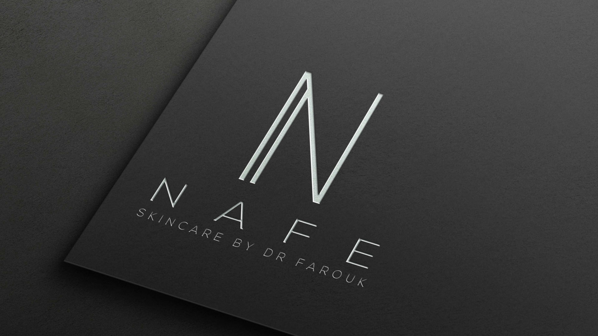
The logo development was guided by the idea of quiet confidence.

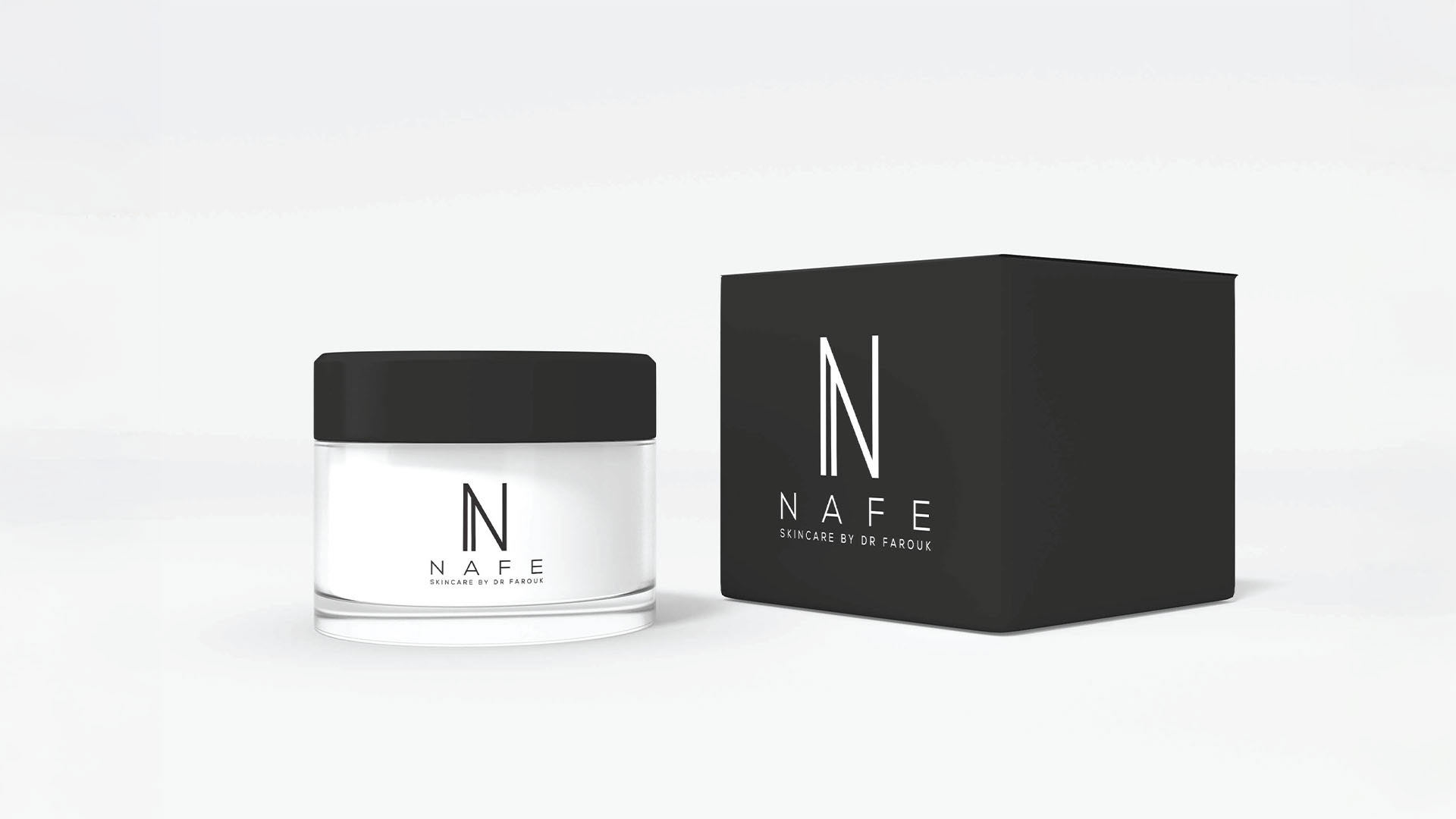
The aim was to create a mark that felt premium, balanced, and enduring. It needed to work across packaging, digital platforms, printed material, and brand communication without losing its sense of refinement.

The biggest challenge was avoiding the usual traps of luxury branding. Overly delicate typography can feel fragile. Excessive ornamentation can feel decorative rather than meaningful. Too much minimalism can become forgettable. The logo needed to sit in the right place between elegance and strength.

The focus was placed on proportion, spacing, and rhythm. The letterforms needed to feel clean and sophisticated, while still giving the brand a distinctive presence. Every detail had to feel intentional.

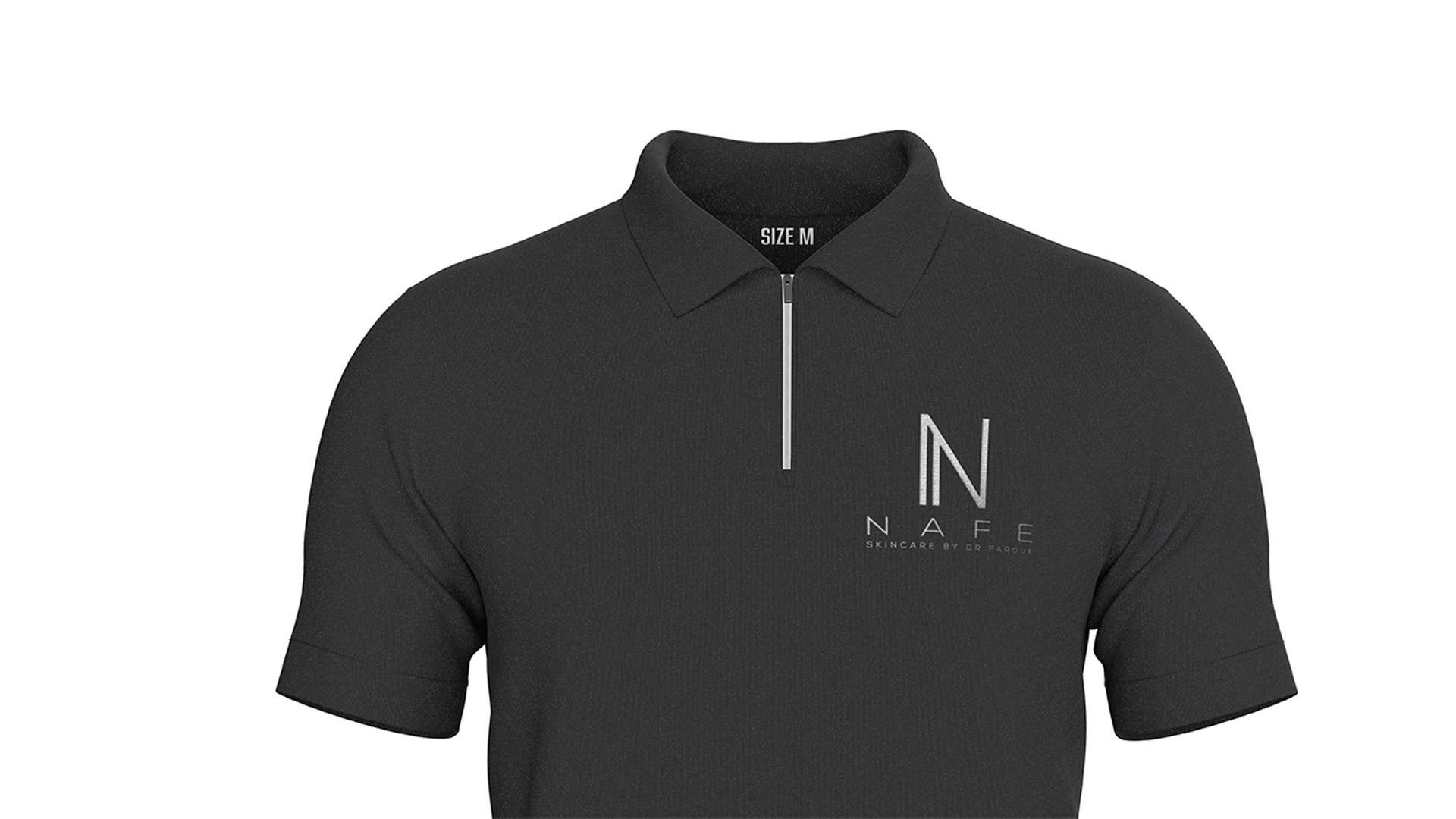
For NAFE, the logo was not treated as an isolated design element. It became the visual anchor for the entire brand system. It needed to carry the feeling of the brand before the audience read a single word.

That is where good identity design becomes strategic. It does not just identify the brand. It starts building belief.

Visual Identity Direction
The visual identity was developed to feel calm, refined, and premium. The brand world needed to support the positioning at every level.

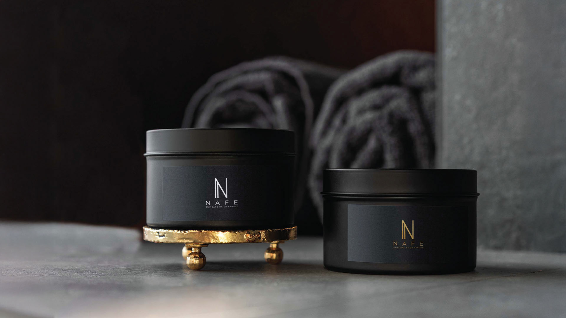
The colour palette was imagined around understated luxury. Soft neutrals, warm creams, deep charcoal, muted earth tones, and subtle metallic accents would allow the brand to feel sophisticated without becoming overly decorative. The palette needed to feel grounded and elegant, not loud or trend-led.

Typography played an important role in creating the right balance between sophistication and clarity. A refined serif could bring elegance and character, while a clean supporting sans serif could keep the communication accessible and modern.

The layout system needed to use space with confidence. In premium branding, what you leave out is often as important as what you include. Generous margins, clear hierarchy, and calm composition all help create the feeling that the brand knows exactly what it is doing.

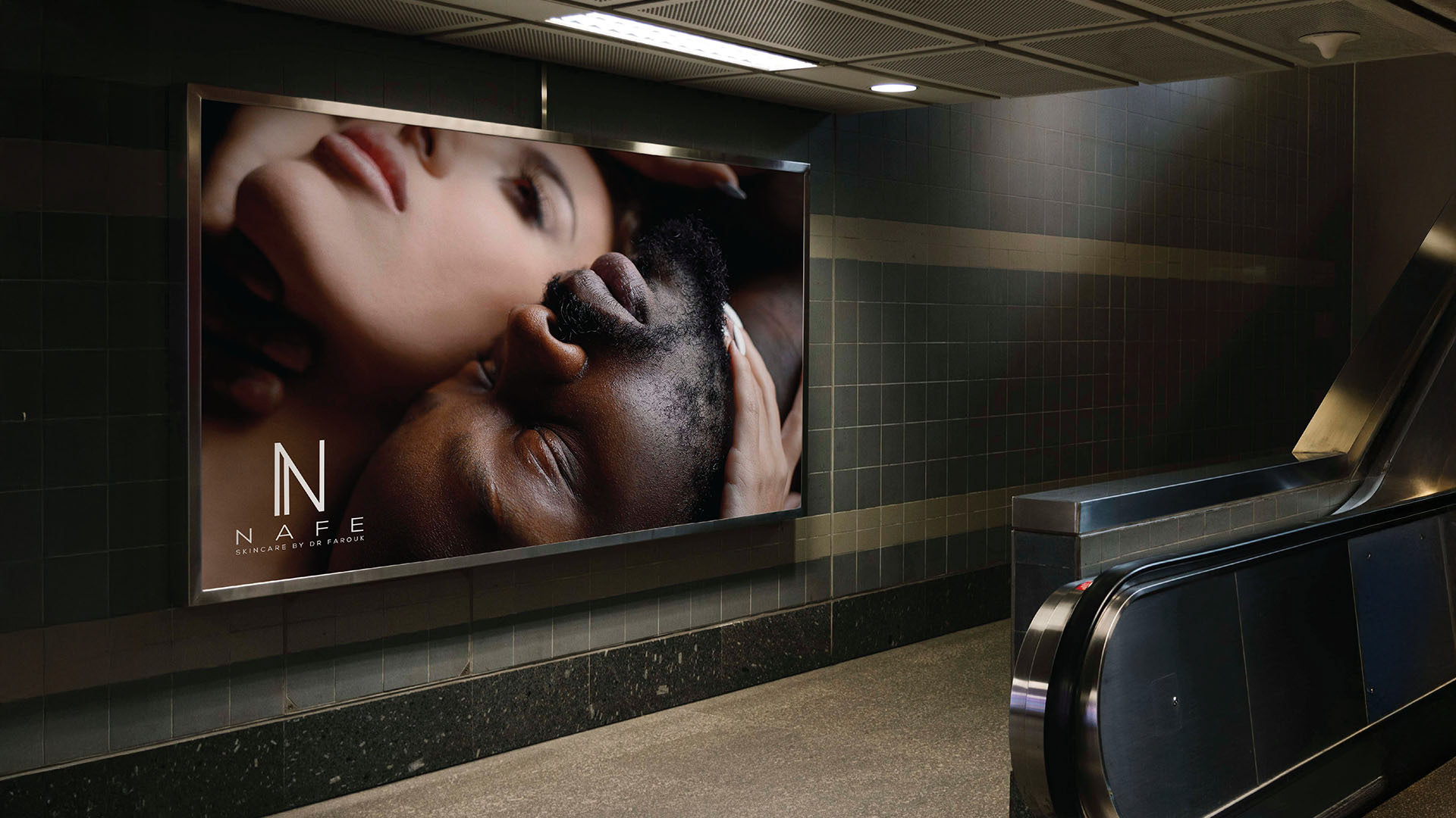
The imagery direction was designed to feel tactile and elevated. Soft lighting, close-up detail, natural textures, and controlled composition would help create a sensory connection without forcing the brand into overly staged luxury.

The visual language was built to feel composed, not cold. Elegant, not empty. Premium, not predictable.

Tone of Voice
NAFE’s tone of voice needed to match the visual restraint of the brand.

The language had to be calm, intelligent, and assured. It needed to avoid exaggerated promises, heavy jargon, or overly emotional luxury language. The goal was to communicate confidence through simplicity.

A brand like NAFE should not sound like it is trying too hard. It should sound clear, considered, and quietly certain of its value.

The voice needed to feel:
Refined | Warm | Trustworthy | Intelligent | Measured | Confident

Example lines for the brand could include:
• Designed with intention. Crafted for confidence.
• Premium quality, expressed with clarity.
• A refined product experience built on trust, simplicity, and care.

The voice supports the same idea as the visual identity. NAFE does not need to overwhelm the consumer. It needs to reassure them.

Building a Brand Experience
One of the most important parts of this project was thinking beyond the logo.

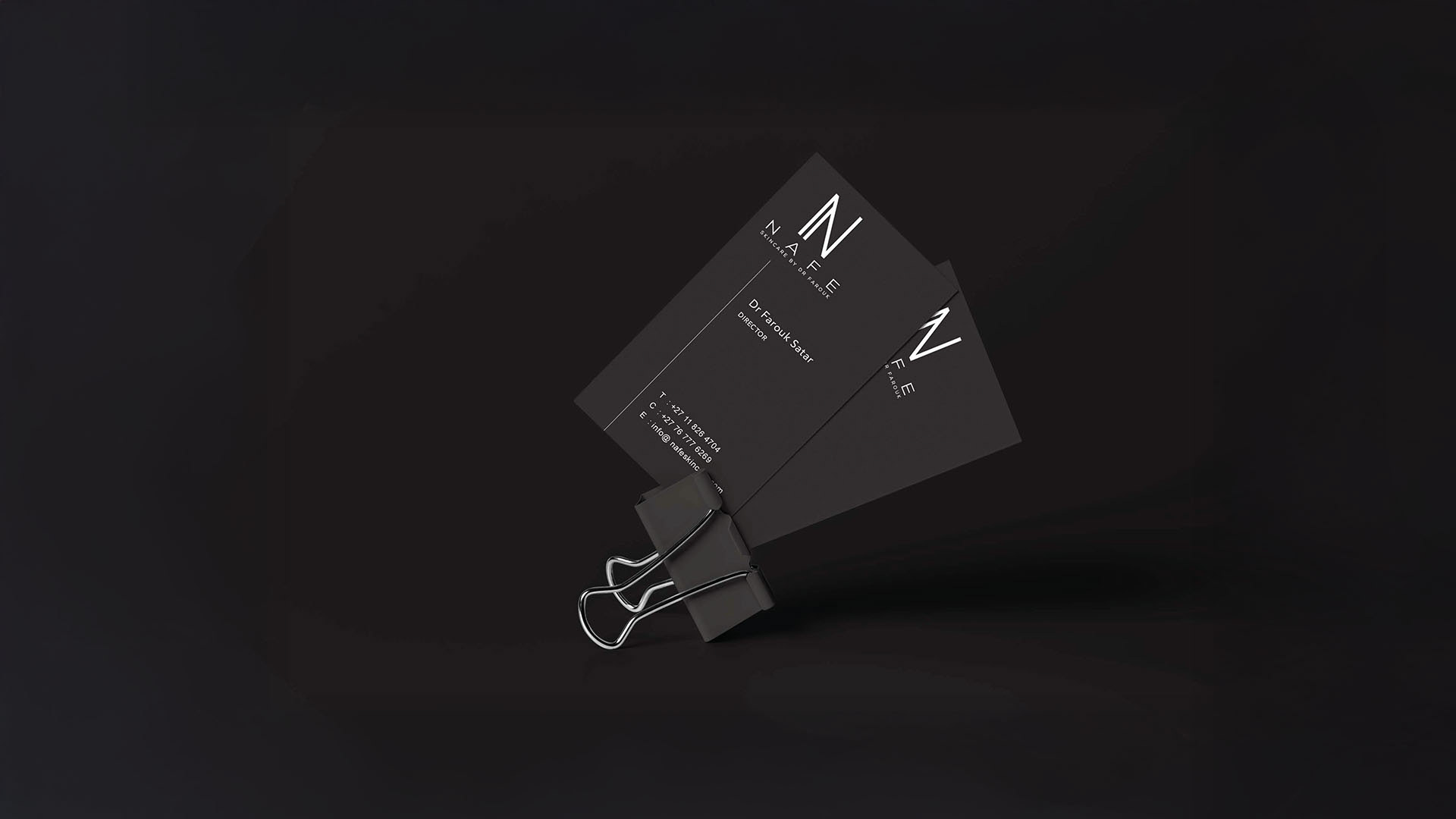
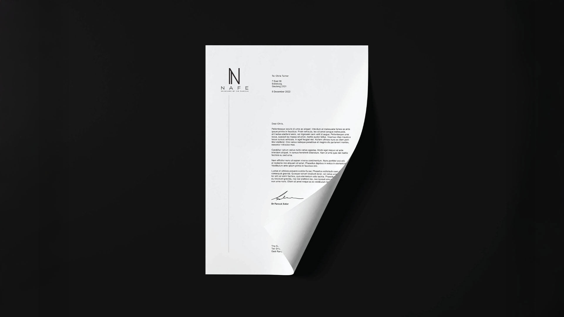
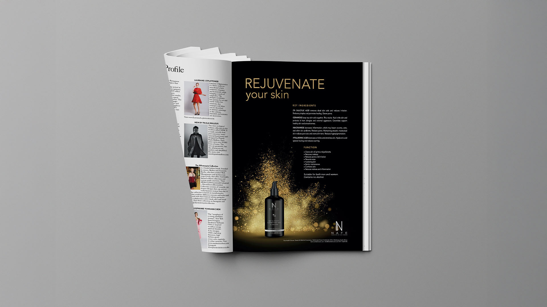
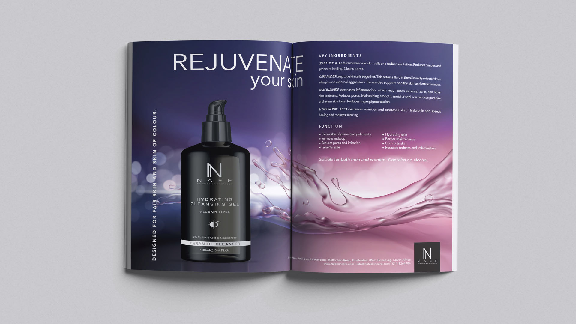
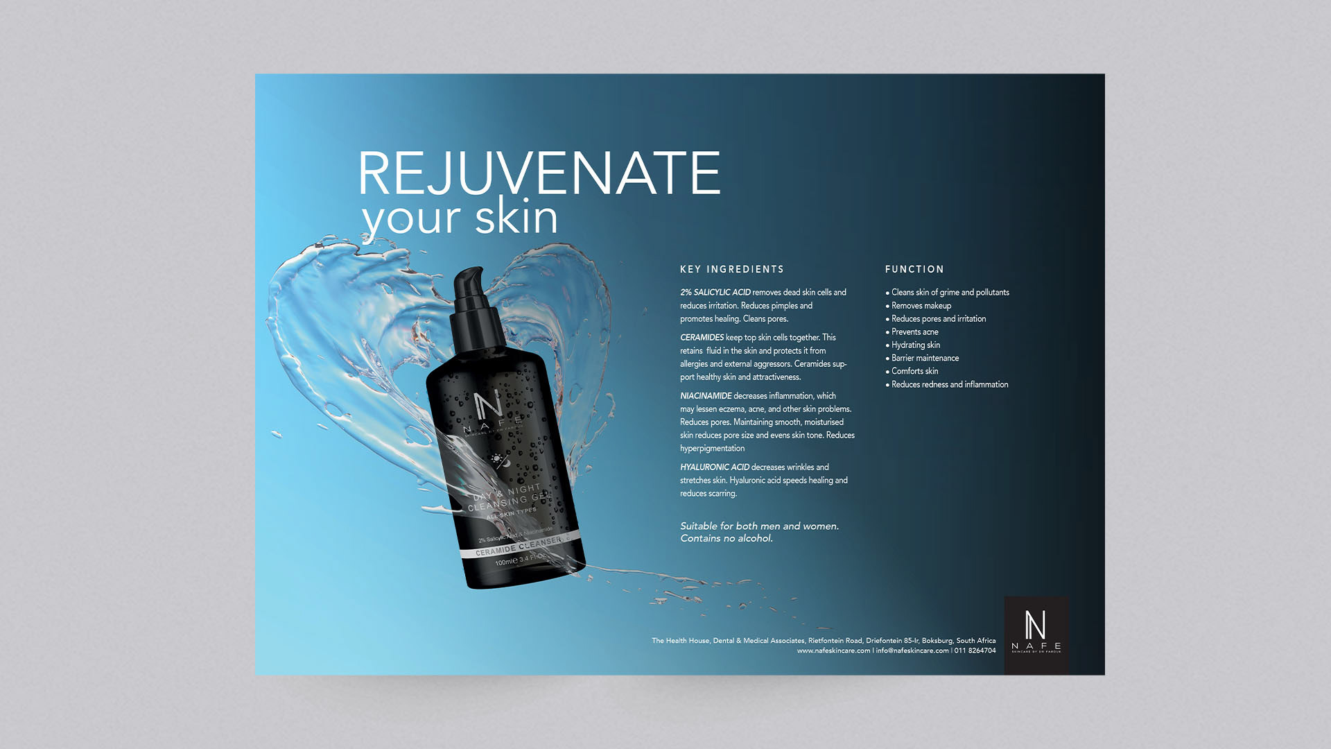
A premium brand experience is built through consistency. The consumer should feel the same sense of quality whether they are looking at the packaging, visiting the website, reading a product description, or seeing the brand in a campaign environment.

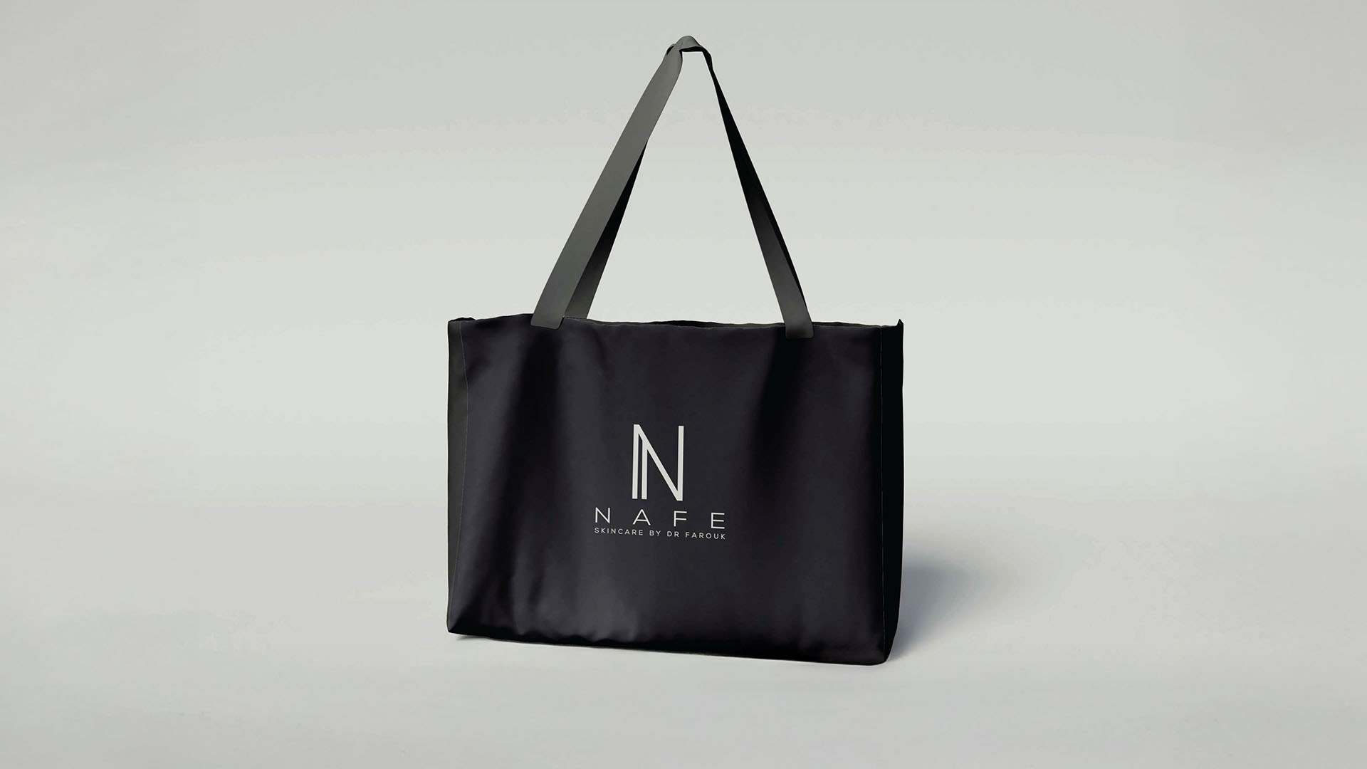
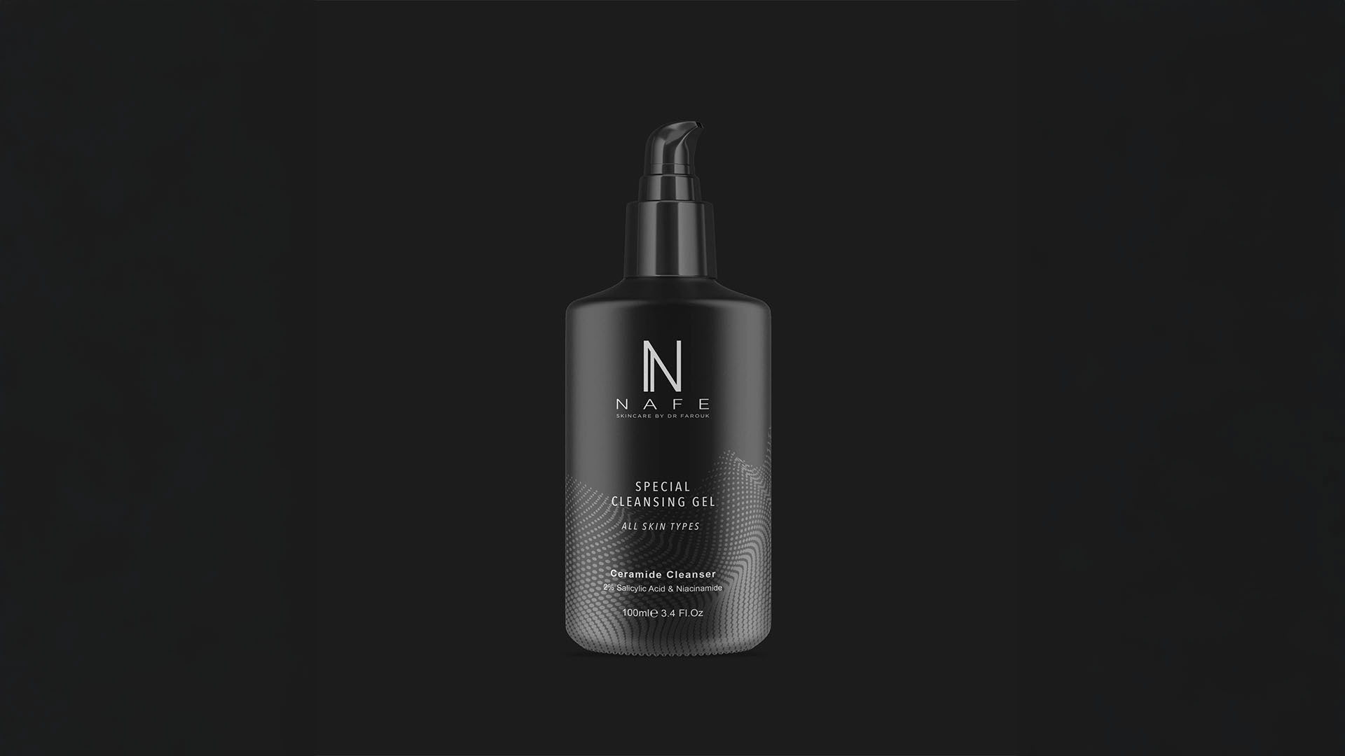
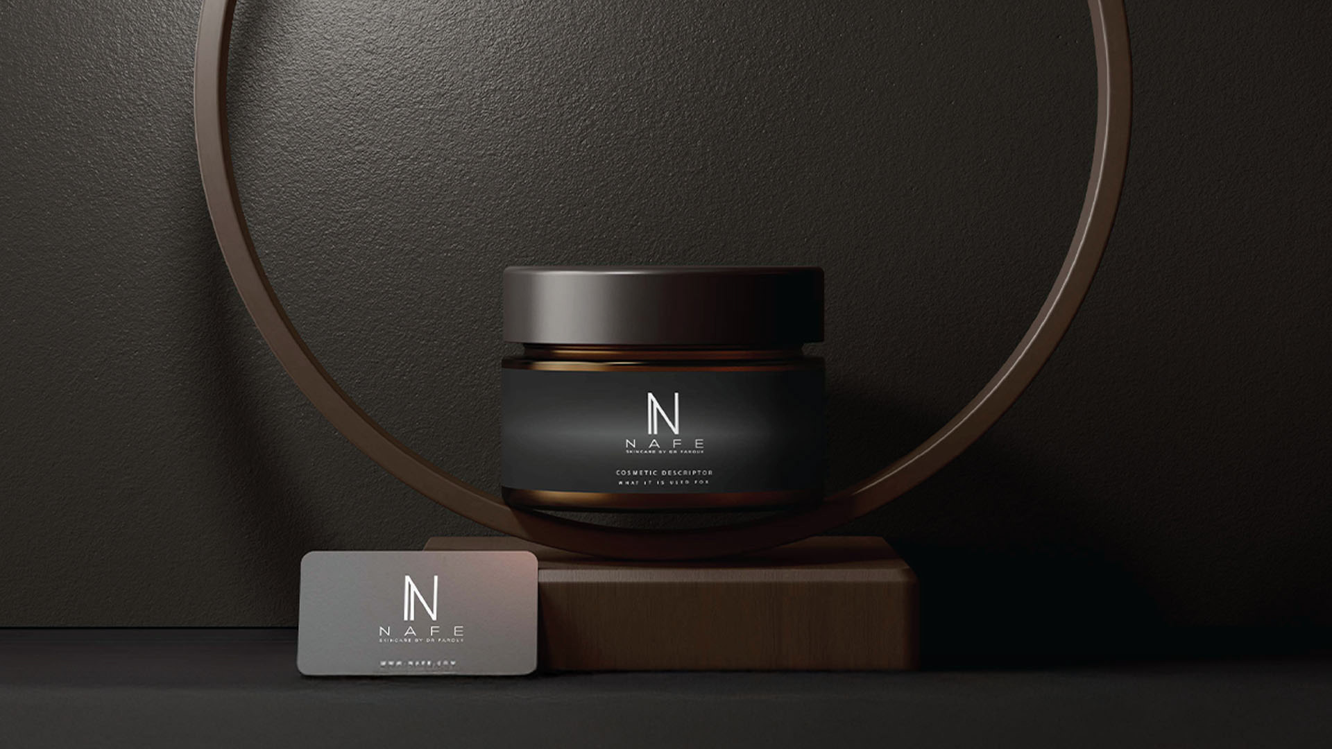
For NAFE, the packaging would carry the first emotional impression. It needed to feel beautiful, but also credible. The digital experience would then need to continue that feeling with clean navigation, clear messaging, and a refined presentation of the product story.

Every touchpoint needed to answer the same silent question:
Can I trust this brand?

The answer had to be immediate.

That is why the strategy focused so strongly on clarity and restraint. When a brand is trying too hard, the consumer can feel it. When a brand is clear about who it is, the experience becomes easier to believe.

The Outcome
The final strategy created a clear foundation for NAFE as a premium product brand.
By starting with the audience, reviewing the competitive space, identifying the market gap, and defining the brand position, the identity could be developed from insight rather than decoration. The result was a brand direction built around quiet confidence, refined design, and commercial credibility.

NAFE was designed to feel elevated without becoming distant, sophisticated without becoming complicated, and premium without relying on empty luxury signals.
For me, this is where brand strategy becomes powerful. It gives design a reason. It turns visual choices into business decisions. It helps a product move from looking good to feeling believable.

In a high-end market, beauty may earn attention. But strategy earns trust.

NAFE was built to do both.

#BrandStrategy #PremiumBranding #VisualIdentity #BrandPositioning #CreativeDirection
Back to Top