O-YONI
Intimate Wellness, Reimagined

Project Overview
This project began with a clear strategic tension: how do you create an intimate product that feels luxurious and aspirational while also distancing it from the clichés of the cannabis market?

The client wanted the product to feel premium, refined, and pharmaceutically trustworthy, while still delivering on enhancement and prolonged stimulation. It also needed to avoid the overly explicit tone so often used in sexual wellness branding. The opportunity lay in building a brand that spoke through elegance rather than provocation.

That thinking informed every part of the solution, from naming to packaging design to the tone of the visual identity.

The Challenge
The category presented two immediate barriers.

The first was the stigma surrounding cannabis. Many products in this space rely on expected visual shortcuts such as leaf imagery, loud wellness claims, or counterculture references, which can alienate consumers looking for something more refined and trustworthy.

The second was the tone of the intimate wellness market itself. Too often, products are either aggressively sexualized or so clinical that they lose all emotional appeal. The brand needed to sit confidently between these extremes.

The challenge was to create a product that felt:
• premium without being intimidating
• intimate without being explicit
• wellness-led without being vague
• pharmaceutically credible without feeling sterile
• sensual without over-sexualizing the message

Strategic Objective
The goal was to position O-YONI as a high-end intimate wellness product for consumers seeking a more sophisticated and discreet experience.

Rather than marketing the product as a cannabis item or an overt sexual aid, the strategy reframed it as a ritual of modern intimacy. This allowed the brand to speak to confidence, comfort, self-care, and refined pleasure while maintaining a tone of calm authority.

Naming Strategy
A major part of the brief involved creating a name that would distance the product from the more obvious language of the CBD and adult wellness sectors.

The name O-YONI was developed to feel elevated, memorable, and feminine without being overt. It carries a sense of intimacy and mystique while remaining elegant enough to sit comfortably within a luxury product environment. For those unfamiliar with alternative wellness products, the name reads more like boutique personal care or prestige beauty than something associated with the cannabis industry.

That was an important strategic move. The name had to open the door rather than trigger assumptions.

Brand Positioning
O-YONI was positioned as a premium, water-based CBD-infused intimate lubricant designed for consumers who value discretion, hygiene, quality, and emotional sophistication.

At the core of the positioning was the idea that pleasure could be communicated through ritual, care, and design rather than through overt sexuality. This made the brand more appealing to a broader, more design-conscious audience, especially those who may be hesitant about both cannabis-led branding and explicit adult product aesthetics.

Positioning Statement
O-YONI is a luxury intimate wellness brand that combines botanical innovation, hygienic design, and understated elegance to create a more refined and trustworthy pleasure experience.

Product Strategy
The product itself was central to the brand story.

O-YONI was designed as a water-based formula, an important functional feature because it reduces the likelihood of irritation and lowers the risk of infection compared with less compatible alternatives. This immediately supported the brand’s wellness-led and hygiene-conscious positioning.

The formula was also intended to enhance pleasure and support more prolonged stimulation, but the communication strategy deliberately avoided overly graphic or exaggerated messaging. Instead, the benefit was framed through language around sensation, ritual, comfort, and connection.

This helped shift the product from being seen purely as a sexual aid to being understood as part of a more elevated personal care experience.

Packaging Strategy
The packaging played a critical strategic role in overcoming stigma and building trust.

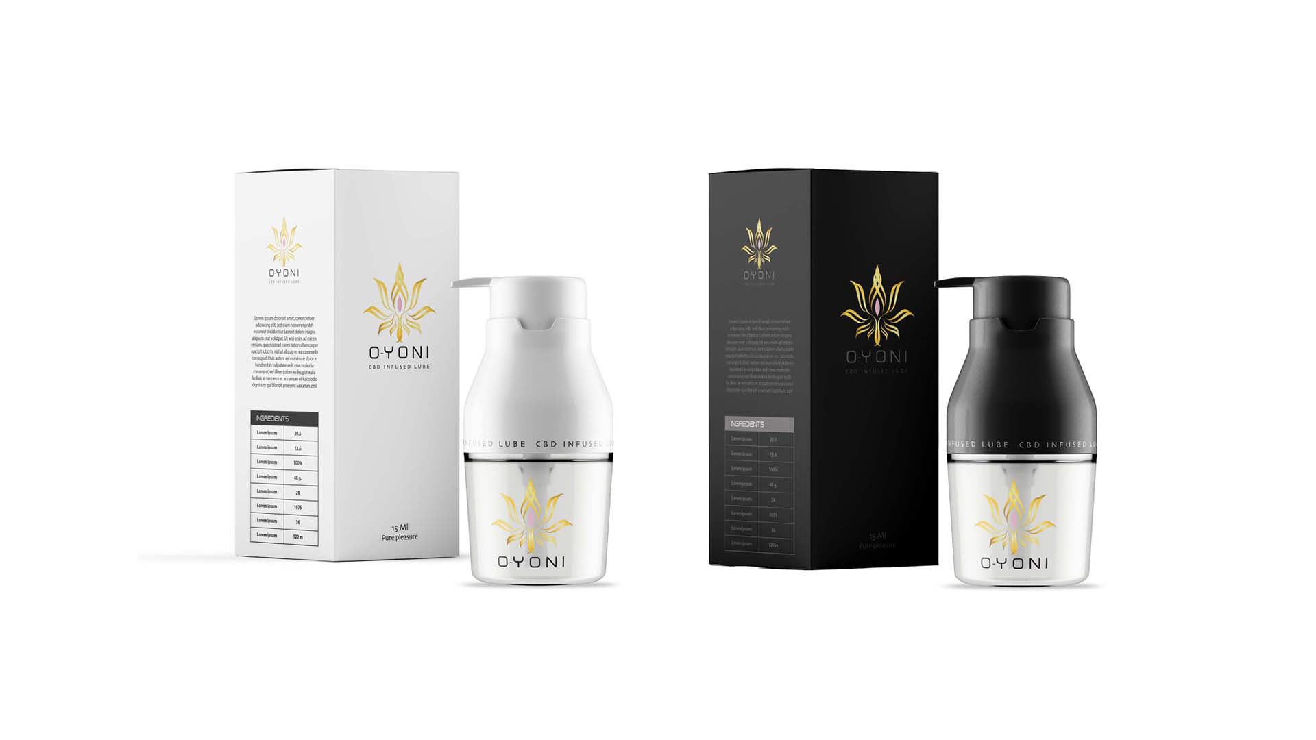
The visual language needed to move away from both cannabis clichés and over-sexualized category codes. Instead, the design direction leaned into minimalism, calmness, and premium restraint. The use of white, black, soft metallic detailing, and generous negative space helped place the product closer to luxury skincare or boutique wellness than traditional adult retail.

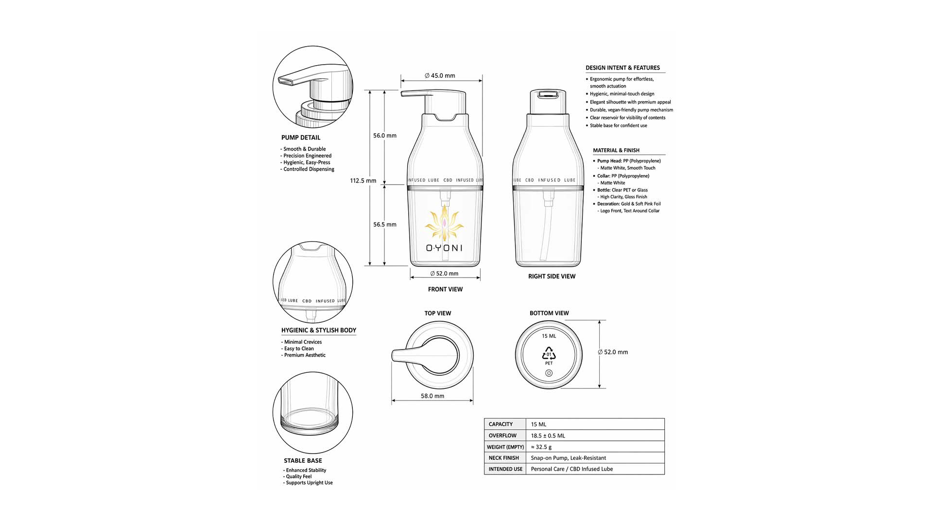
The bottle itself was designed with ease of use and hygiene in mind.

Key considerations included:
• a pump mechanism for controlled and effortless application
• minimal contact during use to support hygiene
• a stable, elegant silhouette that feels premium in-hand
• a clean, refined form that consumers would feel comfortable leaving visible

This was not just a packaging exercise. The bottle became part of the strategy. Its form communicated discretion, quality, and trust before a single word had to explain it.

Creative Direction
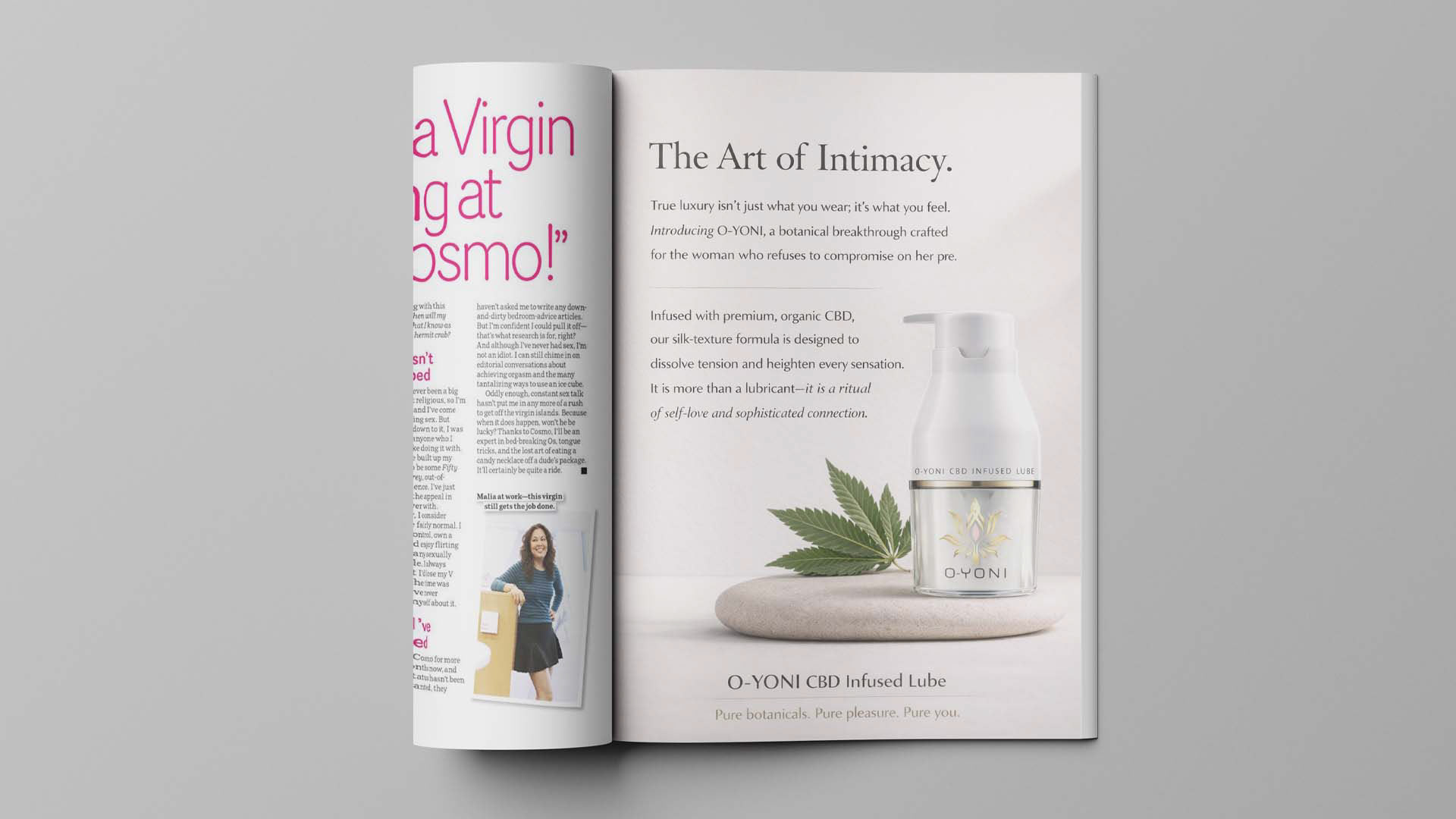
The overall art direction was built around the idea of The Art of Intimacy.

Rather than relying on explicit sensuality, the creative system used softness, restraint, and elevated composition to communicate desire in a more sophisticated way. The imagery, typography, and palette were all intended to support a sense of ritual and refinement.

The result was a brand world that felt:
• sensual but tasteful • premium but accessible • intimate but calm • modern but timeless

This allowed O-YONI to stand apart in a market that often mistakes subtlety for weakness. Which is a very human habit. Loud does not automatically mean convincing.

Messaging Approach
The messaging strategy focused on creating emotional resonance without tipping into cliché or vulgarity.

Instead of speaking in exaggerated sexual language, the copy framed the product around:
• self-care • comfort • confidence • ritual • sophisticated connection

This gave the brand a more mature and premium tone while still clearly signaling its role in intimate wellness.

The phrase “The Art of Intimacy” captured that balance particularly well. It elevated the conversation and positioned the product as something designed to enhance experience, not exploit it.

Target Audience
O-YONI was aimed at consumers looking for a more refined alternative within intimate care.

Primary audience
Women who are wellness-conscious, design-aware, and seeking intimate products that feel luxurious, hygienic, and discreet.

Secondary audience
Partners and premium consumers who want an intimate product that feels elevated, trustworthy, and giftable, rather than overt or novelty-driven.

This audience is more likely to respond to a brand that resembles prestige beauty or boutique wellness than one that looks coded for the alternative market.

Brand Outcome
The final solution gave the client a brand that felt category-defining rather than category-following.

O-YONI succeeded in creating distance from the expected visual language of the cannabis sector while also avoiding the tired tropes of the sexual wellness market. Through thoughtful naming, strategic positioning, and product-led packaging design, the brand became a more elegant expression of intimate care.

It presented pleasure as something refined, hygienic, and self-assured.

More importantly, it made space for a product that consumers could approach without embarrassment, confusion, or distrust.

Key Brand Attributes
O-YONI was built to embody the following qualities:
• discreet • luxurious • hygienic • modern • credible • sensual • sophisticated • wellness-led

Final Reflection
O-YONI was about more than designing packaging for a CBD-infused lubricant. It was about reshaping perception.

By carefully balancing naming, form, tone, and positioning, the project transformed a potentially stigmatized category into something elevated and emotionally intelligent. The final brand invites consumers into a more modern view of intimacy, one grounded in confidence, discretion, hygiene, and care.

It does not rely on shock, gimmicks, or category stereotypes. It relies on design, trust, and restraint. And that is exactly what gave it power.
Back to Top