CULTURAL COMMUNICATION | EDITORIAL STRATEGY | ART PUBLICATION
Executive Snapshot
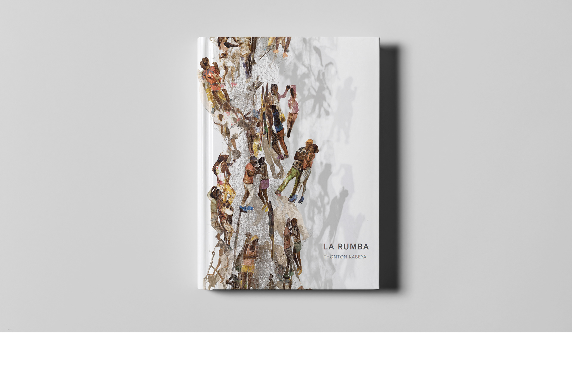
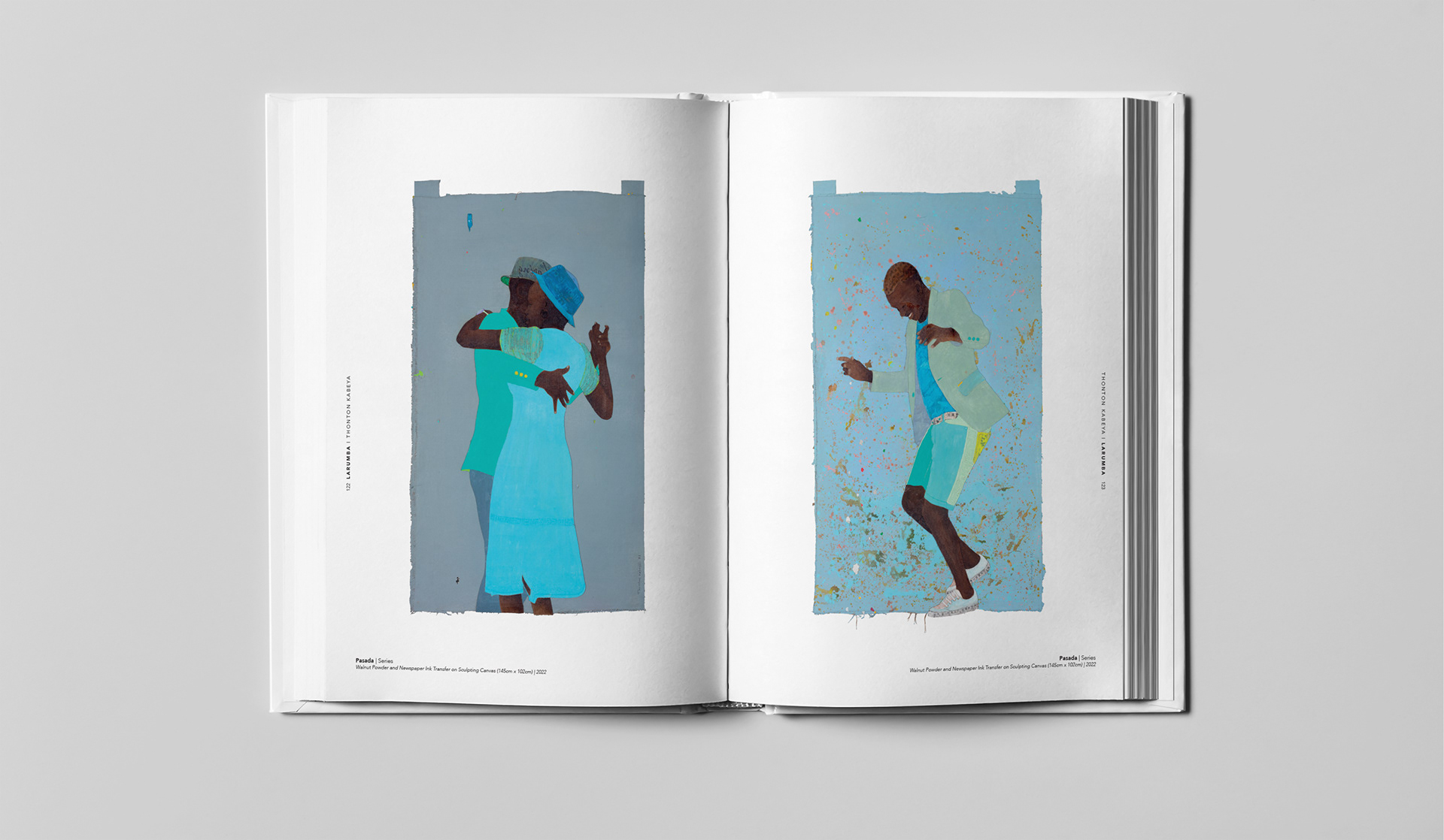
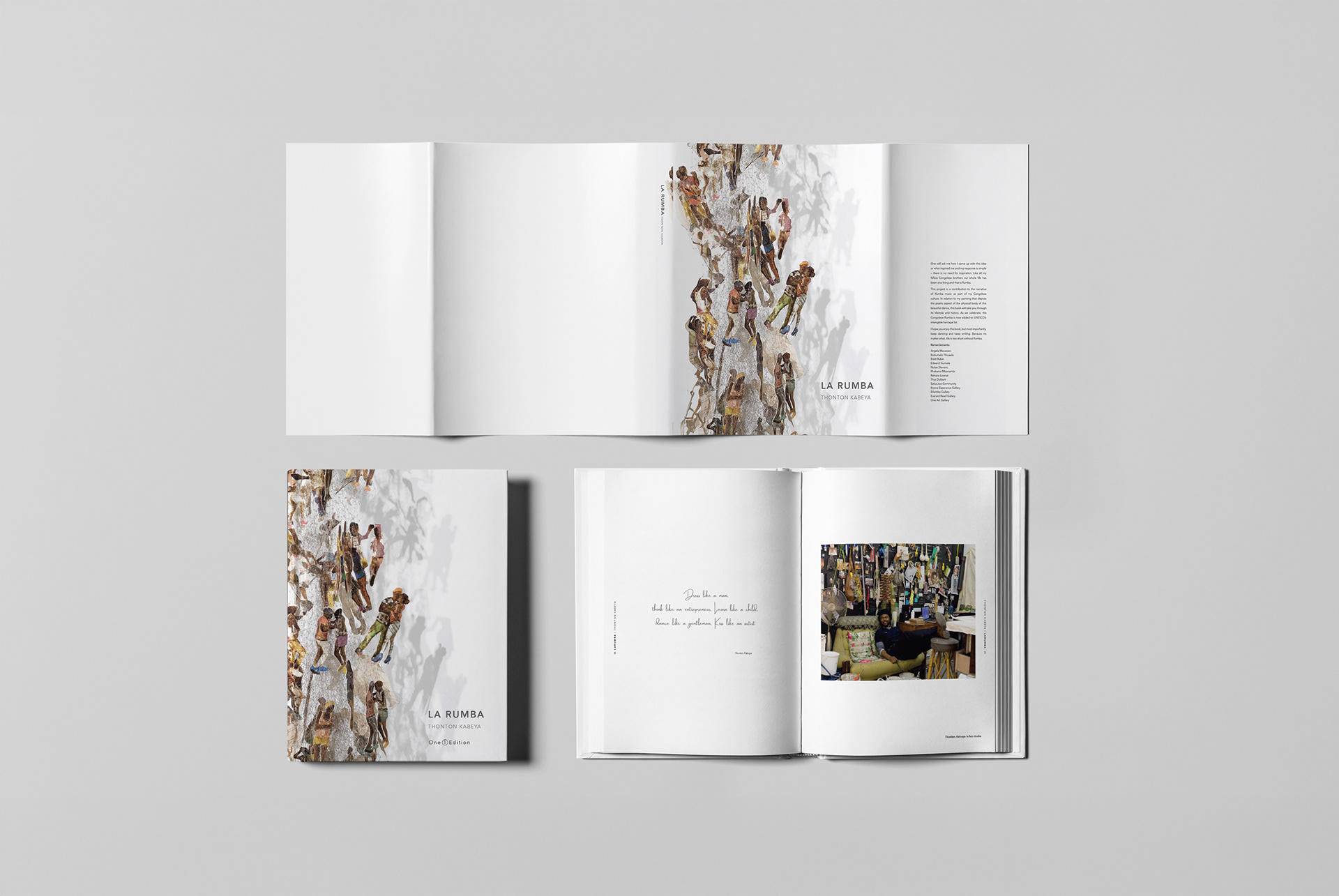
LA RUMBA is a 2022 African art book documenting Congolese-born, Johannesburg-based artist Thonton Kabeya.
Dance becomes a narrative device connecting identity, African history and resilience. The publication needed to work as a gallery-grade art object, a coherent story and a translation-ready book.
The Communication Challenge
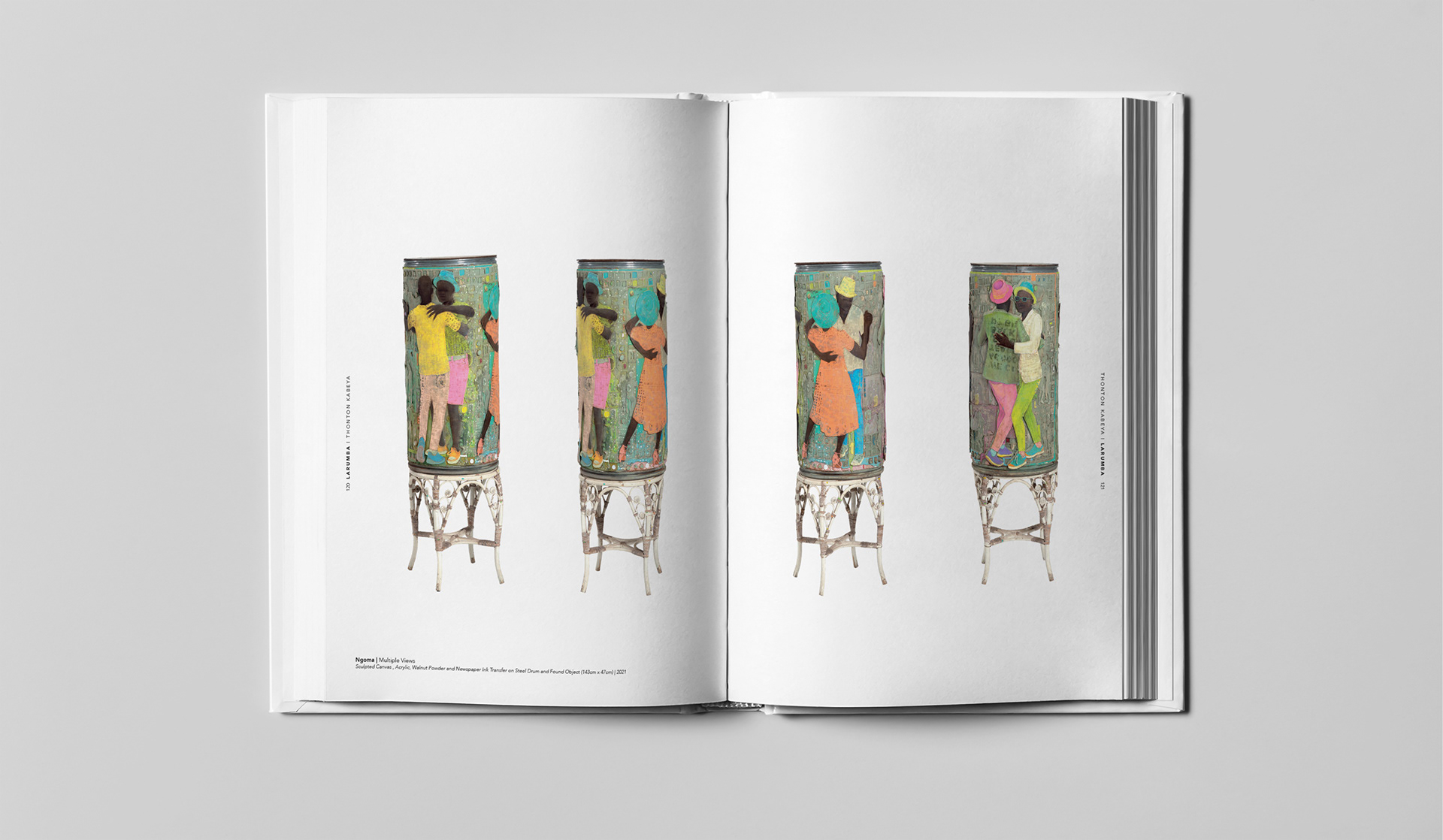
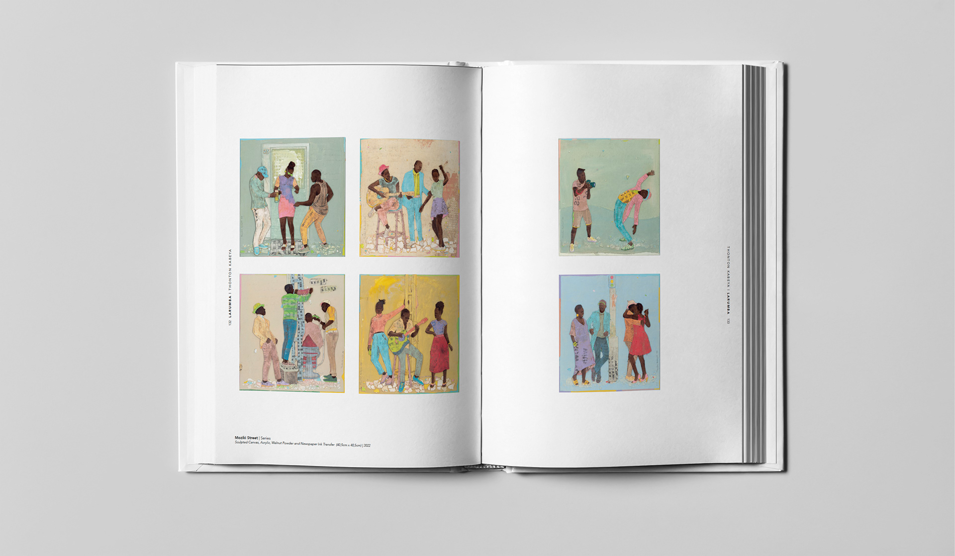
LA RUMBA could not read like a conventional catalogue. It moved between dancing couples, architectural pieces, sculptural works, artist statements and contextual writing.
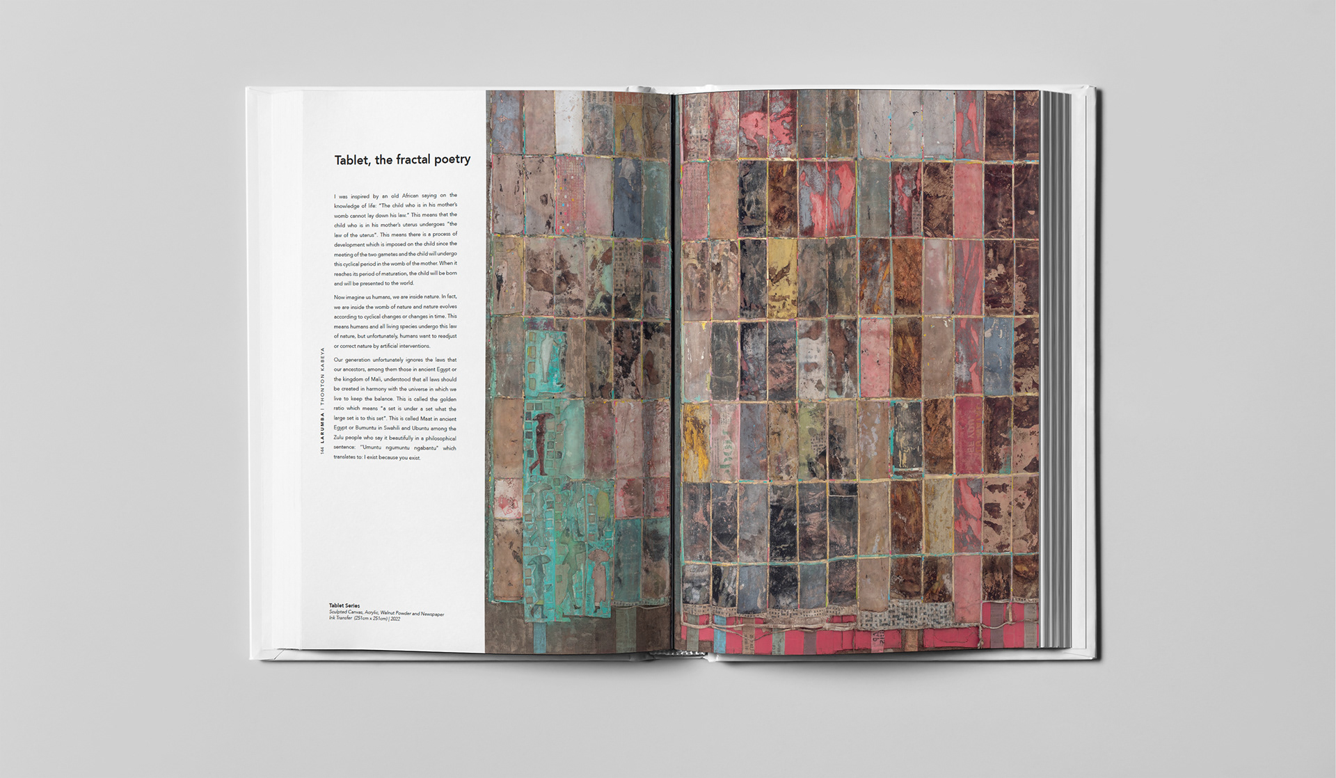
Each body of work required its own presence within one narrative. The book also needed to explain Kabeya’s sculpting-canvas process without reducing it to a technical feature.
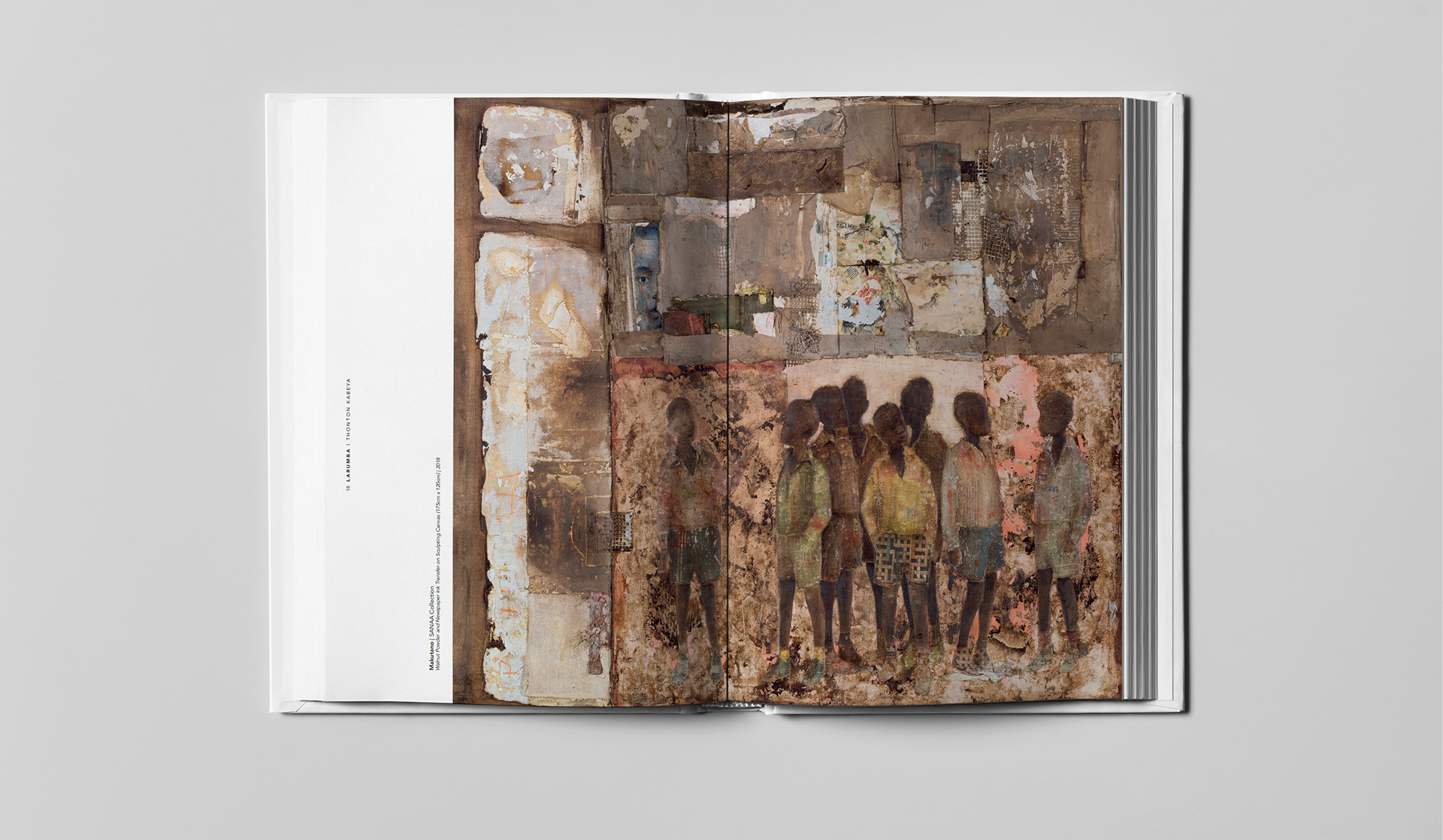
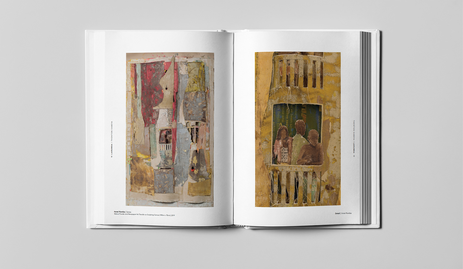
Important details extended across many artwork edges. Standard cropping or forced scaling could remove meaning. English and French editions also required flexibility for changing text lengths.
My Role
As Creative Consultant, Strategist and Designer, I worked directly with Thonton Kabeya to connect artistic intent, editorial structure and production craft. I led creative direction, defined the publication system, managed the typesetter and proofreader, and assisted with selected photography.
The Communication Response
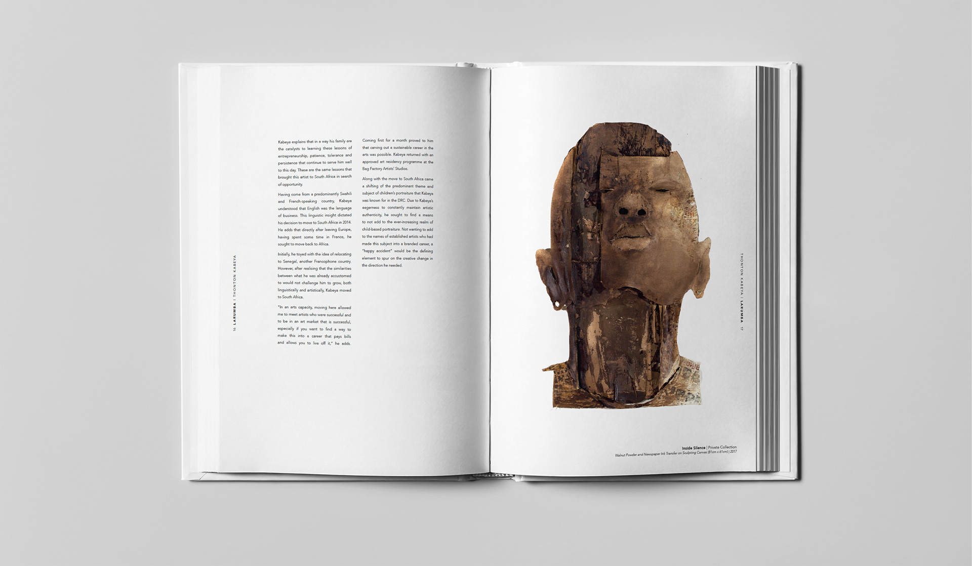
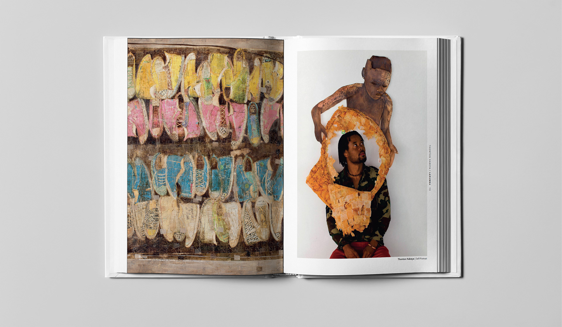
I structured the book as a journey through theme, process and distinct bodies of work. Chapter pacing alternated quiet text pages with high-impact catalogue spreads. Hero images established each series, while close details revealed texture, colour and material transitions.
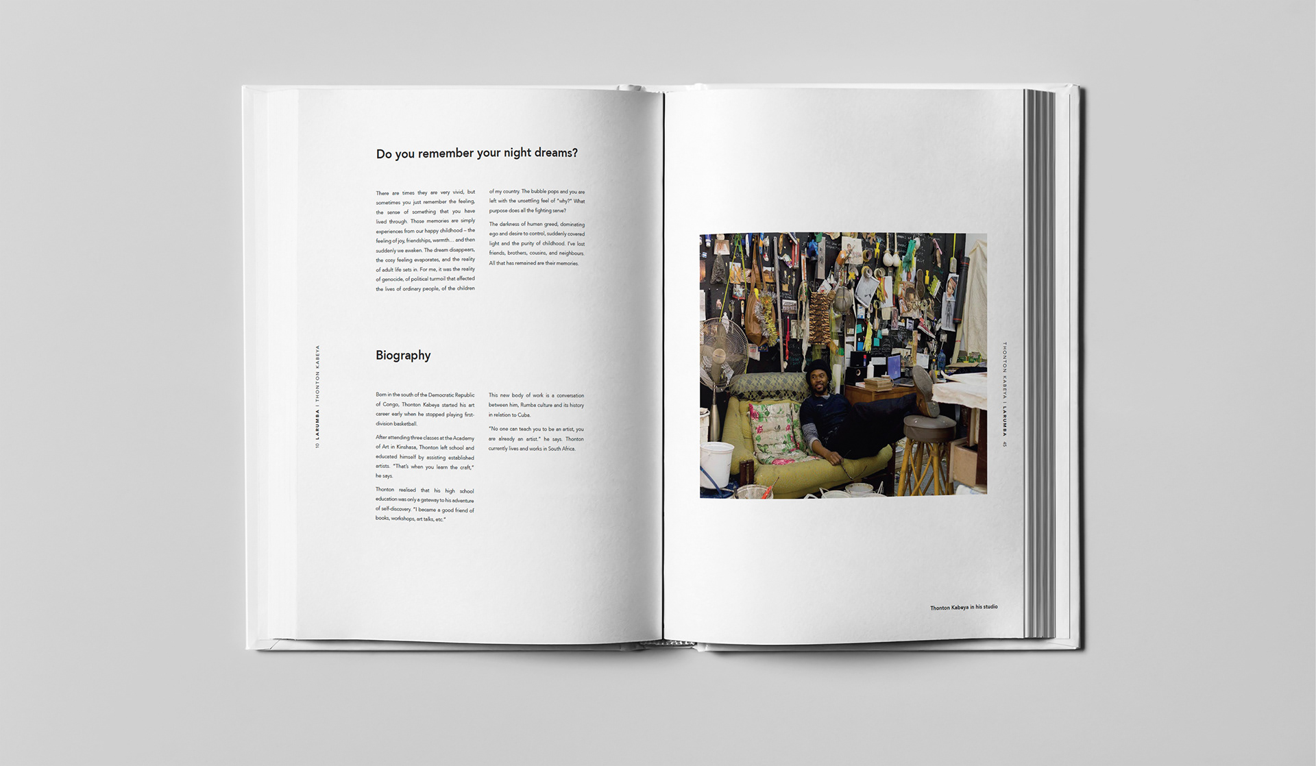
A consistent grid, typography hierarchy and caption system connected works of different sizes. Every artwork followed a deep-edge rule. Its perimeter was treated as part of the work, not spare margin. Scaling and cropping standards protected visual detail.
Background colours supported themes of African spirituality, history and resilience. They created rhythm between sections without competing with the artwork.
The layout accommodated text expansion for planned English and French editions. Titles, essays, captions and credits could change length without breaking the structure.
Communication and Brand Value
LA RUMBA translated Kabeya’s practice into a cultural narrative. It connected his process, themes and bodies of work through one communication system.
For galleries, collectors and cultural audiences, it offered more than documentation. It created a reading experience that preserved the artist’s intent and gave the work room to speak.
What This Project Demonstrates
Cultural brand communication, publication strategy, creative direction, editorial design, typography, visual storytelling, art handling standards, bilingual content planning and production leadership.
View the Art Book
Explore the publication strategy, chapter flow and design system.