INVESTOR COMMUNICATIONS | INTEGRATED REPORTING | EDITORIAL DESIGN
Executive Snapshot
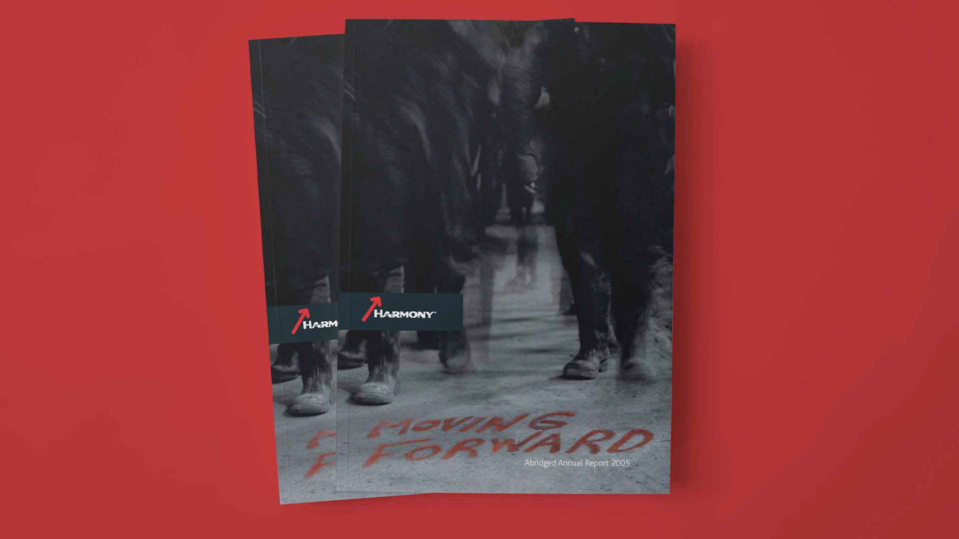
Harmony Gold’s 2005 annual report was produced while the mining company was restructuring and repositioning for growth. It connected operations, exploration, mineral resources, sustainability, governance, financial statements and investor relations within one reporting system.
The publication was an early move toward integrated reporting, before the practice became standard corporate communication.
The Communication Challenge
Mining reports contain large volumes of regulated, technical and financial information. They must preserve accuracy while helping investors and other stakeholders understand the wider business story.
Harmony was expanding its reporting to include economic, social and environmental impacts through developing Global Reporting Initiative alignment. The report needed to communicate accountability and direction without weakening detail.
How could separate business narratives become one clear, credible and memorable publication?
My Role
As Creative Manager at Russell & Associates Strategic Communications, I led four designers and worked with writers, photographers, production specialists, printers and senior client stakeholders.
I directed the creative and information-design system across the annual report, mineral resources and reserves content, sustainable development reporting and investor communication.
The Communication Response
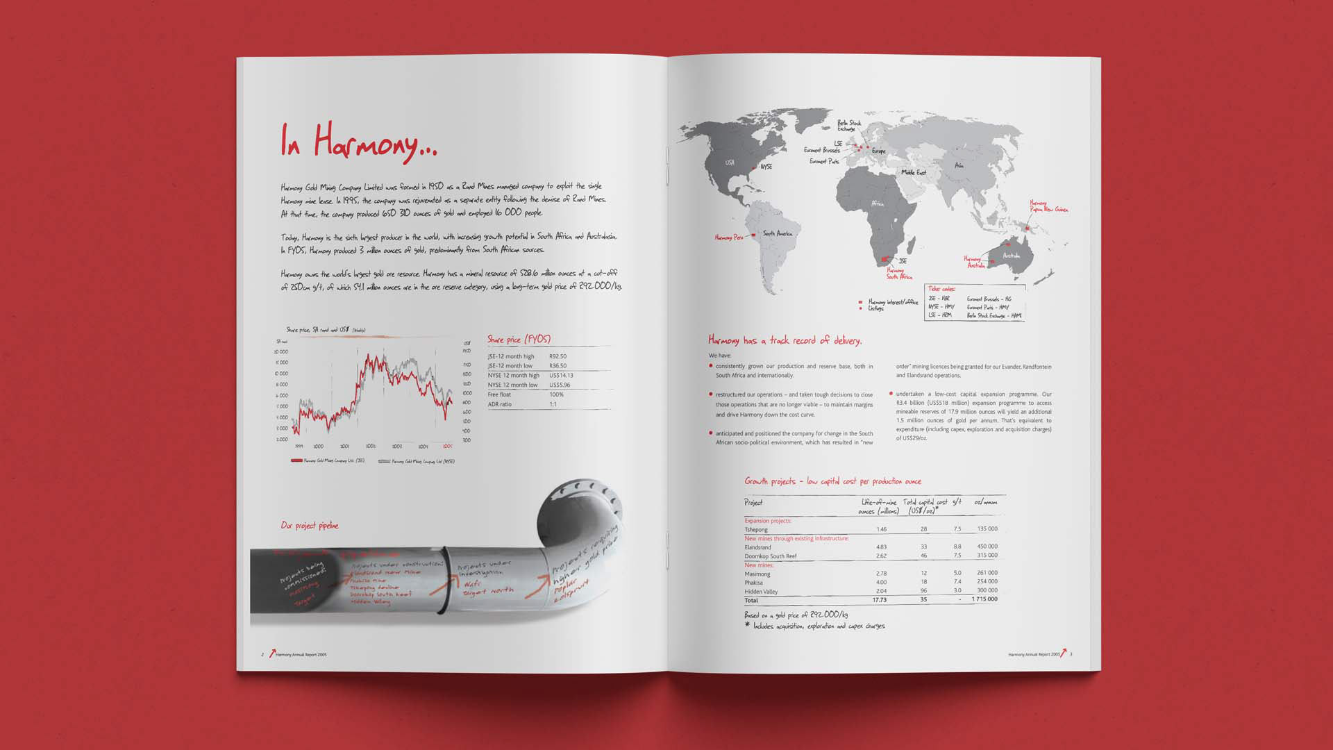
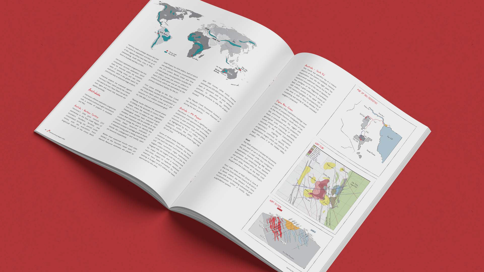
I helped structure the report as one publication with distinct but connected sections. Each subject area had a clear identity while sharing typography, image treatment and pacing.
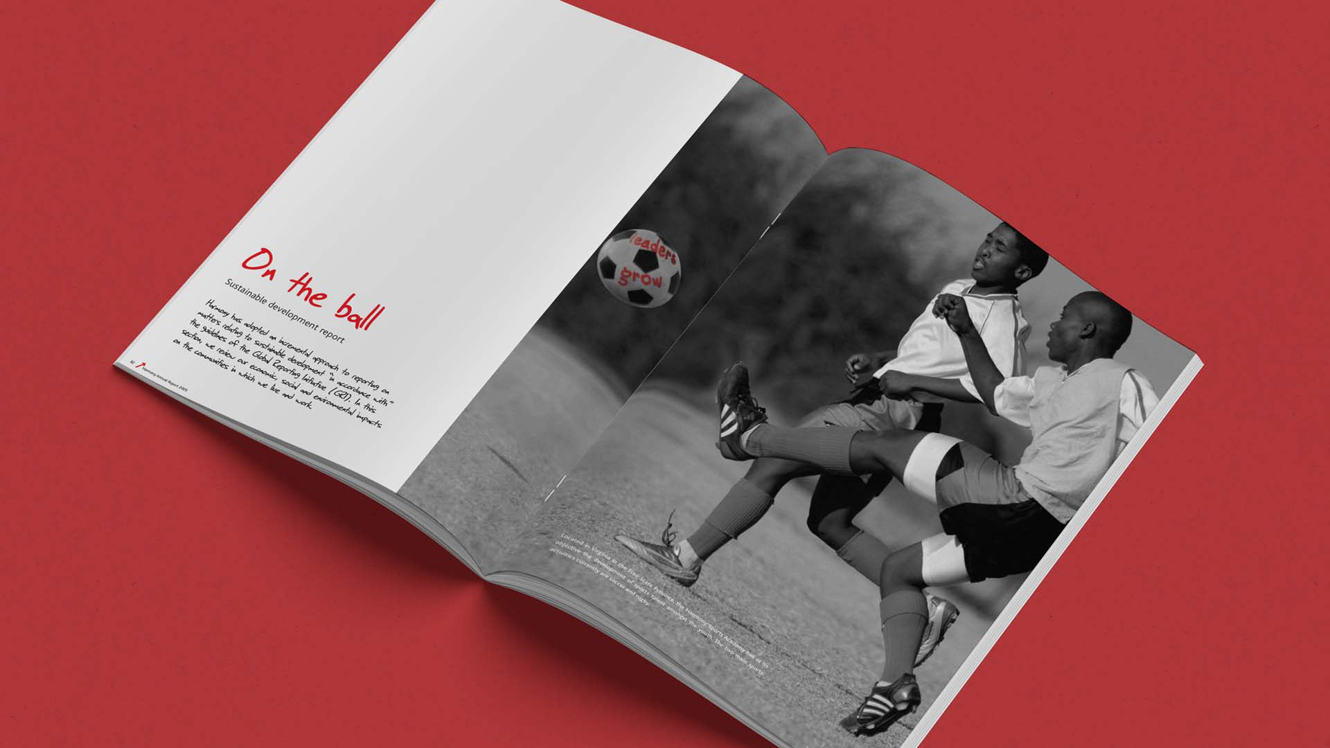
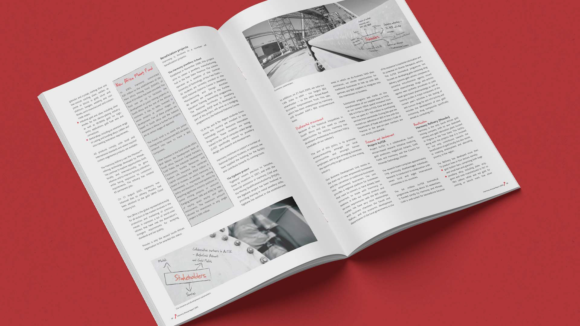
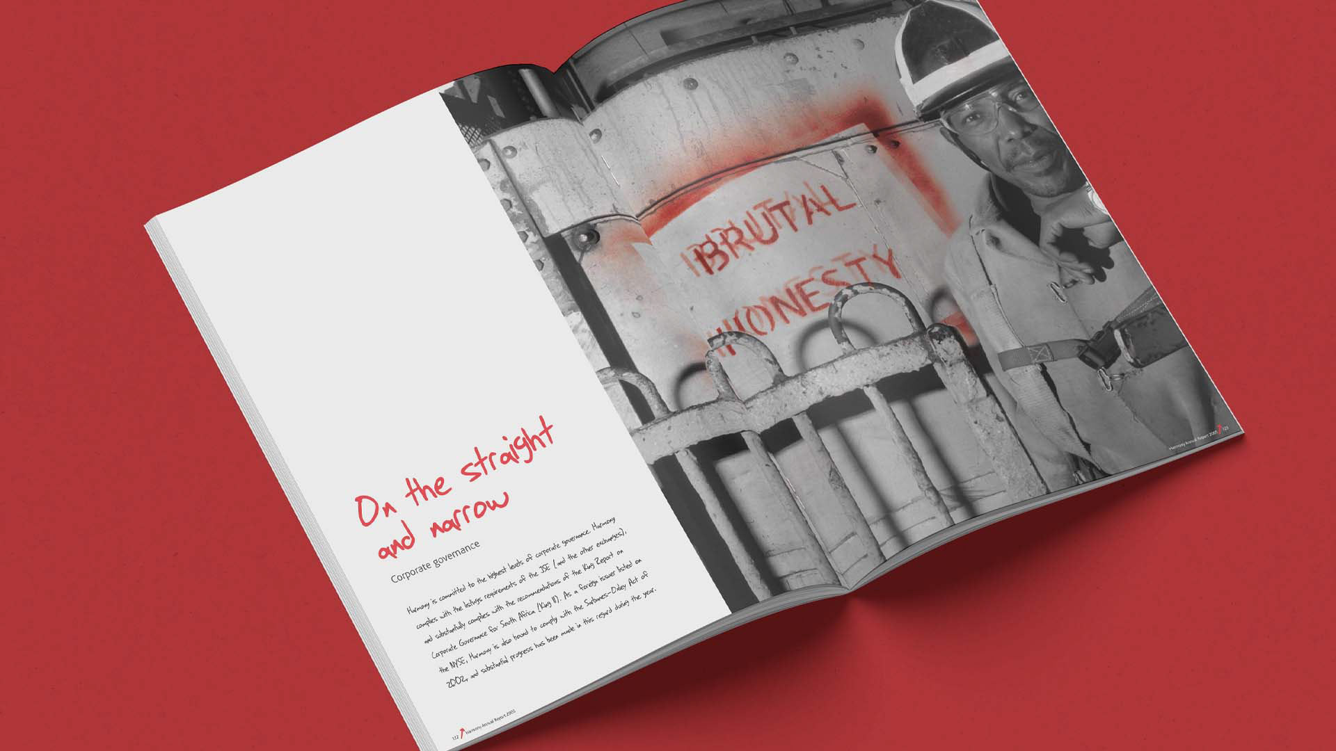
Industrial photography grounded the communication in mines, machinery, landscapes and employees. Red handwritten typography introduced a direct human voice and contrasted with the formal reporting content.
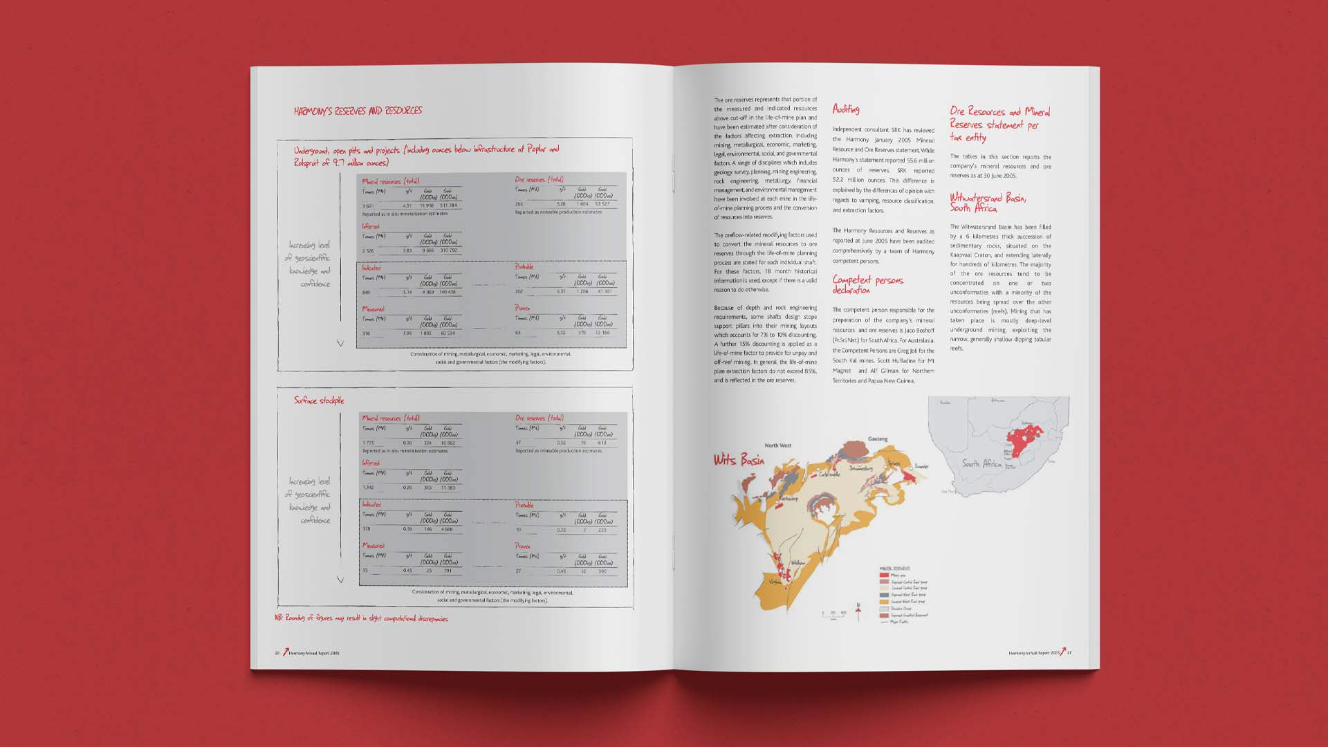
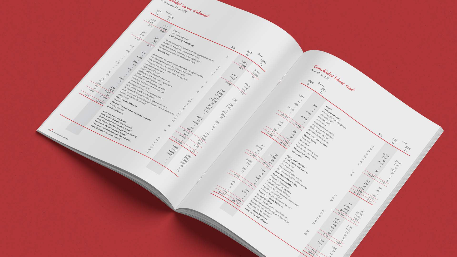
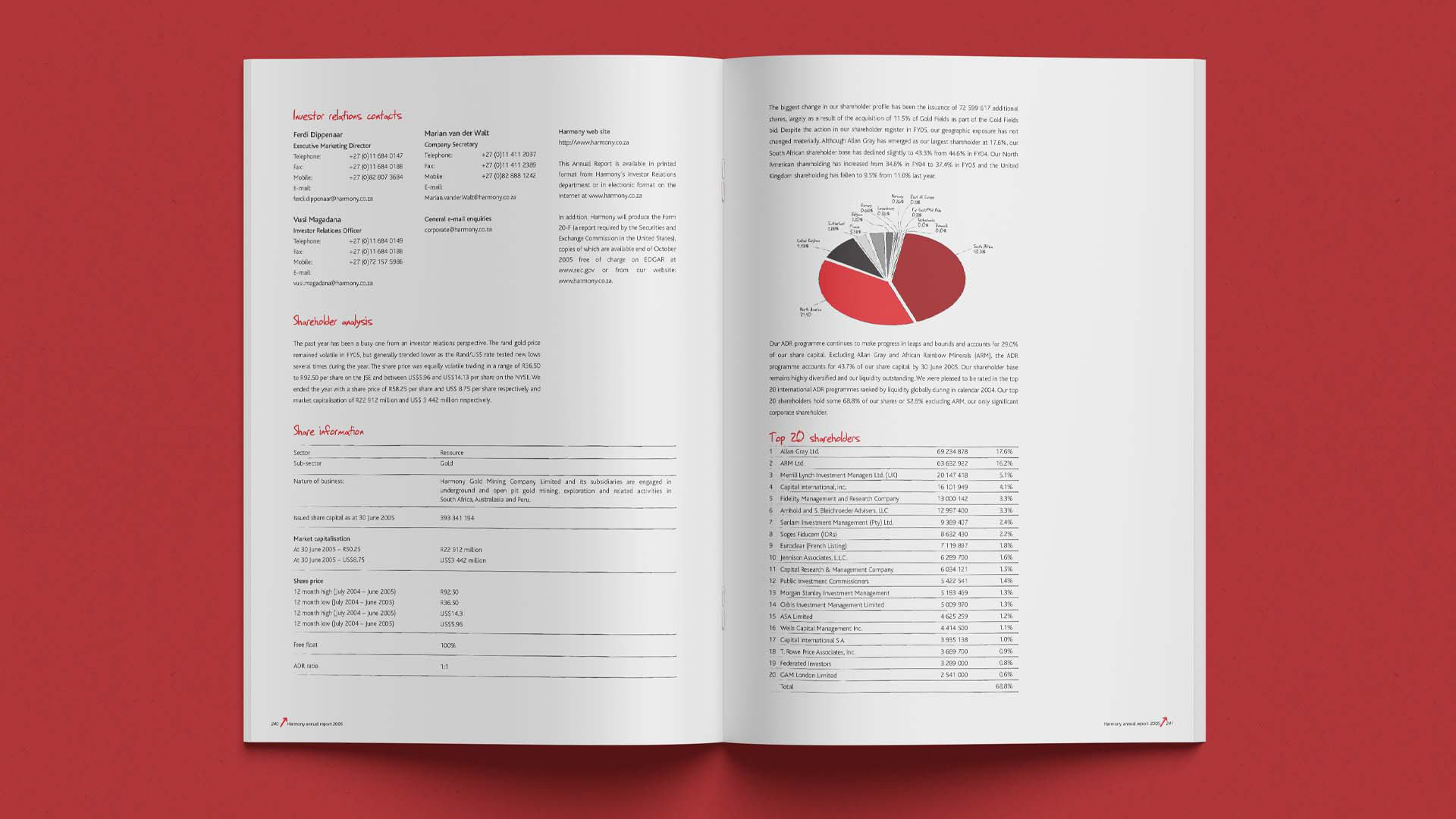
Navigation, visual hierarchy, tables, charts and callouts helped readers move between strategic messages and detailed evidence. The design made dense sections easier to navigate without removing technical substance.
Business and Communication Value
The report connected operational performance with wider stakeholder accountability. It gave Harmony a distinctive corporate voice and turned segmented reporting into a coherent investor narrative.
The work received a Gold Quill Award and earned a Loerie nomination for its communication and design.
What This Project Demonstrates
Investor communications, integrated reporting, creative leadership, team management, information design, financial and sustainability reporting, brand governance, data storytelling, editorial systems and complex production.
View the Published Report
Harmony’s archive provides the 2005 reporting suite, including operations, resources, sustainability, governance, financial statements and investor relations.