Fruitzero
Strategy for a Natural Drinks Brand
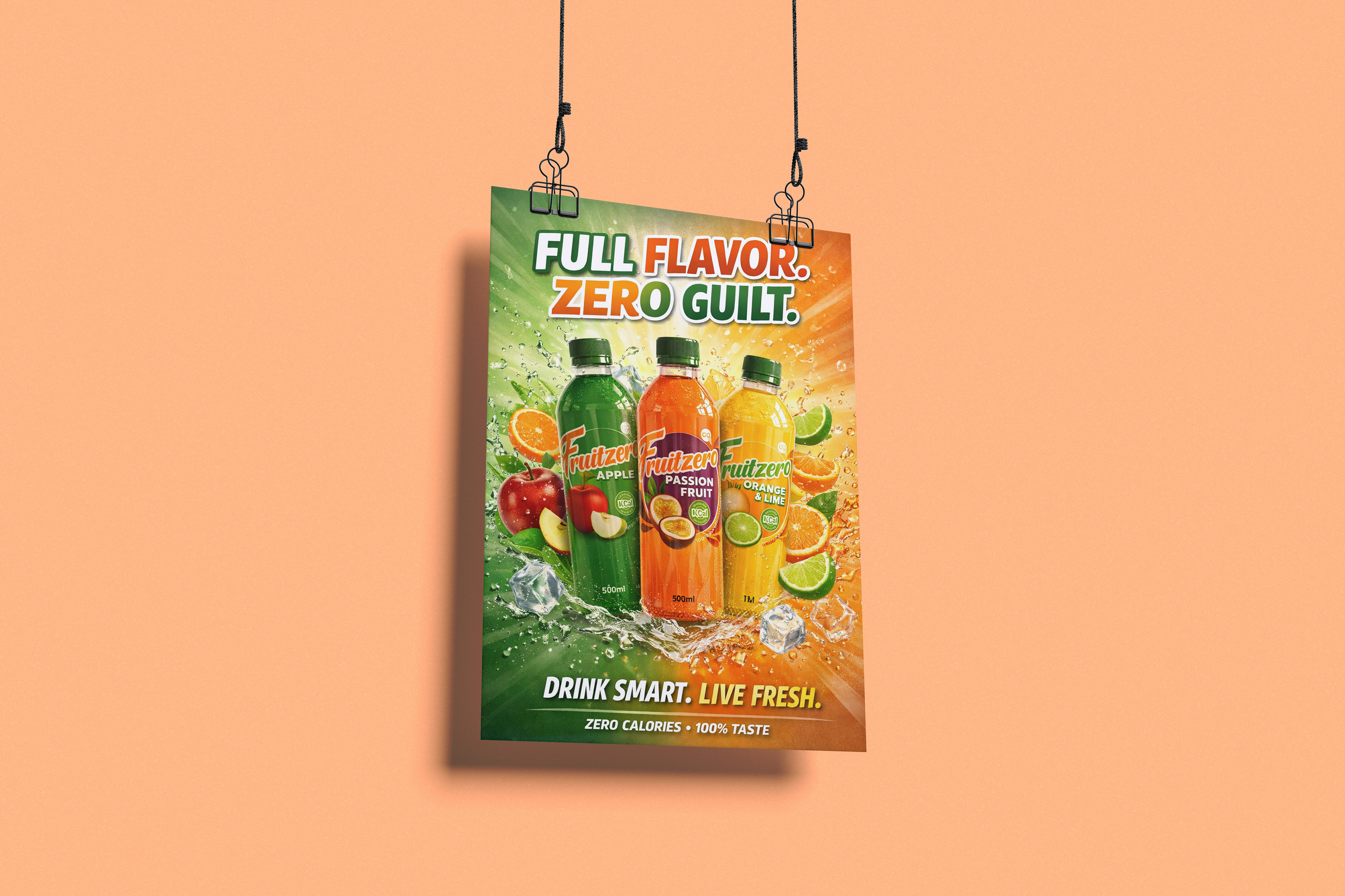
Fruitzero was developed for Vintage Green, a small South African health juice business focused on freshness, natural positioning, and better-for-you beverage choices. The brief was to create a flavored water range that could compete visually in a crowded non-alcoholic drinks market while staying true to the values of a niche wellness-led brand.
This project sat at the intersection of brand strategy, packaging design, and market positioning. In South Africa, health-conscious beverage choices have become more commercially relevant as consumers increasingly respond to no-sugar, low-calorie, and wellness-linked claims. At the same time, the bottled water category has been growing, supported by health awareness, convenience-led lifestyles, and demand for alternatives to traditional sugary soft drinks. South Africa’s Health Promotion Levy on sugary beverages has also reinforced the commercial logic of low-sugar and no-sugar beverage innovation.
For a smaller brand like Vintage Green, this created both an opportunity and a challenge. The opportunity was clear: consumers were becoming more receptive to healthier beverage choices. The challenge was equally clear: the market was competitive, visually noisy, and often dominated by larger FMCG brands with stronger budgets and wider distribution. Fruitzero therefore needed to work harder at shelf level. It needed to communicate freshness, flavor, health, and immediacy in seconds.
From a demographic perspective, the intended audience was highly relevant to the South African market. Statistics South Africa reports that people aged 15–34 make up nearly one-third of the population, at around 21 million people. That makes youth and young adults one of the country’s most commercially important consumer groups. This audience is also closely tied to urban mobility, convenience purchasing, and image-led decision-making, making packaging a critical strategic asset rather than just a branding surface.
Strategic Positioning
The design approach was built around a simple strategic idea:
make the product look as fresh as the promise.
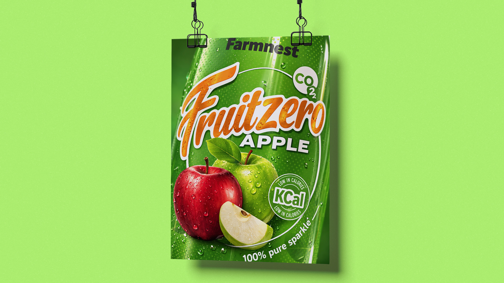
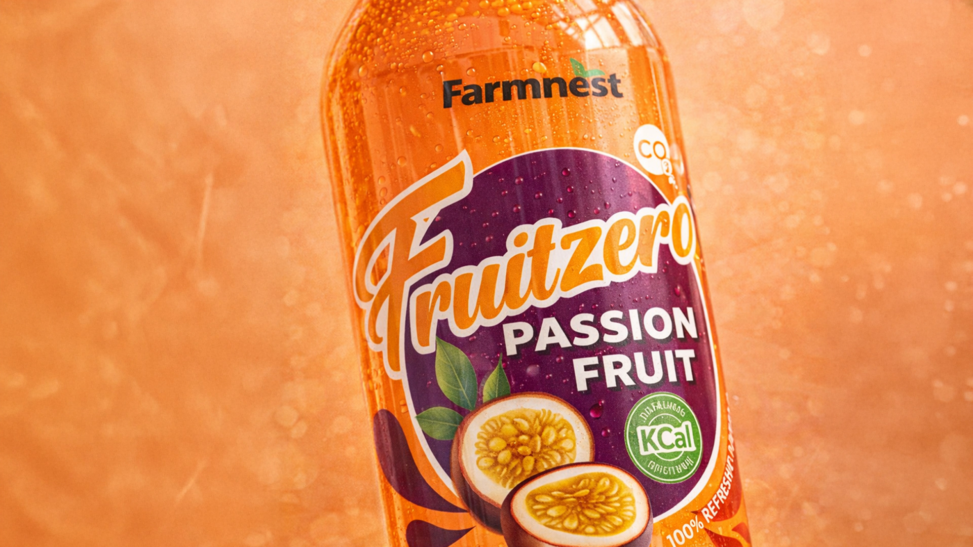
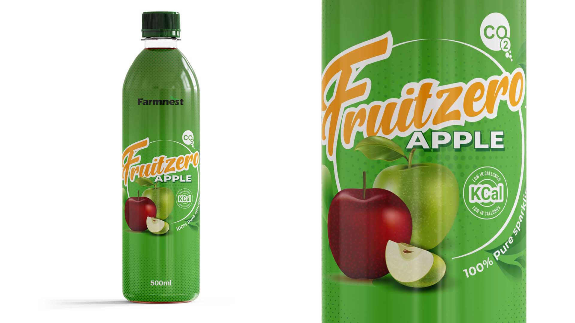
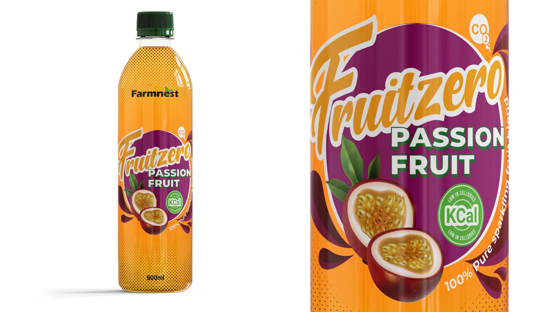
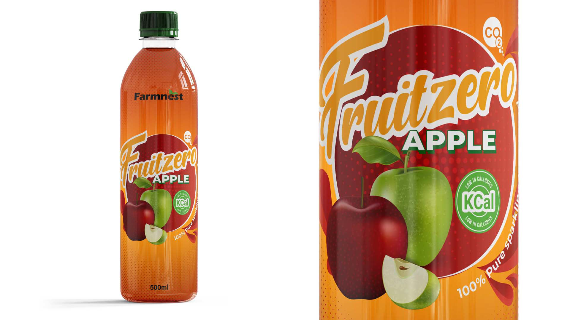
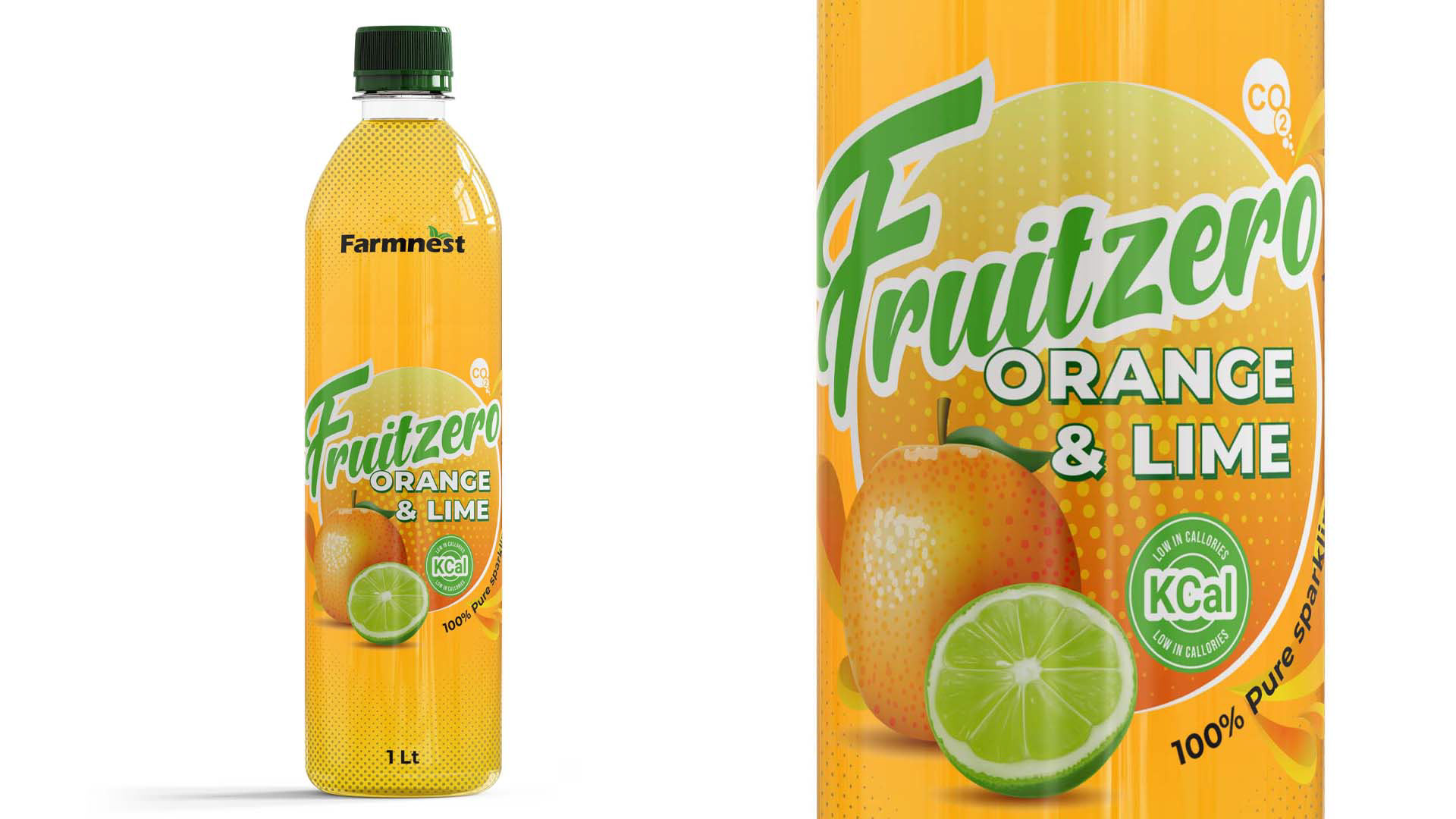
Rather than over-designing the bottle, the concept used a clear shrink-wrap style label that allowed the liquid itself to become part of the visual identity. This was important from both a branding and a consumer psychology perspective. In a category where many “healthy” drinks rely on generic cues, Fruitzero used visible liquid color, bold fruit imagery, and high-contrast flavor naming to make the product feel immediate, honest, and flavor-led.
The label stood for:
• freshness you can see
• fruit-led flavor
• a healthier alternative to sugary drinks
• an artisanal product with retail ambition
• a youthful, on-the-go lifestyle
This was not just a decorative decision. It was a strategic packaging move designed to help a niche brand compete against bigger players by turning the bottle itself into the hero.
Production Thinking: Clear Print and Shrink-Sleeve Logic
A key part of the concept was the use of a clear-printed shrink-sleeve approach. Shrink sleeves are particularly valuable in beverage packaging because they allow 360-degree graphics, conform to curved bottle shapes, and create strong shelf impact across the full container. Industry packaging sources note that shrink sleeves are used precisely for this high-coverage branding effect, and that they are applied as printed film that shrinks tightly around the bottle once heat is applied. They also allow testing for distortion so artwork performs correctly once wrapped to the final form.
For Fruitzero, this mattered in several ways:
• the transparent substrate allowed the drink color to remain visible
• the printed areas could frame, rather than hide, the liquid
• the bottle shape could still feel premium and contemporary
• the result delivered a more energetic shelf presence than a conventional opaque label
From a strategic design perspective, the production process supported the brand idea. The packaging did not merely carry the artwork — it reinforced the message that this was a lighter, fresher, more natural-feeling beverage.
Competitive Context: Natural Drinks in South Africa
South Africa’s non-alcoholic beverage environment has become increasingly responsive to health and wellness positioning. Euromonitor’s 2024 South Africa health-and-wellness sample notes that “no sugar” is a popular claim in soft drinks, reflecting a stronger consumer focus on reducing ingredients perceived as harmful. In parallel, bottled water and adjacent hydration categories continue to grow, suggesting that wellness, convenience, and portability are shaping beverage choice.
That context is important for this project. Fruitzero was not trying to outspend larger beverage companies. It was designed to out-position them within a niche that is becoming more relevant: smaller, health-oriented brands built around natural cues, cleaner choices, and visually led authenticity. That is part of a broader rise of niche businesses in South Africa, where consumers increasingly look for products that feel more aligned to lifestyle, wellness, and individuality. This last point is an inference based on the growth of health claims, bottled water demand, and low/no-sugar positioning in the category.
Challenges and Solutions
Challenge: Competing in a crowded beverage market
The South African drinks market is full of bold color, heavy branding, and established FMCG codes. A small natural brand risked being overlooked.
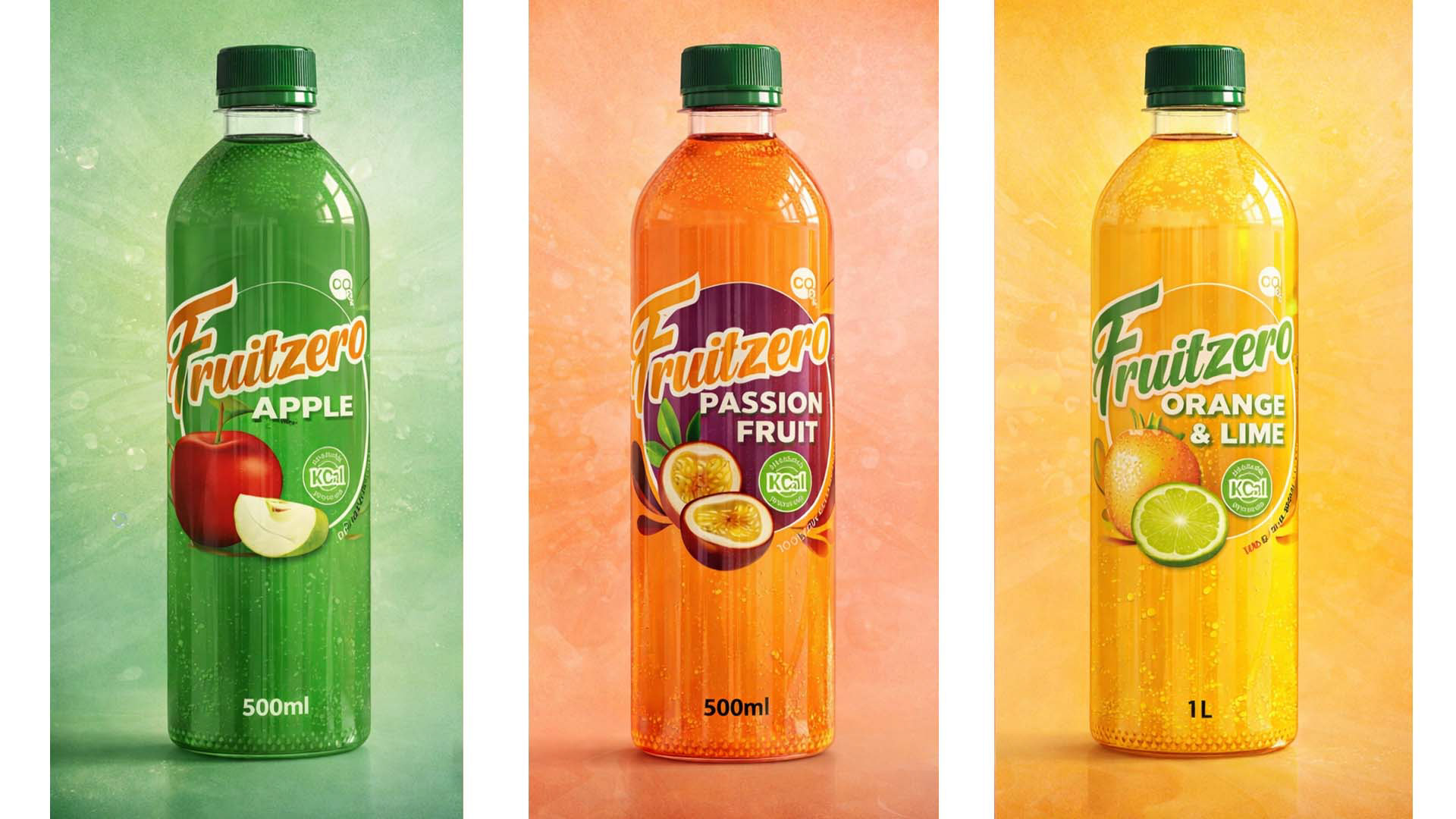
Solution: Create a packaging system that used the product color as part of the design language. This increased standout while making the bottle feel fresher and more ownable.
Challenge: Communicating “healthy” without looking medicinal
Many wellness products become too clinical, too muted, or too premium-niche, which can reduce mass appeal.
Solution: Balance health cues with commercial energy. Fruitzero used fruit-first visuals, vibrant color coding, and large flavor naming so the product still felt exciting, youthful, and accessible.
Challenge: Building trust for a niche business
Smaller natural brands often need to appear credible enough to compete with established players while still retaining their artisanal identity.
Solution: Use a disciplined visual system across variants. Consistent architecture, repeated brand markers, and unified flavor logic helped the range feel structured, intentional, and market-ready.
Challenge: Translating strategy into production
A clear shrink-wrap approach is visually effective, but it demands artwork that will still perform once printed, seamed, and shrunk around a curved form.
Solution: Design with production behavior in mind. The label concept was built to work with a full-wrap sleeve logic, using bold focal zones, strong central branding, and flavor assets positioned to survive contour and movement.
Why This Project Matters for Strategy Roles
Fruitzero is not simply a packaging exercise. It demonstrates the kind of thinking required in creative consulting and brand strategy:
• identifying whitespace in a growing market
• translating consumer behavior into visual positioning
• understanding how production choices can reinforce brand meaning
• designing for shelf competition, not just aesthetics
• helping a niche business look commercially credible without losing its core identity
In short, this project shows how design can do more than decorate a product. It can help a smaller brand enter a competitive category with a clearer point of view, stronger relevance, and sharper consumer appeal.