VISUAL IDENTITY | LOGO GOVERNANCE | PRODUCTION BRANDING
Executive Snapshot
Flat Dog Productions was a startup film company seeking an identity that felt playful, memorable and unmistakably its own.
The brief called for a one-color logo. The mark needed to communicate the name and production category through form, not colour effects or complexity.
The Identity Challenge
Film-production identities often depend on familiar cameras, lenses and play symbols. A generic production logo would make a new company harder to remember.
The name Flat Dog offered personality, but a literal dog could feel unrelated to filmmaking. The identity needed to connect both ideas while retaining professional credibility.
It also had to work across light and dark backgrounds, digital platforms and small promotional items. A detailed illustration might fail on embroidery, stickers or merchandise.
My Role
As Creative Director and Designer, I developed the identity concept, logo and application logic. I balanced the founder’s playful name with the clarity expected from a film-production business.
I tested the mark across scale changes, backgrounds and production methods. The final system focused on recognition and everyday usability.
The Governance Response
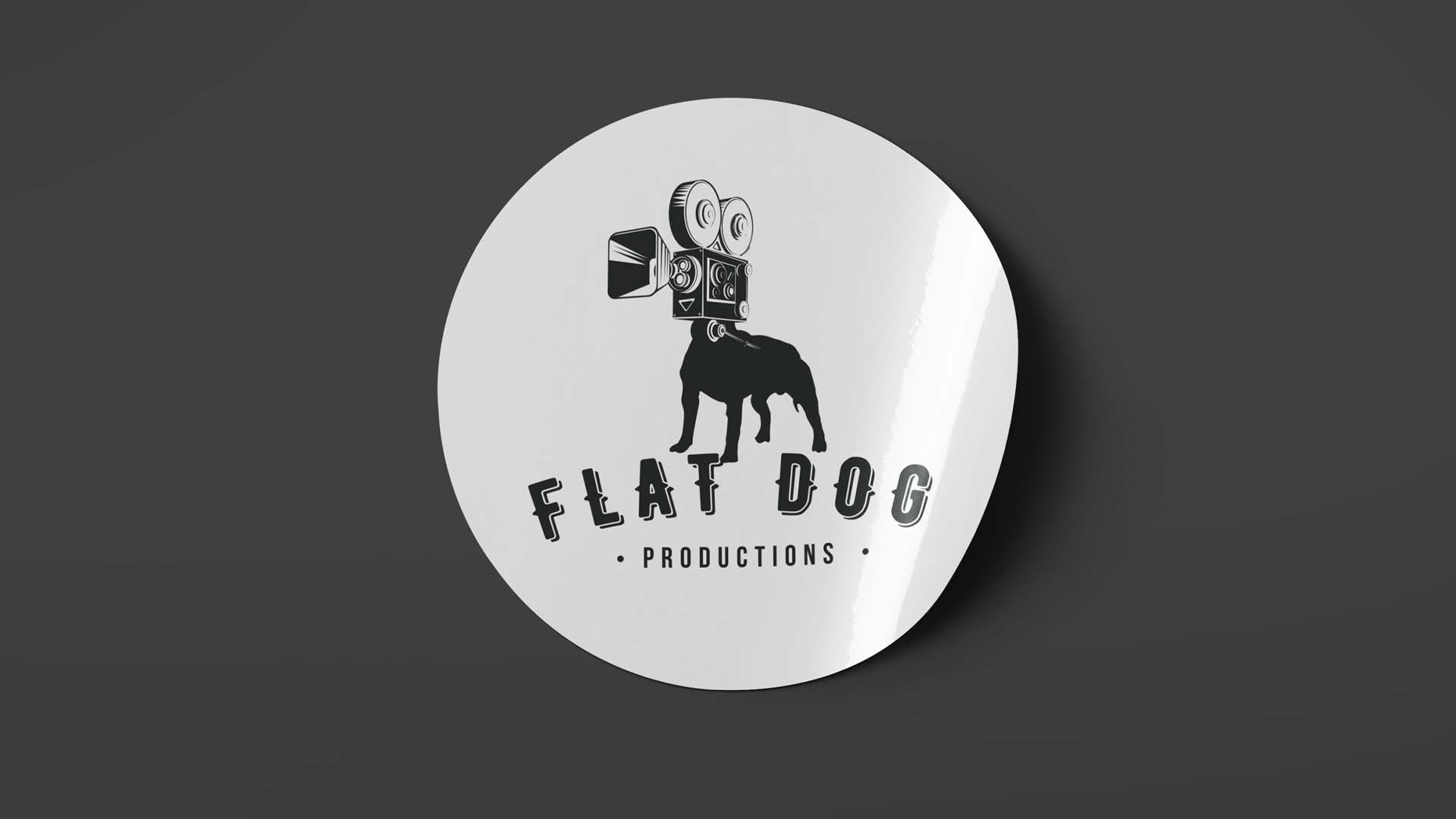
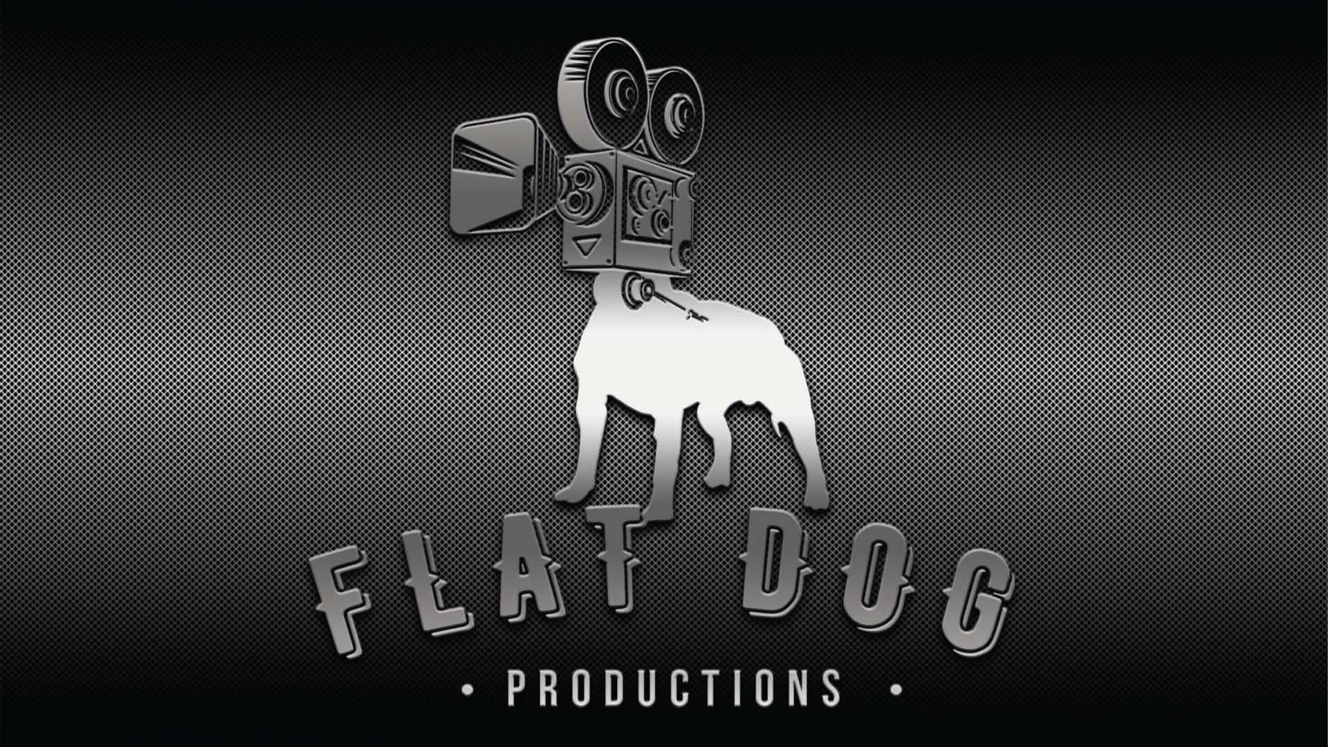
I created a visual hybrid pairing a dog’s body with a vintage movie camera. The concept made the company name memorable while identifying its creative field.
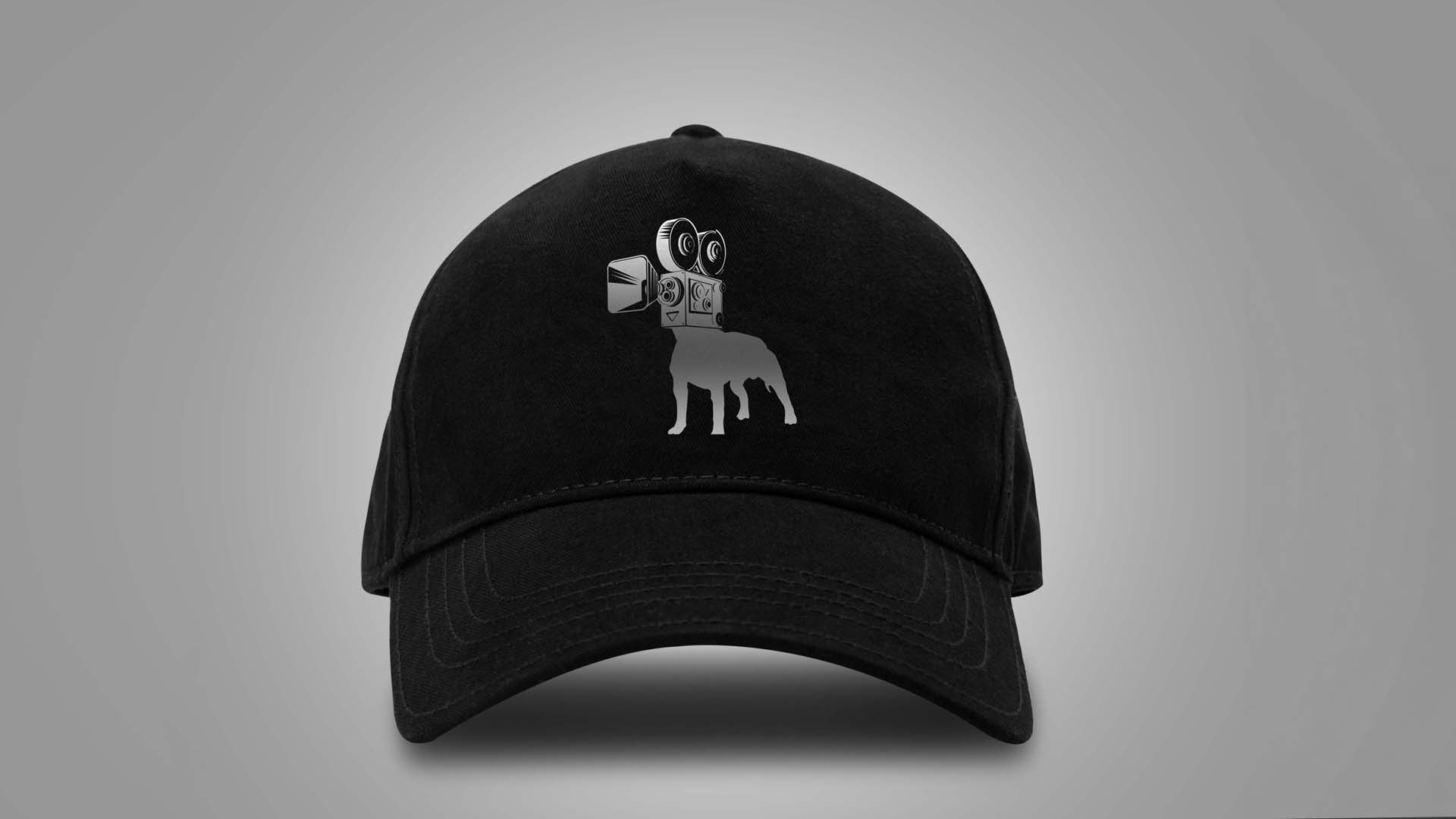
The silhouette carried the idea without gradients, fine detail or multiple colors. Its strength came from shape and proportion, allowing the logo to remain recognisable when reduced or reversed.
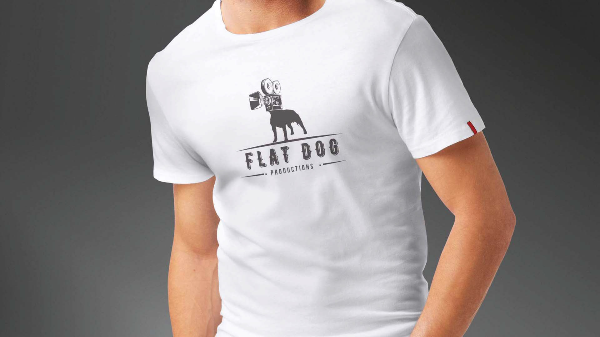
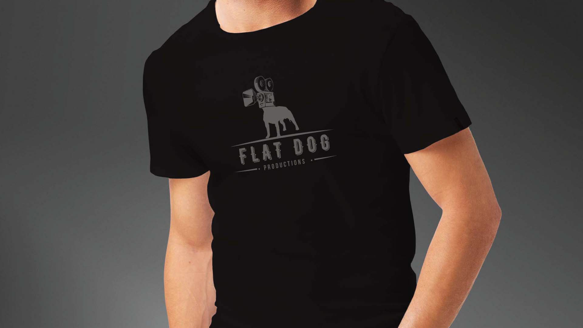
A one-colour master mark supported positive and reversed use. Contrast rules protected visibility on light and dark backgrounds. Scale and placement guidance kept the dog-and-camera form clear.
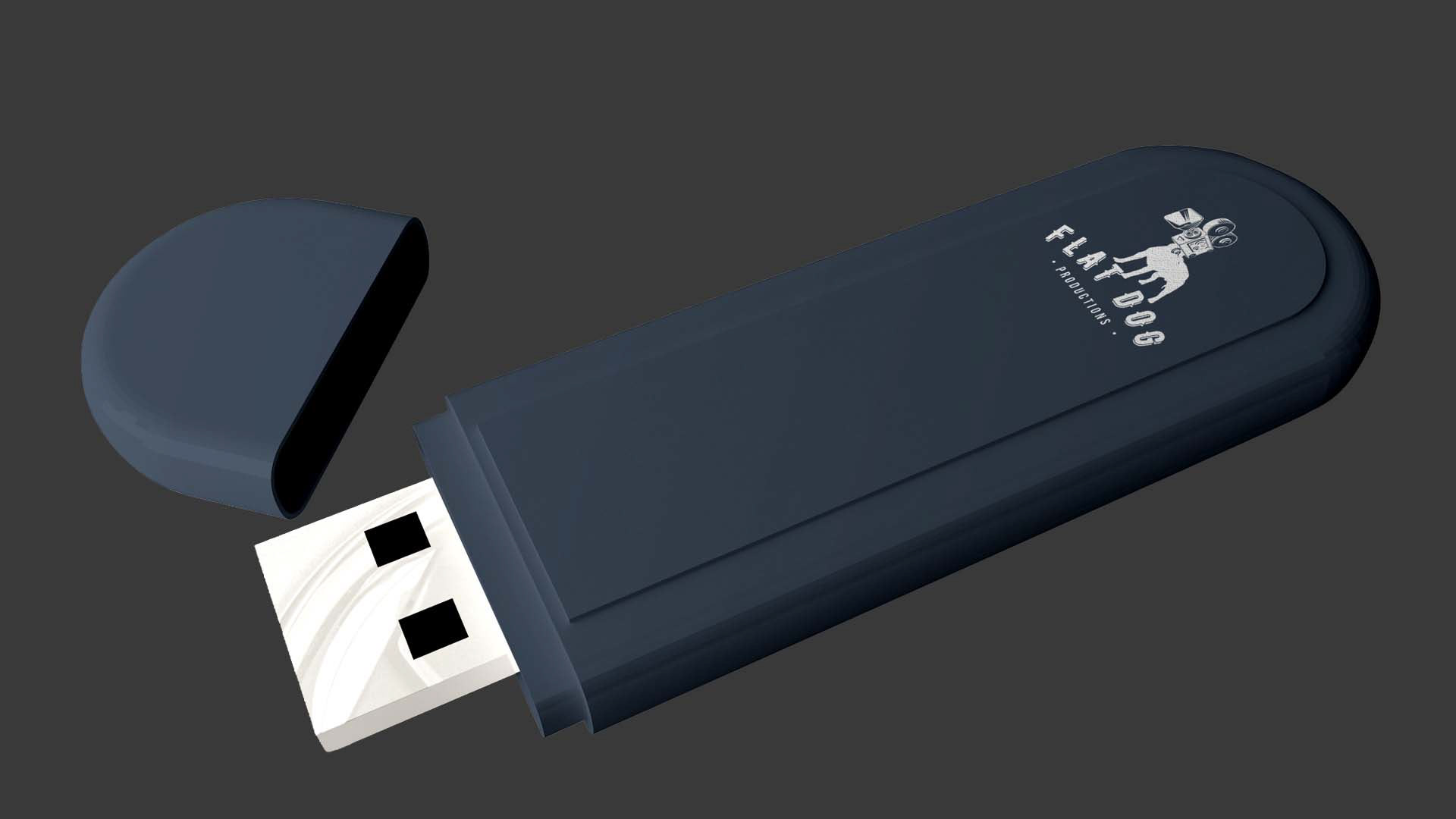
The system extended to T-shirts, caps, stickers, USB drives, digital platforms and promotional material. Each item used the same core mark instead of a different channel version.
The personality came from the concept itself. The brand could feel witty without decorative elements that weakened consistency.
Business and Brand Value
The identity gave the startup a distinctive asset that was simple to recognize and practical to reproduce.
Its one-colour construction reduced dependence on specialist printing or complex artwork. The mark could move from digital use to merchandise while retaining its character.
What This Project Demonstrates
Brand concept development, logo design, visual identity, one-color reproduction, application governance, production branding, merchandise thinking and creative direction.
View the Identity System
Explore the logo concept, reproduction logic and branded applications.