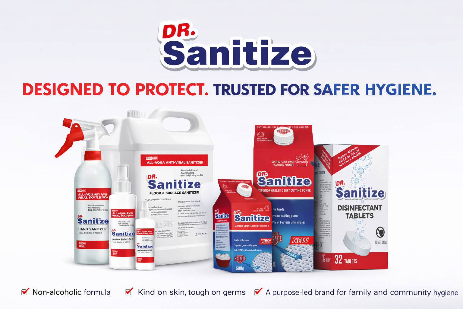
CRISIS BRANDING | PACKAGING DESIGN | RETAIL COMMUNICATION
Executive Snapshot
Dr Sanitize was developed during the COVID-19 crisis for South African community retail, schools, factories and workplace environments.
The complete brand and packaging system was created within one week. Speed was essential, but the range still needed a clear structure and credible visual identity.
The project covered naming, positioning, packaging, retail displays, product extensions and partner communication. Each element had to support fast recognition and practical purchasing decisions.
The Creative Challenge
The pandemic created sudden demand for hygiene products. It also produced a crowded market filled with similar packaging, medical language and fear-based communication.
Dr Sanitize needed to establish trust quickly while remaining accessible to price-conscious consumers. The communication also had to work for people with different languages and literacy levels.
The range included several products, formats and applications. Without a clear packaging structure, customers could struggle to recognise each product’s purpose.
The system needed enough flexibility for bottles, cartons, display units, promotional material and community distribution programmes.
My Role
As Brand Strategist, Creative Director and Designer, I led the project from initial concept to market-ready execution.
My responsibilities covered naming, positioning, identity development, packaging architecture, product differentiation, information hierarchy and retail communication.
I also developed the creative direction for point-of-sale material, product extensions, school rescue kits and supporting sales collateral.
The Brand Response
I built the brand around one central principle: trust through simplicity.
The name Dr Sanitize communicated the product category immediately. Its medical association added reassurance during a period of uncertainty and heightened concern about personal safety.
The visual identity used bold red, white and blue colour blocking. These colours created strong retail visibility while supporting associations with cleanliness, protection and reliability.
Clear typography and prominent product names reduced dependence on detailed copy. Customers could recognise the brand, product type and intended use within a few seconds.
Information-Led Packaging
The packaging system treated every product as part of one recognisable masterbrand.
Consistent logo placement, colour coding and typography connected the range. Product names, pack sizes and functional information provided clear differences between individual items.
The system extended across hand sanitiser, disinfection products, cold-water hand-washing powder and emergency hygiene kits.
Simple layouts, product imagery and visual cues supported customers who relied more heavily on recognition than written explanation.
Retail and Distribution Applications
The identity was designed for varied retail and institutional settings.
Applications included primary packaging, cartons, retail display units, hanging point-of-sale material and informational brochures. Repeatable templates allowed new products and pack formats to be developed quickly.
The retail displays carried the packaging language into the store environment. Strong branding and direct product communication supported recognition in busy community retail spaces.
School and Community Support
A school-focused rescue kit extended the brand beyond individual product sales.
The concept brought essential hygiene products together within a practical branded system. It could support funded distribution through schools and community programmes.
Supporting collateral presented the product range to potential partners, funders and distributors. This connected the consumer identity with the information required for institutional discussions.
Creative and Brand Value
Dr Sanitize moved from concept to a complete creative system within one week.
The project created a consistent brand across packaging, retail material and community applications. It also provided a structure that could accommodate new products without losing recognition.
The work demonstrates how creative leadership can respond quickly during a crisis while maintaining clarity, audience relevance and visual discipline.
What This Project Demonstrates
Crisis brand development, naming strategy, creative direction, packaging design, product architecture, information design, retail displays, point-of-sale communication, community marketing and rapid market rollout.
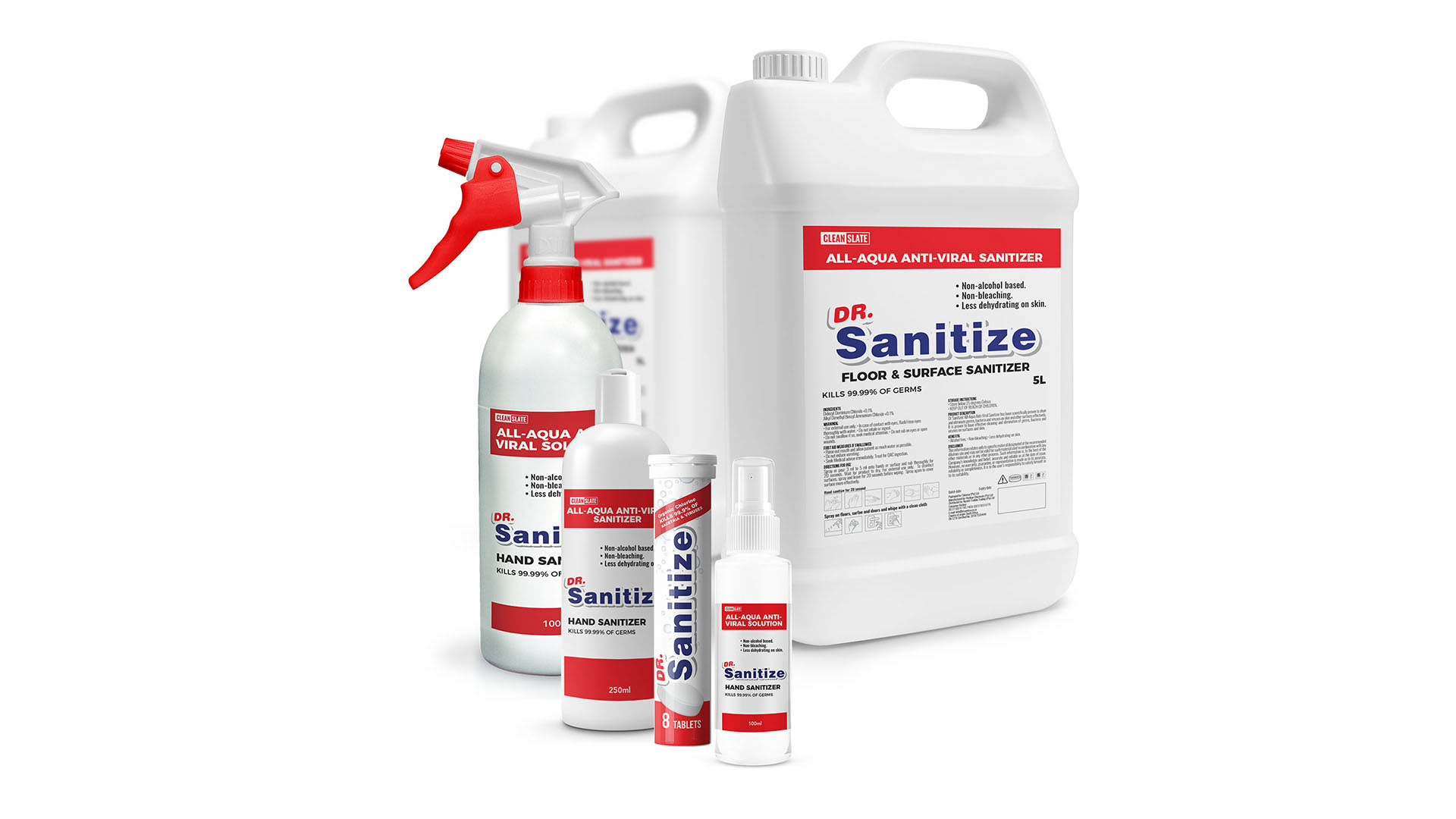
A scalable hygiene brand system developed during COVID-19 to communicate safety, trust, and accessibility.
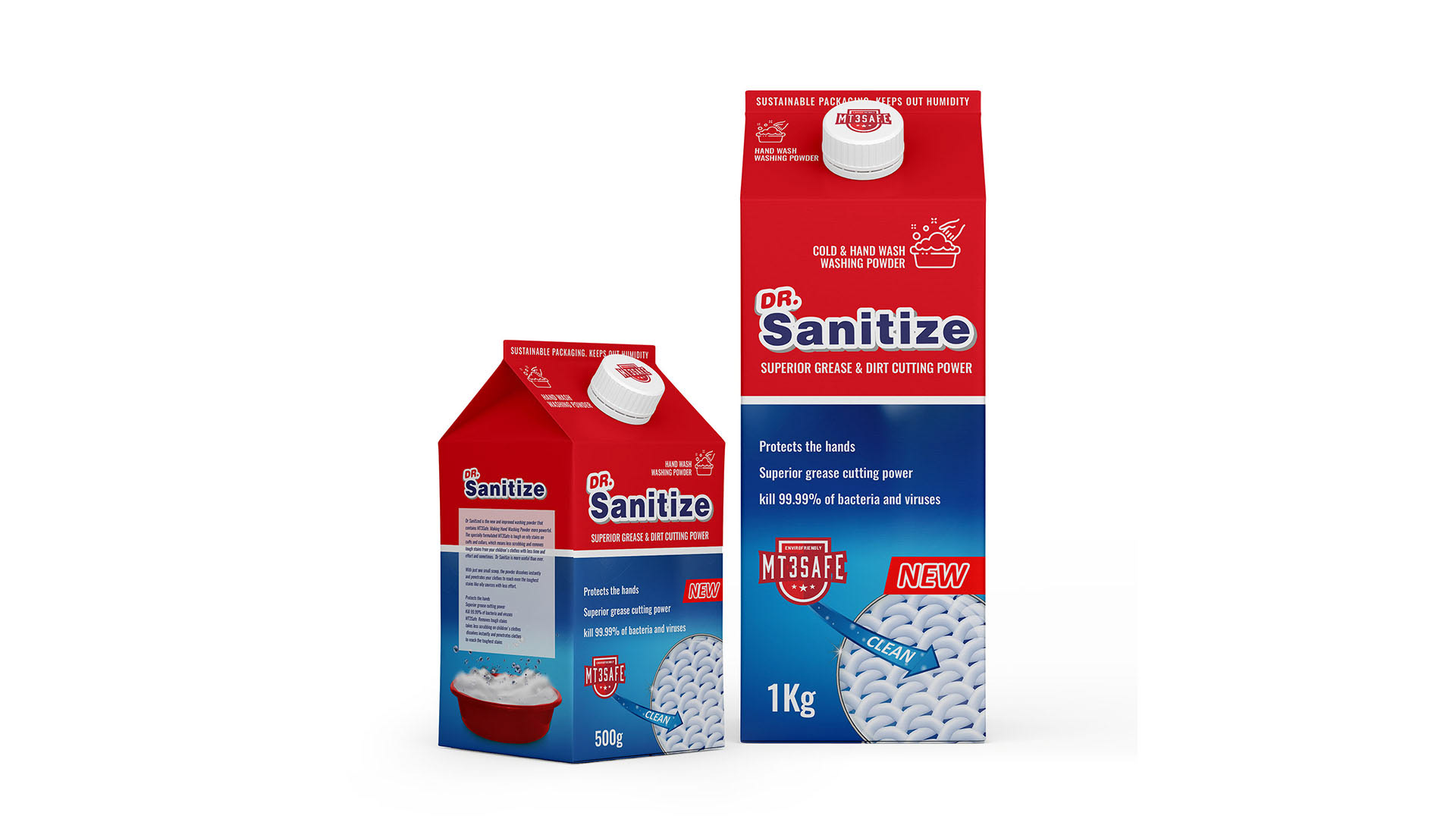
Range expansion into cold-water hand-washing powder, designed to support hygiene while protecting hands.
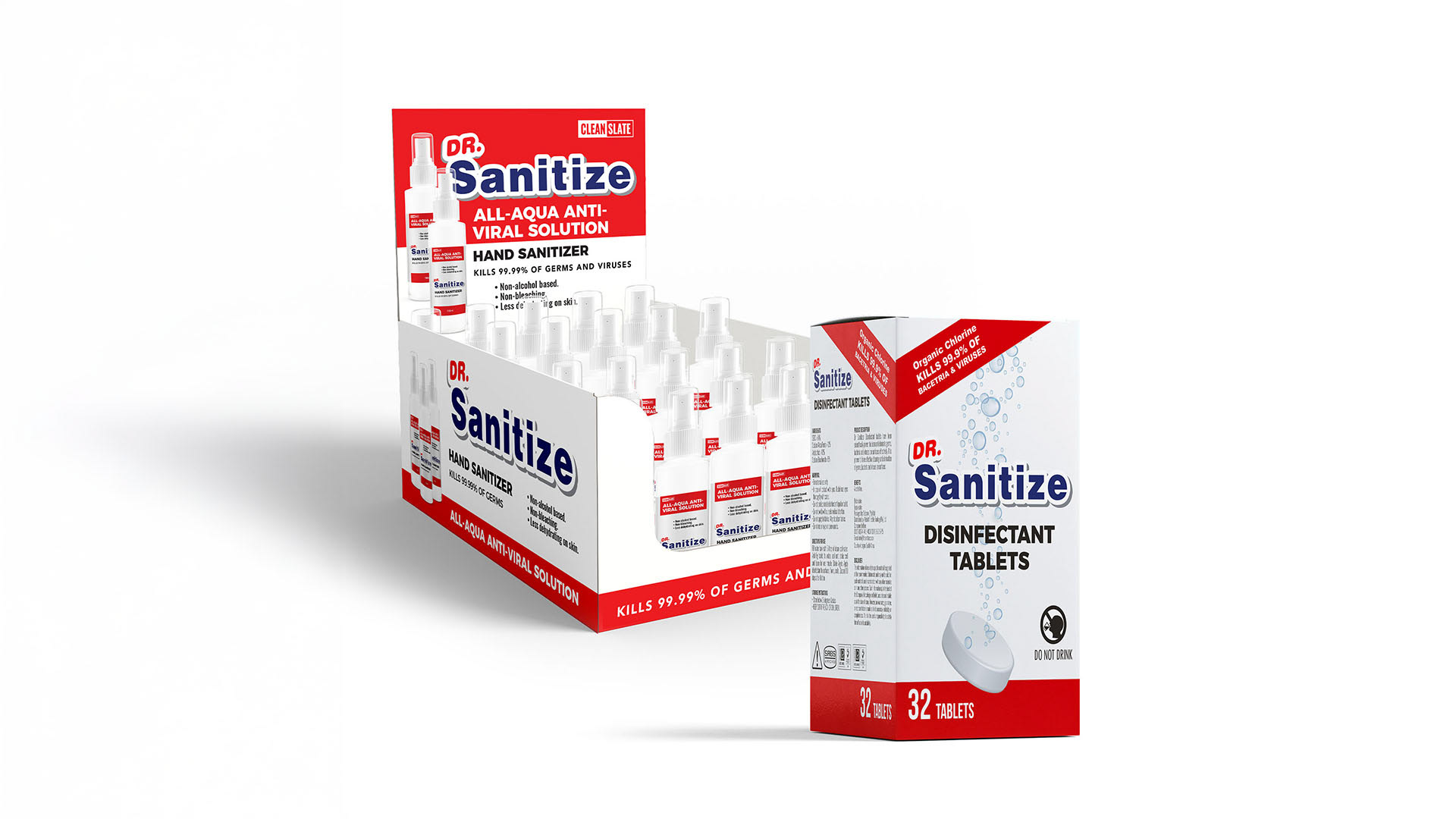
Retail-ready packaging and display system designed for impact, clarity, and quick product recognition.
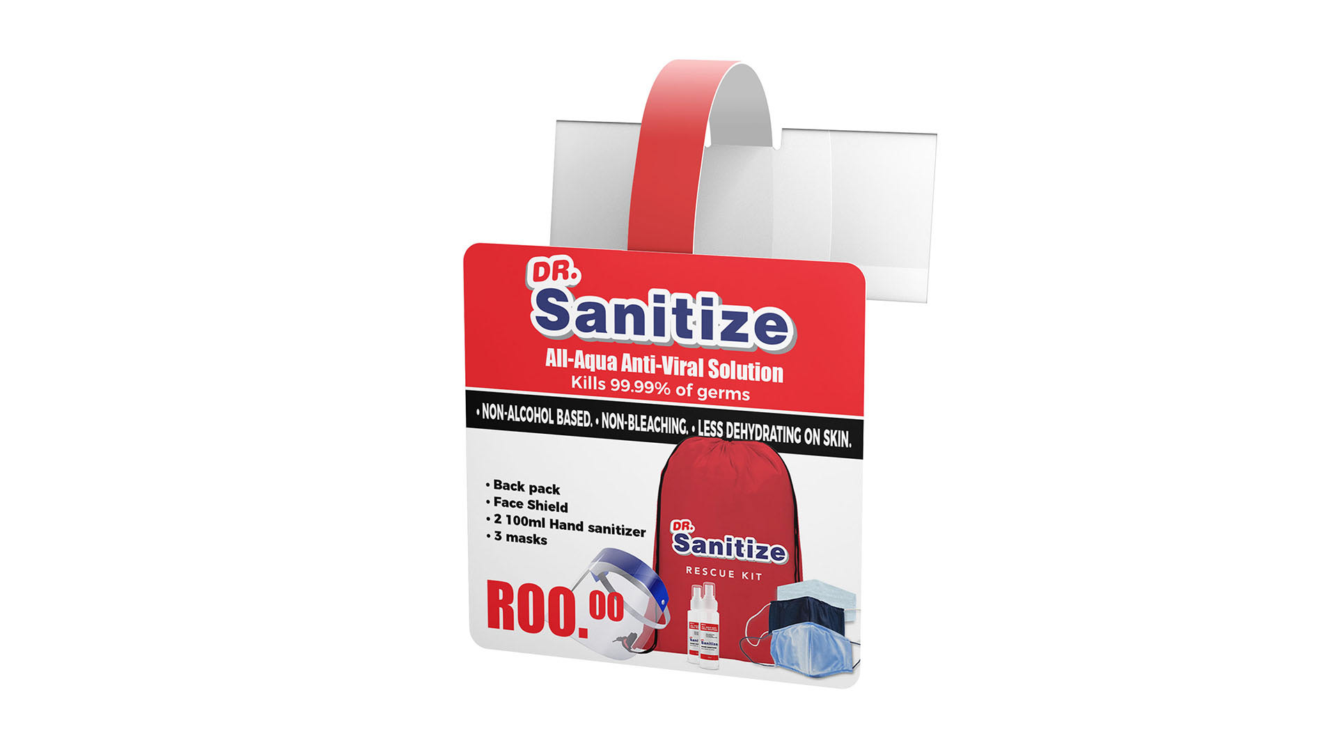
A school-focused rescue kit concept created to support funded distribution into underserved communities.
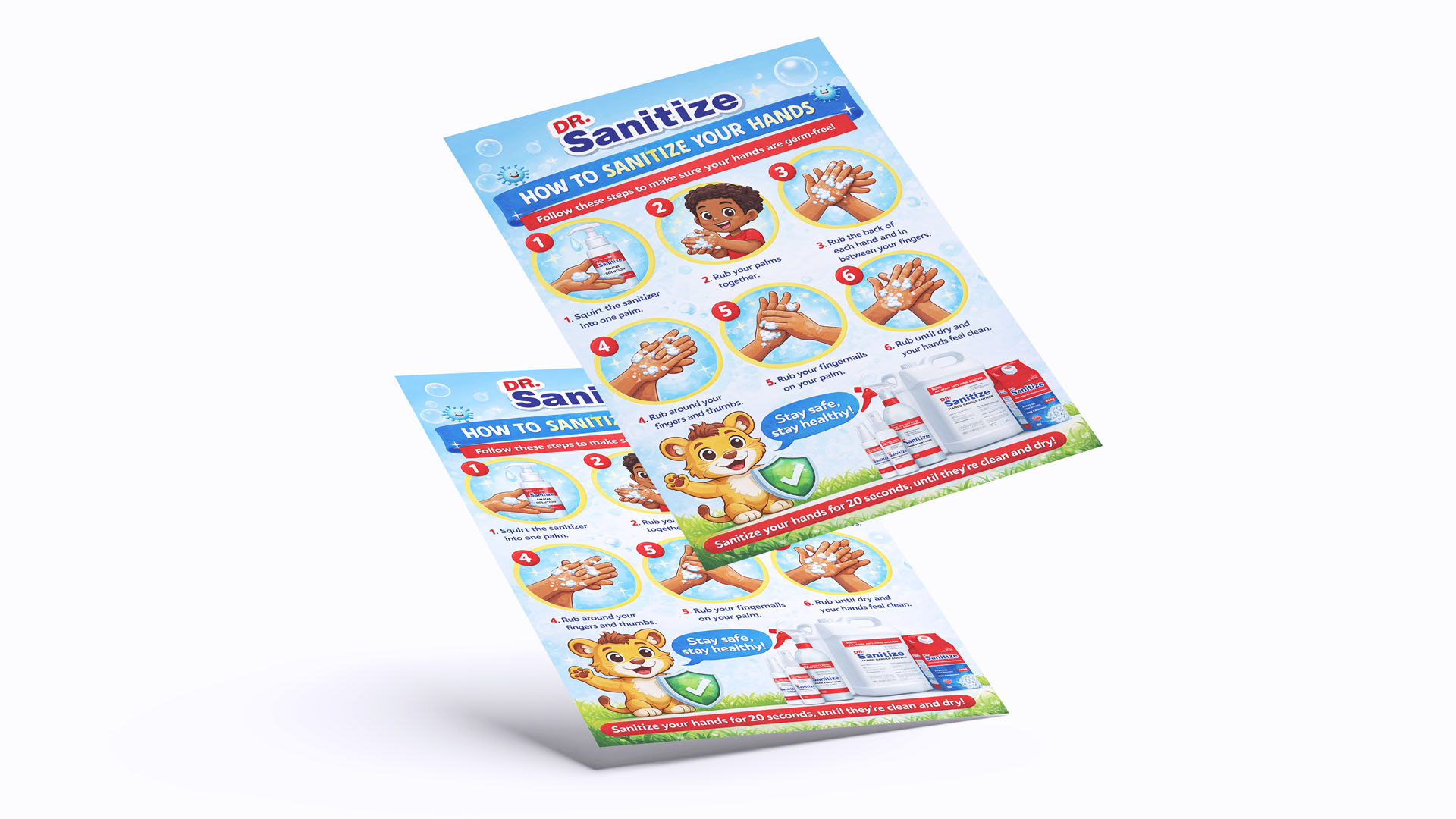
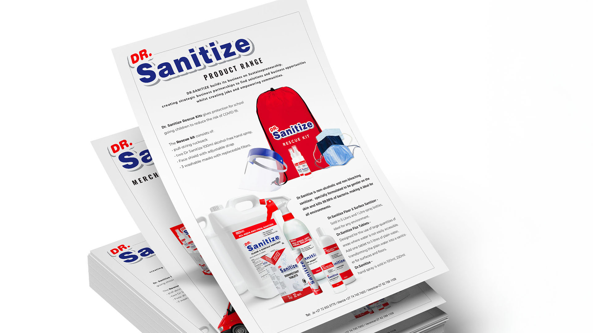
Supporting collateral developed to present the full product range to partners, funders, and distributors.