Discovery Health
Governance Communication
Overview
This project was created to communicate Discovery Health’s governance and quality improvement initiatives in a way that was both strategically clear and visually accessible. The subject matter was complex, involving healthcare reform, specialist collaboration, care delivery models, cost management, and measurable improvement outcomes. The communication therefore needed to do more than simply present information. It needed to guide understanding, build trust, and reinforce Discovery Health’s role as a credible partner in reshaping healthcare delivery.
At the center of the project was a simple but important objective: make complicated healthcare communication easier to absorb without losing authority, professionalism, or brand consistency.
The Challenge
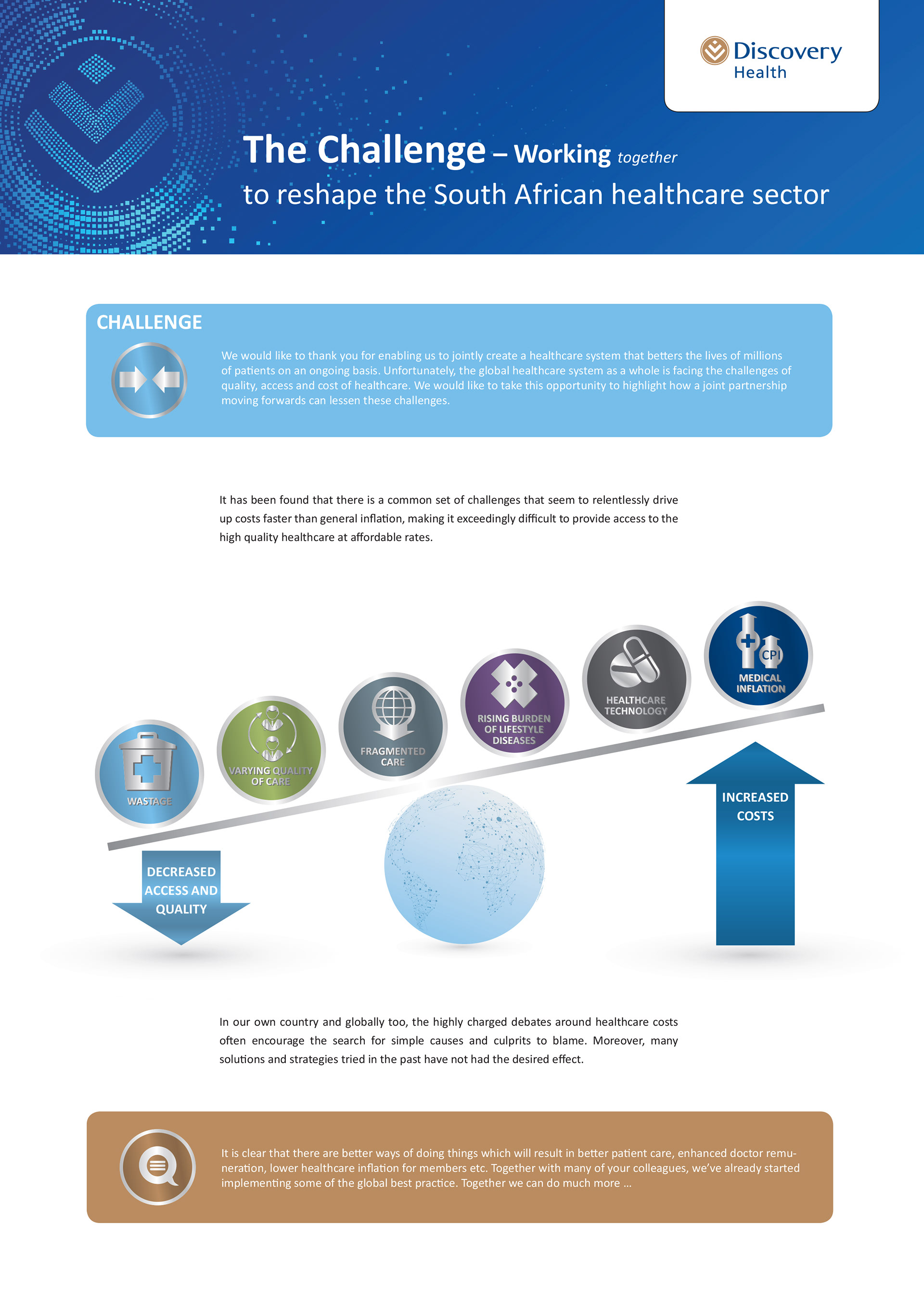
The content for this project was dense, technical, and highly structured. It needed to speak to a professional audience, particularly doctors and healthcare stakeholders, who required both clarity and credibility. The communication also had to operate within an established Discovery Health corporate brand system, which meant there was little room for visual experimentation for its own sake.
The challenge was therefore twofold:
First, the content had to be simplified into a narrative that readers could move through with ease. Rather than feeling like corporate reporting, it needed to feel like a guided story that explained the problem, introduced the solution, and demonstrated the value of participation.
Second, the design had to remain disciplined and brand-led. The work could not drift away from the Discovery Health identity. Every layout decision had to support corporate consistency while still creating enough visual interest to keep highly informational pages readable.
Strategic Approach
The strategic communication idea centered on collaboration and progress. The recurring phrase “working together” became a strong thematic anchor across the material, reinforcing Discovery Health’s position not as a distant institution, but as an active partner in improving healthcare outcomes.
To support this, the information was structured into a clear narrative flow:
• the challenge facing the healthcare sector
• the proposed solution
• the solution in action
• the measurable benefits and outcomes
This progression helped the audience move naturally through the material. Instead of confronting them with isolated facts or overly technical explanations, the content worked as a connected story. Each page built on the one before it, creating momentum and improving comprehension.
Content Strategy
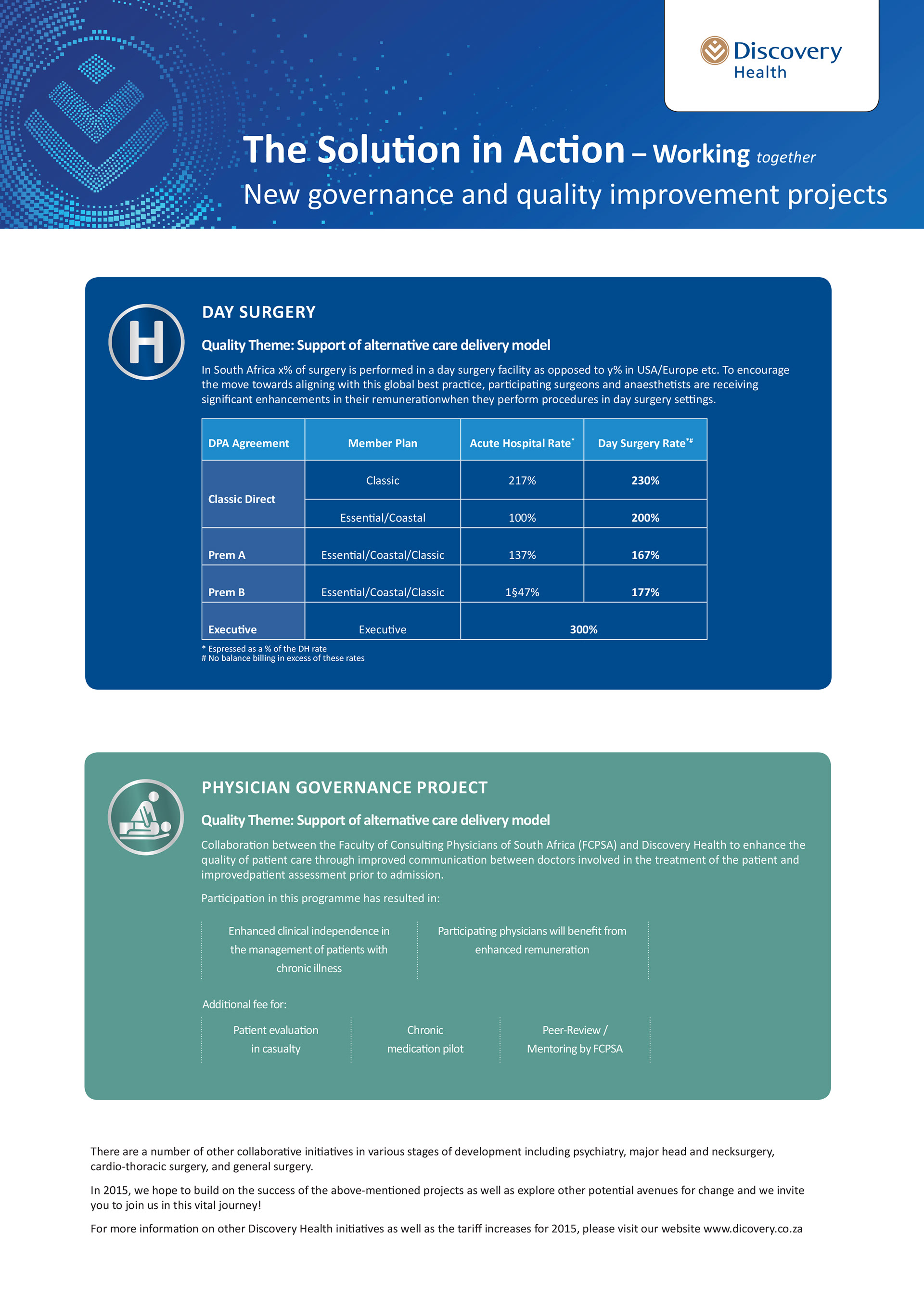
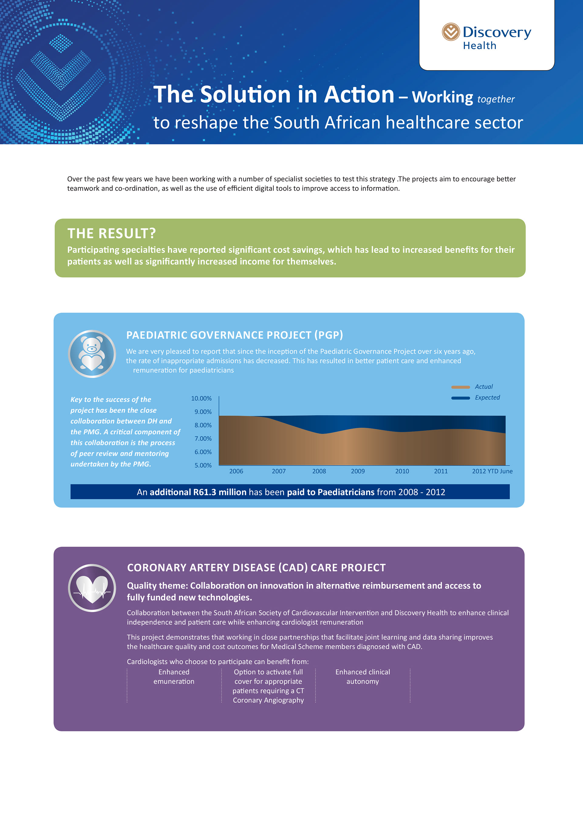
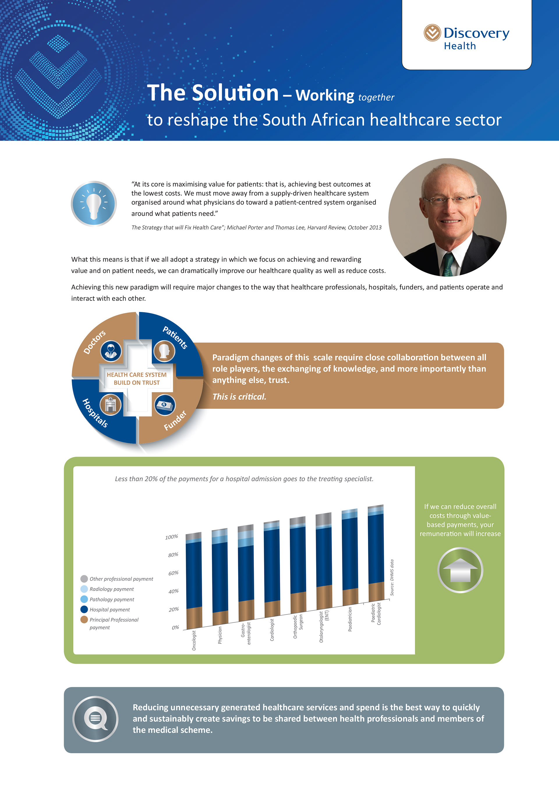
The content strategy focused on making complex information easier to digest by breaking it into clearly defined thematic sections. Rather than presenting long-form text blocks, the message was divided into concise modules supported by headings, short explanatory copy, data points, charts, and summarized outcomes.
The communication consistently highlighted themes that mattered most to the target audience:
• improved patient care
• enhanced quality outcomes
• reduced unnecessary costs
• stronger collaboration between stakeholders
• improved remuneration and professional participation
This made the material more persuasive because it linked system-level healthcare reform directly to individual and professional benefit. In other words, it answered the eternal audience question: why should I care?
The tone remained professional, optimistic, and informative, which was essential for maintaining trust in a healthcare context. The copy needed to feel authoritative without becoming cold or inaccessible.
Layout Strategy
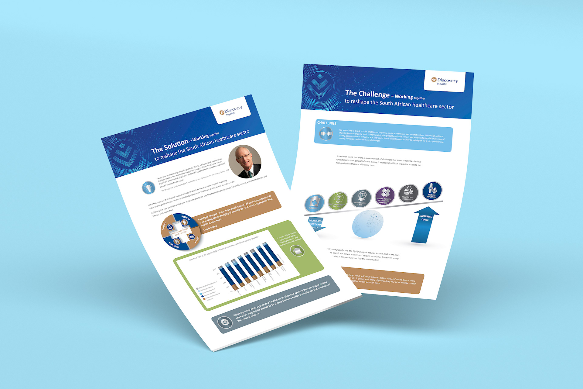
The layout was designed to support clarity above all else. Since the material was detailed and often data-heavy, the structure had to make navigation intuitive. Large branded header areas established consistency and immediately connected each page back to the Discovery Health brand.
Within the pages, information was grouped into contained content panels. This modular approach helped separate topics into manageable sections while maintaining a cohesive visual system across the series. Rounded content blocks, consistent spacing, icon-led introductions, and clearly framed charts all worked together to improve scannability.
A strong visual hierarchy was essential to the success of the layout. Headlines signposted the key message of each section, subheadings added context, and supporting graphics helped reduce reliance on long paragraphs. This allowed the reader to absorb information in layers, from top-level message to supporting detail.
Infographics and comparison charts played a particularly important role. They transformed abstract healthcare issues into visual explanations, making the communication feel more immediate and easier to understand. Rather than overwhelming the audience with text, the layout used visual storytelling to simplify complexity.
Visual Language
The visual language remained closely aligned to Discovery Health’s corporate identity. Brand compliance was a core part of the brief, so the project relied on approved colors, typography, and a controlled graphic style to ensure consistency and recognition.
Blue remained dominant throughout the series, reinforcing trust, professionalism, and corporate authority. Supporting colors were used to distinguish sections and themes without fragmenting the overall system. Iconography and graphic devices were introduced in a way that complemented the brand language rather than competing with it.
This was a project where creativity came through structure, discipline, and clarity rather than decoration. The goal was never to force visual flair into a corporate healthcare piece. The goal was to create a communication system that felt polished, intelligent, and easy to engage with while staying true to the brand.
Design Outcome
The final result was a cohesive healthcare communication system that translated complex strategic content into a clear visual narrative. By combining strong content hierarchy, modular layout thinking, infographic support, and disciplined corporate branding, the project made difficult information more accessible to its intended audience.
It demonstrated that corporate communication does not have to feel flat or inaccessible. With the right strategy, even heavily structured healthcare messaging can feel clear, considered, and persuasive.
This project ultimately succeeded in turning governance and quality improvement communication into something far more usable: a branded information system designed to inform, reassure, and engage.