Building Trust in a Crowded CBD Market
Overview
The CBD market is full of opportunity, but it is also full of tension. Consumer interest is growing, yet so is skepticism. Many brands either lean too heavily into cannabis culture cues or become so clinical that they lose warmth and accessibility.
My goal was to build a brand that could sit confidently between those two extremes.
I wanted this identity to feel premium, clean, and medically informed, while still remaining approachable for everyday consumers. More than that, I wanted the campaign to answer one of the biggest issues in the CBD category: trust.
This project grew into a full visual system that included product branding, packaging direction, educational flyers, social campaign assets, and digital landing page concepts — all designed to work together as one cohesive brand experience.
The Challenge
CBD is still a category where consumers often arrive with questions before they arrive with confidence.
There are concerns around quality, dosage, safety, and credibility. At the same time, the market is visually crowded. Many brands rely on the same shorthand: leaves, earthy tones, soft wellness language, and broad promises that do little to create real distinction.
The challenge was not only to create something visually beautiful, but to create a brand that felt believable.
This meant solving for several things at once:
• how to stand out in an oversaturated category
• how to make the product feel premium without feeling exclusive
• how to communicate health and wellness benefits without overclaiming
• how to reduce hesitation through design and information
• how to build a system that could work consistently across packaging, print, social, and digital
Strategic Response
My approach was to position the brand at the intersection of wellness and reassurance.
Instead of building the identity around trend-led cannabis imagery or overly technical medical language, I developed a brand system that felt calm, clear, and structured. The focus was on helping the product feel trustworthy and easy to understand.
The strategy centered on four key ideas:
• Clarity over clutter
• The CBD space can often feel visually and verbally overwhelming. I wanted this brand to feel distilled, elegant, and easy to navigate.
Trust over hype
Rather than leaning on exaggerated claims, the communication was designed to feel informative, measured, and supportive.
Education as brand value
Consumers do not just want a product; they want confidence in how to use it. Educational design became an important part of the campaign.
Consistency across touchpoints
The identity needed to hold together from bottle to flyer to social content to landing page, so the brand would feel unified wherever a customer encountered it.
Brand Development
The brand system started with the product range itself.
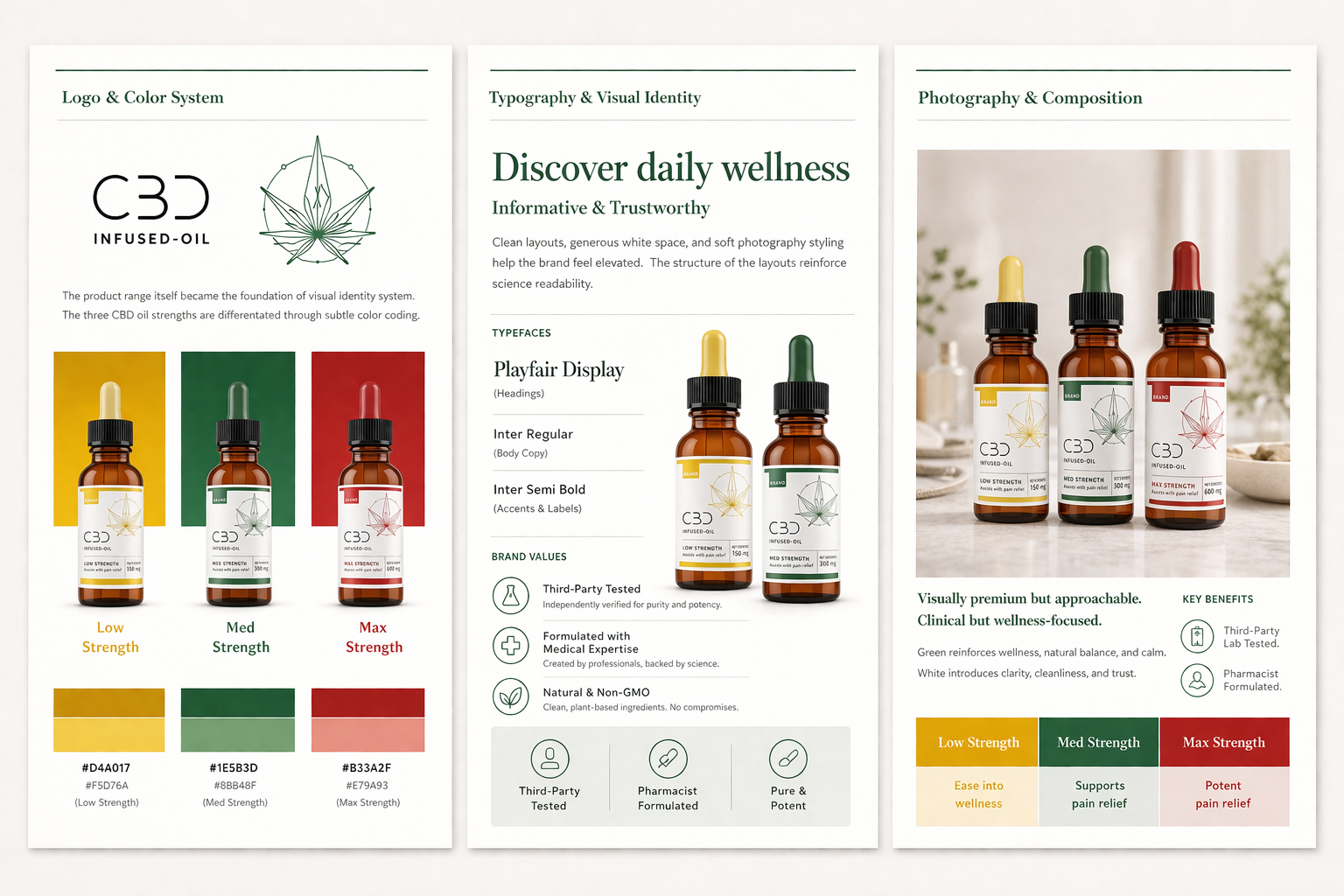
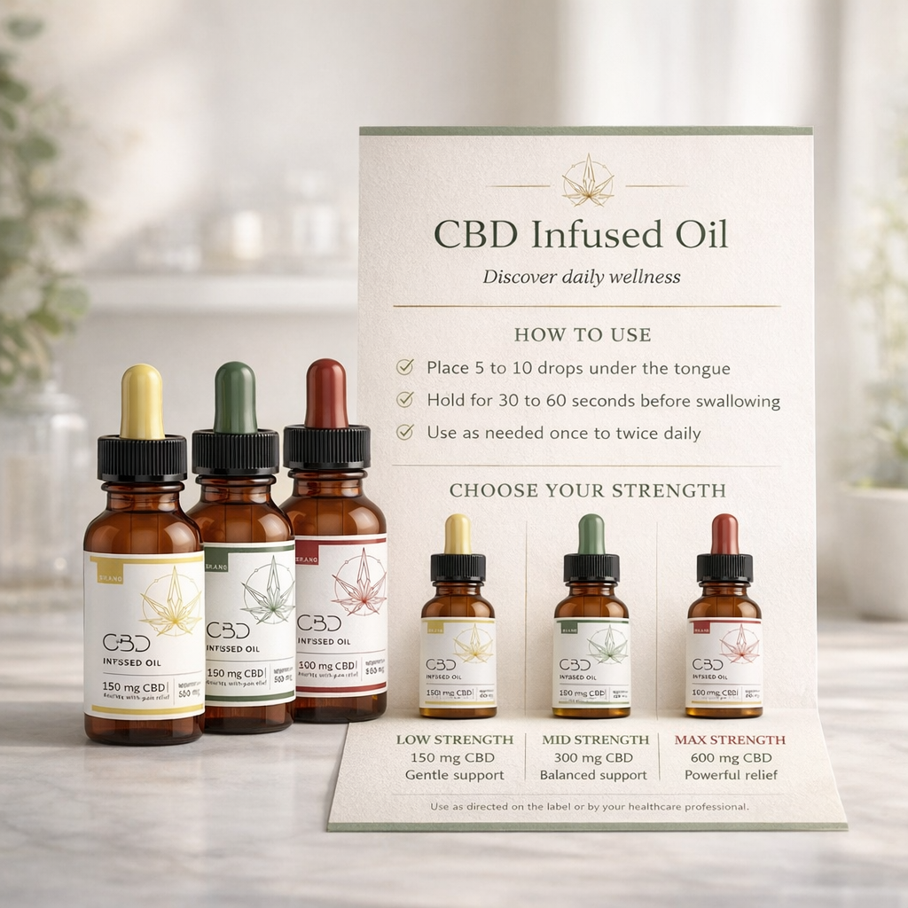
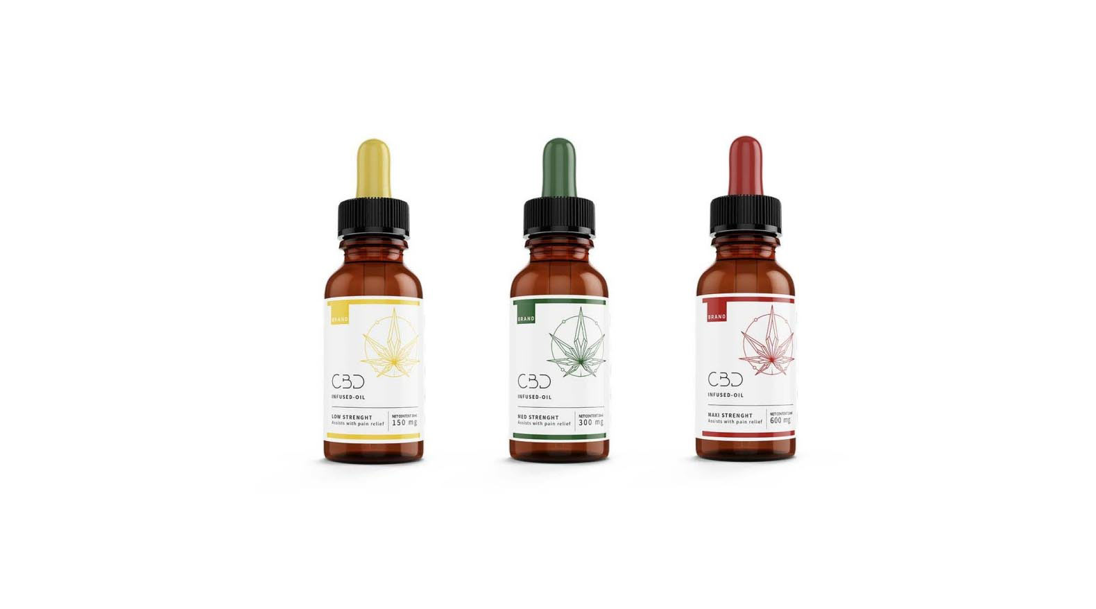
The three CBD oil strengths created a natural visual hierarchy, and I used this to build an intuitive color-coded structure:
• yellow for low strength
• green for medium strength
• red for maximum strength
These accents gave the range clear differentiation, but I deliberately made green and white the dominant brand palette. Green carried the language of wellness, balance, and natural support, while white introduced clarity, cleanliness, and a more pharmacy-inspired sense of confidence.
This allowed the brand to feel refined and health-focused without becoming cold or overly clinical.
I kept the overall visual language minimal, letting space, structure, and restraint do the heavy lifting. The intention was to make the brand feel polished enough for a premium wellness environment, but grounded enough to reassure a first-time CBD customer.
Packaging Direction
The packaging needed to feel both elegant and functional.
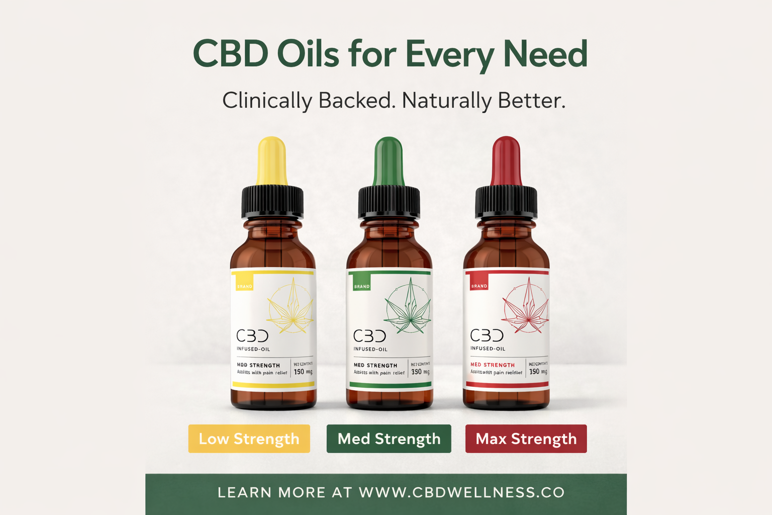
In this category, packaging often has to do more than sit on a shelf — it has to reassure, clarify, and differentiate. I approached the bottles as hero objects within a disciplined visual system, using consistent label architecture and subtle linework to unify the range.
The color coding created easy recognition between strengths, while the clean layout helped keep the product feeling premium and medically informed.
The result was packaging that could sit comfortably in both a modern wellness retail environment and a pharmacy-adjacent setting, with enough character to feel branded and enough restraint to feel credible.
Educational Layer
One of the most important parts of this project was the educational campaign layer.
CBD products often ask consumers to make decisions without giving them enough guidance. That gap can create hesitation, especially for people who are curious but cautious. I wanted the brand to answer that tension directly by building in simple, elegant educational touchpoints.
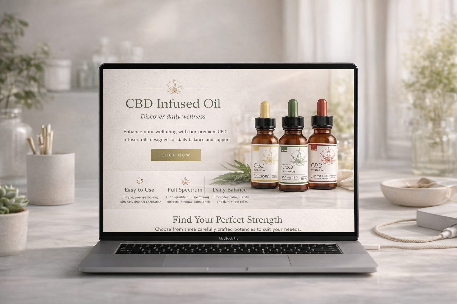
This led to the development of printed flyer concepts, digital educational layouts, and usage-led landing page content that explained:
• how to use the product
• how much to take
• how to choose between strengths
• how the product fits into a daily wellness routine
By doing this, the campaign shifted from pure promotion into something more valuable: reassurance through clarity.
Campaign Rollout
The campaign was designed as a flexible brand system rather than a single visual.
I explored how the identity could extend across:
• premium product scenes
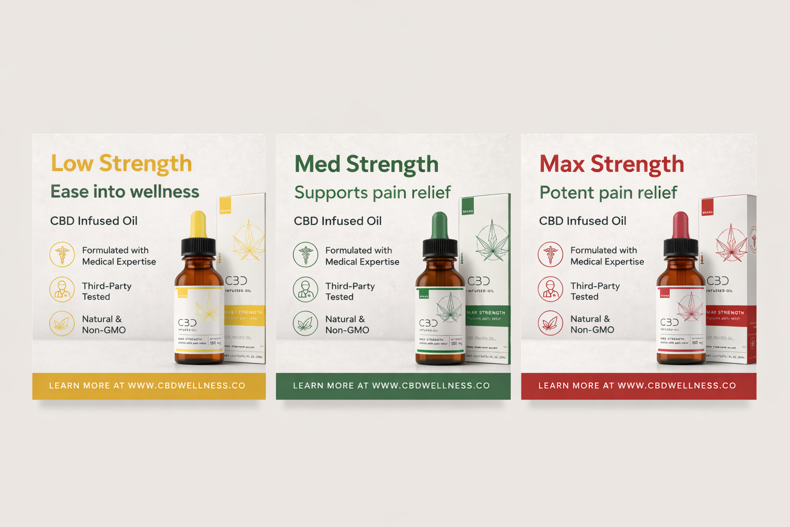
• social media campaign visuals
• educational print collateral
• website and landing page mockups
• product-and-packaging presentations
Across every format, the creative direction remained consistent: soft lighting, clean surfaces, minimal styling, structured typography, and a calm health-and-wellness tone.
This consistency was important. In a market where many brands feel fragmented from one touchpoint to the next, I wanted every execution to reinforce the same message: this is a brand you can trust.
Creative Direction
Visually, I wanted the campaign to feel understated and elevated.
Rather than relying on dramatic or trend-driven aesthetics, I focused on a refined editorial approach with a pharmacy-inspired edge. Soft natural light, gentle shadows, realistic materials, and lots of negative space helped give the work a premium product-photography feel.
This was paired with clean, readable layouts and a more measured tone of voice to support the brand’s core positioning.
The result was a visual world that felt modern and calm — one that could comfortably hold both lifestyle appeal and clinical reassurance.
Challenges and Solutions
Challenge: The CBD category often lacks trust and clarity.
Solution: I built the campaign around guidance, clean information, and a more credible wellness language.
Challenge: Many CBD brands look visually interchangeable.
Solution: I created a more refined and structured identity system with a clear hierarchy and restrained palette.
Challenge: Consumers are often unsure how to use the product.
Solution: Educational flyers, dosage guidance, and strength explanations became a central part of the campaign.
Challenge: The brand needed to work across multiple consumer touchpoints.
Solution: I developed a scalable visual system that translated consistently across packaging, print, social, and web.
Challenge: The identity needed to balance premium appeal with approachability.
Solution: I used minimal styling, soft clinical cues, and a calm editorial tone to create a brand that felt aspirational but accessible.
Outcome
The final result is a CBD wellness brand that feels more considered, more trustworthy, and more commercially mature than much of what is commonly seen in the category.
By combining brand strategy, packaging logic, educational design, and campaign consistency, I was able to create a system that answered both practical and emotional consumer needs. It informs without overwhelming, reassures without becoming sterile, and elevates the product without losing human warmth.
For me, this project was about more than developing attractive visuals. It was about showing how thoughtful brand development can help a product navigate a complicated market and build confidence where confidence is often missing.