Beechies
Refresh for a Competitive SA Market
For this project, I was tasked with refreshing the packaging for Beechies, a well-known chewing gum brand under Simba, one of South Africa’s largest and most established FMCG businesses. The brief was to modernize the range while working within strict brand guidelines and preserving the recognition the product had already built in the market.
This was not simply a packaging redesign. It was a strategic brand refresh intended to help a legacy product remain relevant in a retail environment that had become increasingly more competitive, more visually crowded, and more influenced by youth-driven taste, convenience, and instant shelf appeal.
In the South African market, gum and confectionery products compete in a highly price-sensitive, high-visibility category where purchase decisions are often made quickly at shelf level. Products must appeal across a broad demographic spectrum, from school-going youth and young adults to family shoppers and everyday convenience buyers. In this environment, packaging plays an outsized role. It must communicate flavor, energy, recognizability, and trust within seconds.
The existing Beechies packaging had strong familiarity, but the market around it had evolved. Competitors in confectionery and chewing gum were using brighter color systems, cleaner graphics, stronger flavor cues, and more contemporary pack finishes to attract attention. This meant that Beechies needed to retain its recognizable identity while feeling more current and visually competitive for a South African audience that responds strongly to bold, accessible, flavor-led design.
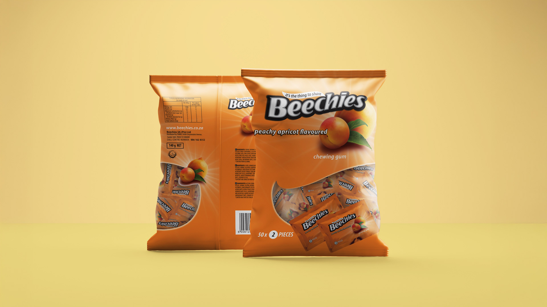
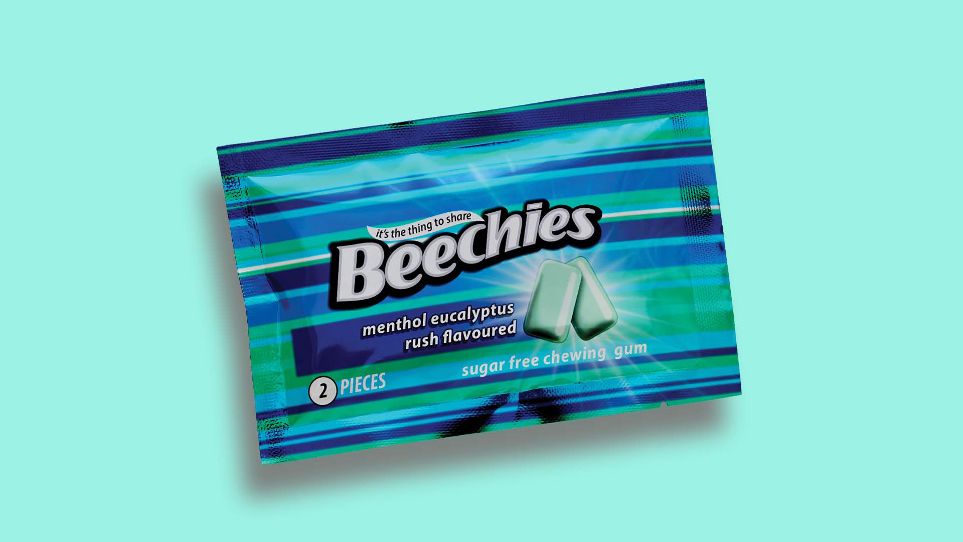
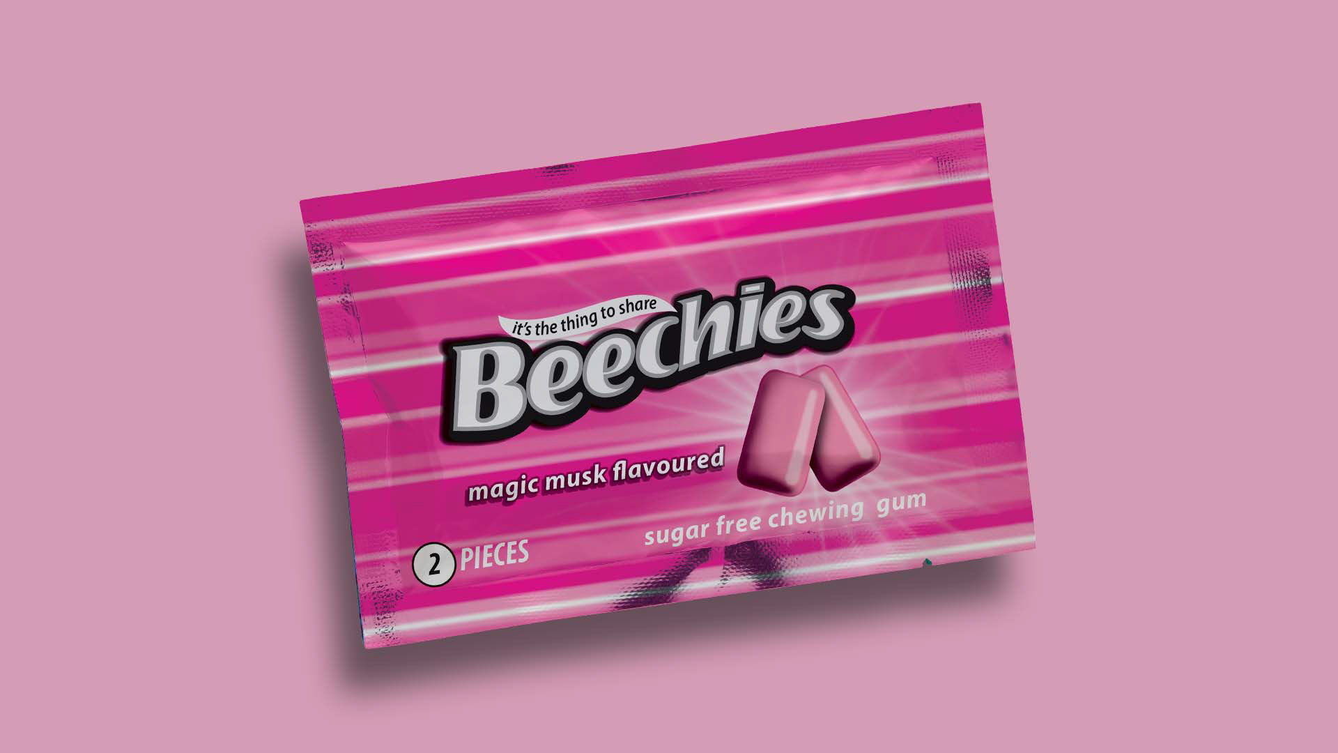
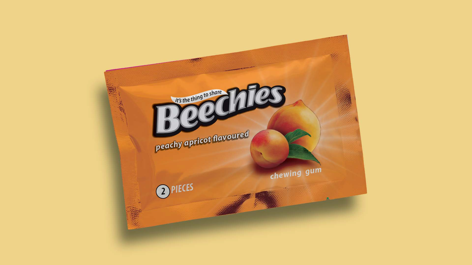
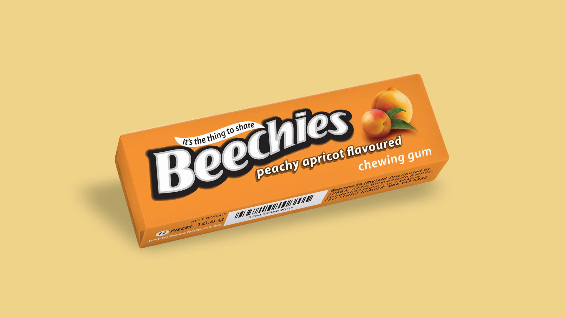
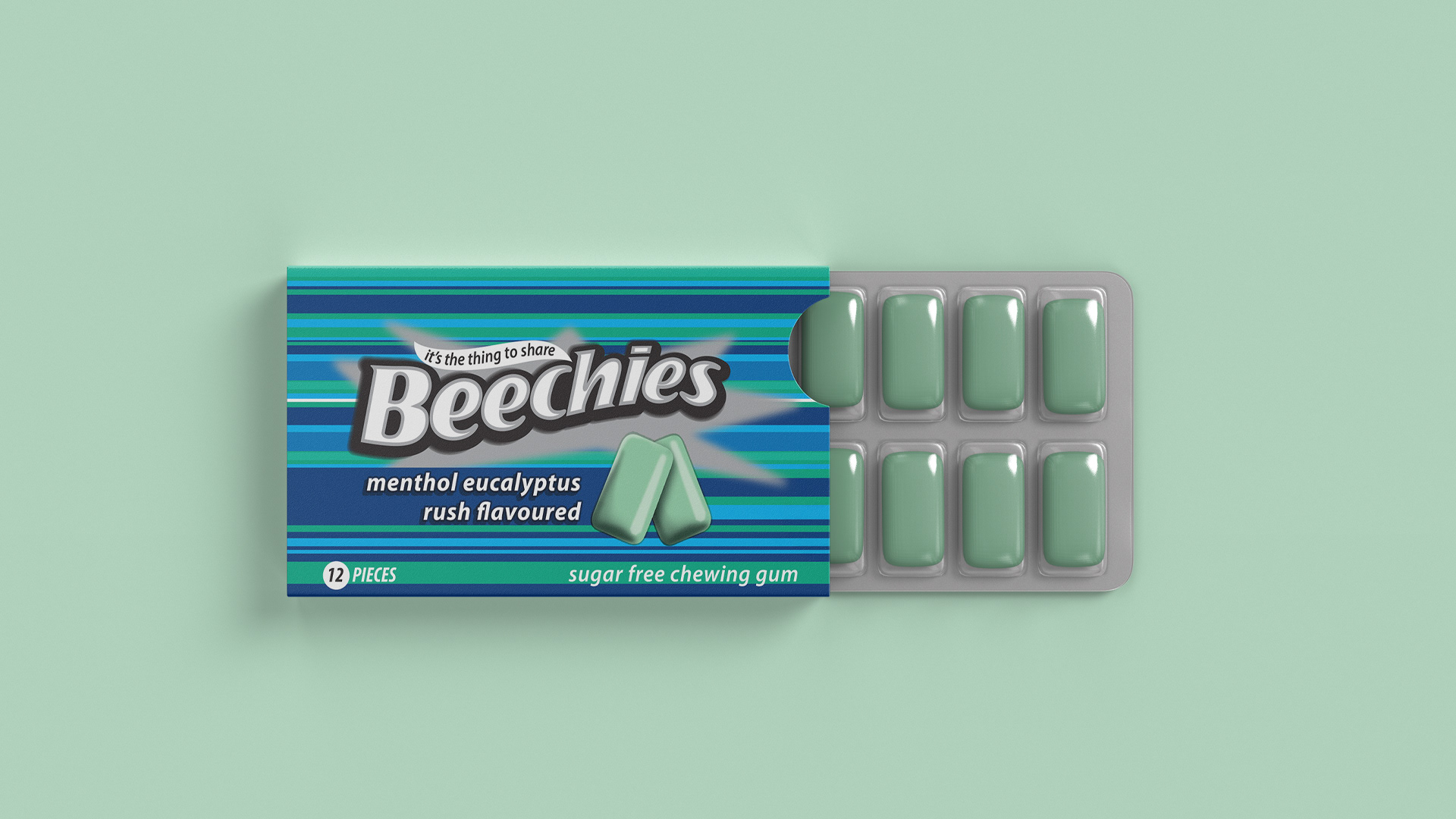
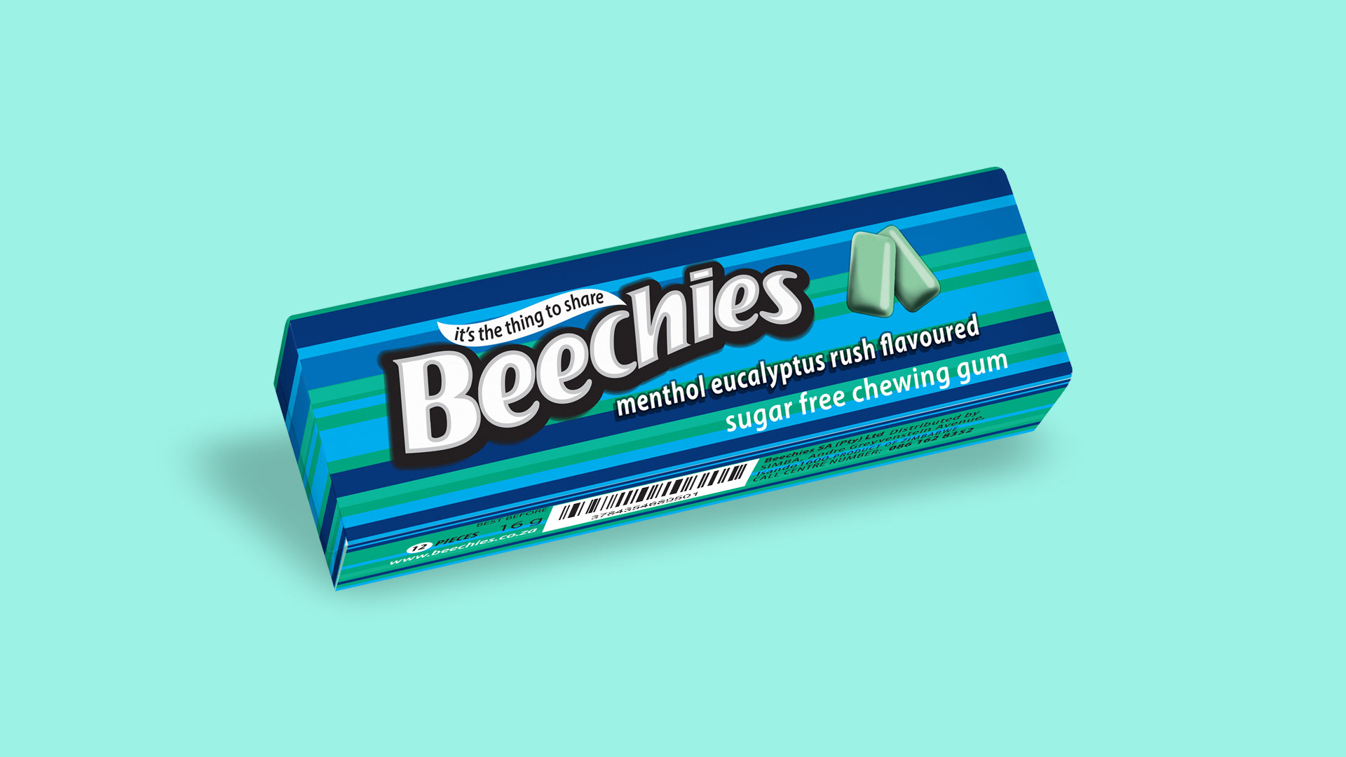
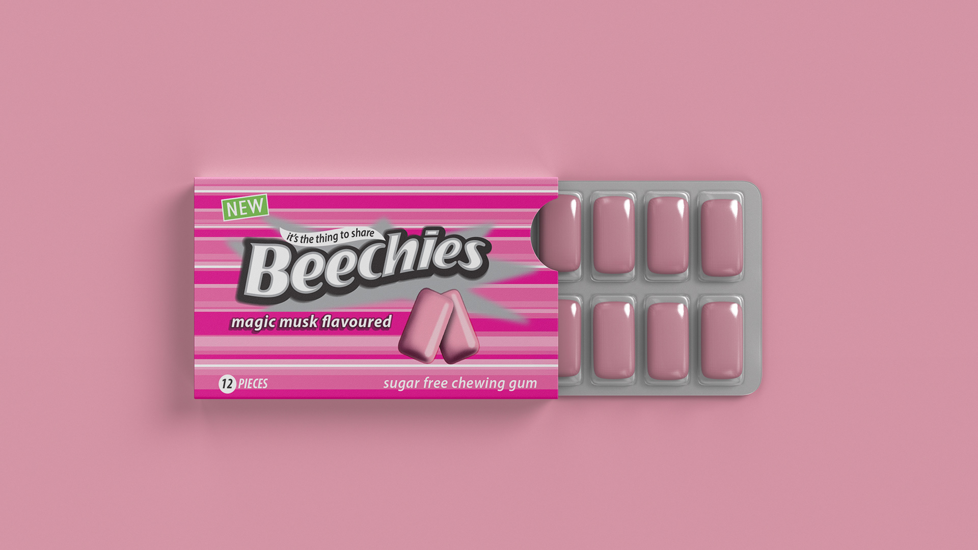
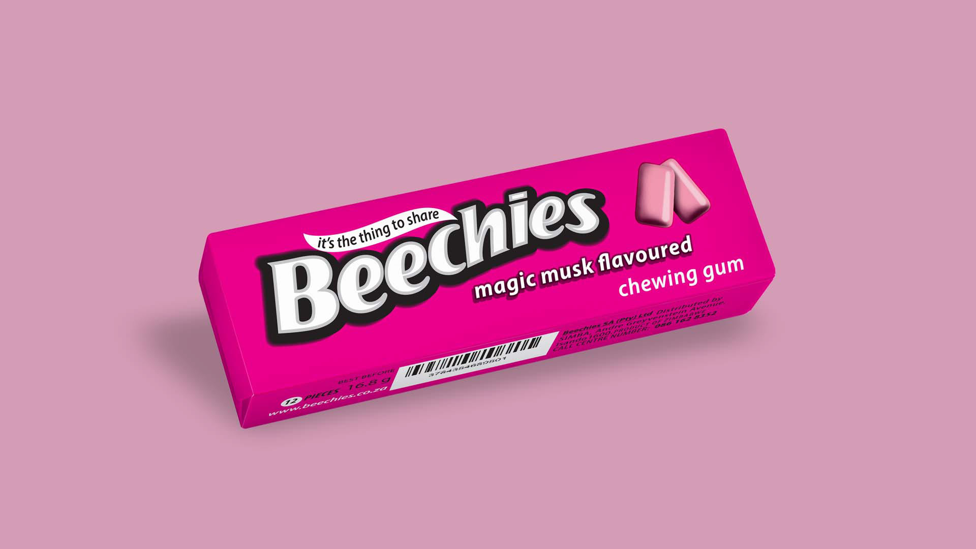
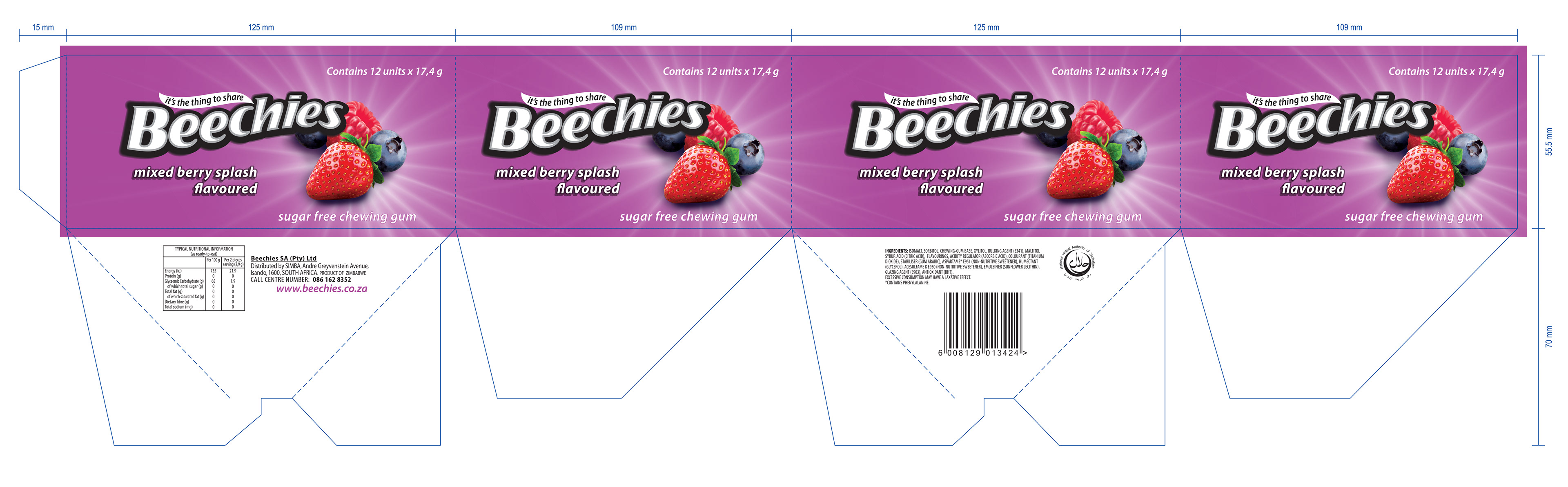
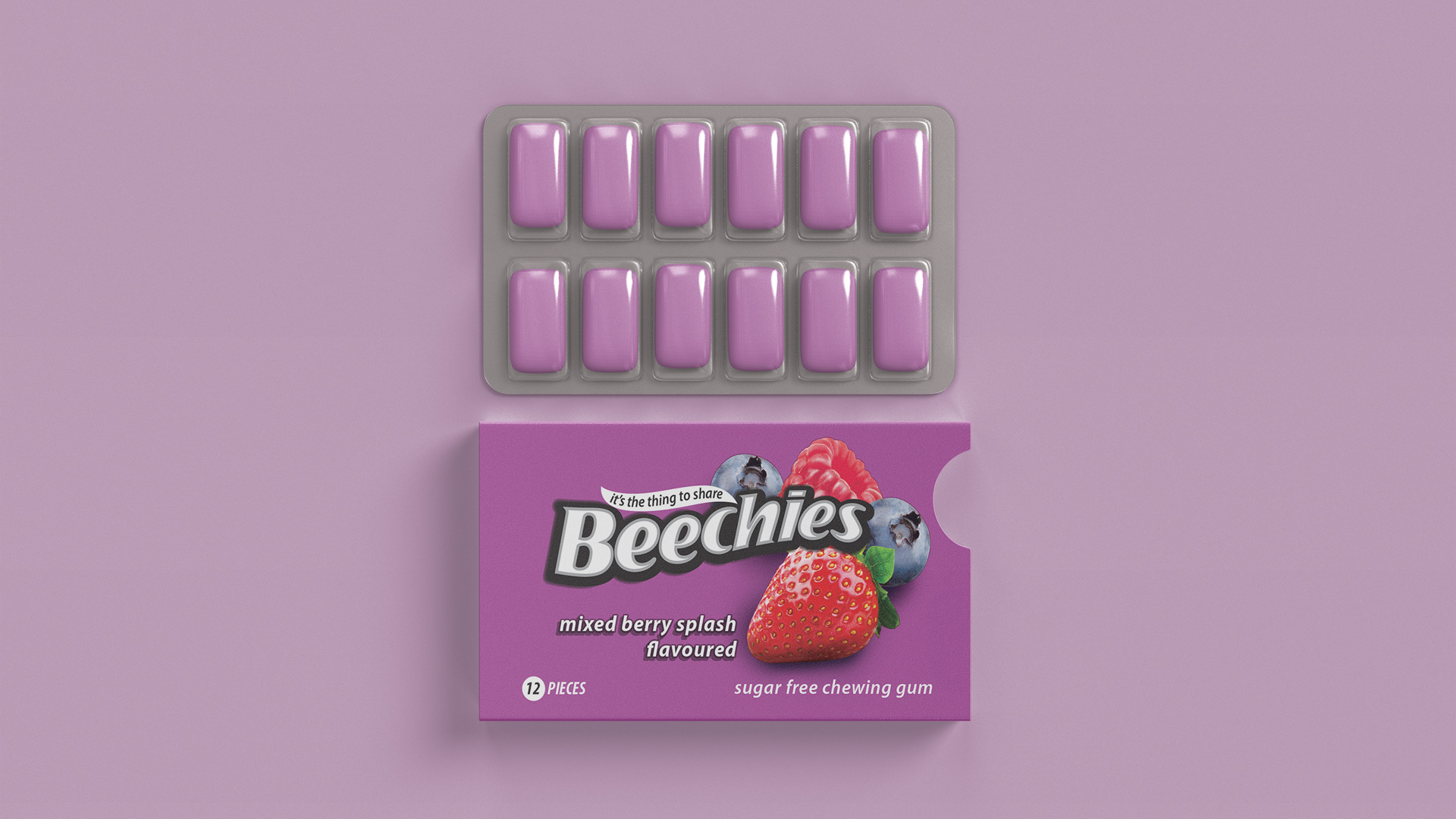
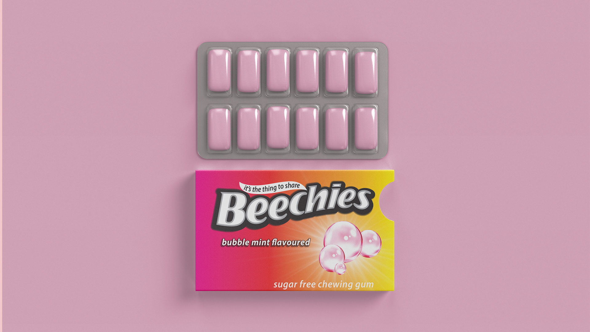
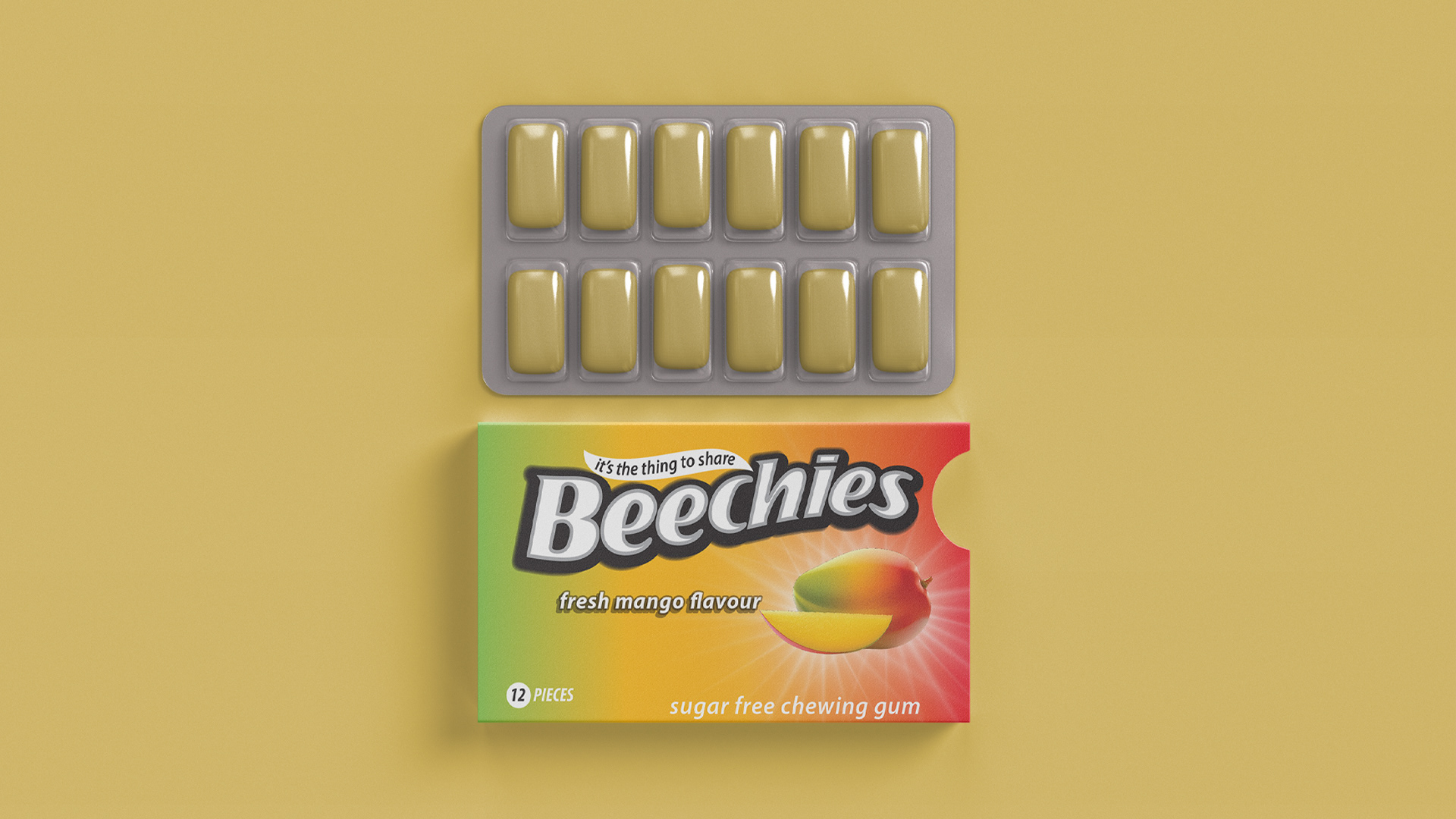
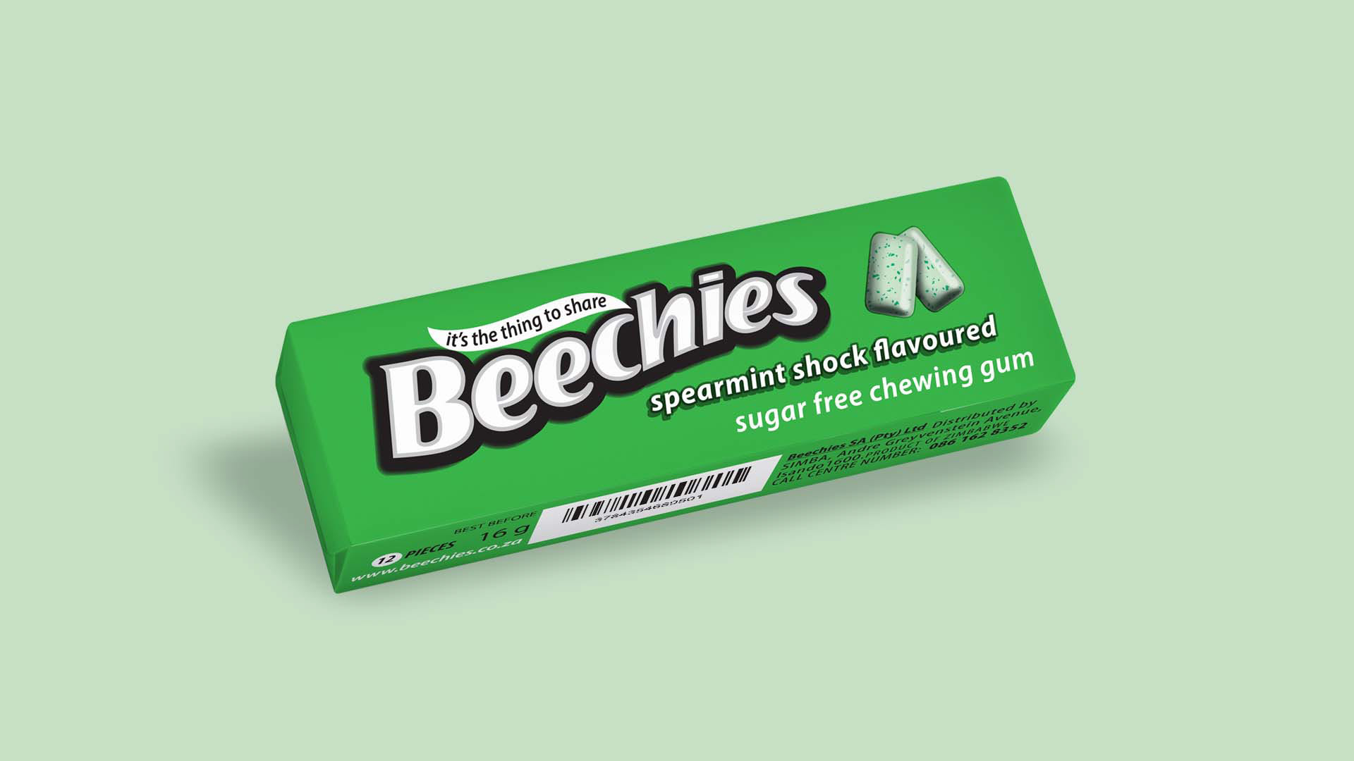
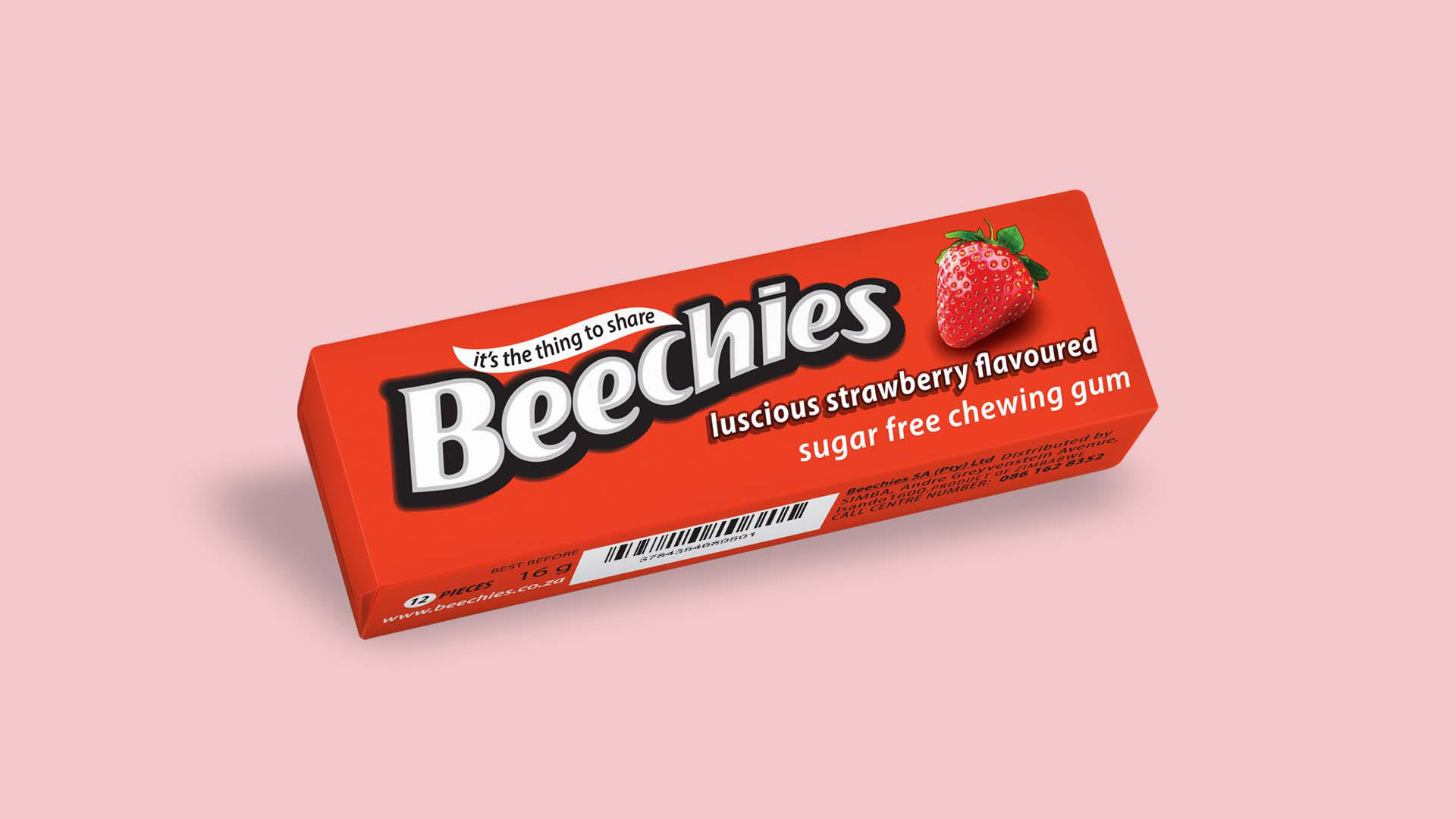
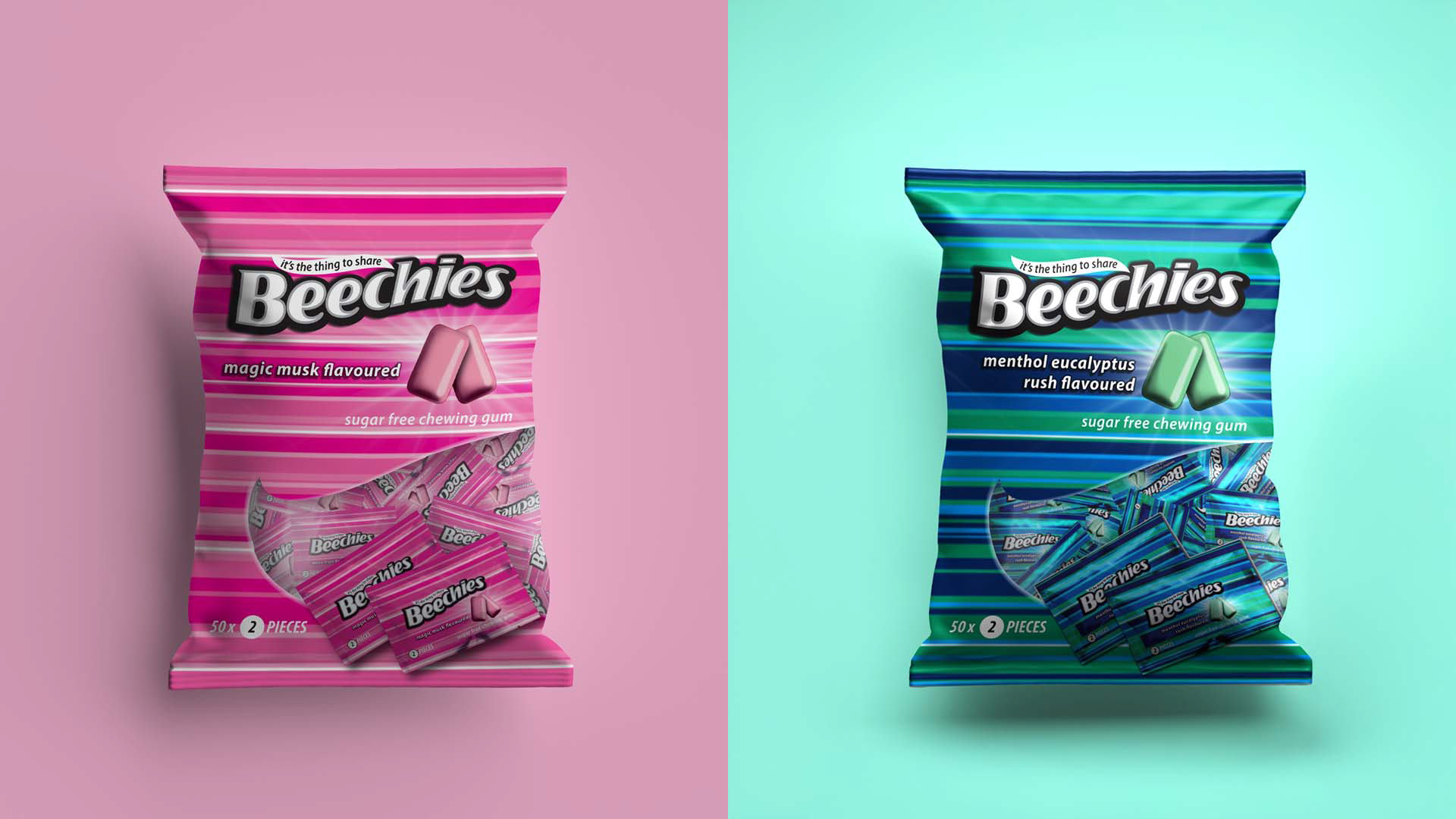
My role was to refresh the visual system without alienating existing consumers. I refined the packaging architecture, strengthened flavour differentiation, and elevated the graphic style to create a range that felt more energetic, polished, and shelf-ready. Each fruit visual and chewing gum element was hand crafted to give the product a more dimensional and distinctive appearance, while the color systems were pushed to create stronger variant recognition and greater impact across multiple pack formats.
The result was a refreshed packaging range that balanced heritage with modernity: recognizable enough to maintain trust, but updated enough to compete more effectively in a fast-moving consumer market.
Strategic Context
South African consumers engage with FMCG brands in a uniquely layered way. Products must often speak across income groups, age groups, and cultural preferences while remaining instantly understandable in busy retail environments. In categories like gum and confectionery, visual communication becomes especially important because the purchase is often emotional, impulsive, and influenced by flavour promise and perceived freshness.
Beechies already had brand equity, but shelf competition had become more intense. To remain relevant, the product needed to feel less dated and more aligned with modern consumer expectations. The refresh therefore had to solve two business needs at once:
• protect existing brand recognition
• increase relevance for a younger, visually driven South African consumer base
Target Audience
The refreshed Beechies range was aimed at the broad South African mass market, with particular relevance for:
• younger consumers and teens drawn to bright, flavor-led products
• everyday shoppers making fast purchase decisions in supermarkets, forecourts, and convenience stores
• families looking for affordable, familiar confectionery brands
• value-conscious consumers who still want products to feel contemporary and appealing
This meant the design needed to be immediate, vibrant, easy to read, and emotionally connected to flavour.
Key Challenges
Refreshing without losing recognition
Beechies was an established product within a major South African FMCG portfolio. The redesign could not move so far that it lost familiarity with existing buyers.
Competing in a crowded category
The confectionery and gum aisle is highly competitive, with multiple brands fighting for attention through colour, flavour imagery, and bold pack styling. Beechies needed stronger visual stopping power.
Working within strict brand guidelines
The project required discipline. I had to respect core brand equities while still finding room to modernise the system.
Appealing to a diverse South African audience
The design needed to work across a broad demographic mix and feel accessible rather than niche or overly premium.
Creating consistency across formats and flavors
The refresh had to extend successfully across bags, cartons, blister formats, and multiple flavor variants, while still allowing each SKU to retain its own personality.
Creative / Strategic Solution
My approach was to treat the refresh as both a visual and strategic exercise.
I retained the most recognisable brand assets to preserve trust, but reworked the surrounding system to feel more contemporary and commercially competitive. I pushed colour contrast and flavour coding more deliberately so that each variant had clearer distinction at shelf level. I also crafted each fruit and chewing gum visual by hand, rather than relying on generic stock-style assets, which gave the packs a more ownable and polished finish.
The design system was built to do three things clearly:
• strengthen shelf presence
• improve flavor communication
• modernize the brand without disconnecting it from its existing customer base
This allowed the packaging to feel brighter, cleaner, and more energetic while still sitting comfortably within Simba’s broader brand standards.
Outcome
The refreshed Beechies range was designed to better meet the realities of the South African retail environment: fast decision-making, high competition, broad demographic reach, and the need for visual immediacy.
From a strategic perspective, the project demonstrates how packaging can act as a commercial tool, not just a design surface. By understanding the competitive market, the target consumer, and the constraints of an established brand system, I was able to deliver a refresh that supported both recognition and renewed relevance.
This project reflects the kind of value I bring as a Creative Consultant / Strategist: translating market context, audience insight, and brand limitations into commercially intelligent creative outcomes.